 FirstRand Logo PNG
Financial operations in African countries must consider local conditions, business structures, and market characteristics. Banking services, lending, and investments are built on the real economic environment and clients’ needs. The FirstRand logo is associated with a South African financial group that provides banking and investment services to private clients and the corporate sector.
FirstRand was established in 1998. It was founded through the merger of Rand Merchant Bank Holdings, Momentum Life Assurers, and the financial division of Anglo American Corporation. The new group combined banking, insurance, and investment operations. As a result, it became one of South Africa’s largest financial institutions.
The merger’s history dates back to 1966. During that period, Momentum Life was created. In 1977, Laurie Dippenaar, Gerrit Ferreira, and Paul Harris founded Rand Merchant Bank. After the merger, FirstRand included the Rand Merchant Bank, First National Bank, and Discovery brands.
In 1998, the company began trading on the Johannesburg Stock Exchange. In the 2000s, FirstRand developed retail banking under the FNB brand. In 2008, it launched the eWallet service. It allowed mobile money transfers without a bank account.
In 2011, FirstRand entered the Nigerian market. In the following years, it expanded operations in Botswana, Zambia, Mozambique, and Tanzania. In 2015, it acquired a stake in the British bank Aldermore Group. By 2019, the company gained full control over this structure.
Credit reserves increased in 2020 and 2021. Later, profits recovered. In 2022, the group invested in digitalization. Together with the retailer TymeBank, it launched a fully online bank.
In 2023, FirstRand began using blockchain for international payments. In 2024, the company expanded online lending for small businesses.
The company manages a diversified financial ecosystem. It includes FNB, Rand Merchant Bank, WesBank, and Ashburton Investments. The group serves over 11 million clients in South Africa, other African markets, and the United Kingdom.
Meaning and History
What is FirstRand?
The largest financial group in South Africa, with a diversified structure and international presence, uniting banking, insurance, and investment divisions. It is one of the country’s four leading banking groups, along with Standard Bank, ABSA, and Nedbank. Most of its assets and revenue come from the banks FNB, RMB, and WesBank, which handle retail, investment, and auto lending, respectively. The network includes hundreds of branches and thousands of ATMs across the country, with offices operating in nine African states and abroad. The group cooperates with Morgan Stanley.
1998 – 2007
The first FirstRand logo introduced a heraldic lion previously used within the Rand Merchant Bank identity. RMB had used the figure long before the new holding company was created. After the financial companies consolidated, the image passed to FirstRand. Modern RMB associates the lion’s head with the brand’s African origins.
FirstRand Limited was formed in 1998 by consolidating assets from RMB Holdings and Anglo American Corporation of South Africa. RMBH contributed Rand Merchant Bank and Momentum to the new structure. Anglo American contributed First National Bank and Southern Life. The agreement took effect on April 1. Momentum Life Assurers Limited became FirstRand Limited on May 25. The group’s shares then began trading on the Johannesburg Stock Exchange.
The FirstRand name combined the names of 2 banks. First came from First National Bank, while Rand came from Rand Merchant Bank. The holding company united FNB, RMB, Momentum, and Southern Life while preserving the recognized names of the businesses within the shared structure.
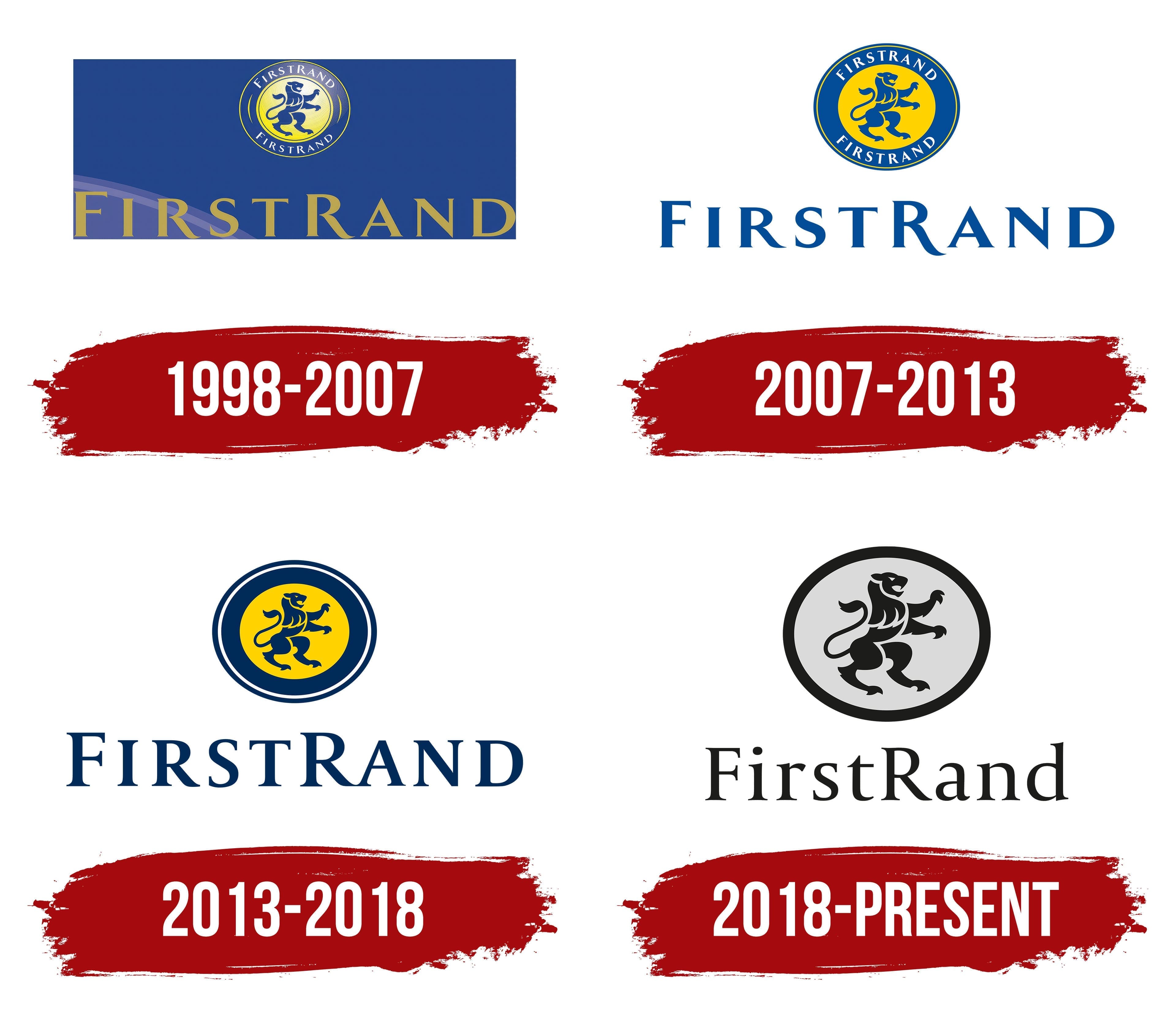
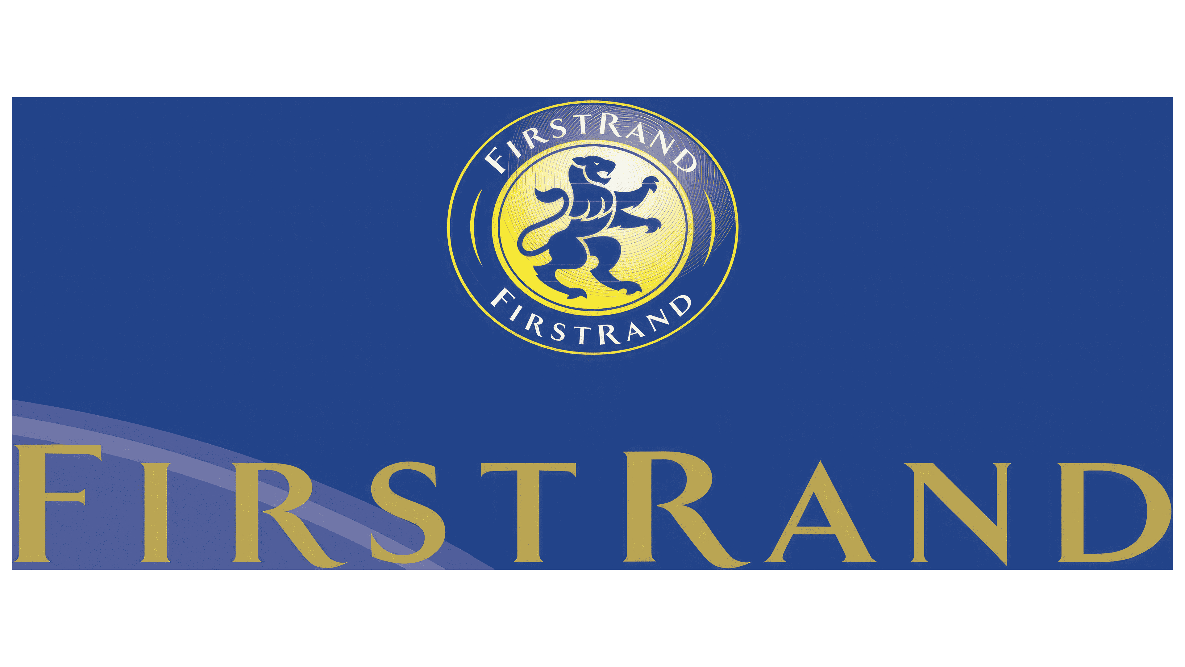
A circular medallion appeared above the name in the 1998–2007 logo. Its yellow-gold center gradually darkened toward the edge. A dark blue lion faced right against the background. It stood on its hind legs with one front paw raised and its long tail curving behind it. In heraldry, the pose is known as “lion rampant.”
Two dark blue rings surrounded the gold center. FIRSTRAND appeared along both the upper and lower curves, creating a symmetrical border. The white uppercase serif letters resembled Trajan or Garamond.
A large gold FIRSTRAND wordmark appeared beneath the medallion. It occupied nearly the full width of a blue rectangular field. The uppercase serif letters alternated thin and heavy strokes. The initial “F” and second “R” were slightly enlarged.
2007 – 2013
FirstRand removed the shared blue panel from the logo in 2007. The medallion and name moved to a light background. The heraldic lion and traditional lettering carried over from the previous version, maintaining a connection with Rand Merchant Bank’s visual heritage.
A bright yellow circle containing a blue lion formed the medallion’s center. The animal stood on its hind legs and faced right. Its front paws rose upward, while its long tail curved behind it. The body, head, and limbs were constructed from solid contours and geometric sections. The pose is known in heraldry as “lion rampant.”
A blue ring surrounded the yellow center. The white word FIRSTRAND appeared twice, following the upper and lower curves. The uppercase letters had traditional proportions and small serifs. Their form resembled Optima. A thin yellow line ran along the medallion’s edge, separating the blue ring from the background.
In the vertical version, FIRSTRAND appeared beneath the medallion. In the horizontal version, it stood beside it. Large blue uppercase letters repeated the style of the text inside the ring. The initial “F” and second “R” rose slightly above the remaining characters. The wordmark matched the color of the lion and blue ring.
2013 – 2018
FIRSTRAND disappeared from the medallion’s outer ring in the 2013–2018 version. Removing the 2 identical inscriptions opened the space around the lion and reduced the number of small details. The heraldic image remained the logo’s foundation, maintaining continuity with earlier FirstRand periods.
A dark blue lion appeared at the center of a yellow disk. The animal stood on its hind legs with its front paws raised. Curved sections defined its musculature, while the body lines became softer. Its curling tail rose and formed an arc. The figure retained the heraldic “lion rampant” pose.
Several outlines replaced the blue text ring. A white line surrounded the yellow disk, followed by a thick dark blue border. Additional blue and white contours created a layered circular frame. Yellow, blue, and white carried over from the 2007 version.
A large dark blue FIRSTRAND wordmark appeared beneath the medallion. Its shade matched the lion and outer border. The uppercase serif letters resembled Trajan and used expanded spacing. The initial “F” and second “R” were slightly larger than the other characters.
2018 – today
FirstRand introduced a monochrome corporate logo in 2018, separating the holding company’s image from the colorful identities of its customer-facing brands. Gray, black, and white replaced the yellow and blue used in previous versions. FNB retained its turquoise identity, WesBank continued using its red emblem, and RMB kept a black-and-white version featuring the lion.
The circular form and the animal’s pose carried over into the new version with minor revisions. The center became light gray, while a heavy black line formed the outer edge. The lion turned black. It stands on its hind legs with both front paws raised and its body turned slightly to the left. The head points upward, and the mouth is open. Angular curves form the chest, large paws, thighs, and long tail extending along the left side of the body.
The wordmark changed as well. The uppercase FIRSTRAND form gave way to the mixed-case FirstRand. The initial “F” and the middle “R” became uppercase, while the other letters were lowercase. The narrow serif typeface resembled Adobe Garamond or Caslon. Thin and heavy strokes alternated, while black matched the lion and circular outline.
The logo appears in FirstRand Limited’s corporate materials. The group presents its structure as a portfolio of integrated financial companies. The monochrome identity represents the parent holding company, while customer-facing divisions operate under separate brands.