 FNB (First National Bank) Logo PNG
Financial transactions in South Africa include app payments, transfers, and savings, all conducted digitally through banking services. Money management combines mobile technologies with traditional banking products. The FNB logo represents a bank that serves individual and business customers, offering accounts, loans, and digital services.
First National Bank dates back to 1838. That year, British settlers in Grahamstown founded the Eastern Province Bank. In the 19th century, the bank served farmers and merchants in the British colonies. After a 1862 merger, it began developing as a regional financial institution. In 1925, the organization was renamed First National Bank of Southern Africa. By the early 20th century, the bank already had branches in Cape Town, Johannesburg, and Durban.
During the late 19th-century gold boom, the bank financed mining companies. During the apartheid era, the bank primarily served the corporate sector and remained one of South Africa’s largest banks.
In 1987, FNB became part of FirstRand Group. The group also included Rand Merchant Bank and Southern Life. After apartheid ended in 1994, the bank began serving a broader customer base and expanding its presence.
In 1998, FirstRand listed its shares on the Johannesburg Stock Exchange. In the 2000s, FNB pioneered digital banking. It launched the eWallet service for mobile money transfers.
Since the 2010s, the bank has expanded its presence across Africa. New divisions appeared in Namibia, Botswana, Ghana, and Mozambique. In 2015, it launched a fully digital bank. In 2018, the bank introduced the Nav platform, which includes artificial intelligence features.
From 2020 to 2024, FNB advanced digitalization. The bank developed services for small businesses and entered new markets, including Nigeria.
First National Bank is one of South Africa’s four largest banks. It operates in more than ten countries and serves millions of customers through the FirstRand Group network.
Meaning and History
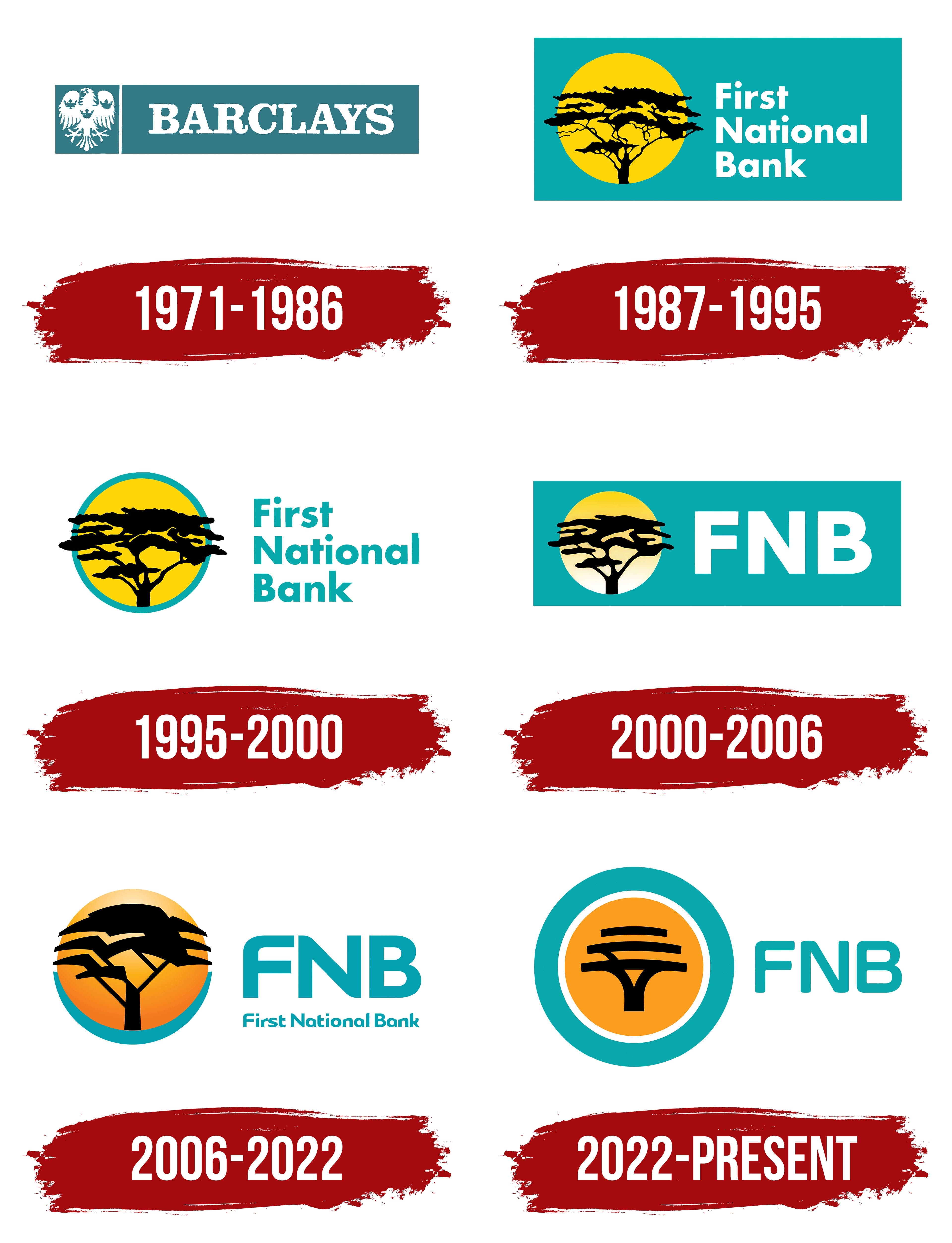
What is FNB?
The largest financial institution in South Africa, part of the country’s “big four,” operates under FirstRand Limited. It serves millions of customers through a network of more than 600 branches, 1,000 ATMs, and digital platforms. It offers checking and savings accounts, mortgages, car loans, insurance, investment, and management solutions. Barclays previously owned it and, since the late 1990s, has been a key asset of the FirstRand Group, alongside Rand Merchant Bank and WesBank, accounting for a significant share of the group’s income and assets.
1971 – 1986
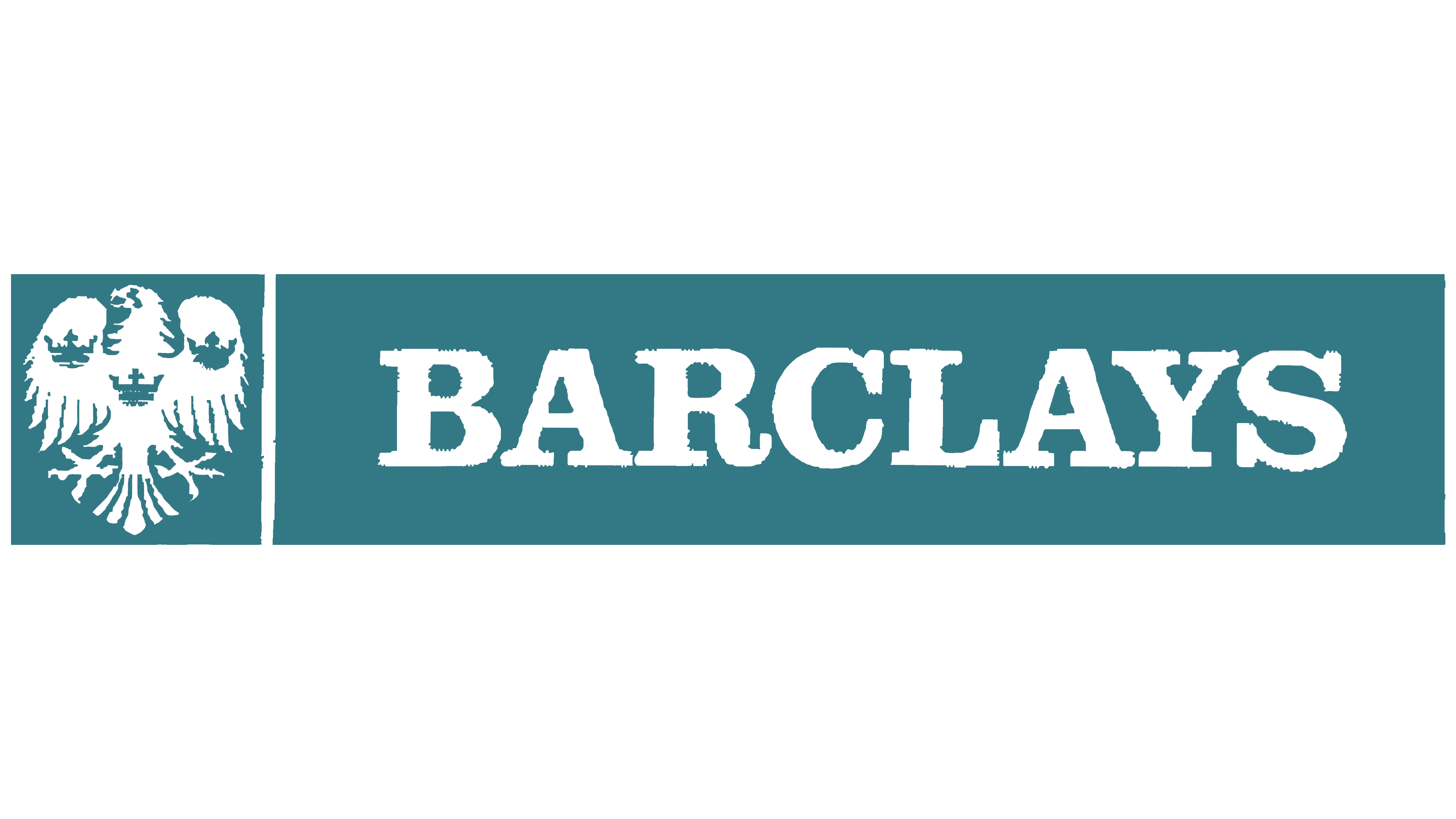
Before adopting the First National Bank name and African acacia emblem, the South African bank operated under the Barclays brand. Its history traces back to Eastern Province Bank, founded in Grahamstown in 1838. Its connection to Barclays began in 1925, when National Bank merged with Anglo-Egyptian Bank and Colonial Bank. The combined business became Barclays Bank Dominion, Colonial and Overseas. In 1971, the South African organization became Barclays National Bank Limited.
An eagle and the British surname identified its Barclays affiliation. In the rectangular logo, a white bird with spread wings occupied a separate field on the left. A vertical line divided it from “BARCLAYS,” set in large serif capitals. Both parts appeared against a shared blue-green background.
Separation from Britain’s Barclays brought a new name and new symbolism. First National Bank of Southern Africa Limited was introduced on September 30, 1987. The initials of First National Bank formed the abbreviation FNB. An African acacia replaced the Barclays eagle. Today, FirstRand is part of South Africa’s FirstRand group.
1987 – 1995
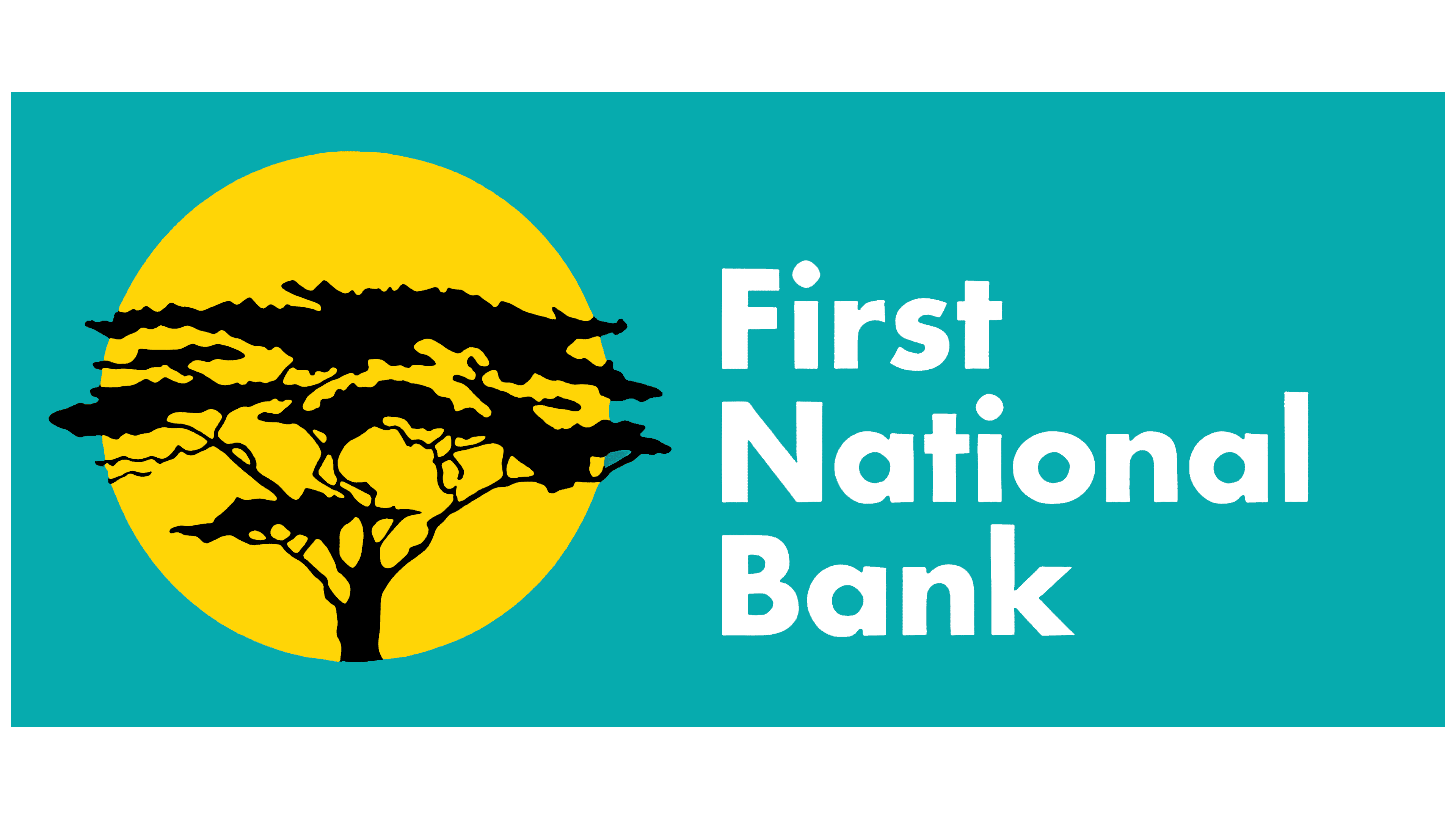
A change in ownership replaced the Barclays eagle with an African acacia. Under pressure from the campaign for divestment from apartheid South Africa, Barclays sold its remaining stake in 1986. In 1987, the bank became First National Bank of Southern Africa Limited and passed entirely into South African ownership. Bank head Chris Ball led the naming and identity project. New York’s Siegel+Gale developed the identity, while local firm Pentagraph handled its implementation in South Africa. Logo credits include Clive H. Gay, Darren Gay, and Craig Lyon of Trademark Design (PTY) Ltd.
The acacia against a rising sun linked the new name to Africa and marked a new chapter in the bank’s history. The phrase “Symbol of life, strength, hope” accompanied the emblem. The tree represented FNB’s historic roots in South Africa, growth, and service to customers and local communities.
In the 1987 version, a black branching trunk supported a flat, spreading canopy. Numerous gaps between the fine branches revealed the yellow sun disk behind them. The canopy extended beyond the circle’s edges. A horizontal version placed the image and name on a turquoise rectangle. The tree occupied the left side, while “First National Bank” appeared on three lines to the right. The white lettering used Futura Bold, a bold sans-serif typeface.
The acacia drawing traces back to a botanical illustration by Jo Onderstall. Her work appeared in the book Transvaal Lowveld and Escarpment, devoted to South African nature and including the Kruger National Park. The first edition was published in 1984. After the logo appeared, Onderstall contacted Chris Ball about using her drawing. Bank representatives visited the National Botanical Garden library in Pretoria and compared the images. Onderstall was subsequently paid a fee as a goodwill gesture.
The original emblem was hand-drawn. Pentagraph art department head Carlo Kaminski recalled the original artwork arriving from New York with the tree, circle, and sun. The new identity had to be applied to signs, vehicles, letterheads, and printed materials at branches across the country. Kaminski used a single-engine airplane to visit small towns. The acacia replaced the eagle even at branches operating from small houses in farming areas.
Rumors soon spread about the gaps among the branches. People identified the outlines of a rabbit, a crocodile, an automatic firearm, and a map of Africa, linking the supposed images to the political climate of the late 1980s. FNB denied that animals and weapons had been deliberately incorporated into the drawing. Arthur Goldstuck recounted the story in The Rabbit in the Thorn Tree, his book about South African urban legends. Portions of the tree were later adjusted to reduce their resemblance to the alleged silhouettes. Kaminski recalled making the corrections in ink on tracing paper and placing them over the original artwork.
1995 – 2000
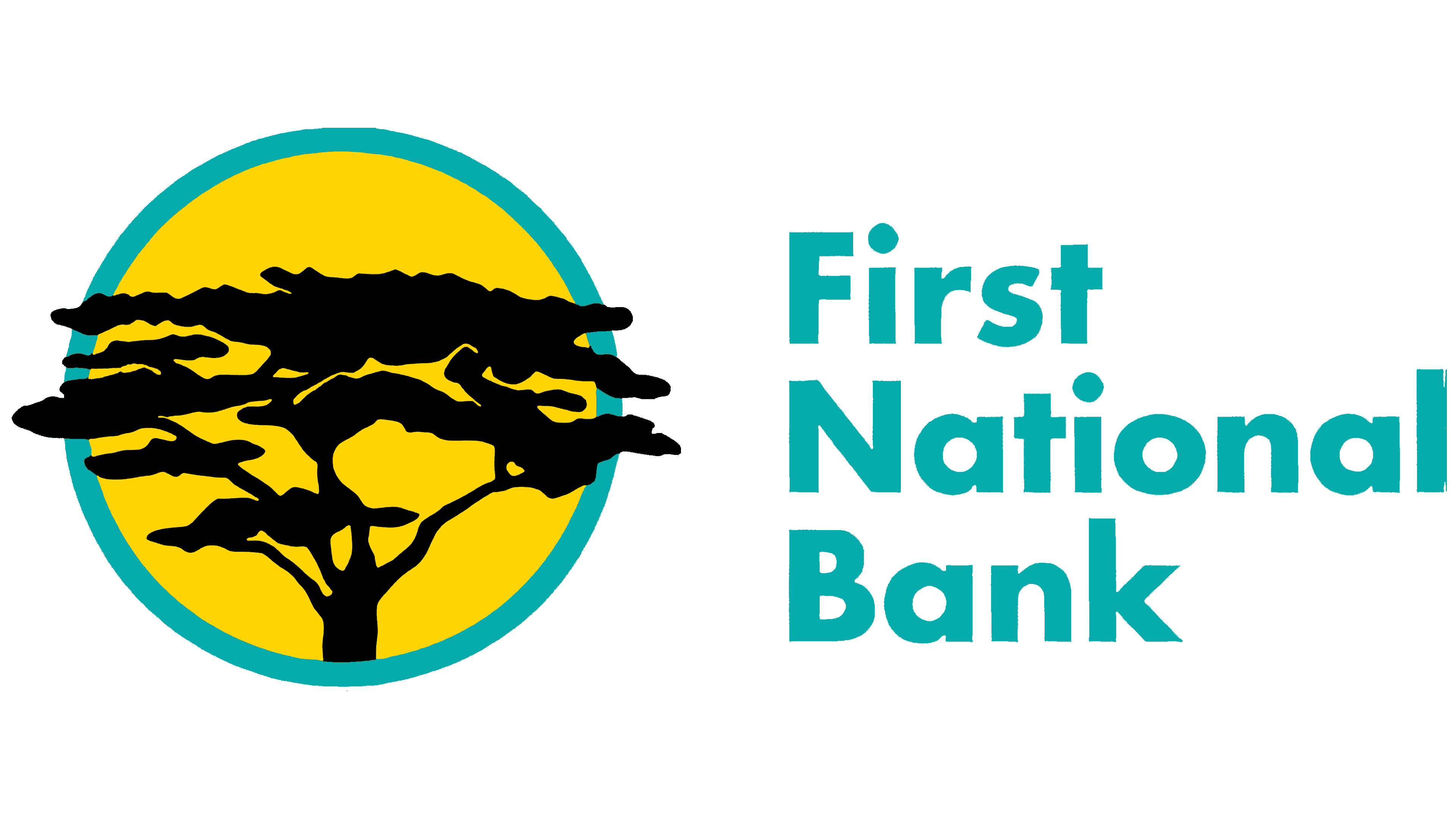
In the next First National Bank logo, white replaced the shared turquoise rectangular background. The acacia, sun disk, and full three-line name remained. The formerly white lettering became turquoise, and a thin border in the same color appeared around the bright yellow sun.
A circle containing the black tree sat to the left of the name. Strongly curved branches with flowing lines and uneven edges spread from a thick trunk. They supported the acacia’s flat, horizontally extended canopy, typical of the African savanna. Its edges still projected beyond the sun disk. The branches and foliage grew larger, making the drawing denser and shifting the balance between black areas and open space.
“First,” “National,” and “Bank” appeared one below another on the right. Each word began with a capital letter followed by lowercase letters. The heavy sans-serif lettering resembled Futura Bold and Gill Sans. Turquoise connected the name to the sun’s outline.
2000 – 2006
The 2000 consolidation of banking brands updated FNB’s identity. First Commerce, First Express, Personal Bank, and several other brands merged into First National Bank. The logo replaced the full three-line name with large “FNB” initials on a single line.
In the horizontal version, a turquoise rectangle brought the emblem and lettering together. White “FNB” letters sat on the right, with the tree inside a circle on the left. The sun disk gained a yellow-to-light-yellow gradient. The acacia changed as well. Larger black shapes replaced the fine network of branches, preserving the image of a tree against the sun.
2006 – 2022
By 2005, FNB’s logo featured an acacia with angular branches. Several black bands formed the canopy, while the trunk and branches acquired geometric outlines. An orange-yellow sun appeared behind the tree, with turquoise framing the lower portion of the circle. Turquoise “FNB” lettering stood to the right, with the full name “First National Bank” repeated below in small letters. A vertical version placed the initials beneath the tree.
In the mid-2000s, the outline of Africa within the acacia was explained as a reference to the bank’s origins. The continent’s silhouette also served a practical purpose. It helped verify the emblem’s orientation when reproduced and detect mirrored versions. Turquoise and amber maintained the connection between the tree and sun disk.
Related brands later adopted the sun imagery and color combination. In the 2013 eBucks update, they signaled its affiliation with FNB. The bank continued using the promise “How can we help you?”
2022 – today

FNB’s transition to a digital platform led to an update of its acacia emblem. The bank unveiled it on October 7, 2022, as part of First National Bank’s South African rebrand, timed to coincide with the launch of a redesigned mobile app and web platform. The bank was expanding its financial advice and everyday services. Marketing head Faye Mfikwe explained that the changes adapted FNB’s symbolism to new ways of interacting with customers.
Grid Worldwide developed the logo under the leadership of chief creative officer Nathan Reddy. Paul Hinch and Yatish Narsi served as executive creative directors on the project. Jignil Kandasamy, Tanya de Jong, and Gregory Trombetta also shared responsibility for creative direction.
The designers retained the tree as an image of African roots, protection, and growth while reworking its outlines. Three slightly curved horizontal bands, stacked vertically, replaced the small branches and uneven foliage edges. The lowest band connected to a forked trunk, while the upper two remained separate. The black acacia sat inside an orange circle, separated from a thick turquoise ring by a white gap. Solid fills replaced the gradients.
Turquoise “FNB” lettering with rounded stroke endings appeared to the right. The full name beneath it was removed. The new guidelines allowed the circular emblem to be used independently of the initials.
The geometric canopy resembled an upside-down Wi-Fi icon and an electricity pylon. The bank explained that the redesign was intended to offer a contemporary image to a new generation of customers and reflect FNB’s role as an adviser.