


 Birkenstock Logo PNG
Everyday footwear is designed with the foot’s shape and the strain of prolonged walking in mind. People wear sandals and footwear in urban settings, at work, and during leisure time, where comfort affects well-being throughout the day. The Birkenstock logo is associated with a company that manufactures shoes featuring anatomical insoles and prioritizes comfort and durability.
Birkenstock’s history begins in 1774, when Johann Adam Birkenstock registered as a shoemaker in Langen-Bergheim. In 1896, his descendant Konrad opened workshops in Frankfurt and created the first flexible anatomical insole. In 1902, he patented it. In 1913, his son Carl joined the business. He focused production on orthopedic footwear.
In 1925, the company opened a factory in Friedberg. After World War II, Carl Jr. restored production in 1947. In 1964, the first footwear model, Madrid, appeared. In 1966, Birkenstock released the Arizona model. It later became a brand symbol.
In 1967, American Margo Fraser began selling Birkenstock in the United States. This helped it gain popularity among hippies in the early 1970s. In 1973, the company moved its headquarters to Linz am Rhein, where it remains today.
In the 1980s, Birkenstock footwear became popular among students and medical workers. In 1988, the company’s management passed to brothers Alex and Christian Birkenstock. They modernized the company and expanded export sales.
In the 1990s, interest in the brand declined. Starting in 2000, it returned to the market as minimalism gained popularity. In 2012, the sandals appeared in Celine’s collection. This paved the way for collaboration with luxury brands.
Since 2013, Birkenstock has collaborated with Givenchy and Rick Owens. By 2014, the brand had become a fashion phenomenon among a new generation. In 2021, L Catterton, an LVMH subsidiary, acquired a controlling stake in the company. The deal was worth about €4 billion.
In 2023, the company went public on the New York Stock Exchange. The company’s valuation reached $ 8.6 billion. In 2024, Birkenstock expanded its product range beyond sandals. Boots and sneakers were added.
The company produces more than 30 million pairs of shoes annually. Products are supplied to 90 countries. Production facilities are located in Germany and Portugal.
Meaning and History
What is Birkenstock?
A German footwear manufacturer focused on orthopedics, it operates six factories in Germany and is headquartered in London. Founded by master craftsman Johann Adam Birkenstock, the company sells over 34 million pairs of shoes per year and generates about 1.8 billion euros in revenue. The key element is the anatomical cork footbed Konrad Birkenstock created. Classic models include Madrid, Arizona, Boston, and Gizeh. After collaborations with Valentino, Prada, and Dior, the brand gained worldwide recognition.
1957 – 1995

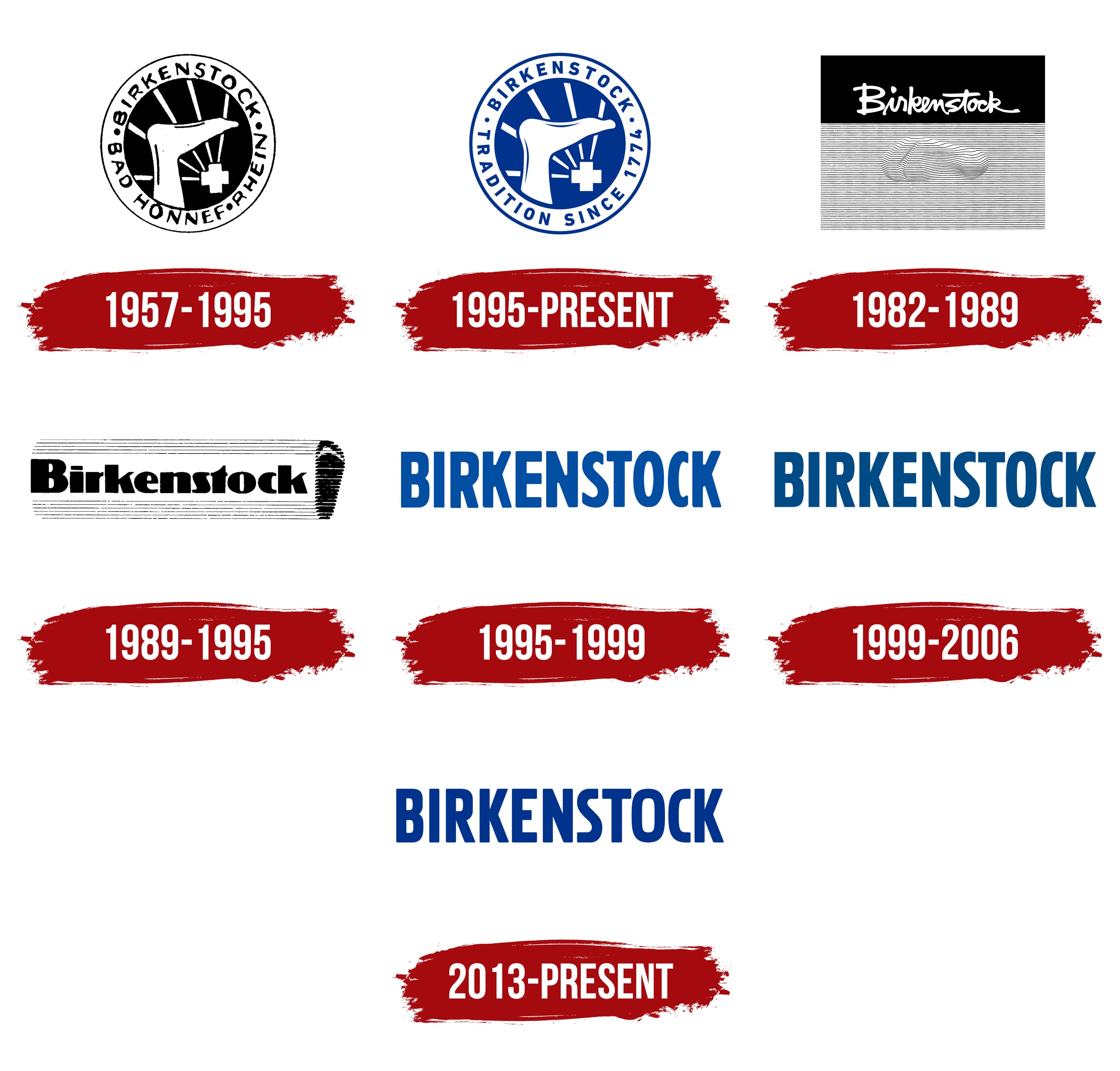
Birkenstock’s circular emblem features a foot, linking the brand to its sandals and contoured footbeds. Used from 1957 to 1995, the design combined a lower leg and foot, a cross with radiating lines, and lettering around the edge. The black-and-white treatment separated the illustration from the text. White symbols occupied the dark center, while the name and location appeared in the white outer ring.
Birkenstock takes its name from a German shoemaking family. Its craft history dates to 1774, when shoemaker Johannes Birkenstock was recorded in Langen-Bergheim. In 1896, Konrad Birkenstock opened a workshop in Frankfurt am Main. His development of a contoured shoe last and flexible insole laid the groundwork for the brand’s future products. The date 1774 later appeared on the emblem, marking the beginning of the family’s documented shoemaking tradition.
Inside the black circle, a white silhouette of a lower leg showed the foot raised and the toes pointing right. An equal-armed cross resembling a medical symbol sat beneath the arch, with five straight white rays extending from it. The simplified illustration retained the leg outline and the arch curve.
The white outer ring contained BIRKENSTOCK • BAD HONNEF • RHEIN •. Round dots separated the brand name from the words identifying Bad Honnef on the Rhine. Black uppercase letters followed the circle at even intervals. The bold sans-serif lettering combined straight lines with slight variations in letter width and slant, giving it a hand-drawn appearance.
1995 – today

Beginning in 1995, Birkenstock’s circular emblem conveyed the length of the family’s shoemaking tradition through the inscription TRADITION SINCE 1774. It replaced the location wording BAD HONNEF RHEIN. The brand name remained in the upper half of the ring, while the phrase and date occupied the lower half. Two round dots, one on either side, separated the text.
The overall structure retained the foot, equal-armed cross, and radiating lines inside the circle. The illustration received more even contours, and blue replaced black. Blue filled the inner circle and defined the lettering and outer border. White formed the leg, cross, and rays, while the white ring separated the illustration from the surrounding text.
The uppercase sans-serif letters became heavier, with more consistent widths and spacing. The upright lettering followed the circle’s curve, and the numerals 1774 matched its style. The circular version continued to appear alongside Birkenstock’s wordmark, retaining a separate emblem with a foot illustration and a reference to the age of the family’s craft tradition.
1982 – 1989

From 1982 to 1989, a rectangular black-and-white logo created by James McElheron and Erin Cook represented a separate branch of Birkenstock’s visual identity. Two stacked panels replaced the circular frame. The upper panel held the handwritten name, while the lower one contained a foot illustration formed from horizontal lines.
White Birkenstock lettering on a black background resembled a calligraphic signature. A large initial “B” led into connected lowercase letters that ended in a long flourish. Flowing connections and varying stroke thickness reproduced the broad and narrow marks of handwriting while keeping the word continuous.
Closely spaced parallel black lines filled the lower rectangle. They extended across its full width and curved in the middle to create a three-dimensional impression of a foot. Fine hatching conveyed depressions and raised areas. The resulting relief resembled the surface of a contoured footbed, connecting the emblem to foot support.
1989 – 1995

The 1989 logo update accompanied efforts by the American company Birkenstock Footprint Sandals to change perceptions of the brand. Under Margot Fraser’s leadership, the company sought to reach an audience beyond Birkenstock’s familiar association with hippie footwear. The new identity replaced the handwritten name with heavy typeset lettering and a stylized sole on the right.
Birkenstock retained an uppercase “B,” with the rest of the name in lowercase. Thick vertical strokes and rounded letterforms replaced connecting flourishes. The bold black sans-serif lettering had substantial shapes with slight rounding. Tightly spaced letters formed a line enclosed by thin horizontal rules above and below.
A large vertical sole silhouette occupied the right side of the logo, with its heel at the bottom. It stood at the ends of the lines framing the name. Horizontal hatching formed the foot’s outline and connected the illustration to the rules around the lettering. Both the name and image were black, with white gaps dividing the sole into narrow sections.
1995 – 1999

In 1995, Birkenstock adopted a wordmark built entirely around the brand name. The 1995-1999 version used blue BIRKENSTOCK lettering without a frame, hatching, or sole illustration. A single line of uppercase letters replaced the text-and-imagery combination.
The tall, narrow sans-serif lettering gave the letters elongated proportions. All stood upright, with tight spacing leaving small gaps between neighboring characters. One version exaggerated their height. Rounded transitions and soft endings on certain strokes complemented the straight sections while keeping the style consistent throughout the name.
1999 – 2006

Another version of Birkenstock’s wordmark changed the name’s proportions and color. The letters became wider, and the blue took on a greenish tint. Heavy vertical strokes combined with narrow interior spaces, while the letters remained tightly spaced.
The next version differed in color. The lettering became dark blue, one or two shades darker than before. The letter proportions, vertical stroke thickness, interior shapes, and spacing remained the same.
2013 – today
In the Birkenstock version used since 2013, the update focused on color. Bright blue replaced the previous dark blue, while the lettering’s structure remained unchanged. Dark blue BIRKENSTOCK lettering had already appeared in 2010 above the line Made in Germany · Tradition since 1774. The tagline paired German manufacturing with the starting date of the family’s shoemaking tradition. The large family name dominated the logo. At the same time, the smaller text below added information about the brand’s origins and history.
Karl Birkenstock contributed to the visual identity. Alongside footwear development and orthopedic research, he sketched logos and packaging. Surviving drawings became part of Old Mills Never Die, a Steidl book project about the company’s heritage. The sketches document Karl’s contribution to Birkenstock’s visual language.
A separate typographic mark was created for Birkenstock 1774, the brand’s designer collaboration line. Its name repeats the date marking the beginning of the family’s shoemaking tradition. Bruno Michaud of BMD Design, a French studio in Bordeaux, created the logo. He built it from four large numerals with individually drawn contours. Both “7” numerals have long diagonal strokes and broad top bars, while the “4” has an open interior. The numeral-based logo appears on the contoured footbeds, boxes, and fabric bags of the 1774 line.
Investment from L Catterton, LVMH’s equity involvement, and Birkenstock’s subsequent IPO left the brand’s main logo unchanged.