 BlueScope Logo PNG
Steel materials with protective coatings are used to build roofs, facades, and fences where surfaces must withstand rain, sun, and temperature fluctuations. Production involves metal processing and applying coatings that extend the product’s lifespan. The BlueScope logo is associated with a company that produces coated steel for construction and infrastructure projects.
BlueScope Steel was established in 2002 after separating its steel division from BHP Billiton. The company’s origins date back to 1885, when the Broken Hill Proprietary Company was founded, initially focused on ore mining. In 1915, the company built its first steel plant in Newcastle. Throughout the 20th century, BHP became Australia’s main steel supplier to the industrial and defense sectors.
In 2001, after the merger with Billiton, management decided to focus on mineral extraction. Management spun off the steel division as an independent entity. In 2003, the company adopted the name BlueScope Steel. The name reflected independence and a commitment to growth. Its main asset was the Port Kembla plant, with an annual capacity of about five million tons of steel.
In the mid-2000s, the company expanded its presence in Asia. It opened plants in China, India, Thailand, and Vietnam. The 2008 financial crisis led to a decline in production. In 2011, the company shut down one of the blast furnaces in Port Kembla and carried out a large-scale restructuring.
Since 2015, BlueScope has strengthened its position and expanded the production of painted and galvanized steel. In 2017, the company acquired its American partner, North Star BlueScope Steel, in full. In 2019, it invested about A$1 billion in building a new furnace in Ohio.
In 2022, the company began modernizing blast furnace number five in Port Kembla. In 2023, the company introduced artificial intelligence systems to optimize production processes. In 2024, the company increased capacity in the United States and strengthened its position in the North American market.
BlueScope Steel remains the largest steel producer in Australia and New Zealand. The company produces about six million tons of steel annually for the construction, automotive, and industrial sectors.
Meaning and History
What is BlueScope?
A major steel producer forming the core of the steel industry in Australia and New Zealand. The company was established after separating from BHP Billiton and has expanded its network of facilities across Australia, New Zealand, the United States, and Asia. The product range includes slabs, hot-rolled and automotive steel, ZINCALUME and Colorbond coatings, profiles, and construction sheet materials. The products are used in residential, commercial, and infrastructure projects.
2002 – 2003
BHP Billiton’s steel division became an independent company, BHP Steel Limited, and was listed on the Australian Securities Exchange on July 15, 2002. Its manufacturing assets had ties to BHP, John Lysaght Australia, and Australian Iron & Steel. BHP’s history began in 1885, while BHP Steel became a separate corporate entity after the group split in 2002.
Cato Brand Partners developed the first identity. The agency used BHP’s 1985 emblem as a foundation and adapted it for the steel company. The continuity helped customers, business partners, and investors connect the young organization with a recognized industrial name following its separation from BHP Billiton.
Five broad blue bands with smooth curves and a rightward slant occupied the upper section of the logo. White gaps followed the contours of the colored lines. The second and third bands were the longest, while the first and fourth were shorter. The fifth band was the most compact. The upper band sat closer to the left edge, while the others shifted toward the right. Together, they formed a slanted diamond-like shape with wavy edges.
The abstract BHP emblem associated with the map of Australia served as the basis of the symbol. The BHP Steel version retained its earlier contours through 5 curved bands. Rich blue with an indigo undertone resembled cold metal. The uncomplicated form worked well on printed materials, corporate documents, and stock market publications.
BHP STEEL appeared beneath the bands in light blue-gray. All letters used the uppercase Stone Sans typeface. Their dense contours resembled Eurostile Bold and HWT Gothic Heavy, though Stone Sans remained the typographic foundation. The heavy wordmark supported the upper figure’s geometry.
The enlarged “S” in STEEL marked the transition between the 2 parts of the name. A narrow space between the “P” and “S” united the words as one brand while retaining the reference to the steel industry. The large emblem and narrow signature formed a vertical arrangement used on corporate materials in 2002 and 2003.
Because BHP used the name under license, management began preparing a new name after the separation. Shareholders approved BlueScope Steel Limited on November 11, 2003, and implementation began on November 17. The BHP Steel logo then gave way to the BlueScope identity.
2003 – 2013
BHP Steel management announced the new BlueScope name in mid-2003, several months before the shareholder vote. Blue referred to the color long associated with the company. Scope represented opportunities for growth and engagement with new ideas in the steel industry. The compound name suited an international company ending its use of the former parent group’s licensed brand.
The company began legal preparations before the official brand launch. The company filed an application for the BLUESCOPE word mark in the United States on August 29, 2003. The company submitted European Union registration documents on September 1. Shareholders approved the name BlueScope Steel Limited on November 11, and it appeared on corporate materials, production sites, and business communications beginning November 17.
The company retained BHP Steel’s 5-part emblem after the name change. A slanted figure made from broad blue bands with smooth curves appeared above the text. White gaps followed the bands and separated them. All sections pointed to the right and formed a diamond-like plane with wavy edges.
The bands varied in size. The second and third were the longest, the first and fourth were shorter, and the fifth was the smallest. The upper section sat closer to the left edge, while the lower sections shifted toward the right. The arrangement created a stepped outer contour and continued the structure of the BHP Steel emblem derived from BHP’s visual heritage.
Blue became richer after the name change. The new shade corresponded with the word Blue and helped separate BlueScope Steel from the former brand. The 5 bands maintained continuity with the BHP Steel period familiar to employees, customers, suppliers, and investors.
The name appeared beneath the emblem across 2 lines. BLUESCOPE occupied the upper line, while STEEL appeared below. The first line was larger, while the industry designation was smaller. Heavy uppercase sans-serif letters had solid forms and consistently thick strokes. Their structure resembled Eurostile Bold and Square 721.
The “S” in the middle of BLUESCOPE was larger than the surrounding letters and separated Blue from Scope. STEEL used a similar style. It identified the company’s business and replaced the complete legal name within the logo. The light blue-gray text differed from the rich blue bands and recalled the color of metal.
The public conclusion of the BHP Steel era took place at the Port Kembla facility. On the day of the brand launch, they lowered the old banner and raised a BlueScope Steel flag above the plant. The ceremony marked the name change at a production site that had operated under the BHP identity for many years.
2013 – 2021
By 2013, STEEL had disappeared from the BlueScope logo. The 2-line BLUESCOPE STEEL signature was replaced by the single word BLUESCOPE, while BlueScope Steel Limited remained the legal name. The shorter form represented the entire group and worked beside the names of its different divisions.
The update accompanied the expansion of BlueScope’s corporate structure. NS BlueScope Coated Products, a joint venture with Nippon Steel & Sumitomo Metal Corporation, began operating in ASEAN countries and North America. The single-word brand covered the group’s different operations. At the same time, its connection with the steel industry remained in the legal name and corporate history.
The 5-part emblem remained above the name. It consisted of broad parallel bands with smooth curves and a rightward slant. White gaps followed the outlines of the blue sections and separated them. The overall silhouette resembled a diamond with wavy lines and stepped edges.
The bands differed in length. The second and third occupied most of the width, while the first and fourth were shorter. The fifth completed the shape as a small lower section. The upper band sat closer to the left edge, while the others shifted toward the right. The arrangement maintained the overall slant and preserved the previous emblem’s structure.
The bands’ color treatment changed. Gradients ran from light blue near the center to dark blue at the edges, replacing the solid fill. The gradient emphasized the curves and distinguished the 5 components without altering the established silhouette. White gaps separated the neighboring bands against a light background.
BLUESCOPE appeared beneath the emblem in one line of large uppercase letters. The blue-gray wordmark had compact proportions, an upright position, and strokes of consistent thickness. Its sans-serif construction resembled Eurostile and Gotham Bold.
The “S” in the middle of the name was larger than the other letters. It marked the division between Blue and Scope while preserving the name as one word. The enlarged “S” continued a typographic feature from the earlier BlueScope Steel logo. The light blue-gray wordmark remained visually separate from the emblem’s rich gradient.
2020 – today
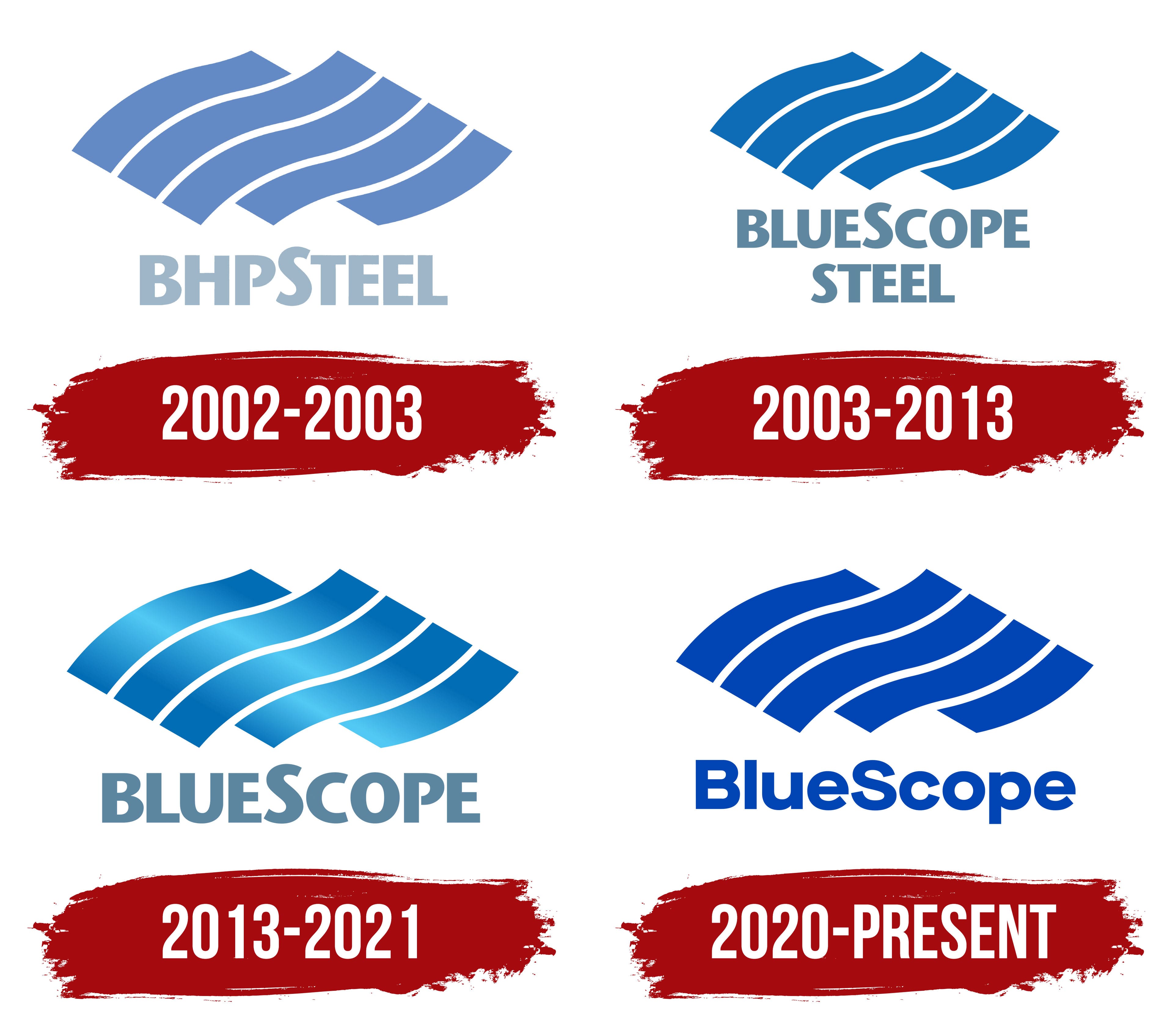
BlueScope completed a major identity redesign in 2020. The 5 bands remained the emblem’s foundation, though their treatment changed. Managing Director and CEO Mark Vassella introduced the new corporate system at the company’s annual meeting. The project covered the logo, colors, and communications guidelines. Australian agency Hulsbosch developed the identity.
The update was connected with the company’s purpose and the statement “Creating Strength.” BlueScope continued the brand’s historical line by retaining the emblem known since the BHP Steel period. The 5-part foundation helped customers, employees, and business partners connect the new version with earlier eras.
The emblem consisted of 5 broad parallel bands with smooth curves and a rightward slant. White gaps separated the neighboring sections. The second and third bands were the longest, while the first and fourth occupied less space. The fifth completed the figure as a short lower section. The upper line sat closer to the left edge, while the remaining bands shifted toward the right.
The overall silhouette resembled a slanted diamond-shaped plane with wavy edges. Hulsbosch refined the band contours and removed the gradients introduced in 2013. A solid dark blue fill replaced the color transitions. The shared color united the 5 sections, while the white gaps preserved their interior separation.
Blue continued BlueScope’s long-standing color tradition. The same rich shade was applied to the emblem and name. Flat coloring simplified reproduction across corporate materials of different sizes and formats.
The name BlueScope appeared beneath the bands. The uppercase BLUESCOPE form was replaced by uppercase “B” and “S” letters with the remaining characters in lowercase. The capitalization separated Blue and Scope within the single word. The “S” retained its role as the boundary between them but matched the surrounding letters in height.
The wordmark used Maison Neue, a sans-serif typeface created by designer Timo Gaessner. Its letters had rounded contours, open counters, and moderately thick strokes. The new style appeared softer than the previous heavy uppercase wordmark. Its construction resembled Helvetica Rounded and Gilroy Bold.
The name and emblem used the same blue and were arranged vertically. The 5-part figure occupied the upper area, while BlueScope appeared below with an open gap between them. Hulsbosch developed the Flex motif for corporate materials from the bands’ curves. The flexible forms were connected with “Creating Strength,” combining steel’s strength with BlueScope’s innovative operations.