 ASX (Australian Securities Exchange) Logo PNG
Stock exchange trading involves buying and selling shares, placing orders, and managing investments, facilitating the flow of capital in the market. The platform connects companies and investors, creating conditions for transactions and financial operations. The ASX logo is associated with the Australian Stock Exchange, which operates the market for trading in securities and financial instruments.
The Australian Securities Exchange began operations on April 1, 1987, after merging six regional Australian exchanges. These markets had existed since the 19th century. The government’s initiative created a single securities market centered in Sydney. In 1990, the exchange introduced the SEATS system and switched trading to an electronic format. In 1991, the company completely abandoned the trading floor and became one of the world’s first digital trading platforms.
In 1996, the exchange underwent demutualization. In 1998, it listed its own shares. In the early 2000s, ASX invested in modernizing its trading systems. These efforts coincided with the growth of the Australian market, supported by the expansion of the mining industry.
In July 2006, ASX merged with the Sydney Futures Exchange. The result was a unified platform for trading stocks, bonds, and derivatives. At the time of the merger, the combined exchange ranked among the ten largest in the world. The government blocked an attempted merger with the Singapore Exchange in 2010 for national security reasons.
In 2015, the company announced plans to replace the CHESS system with a blockchain-based solution. The exchange became the first major platform to begin implementing distributed ledger technology. In 2022, the project was canceled after seven years of work and more than 250 million Australian dollars in investment. The reasons were technical difficulties and management errors.
Since 2023, ASX has been developing a new clearing system in cooperation with Accenture. At the same time, it has been expanding its digital asset trading. In 2024, the exchange introduced a line of cryptocurrency ETFs and updated its risk management system.
The Australian Securities Exchange remains Australia’s leading exchange and one of the largest in the Asia-Pacific region. It lists shares of more than 2,000 companies, with a total market capitalization of about 2.5 trillion Australian dollars.
Meaning and History
What is ASX?
The largest stock and futures exchange in Australia, with headquarters in Sydney. It was formed after the merger of six regional exchanges and a futures exchange. The platform enables trading in stocks, bonds, currencies, commodities, and derivatives. More than 2,000 companies are listed, with a total market capitalization of about 2 trillion Australian dollars, including Commonwealth Bank, CSL Limited, BHP Billiton, and Rio Tinto. The exchange manages the S&P/ASX indexes and supports trading in ETFs, options, and futures.
1987 – 2000

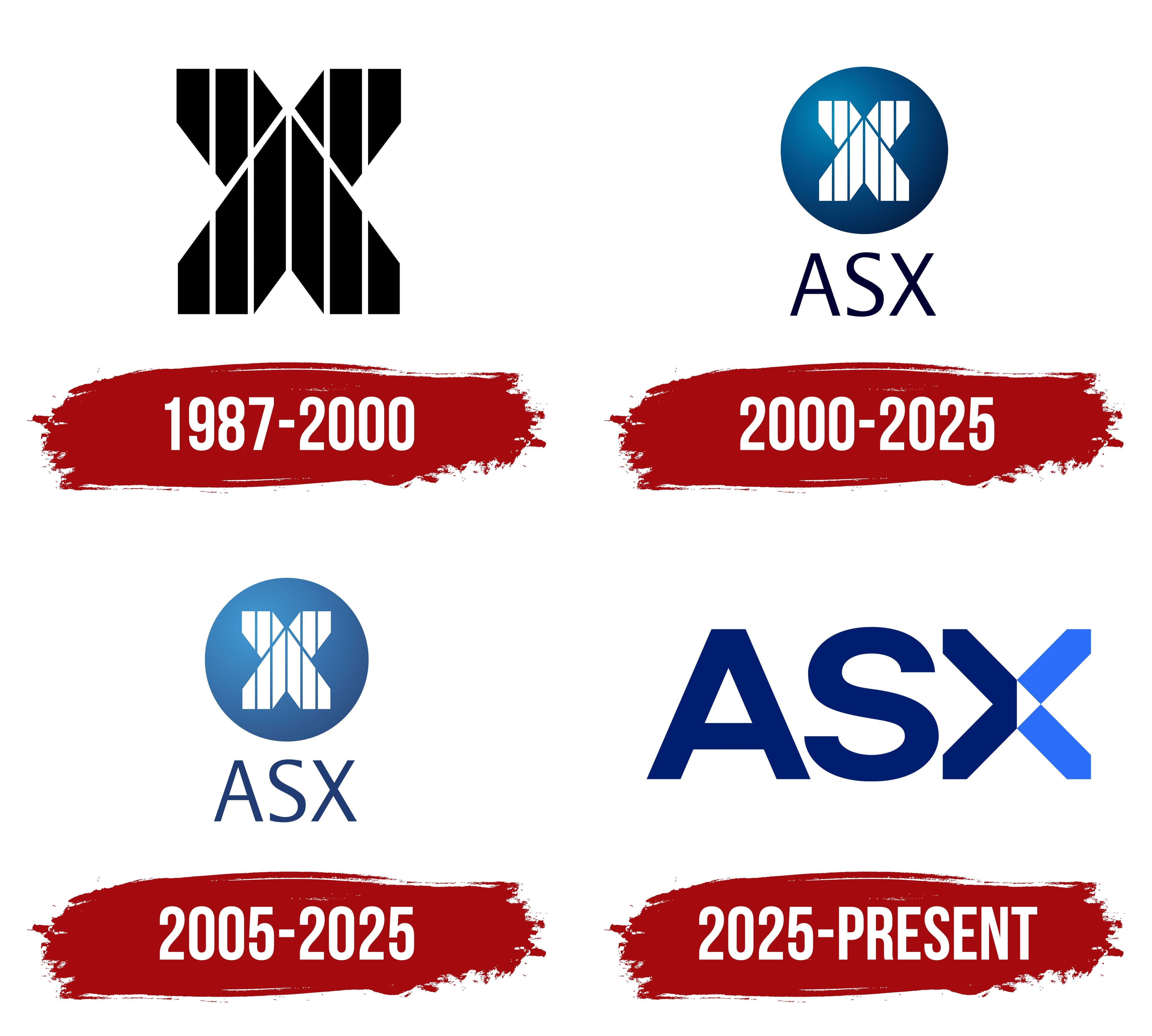
The letter “X” formed the basis of the first identity created for Australia’s unified securities market. Introduced in 1987, it appeared as a standalone monogram, separate from the company name and other components. The black figure made from intersecting bands represented the national exchange through a single letter associated with the ASX abbreviation and the English word “exchange.”
Australian Stock Exchange Limited began operating on April 1, 1987, following the merger of 6 regional exchanges in Australia’s state capitals. The history of local trading venues dates back to the 19th century. The merger brought them under a single national administration. The abbreviation “ASX” was formed from the initials of Australian Stock Exchange.
The new organization’s logo consisted of an abstract black figure based on a large “X.” The symmetrical composition was constructed from 2 elongated bands with pointed ends. The bands crossed diagonally, forming several lines converging at the center.
Thin white cuts divided the interior of the monogram. Five lines ran vertically, while 2 additional lines followed the intersecting diagonal sections. The white gaps separated the black mass into individual bands while preserving the overall “X” silhouette. The contrast created the appearance of a linear structure within a solid outer form.
The identity relied entirely on the monogram’s geometry. The final letter of the ASX abbreviation had a dual connection to the exchange’s name. It completed the abbreviation and referred to the word “exchange.” The black-and-white treatment focused attention on the intersecting bands, symmetry, and pointed terminals.
In July 2006, the exchange group merged with SFE Corporation, owner of the Sydney Futures Exchange, and adopted the name Australian Securities Exchange. The organization replaced “Stock” with “Securities” after expanding its operations and combining the stock and derivatives markets. The legal name ASX Limited remained in place, while the abbreviation took on a new meaning.
2000 – 2025
By 2000, the former ASX monogram had become part of a multilevel logo. The striped “X” was placed inside a blue circle, with a large abbreviation and the full name Australian Stock Exchange below it. The new structure combined the short designation with the expanded name while maintaining a connection to the exchange’s first emblem.
A circle with a blue gradient occupied the upper section. Bright light blue began in the upper-left area and gradually darkened toward the lower-right edge. The transition created depth within the compact circular frame. Blue became the primary corporate color, connecting the emblem with the lettering.
Inside the circle was a stylized white “X” constructed from 2 intersecting elongated figures with pointed ends. Thin blue cuts divided its inner sections. Five lines ran vertically, while 2 followed the diagonals. They separated the white figure into bands while preserving the solid letterform and the monogram’s symmetry.
The dark blue abbreviation “ASX” appeared beneath the circle. The 3 uppercase letters used a thin sans-serif typeface. Australian Stock Exchange occupied the next line in small, narrow lettering. Size differences established the viewing order. The circular emblem with the “X” came first, followed by the abbreviation and then the exchange’s full name.
The circular frame gave the former monogram a compact shape and separated the emblem from the typographic section. The white “X” retained the striped construction of the 1987 version. The blue background introduced a permanent corporate color, while the full name explained the ASX abbreviation to a broad audience.
The monogram still appeared inside a circle in the 2003/04 annual report. The identity included several color versions. It used a solid background alongside the blue gradient. Other variations featured a white circle with a blue “X” or a reversed color arrangement. All versions placed the large ASX abbreviation and the smaller Australian Stock Exchange line beneath the emblem.
2005 – 2025
The merger of 2 exchanges changed the meaning of ASX, while the striped “X” retained its primary role in the identity. Following the 2006 merger with the Sydney Futures Exchange, the Australian Stock Exchange became the Australian Securities Exchange. The abbreviation remained unchanged, so the update affected the organization’s full name and its placement beside the emblem.
The logo adopted a horizontal layout in the 2008 annual report. A blue circle containing a white “X” appeared on the left, while a large ASX letter block stood on the right. Australian Securities Exchange ran beneath the abbreviation and explained its new meaning. The emblem, short designation, and full exchange name appeared in a single composition.
The white “X” inside the circle retained its striped construction. Several elongated sections crossed diagonally to form a large letter against the blue background. The monogram remained unchanged, while the circle’s shade varied with the medium and printing method. The arrangement allowed the emblem to appear beside or above the lettering.
ASX used both horizontal and vertical versions in later years. On the cover of the 2011 report, the circle appeared above the ASX letters. The shortened composition included the circular emblem and abbreviation. Materials requiring the complete name used an expanded version with the Australian Securities Exchange line.
North updated ASX’s digital system in 2020. The project included interfaces and new guidelines for using the brand across digital platforms. The circular emblem entered the new system with its existing geometry. The white “X” retained its striped construction and diagonal intersections.
The circle became 1 or 2 shades lighter than the previous blue version. A similar adjustment affected the ASX letters, which had formerly appeared in dark blue. The circle’s shape, monogram pattern, letter proportions, and arrangement remained unchanged. The lighter shades adapted the emblem to North’s digital system. Meanwhile, the “X” symbol and exchange abbreviation remained in their established forms.
2025 – today
In June 2025, ASX replaced the blue circle and striped monogram with a large 3-letter wordmark. The exchange incorporated its symbol into the Australian Securities Exchange abbreviation. It became part of the letter “X.” The company commissioned the international branding agency Landor to develop the logo and new identity system.
The composition consisted of the uppercase Latin letters “ASX.” The abbreviation took center stage and became the exchange’s sole identifier in the logo. The “X” served 2 purposes. It completed the abbreviation and replaced the former monogram previously enclosed in a circle.
The “A” and “S” appeared in dark blue. Heavy sans-serif lettering, broad strokes, and dense contours formed a substantial letter block. Their height and thickness matched the proportions of the “X.” The shared construction made the 3 letters read as one wordmark, while the color change distinguished its final character.
The “X” consisted of 2 thick lines intersecting at a 45-degree angle. Their ends were pointed. The left half of the “X” retained the dark blue used for the “A” and “S,” while the right half used bright light blue. The single letter was divided into dark and light areas.
The intersection formed a diamond divided vertically into 2 triangles. The left section appeared in dark blue, while the right section was white. The white area created a break between the blue and light blue sides of the “X” and preserved a diamond-shaped opening inside the heavy letter. Pointed edges supported the angular structure of the diagonal strokes.
Landor combined the name and emblem into a single letter-based composition. The previous arrangement of a circle, monogram, and signature gave way to one ASX block. The dark blue “A” and “S” formed the typographic base, the 2-color “X” completed the abbreviation, and the white triangle marked the intersection of the diagonals.