() Singapore Exchange Logo (SGX Logo) PNG
The exchange infrastructure facilitates trading in stocks, derivatives, and other financial instruments. The trading system processes orders, records transactions, and updates data in real time. The Singapore Exchange logo represents the exchange that operates trading platforms and provides capital market tools in Asia.
Singapore Exchange (SGX) was established on December 1, 1999, through the merger of three organizations. The three organizations were the Stock Exchange of Singapore, the Singapore International Monetary Exchange, and Securities Clearing and Computer Services. The merger created a single platform for trading stocks and derivatives. Trading immediately moved to an electronic system.
In 2000, the company held a public share offering and became one of the first companies in the region to list on its own market. By 2005, capitalization reached S$ 294.4 billion. Trading volume amounted to 116 trillion.
In 2007, the company acquired a 5 percent stake in the Bombay Stock Exchange. That same year, the Tokyo Stock Exchange purchased a 4.99 percent stake in SGX. In 2009, the company created the joint venture Chi-East. In 2010, the company invested $250 million to develop the Reach trading platform and opened a London office.
An attempt to acquire the Australian Stock Exchange in 2010 for 8.3 billion dollars was not approved by the Australian government. In 2012, SGX acquired a 49 percent stake in Energy Market Co. In 2014, it bought the company in full and began trading electricity futures in 2015.
In 2016, SGX acquired the London-based Baltic Exchange for 87 million pounds. In 2019, the company purchased a 20 percent stake in the BidFX foreign exchange trading platform. In 2018, talks began with the National Stock Exchange of India to create a cross-border trading link. This project was completed in 2022 with the launch of NSE IFSC-SGX Connect.
In 2021, SGX created Asia’s first carbon exchange, Climate Impact X, for carbon credit trading. From 2020 to 2023, the exchange strengthened its position in the bond and syndicated loan markets. It also attracted Chinese companies to list on the Singapore Exchange.
The company announced the launch of perpetual Bitcoin futures. Designed for institutional investors, they strengthen Singapore’s role as a center of digital finance.
Meaning and History
What is Singapore Exchange?
The Singapore Exchange Group, formed by merging three national markets, operates Southeast Asia’s largest stock exchange, with a capitalization exceeding $ 638 billion. It trades stocks, bonds, derivatives, currencies, and commodities, and provides clearing, settlement, and depository services. The main platforms are SGX Main Board, designed for large companies, and SGX Catalist, focused on fast-growing businesses. The exchange, a leader in Asian derivatives trading, owns shares in the Bombay Stock Exchange and partners with Nasdaq.
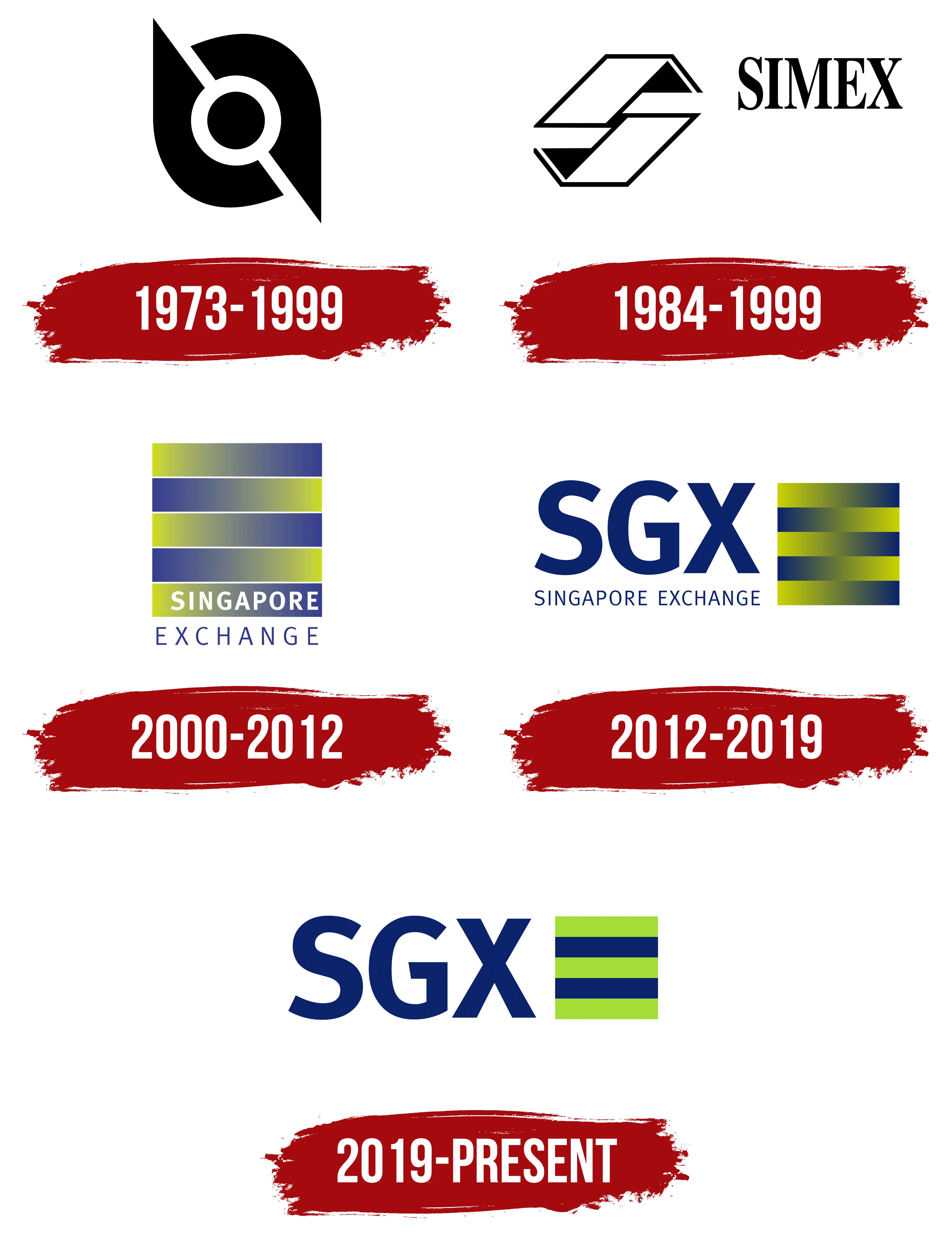
1973 – 1999

Before Singapore Exchange was established, the two exchanges that later became part of the combined company used their own emblems. One was the Stock Exchange of Singapore, or SES, and the other was the Singapore International Monetary Exchange. SGX’s logo history begins with its identities, created before the markets merged.
SES was established in 1973 after the joint Malaysia-Singapore stock exchange split. The split followed the end of interchangeability between the Singapore dollar and the Malaysian ringgit, and a separate stock exchange began operating in Kuala Lumpur. Jimmy Lim designed the Singapore exchange’s emblem, winning an open competition with over 500 entries. Lim, 35, worked in advertising and received $750 for the design.
Lim placed a black circle at the center, separated from two outer black shapes by a white ring. Their rounded sections extended into sharp points facing in opposite diagonal directions. The circle represented financial institutions, while the surrounding forms represented securities investments as a source of their capital. The emblem contained no lettering.
In 1999, SES and the Singapore International Monetary Exchange merged with Securities Clearing and Computer Services. The new company became Singapore Exchange (SGX). The name encompassed securities and derivatives trading as well as clearing services. In contrast, the earlier name, Stock Exchange of Singapore, referred to the stock market.
1984 – 1999
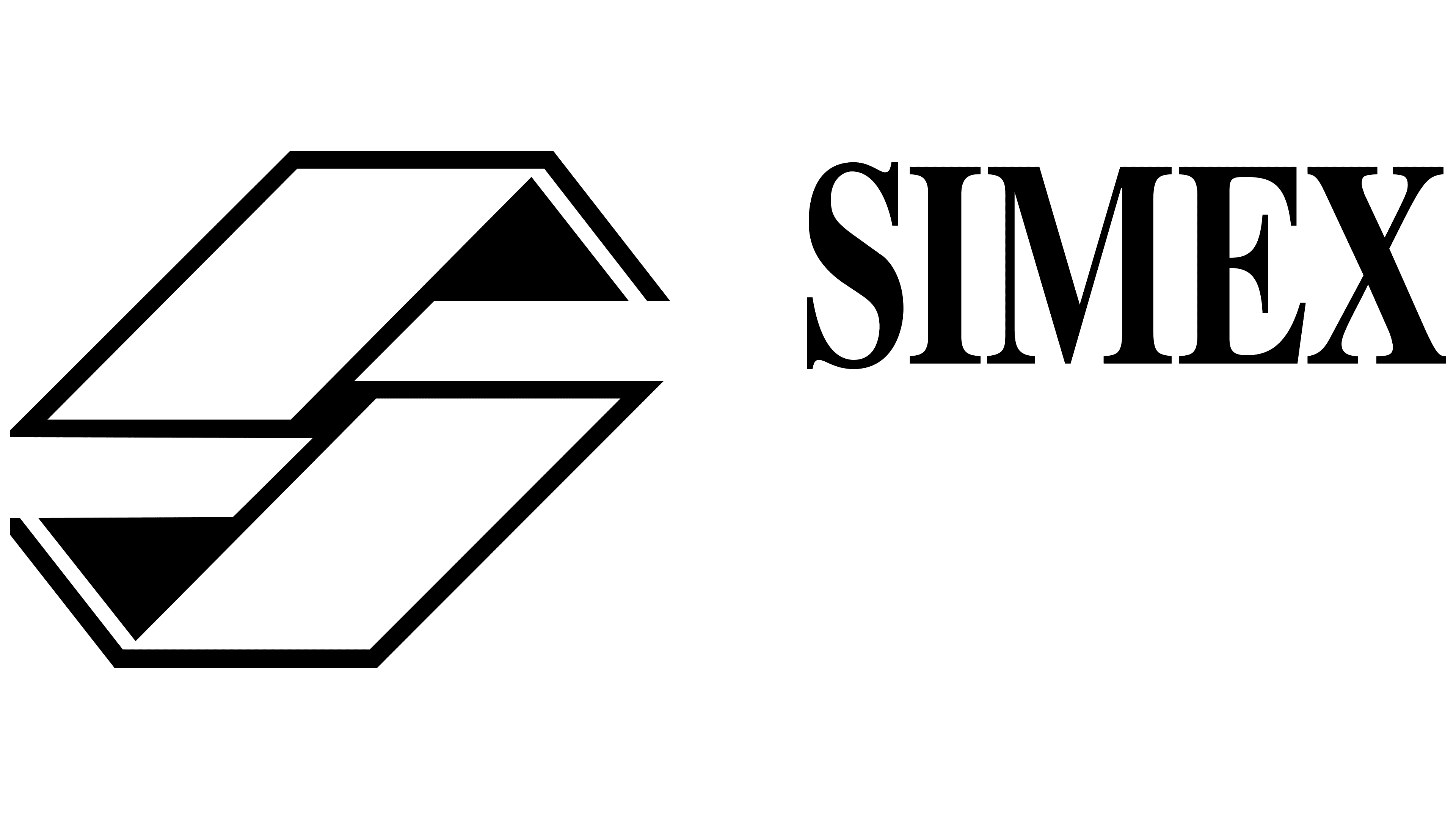
Singapore International Monetary Exchange, abbreviated as SIMEX, was the second exchange in SGX’s logo history. It began operating in 1984 as Asia’s first futures market. Its logo was used during the same years as the SES emblem. SIMEX adopted a different design, placing a large angular figure to the left of its name. Straight lines and sharp projections replaced SES’s rounded forms.
The black symbol resembles an “S” formed from two outlined ribbons offset diagonally. Sloping sections become horizontal, and solid black triangles mark the opposite ends. One points up and to the right; the other points down and to the left. SIMEX appears to the right in heavy serif capitals. The contrast between thin and thick strokes distinguishes the lettering from the emblem’s geometric forms. At the same time, black unifies both parts of the logo.
2000 – 2012
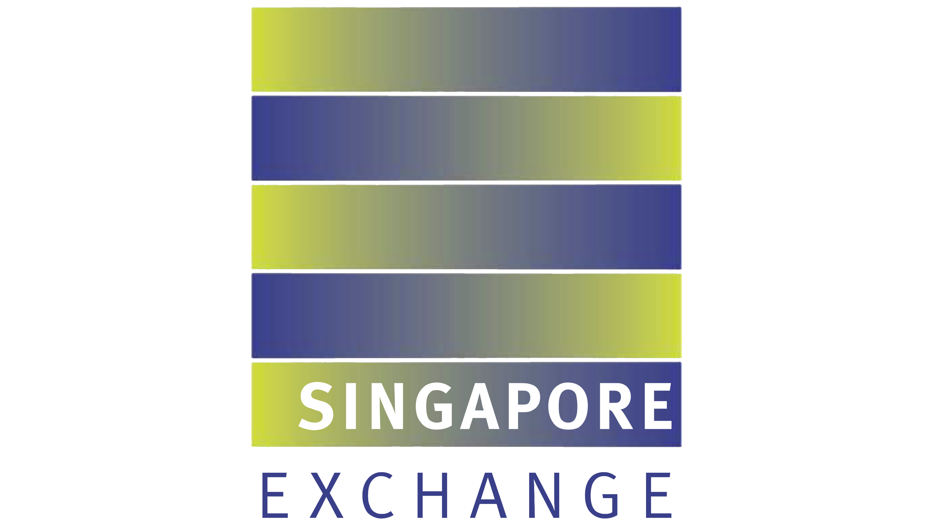
Five colored bands formed the basis of Singapore Exchange’s first shared logo. In 1999, the newly combined securities and derivatives exchange needed a name and identity for the international market. Landor Associates developed a new emblem rather than extending either earlier black-and-white design. The designers described the interwoven bands as an “E” monogram for “Exchange,” linking the symbol to the exchange activity at the business’s heart.
The first logo used a stacked arrangement. Five identical horizontal bands formed a nearly square block, with thin white gaps between them. Yellow-green shades transitioned into blue within each band, with the direction alternating from one row to the next. The top band began with green on the left, while the next began with blue.
The white word SINGAPORE appeared inside the lowest colored band. Beneath the block, blue EXCHANGE lettering used widely spaced capitals. Both parts of the name used sans-serif type, with the upper line heavier than the lower. The full Singapore Exchange name formed part of the emblem, connecting the colored monogram to the new exchange.
2012 – 2019
In the next version, Singapore Exchange placed the SGX abbreviation before the emblem. Three large dark blue capitals occupied the left side of the horizontal logo. They used a heavy sans-serif typeface. The full SINGAPORE EXCHANGE name remained beneath them, reduced to a narrow line of thin capitals in the same color. The name continued to spell out the abbreviation while giving it the leading role in the design.
On the right, a square was made up of five adjoining horizontal bands of equal height. The thin white gaps from the previous version disappeared, while the blue, yellow, and green gradients remained. In the top, middle, and bottom bands, green shades transitioned into blue from left to right. The two bands between them reversed that direction. Moving the colored emblem to the right changed the reading order, leading the eye from SGX to the striped square, then to the explanatory line beneath the abbreviation.
2019 – today
SGX became the only lettering in the next version of Singapore Exchange Limited’s logo. The SINGAPORE EXCHANGE line was removed, leaving large, dark-blue sans-serif capitals. The heavy strokes are uniformly thick, with straight, geometric contours. The square emblem of five bands remained on the right, but solid colors replaced the gradients.
The first, third, and fifth bands became bright lime green. The second and fourth adopted the same dark blue as the SGX lettering. The bands are equal in height, with square corners and aligned sides. They meet without gaps to form a solid square. The emblem retained its position to the right of the name, keeping the color changes and shortened wording.
The identity later developed into the SGX Group system. Marketing and communications executive Ai June Teo linked the transition from a single brand to a family of brands to the company’s expansion into an international infrastructure group serving multiple asset classes. Within that structure, SGX connects the business divisions, while “Group” identifies the organization as a whole.