


 Cheez-It Logo PNG
Cheez-It began in 1921 in Dayton, Ohio, where Green & Green created square cheese-flavored crackers. Willis and Cyril Green wanted a snack with a creamy cheese taste and a crisp cracker texture. Early production was small and partly manual. After baking, the crackers were packed in large tins and sold through nearby stores, where their flavor and format helped the product gain early demand.
In the 1930s, Cheez-It continued to grow despite the Great Depression. Production increased, distribution moved beyond Ohio, and the use of real cheese helped separate the crackers from many snacks of that period. In 1932, Loose-Wiles Biscuit Company acquired the production rights. The company later became Sunshine Biscuits, which invested in manufacturing and wider national distribution.
During the 1940s and 1950s, Sunshine Biscuits promoted Cheez-It through print and radio advertising. Around the same period, the red packaging became one of the brand’s familiar features. In the 1960s, the range changed through packaging updates and single-serve snack bags, which suited school lunches. Television advertising followed in the 1970s, giving the crackers broader recognition across the United States.
Keebler acquired Sunshine Biscuits in 1996, and Kellogg’s bought Keebler in 2001, giving Cheez-It new resources for product development and marketing. The 2000s brought White Cheddar, Hot & Spicy, Four Cheese Italian, and Grooves. Snap’d launched in 2019 with thinner crackers and flavors such as Double Cheese, Jalapeño Jack, and Cheddar Sour Cream & Onion. Later launches included Loaded Popcorn in 2021, Puff’d and whole-grain crackers in 2022, resealable bags in 2023, plus campaigns with influencers and challenges on TikTok and Instagram.
Meaning and History
What is Cheez-It?
This is a popular brand of cheese crackers produced by the Kellogg Company. Known for their distinctive square shape and crispy texture, they are made with real cheese baked into each cracker, giving them a signature savory flavor. The brand offers various flavors beyond the original cheddar, including white cheddar, sharp and spicy Italian cheese, and various limited-edition flavors. The crackers are available in various sizes and packaging options, from individual snack packs to boxes for the whole family. The brand has expanded its product line by adding formats such as Cheez-It Grooves with ridges, Cheez-It Snap’d for a thinner, crunchier option, and Cheez-It Duoz, which combines two flavors in one box. With its strong cheese flavor and satisfying crunch, the company has established itself as a favorite snack brand in the U.S., popular with kids and adults for school lunches, office snacks, and casual snacking.
1921 – 1932
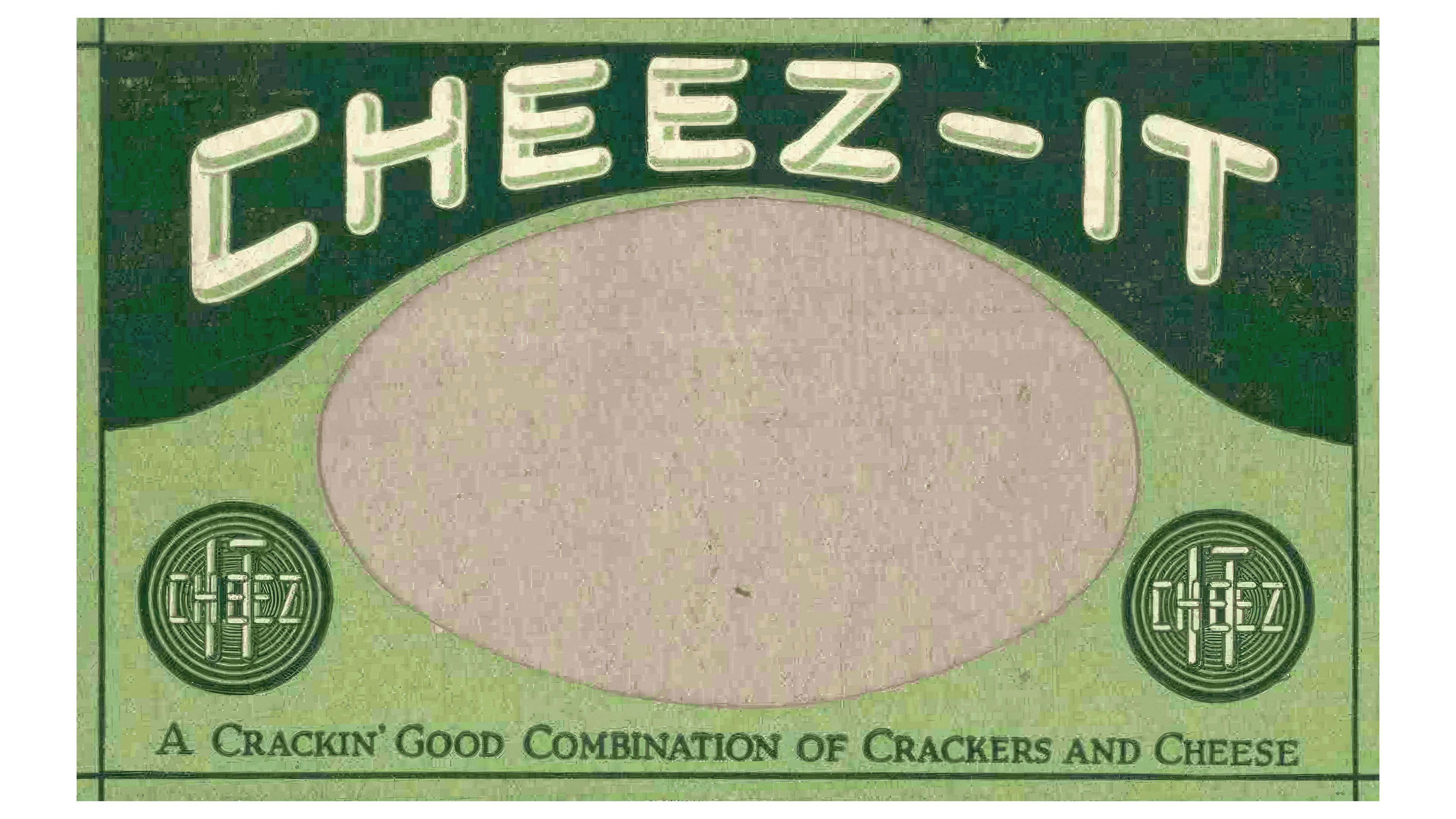
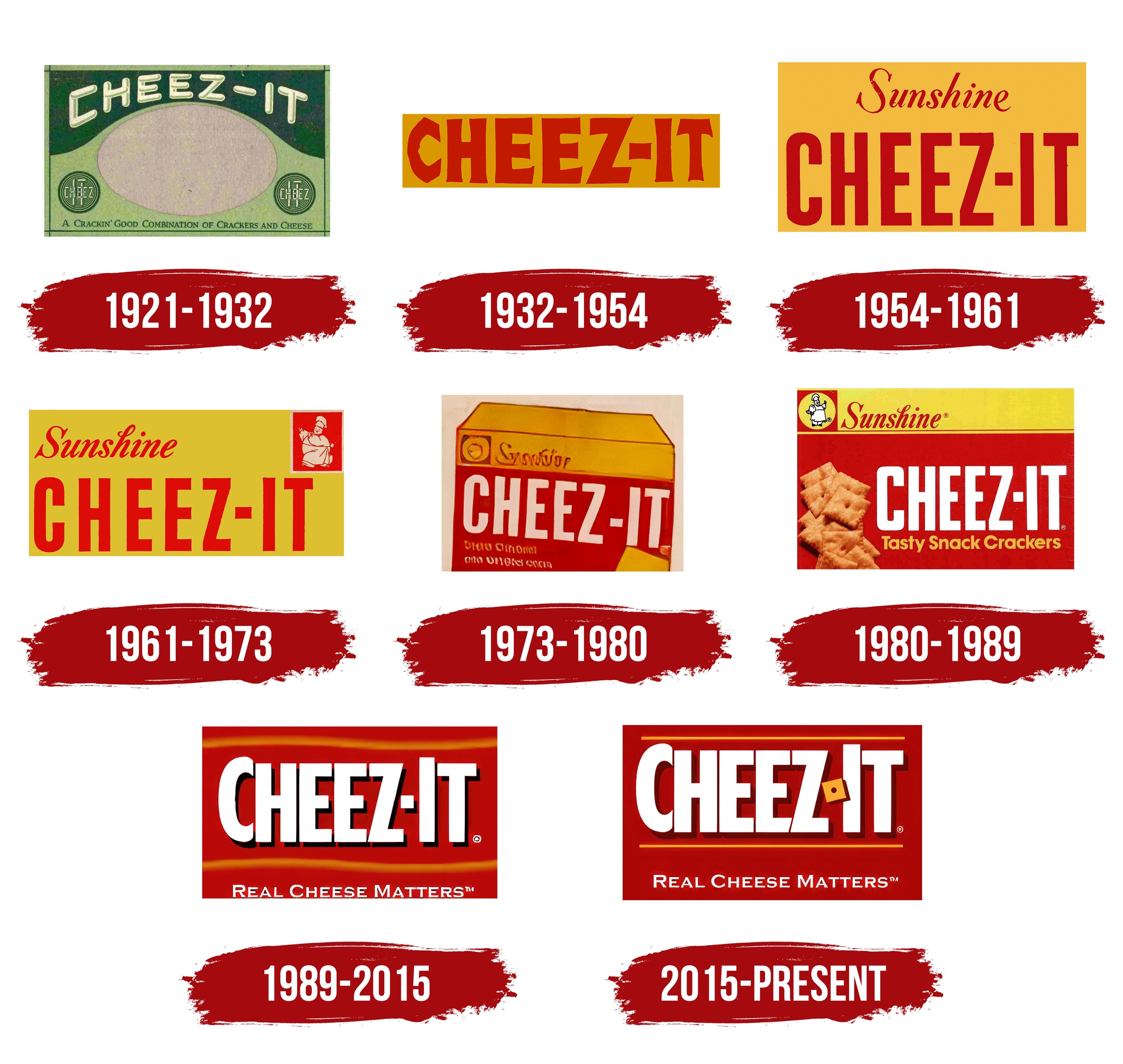
The first Cheez-It snack logo was notable for its originality and creativity. The emblem was styled like a banknote, featuring green tones, detailed lines, and seals, resembling a dollar bill. In the center, where a president’s portrait would typically be, there was a space symbolically inviting each customer to feel important or even imagine their photograph.
The brand name was placed at the top and on the side seals of the banknote, in spots where the words “United States of America” would be on real currency. This design emphasized the product’s value and its American roots. The choice of green was also connected to the company’s original name, Green & Green Company. The logo conveyed a sense of importance and exclusivity, turning the snack purchase into an “acquisition of value.”
1932 – 1954

In 1932, the Cheez-It brand came under the management of the Loose-Wiles Biscuit Company, which introduced an updated logo for the crackers. The emblem featured an orange rectangle, resembling the snack’s color, strengthening the association with the product. The brand name was written in large red letters, emphasizing the seasoning’s rich flavor and the enjoyment of the crispy crackers.
1954 – 1961
In 1954, after the company was renamed Sunshine Biscuits, the logo was updated again. The top of the emblem featured the word “Sunshine,” written in uppercase letters to honor the company’s new name. Below it was the name of the crackers, also in large red letters, emphasizing the brightness and richness of the flavor. All the text was set against an orange background, reminiscent of cracker packaging and evoking the color of cheese, making the logo recognizable and appealing.
1961 – 1973
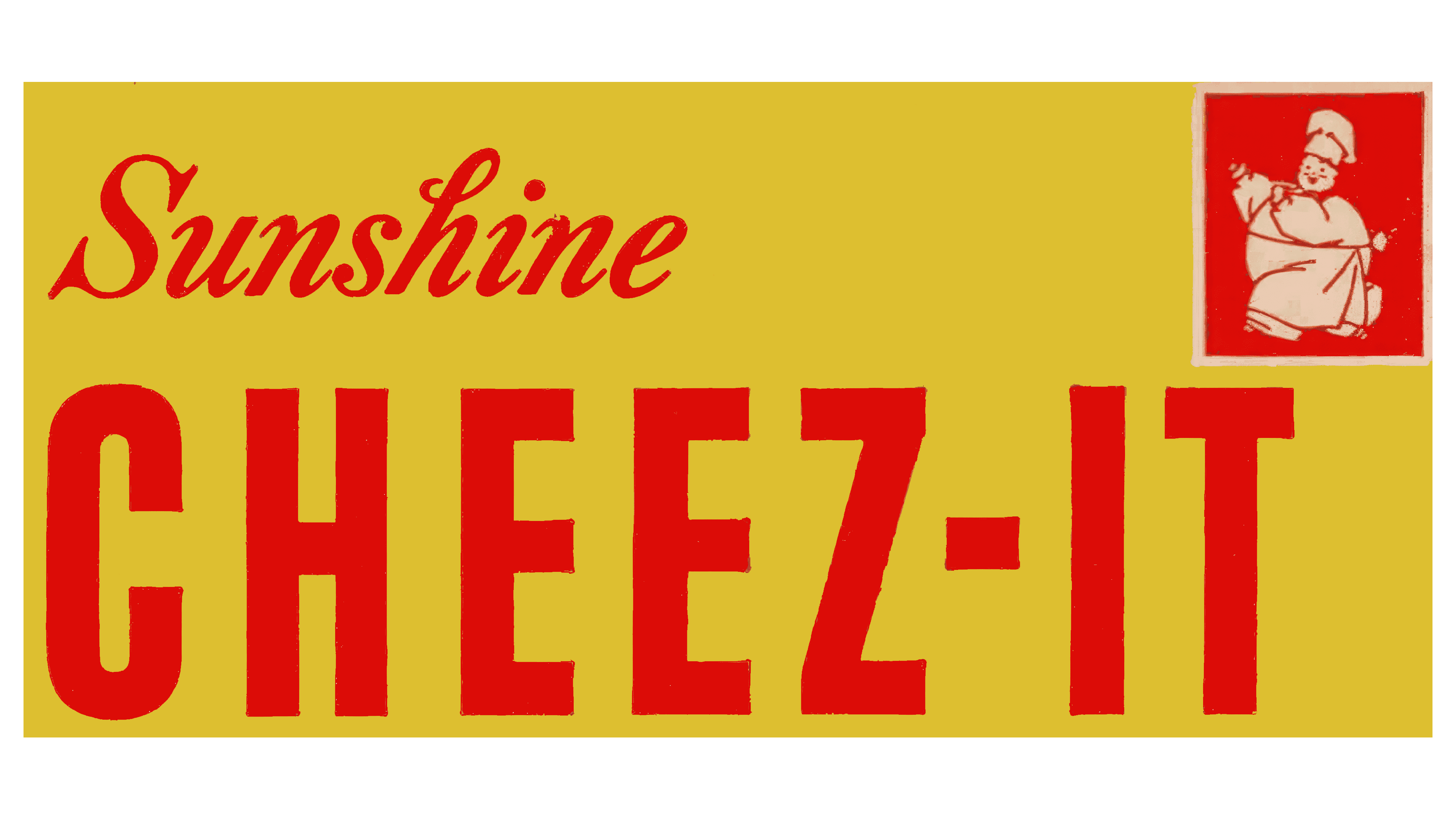
In 1961, the Cheez-It logo changed, becoming lighter and more refined. The “Sunshine” inscription was aligned to the left and set in a new font with a different slant, highlighting the brand’s commitment to its unique style and ongoing development. The crackers’ name retained its previous style and font. In the upper-right corner of the logo, a portrait of a chubby chef in motion was added to symbolize the snack’s professional preparation, richness, and nutritional value.
1973 – 1980
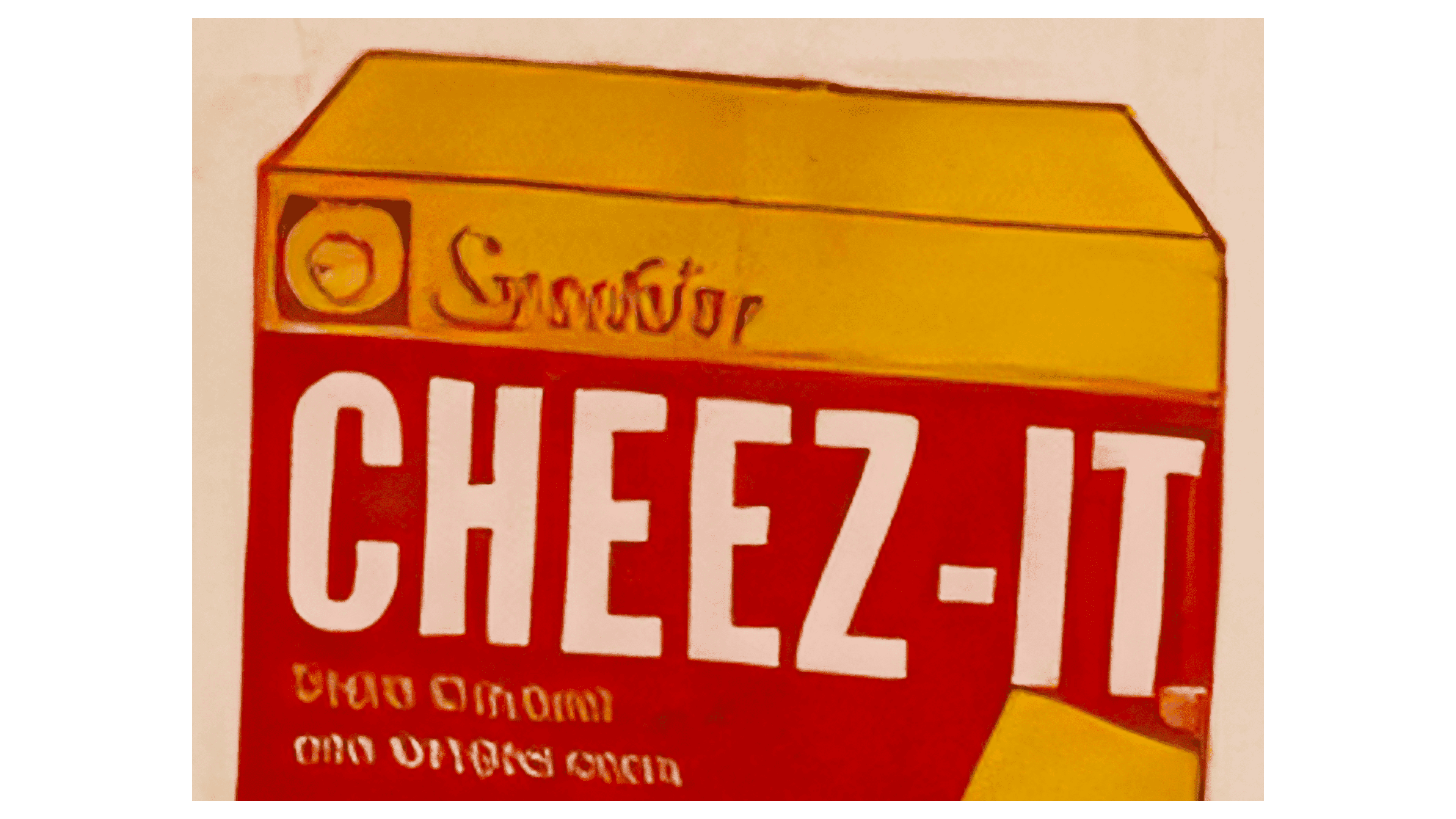
In 1973, the logo’s design was revised. The chef was moved to the left side of the logo, positioned next to the parent company’s name on a yellow background. The crackers’ name was set against a red background, with white lettering that emphasized the natural ingredients and low-fat content, aligning with health-conscious and nutrition-focused trends. The emblem separated the elements, making the “Sunshine” inscription universal across all company products.
1980 – 1989
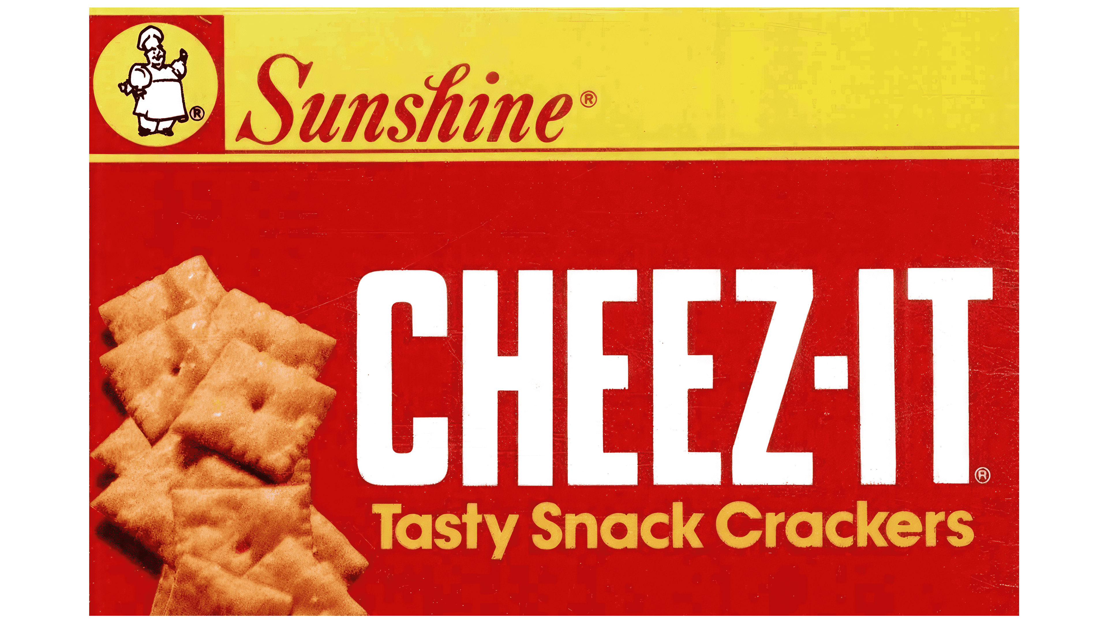
In the 1980s, the Cheez-It logo focused more on natural appeal and visual attractiveness. The red background was enhanced with a neatly arranged image of actual crackers, which heightened the desire to try the product. A tagline highlighting the tasty crackers emphasized the product’s appeal. The brand’s mascot, the chef, was placed in a yellow circle on the red background, creating a contrast that drew attention. A double line separating the yellow and red sections of the logo clearly distinguished the parent brand from the subsidiary. These elements made the logo more stylish and attractive, underscoring the company’s professionalism.
1989 – 2015
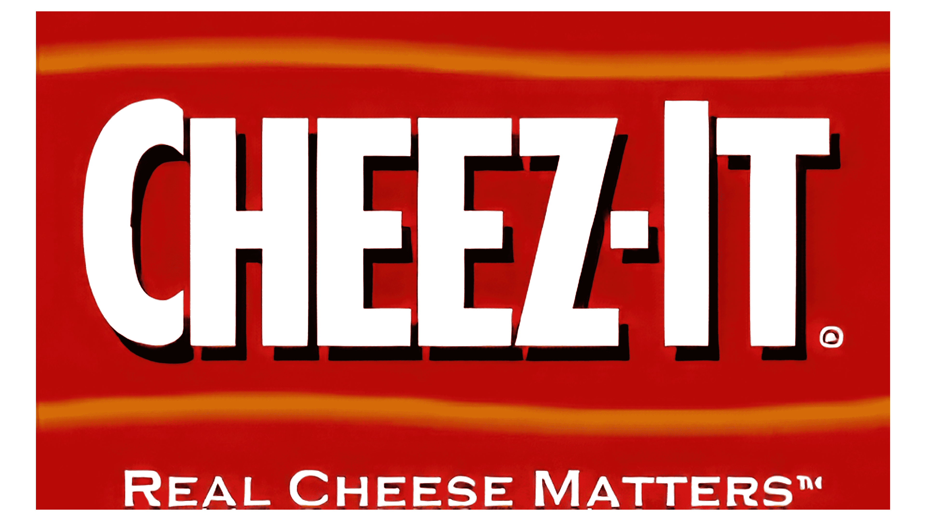
The late 20th-century logo featured a rich red background, emphasizing the product’s bold, premium flavor. The white lettering with a black shadow appeared crisp and easy to read, making the crackers stand out among other snacks. Thin yellow lines above and below the brand name hinted at the snack’s cheesy aroma. An added element was the tagline “Real Cheese Matters,” highlighting the importance of using real cheese in the product.
2015 – today
The designers’ main goal was to create a new brand image that reflects the product’s quality, naturalness, and uniqueness while maintaining its simplicity and accessibility to consumers.
The modern Cheez-It logo is a well-crafted visual that conveys the product’s key characteristics and emphasizes its recognition in the market. The emblem has become more refined and elegant while retaining its vibrancy and dynamism, making it appealing to a broad audience.
The color scheme plays a crucial role in creating associations with the product. The red background symbolizes energy, passion, and appetite, and it also grabs shoppers’ attention, making the brand stand out on store shelves. The bright red color is also associated with baking, highlighting that the product is baked rather than fried.
One of the key features of the new logo is the straight yellow stripes positioned above and below the emblem. These stripes create a sense of completeness and give the emblem a more structured appearance, emphasizing neatness and symmetry. Yellow is associated with cheese and the golden hue of baked goods, further tying the logo to the product.
The slogan “baked snack crackers” is symmetrically centered in the lower stripe. This adds sophistication to the emblem and highlights the high-quality and thoughtfully designed product.
A particularly striking detail is the miniature cracker symbol that replaces the hyphen in “Cheez-It.” This element exactly replicates the actual cracker’s appearance and resembles a cube of cheese, reinforcing associations with the product. This design choice adds uniqueness and makes the brand’s visual identity more memorable.