


 Chips Ahoy Logo PNG
The Chips Ahoy logo is one of the most expressive and impressive. Its modern design accurately conveys the manufacturer’s concept and demonstrates the product’s excellence. Over its long existence, the brand has become beloved by many. Customers enjoyed the taste of the treats, which became associated with gastronomic pleasure.
Designers put a lot of effort into creating a recognizable logo that tells the essential story. The logo easily and effectively holds the target audience’s attention. The color palette is carefully selected, and every identity element is thoughtfully designed. Looking at the logo, it’s clear that there are no better treats than Chips Ahoy. The complex yet easily readable company symbol has determined the brand’s success. The path to this success was long, with each stage marked by change and innovation.
Chips Ahoy! began in 1963, when Nabisco entered the chocolate chip cookie market with a product developed over several months. The recipe focused on a crisp texture, strong chocolate presence, and carefully measured chip size. The name played on “Ships Ahoy!” and linked the brand to the chocolate chip cookie.
The product launched in the United States in 1963 and promoted the claim that each package contained at least 1,000 chocolate chips. In the 1970s, the brand expanded internationally and increased its share of the U.S. market, aided by extensive television advertising. In 1984, Chewy Chips Ahoy! introduced a softer version, giving the line a new audience beyond fans of the original crisp cookie.
During the 1990s, the range expanded to include different chocolates, almonds, and other ingredients. A reduced-fat version followed in 1996 as demand for lighter snacks increased. In 2000, Kraft Foods acquired the original owner, giving the cookie line wider distribution and stronger product development. In 2003, Chips Ahoy! with Reese’s linked the brand with a well-known candy flavor.
The 2010s and 2020s brought thinner cookies, bite-size formats, filled versions, and limited editions. The brand marked its 50th anniversary in 2013 and was later acquired by Mondelez International following a 2015 corporate restructuring. Later releases included Thins Bites in 2016, Reese’s Peanut Butter Cups in 2017, Chewy Gooey in 2018, brownie-filled cookies in 2020, Sour Patch Kids in 2021, sugar-free Thin Bites in 2022, and a 60th anniversary birthday cake edition in 2023.
Meaning and History
What is Chips Ahoy!?
It is a brand of chocolate chip cookies produced by Nabisco, a subsidiary of Mondelēz International. The brand is known for its crispy and chewy cookie varieties, each filled with chocolate chips. It offers a wide range of flavors and types, including original, chewy, broken, and variants with added ingredients such as Reese’s and caramel. The brand is a popular choice for those looking for classic, delicious cookies and is widely available in grocery stores, convenience stores and online retailers. It has become a staple in many families and is loved by children and adults alike.
1963 – 1975
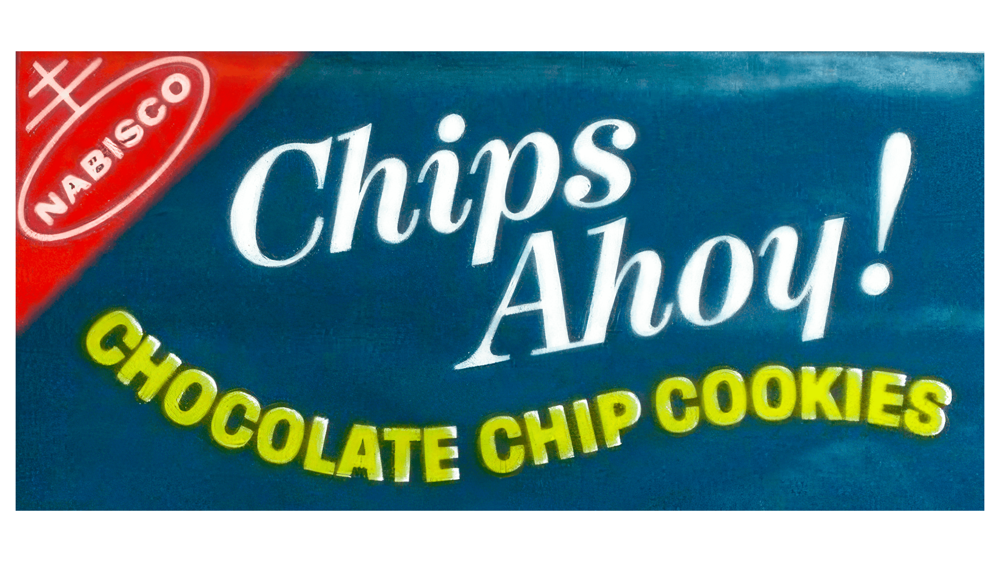
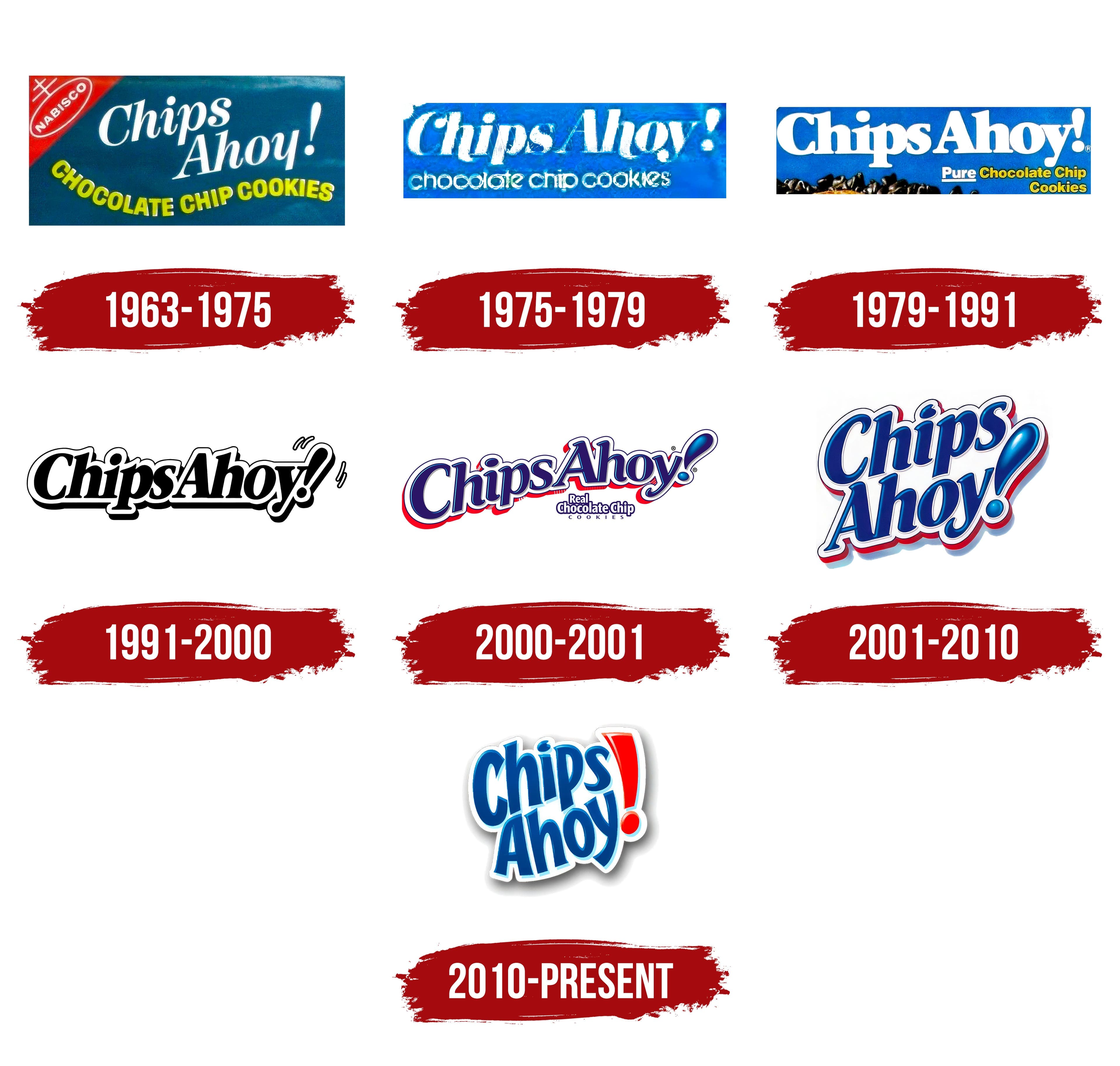
The first brand logo features blue, red, and yellow colors in different proportions, each holding symbolic meaning, conveying freedom of thought, and allowing you to enjoy cookies wherever you are. Blue dominates as the background color, coexisting with red.
Designers decided to present three informational blocks, each with its own impact. The first thing that stands out is the brand name, written in large, thin letters, indicating who makes the excellent cookies. The text is quick and easy to read. The second informational block contains product details, with letters appearing to float on a wave, reflecting dynamism and lightness. The top left corner is highlighted in red and stands out as a separate element, attracting attention.
1975 – 1979
During this period, designers updated the logo, removing excessive symbolic elements. The inscriptions disappeared, and the logo became less dynamic. The text is arranged in two parallel rows: the upper row has larger, dense letters with rounded ends, and the product information occupies the lower row. The letters are well-read and have excellent visibility. A simple punctuation mark remains, giving the logo an exclamatory tone. “Notice the fabulous cookies!” is the message from the producers. The blue background and light lettering harmonize well together.
1979 – 1991
The new interpretation of the logo resembles a scene from a Christmas movie. The blue background has become richer and brighter, creating a shimmering, twinkling effect similar to holiday lights. The focus is not on the product being meant for celebrations, but on highlighting its vivid flavor.
The text detailing information appears very clear. The letters have gained dimension, and their font has slightly changed. The emblem is divided into sections: the brand name is in the center, while the lower corner features text about the product and its benefits. A striking design on the right side adds meaning and draws attention to new products.
Overall, the logo accurately reflects the company’s philosophy: the product is created for the enjoyment of both children and adults. The delightful cookies melt in your mouth, helping you forget all problems and unpleasantness and giving you a boost of energy and a great mood.
1991 – 2000
In 1991, the logo update was a pleasant surprise for regular customers. The new logo was unusual, eliciting excitement and interest. The logo had a sense of strictness for the first time in the history of selling the most chocolatey cookies. A touch of aristocracy combined with creativity became a hallmark of the new design.
The background is perfectly white, creating a sense of absence. Attention is drawn to the elegant black letters, an interesting play of opposites. The outline is captivating: white, emphasizing each line of the bold letters forming the familiar brand name.
Two charming “highlights” complement the logo. The exclamation mark, remaining in place, adds dynamism to the overall composition. Additionally, small, playful parentheses indicate movement, relocation, and exclamation.
2000 – 2001
During significant changes, the company’s designers developed a logo that lasted no more than a year. This logo was an experiment, a departure from traditions and established rules. The brand name letters were arranged in a semicircle, maintaining their shape and slightly increasing in size. The familiar outline remained in place. The color palette focused on simplicity while ensuring brightness and visibility. As the cookies became more delicious, the logo reflected this aspect. In a unified composition, blue, red, and white colors attracted attention and encouraged trying the new products.
Rounded elements predominated, and traditions were preserved in the bright and graceful exclamation mark. A small inscription beneath it invited closer inspection of the text, emphasizing potential buyers’ curiosity.
2001 – 2010
Customers perceive the recently created company logo as playful and somewhat magical, like light, tasty cookies; it feels weightless.
The design incorporates innovations. The text almost transforms into a drawing, a stylish image. Blue is the primary color, contrasted with white. A red outline adds brightness, creating a 3-D effect.
The letters appear to be in motion, gliding smoothly. The exclamation mark seems alive, like a drop of water, like the new taste of airy cookies, bringing smiles and joy.
The inscription points to the sky, literally aiming to reach new heights. The company’s growth continues…
2010 – today
Blue, white, and red became the key colors in forming the logo for this period. They take customers back to the past, reminding them of the long-standing, well-known logos from the company’s early stages. However, the new format is even brighter and aligns with all modern trends to create a presentable identity.
A snowy backdrop is the background, with the brand name shining distinctly. The letters are large and uppercase, with the phrase split into two parts and placed in the logo’s upper and lower zones. The edges of the letters have different geometries: the initial letter is rounded with serifs at the ends, and the lower part of the letter “y” is extended and rounded.
To enhance readability, the exclamation mark is highlighted in red, medium-sized, and in proper shape. The primary mission of the exclamation mark is to attract the attention of as large a target audience as possible.
The logo represents an image that conveys a full spectrum of information. It invites endless viewing and evokes positive emotions like the company’s products. It is essential to remember that the delicious chocolate chip cookies are a favorite treat for people of all genders, ages, and professions.