 DiDi Logo PNG
The DiDi logo emphasizes the company’s global reach and professionalism. It implements cutting-edge technology in the transportation services industry. The emblem also conveys the brand’s accessibility, aimed at attracting those seeking reliable taxi services or car rentals.
DiDi began in Beijing in 2012, when Cheng Wei, a former manager at Alibaba Group, launched Didi Dache as a mobile taxi-hailing service. The first team built geolocation tools and a simple interface to connect passengers with nearby drivers. By late 2012, the app was operating in Beijing and attracting taxi drivers who wanted a new way to find customers.
In 2013, the company expanded into other major Chinese cities and received investment from Tencent Holdings. Competition intensified in 2014 against Kuaidi Dache, which led both firms to spend heavily on driver subsidies and passenger discounts. In February 2015, Didi Dache and Kuaidi Dache merged into Didi Kuaidi, later known as Didi Chuxing. That same year, the Hitch ride-sharing service widened its offer beyond standard taxis.
The 2016 acquisition of Uber’s China business removed its largest local rival. In 2017, DiDi began investing abroad, including 99 in Brazil and Grab in Southeast Asia. In 2018 and 2019, the company tested bike and scooter rentals, launched Didi Food, entered markets such as Australia, Japan, and Latin America, and built research centers in China and the United States for autonomous driving.
In 2020, DiDi presented an electric vehicle developed with BYD. In 2021, it entered South Africa and Russia and tested robotaxis in Shanghai. Regulatory pressure in 2022 led to app removals in China and a New York Stock Exchange delisting process. In 2023, Chinese authorities allowed new user registration again. In early 2024, DiDi expanded autonomous taxi tests and introduced a mobility platform combining scooters, car sharing, taxis, and bike rentals.
Meaning and History
What is DiDi?
It is a Chinese transportation company that provides app-based mobility services. These services include ride-hailing, cabs, private cars, bike-sharing, destination driving, and other urban transportation options. The company operates in several countries worldwide, offering users a convenient platform to book rides on their smartphones. It is one of the largest ride-hailing companies worldwide, competing with major players such as Uber and Lyft.
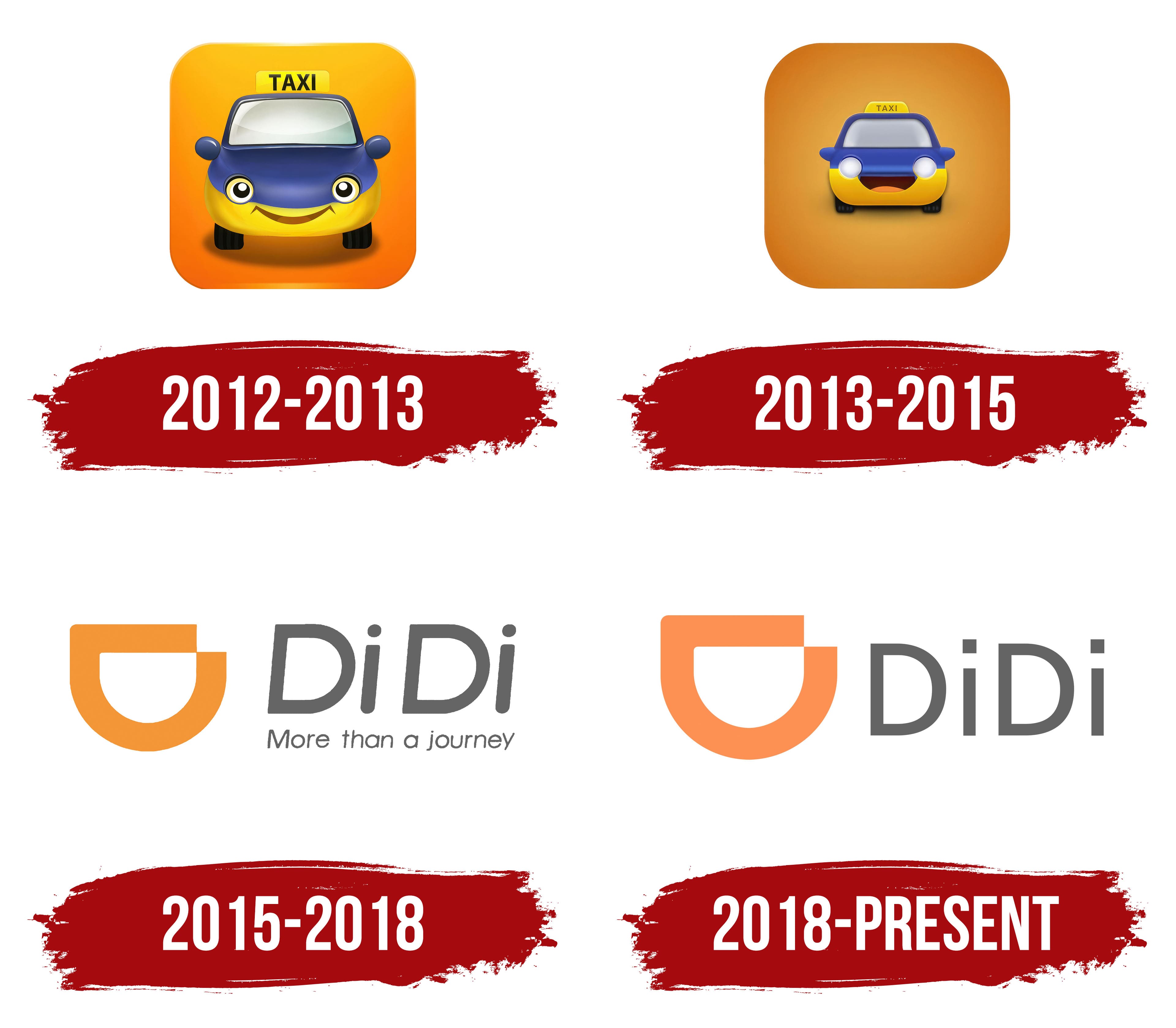
2012 – 2013
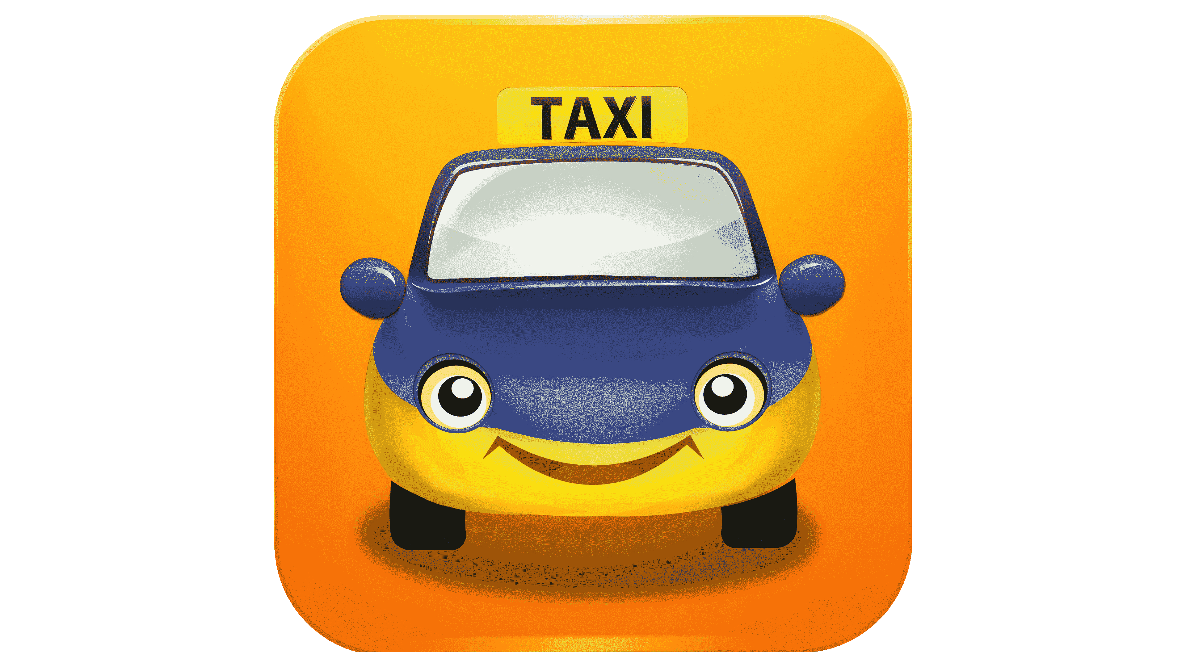
The DiDi company provides services through a mobile app, so its debut logo resembles an app icon with rounded corners. A small cartoon car with a yellow taxi sign on its roof is at the center of the orange square. This image best represents the transportation platform’s specialization, which allows users to order taxis, rent cars, and access delivery and logistics services.
The car is depicted from the front, with large eyes and a friendly smile. The eyes are positioned where the headlights would be, the mouth where the license plate should be, and the side mirrors resemble widely spaced ears. This turns an ordinary car into a charming character, looking hopefully at anyone about to open the app.
The designers intentionally made the taxi anthropomorphic to build trust in DiDi and convey the service’s friendliness and accessibility. The modern style also reflects the company’s forward-thinking approach, visible in the unique textures that create a sense of volume and visual depth.
- The front of the car appears convex due to a successful combination of lightened and darkened areas.
- The intersecting gray stripes of different shades give the impression that the windshield is shining in the sun.
- The square base also has a gradient: the light orange at the top smoothly transitions to a dark orange at the bottom, making the emblem look dynamic.
- The semi-transparent shadow beneath the car enhances the illusion of three-dimensional space.
The use of modern computer graphics demonstrates DiDi’s commitment to technological progress. The company offers innovative transportation solutions and actively invests in developing autonomous vehicles.
The combination of bright colors makes the emblem even more attractive. The designers combined yellow and blue so the car would stand out well against the orange square. Black and gray create contrasting accents that enhance the dynamic feel of the orange square.
2013 – 2015

In 2013, the DiDi logo lost some of its playful, childlike atmosphere when designers reworked the cartoon car’s appearance. The car’s cheerful color (a combination of a blue top and a yellow bottom), the “TAXI” sign, the large smiling mouth, and the funny ears shaped like side mirrors remained. However, the eyes turned into gray headlights, resembling shiny spheres due to a radial gradient. The shadow beneath the car is now almost invisible, but the car has gained sharp contours, giving it a sense of depth.
These changes highlighted the company’s rapid development but negatively impacted the anthropomorphic car’s character. Without the friendly eyes, it no longer appears as welcoming as it once did. Even the large smile, which takes up nearly a third of the space between the wheels and the windshield, doesn’t quite compensate for this.
The scale of the elements also changed. The car became very small, making it appear distant. This creates an illusion of depth, further enhanced by gradients, shadows, and highlights. The square base still has rounded corners, adding dynamism to the emblem. However, it no longer radiates positivity, as the designers colored it a dark, matte orange.
Overall, the logo was simplified, and paler shades were adopted, but it lost its joyful charisma. The glowing gray eyes, lacking pupils, appear somewhat eerie when combined with the wide smile. Nevertheless, despite these changes, the redesigned icon effectively represents DiDi’s essence, as it is associated with the company’s transportation services, offering a convenient platform for ordering taxis, car-sharing, food delivery, and more.
2015 – 2018
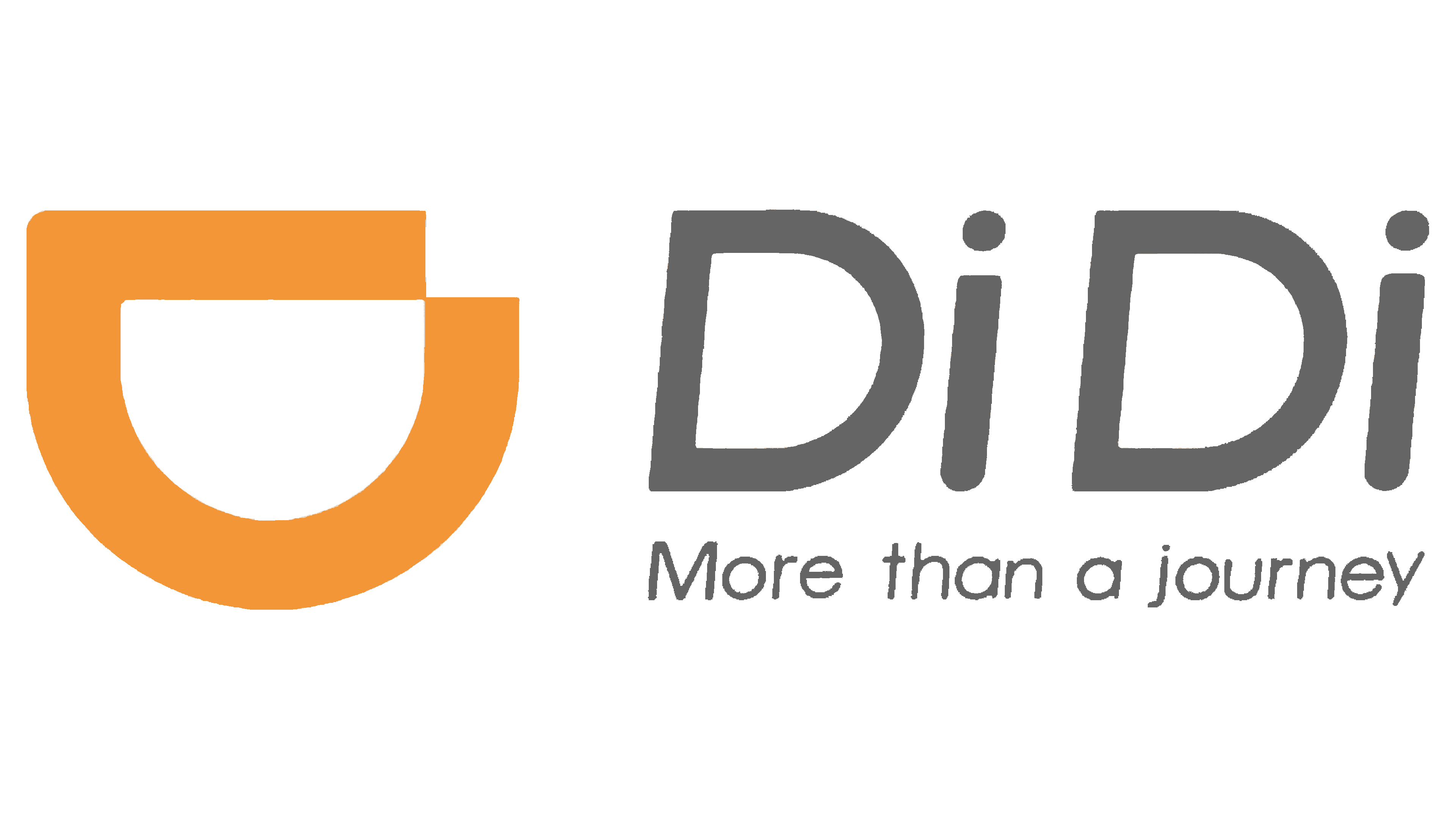
The logo no longer resembles a mobile app icon, as it has lost its square base. It now emphasizes text that contains basic brand information. The top features the large word “DiDi,” while the bottom line holds the small slogan “More than a journey.” Designers specifically sized them to match in width, maintaining visual balance.
A clear italic font with uniform stroke thickness conveys movement, reflecting the company’s connection to transportation services, where speed is valued. The predominance of lowercase letters enhances the text’s visual lightness, suggesting the ease of using the platform for ride-hailing and car-sharing. The gray color is associated with calmness, compromise, and stability, aiming to build trust in the brand.
This contrasts with the symbol’s orange color, located to the left of the text. The abstract geometric figure, consisting of an arc and a short horizontal line, carries several meanings:
- It represents the letter “D” rotated 90 degrees.
- It depicts a cheerful smile, conveying a relaxed atmosphere.
- The curved line symbolizes a road, as the company provides transportation services.
Orange pairs well with gray, as it balances out its excessive calmness. It also recalls the previous emblem, which featured a large orange square. The new logo includes a subtle nod to the cartoon car that once starred in the brand’s identity. The smiling mouth and the word “DiDi,” which in Mandarin mimics the sound of a car horn “beep-beep,” hint at this playful character.
2018 – today
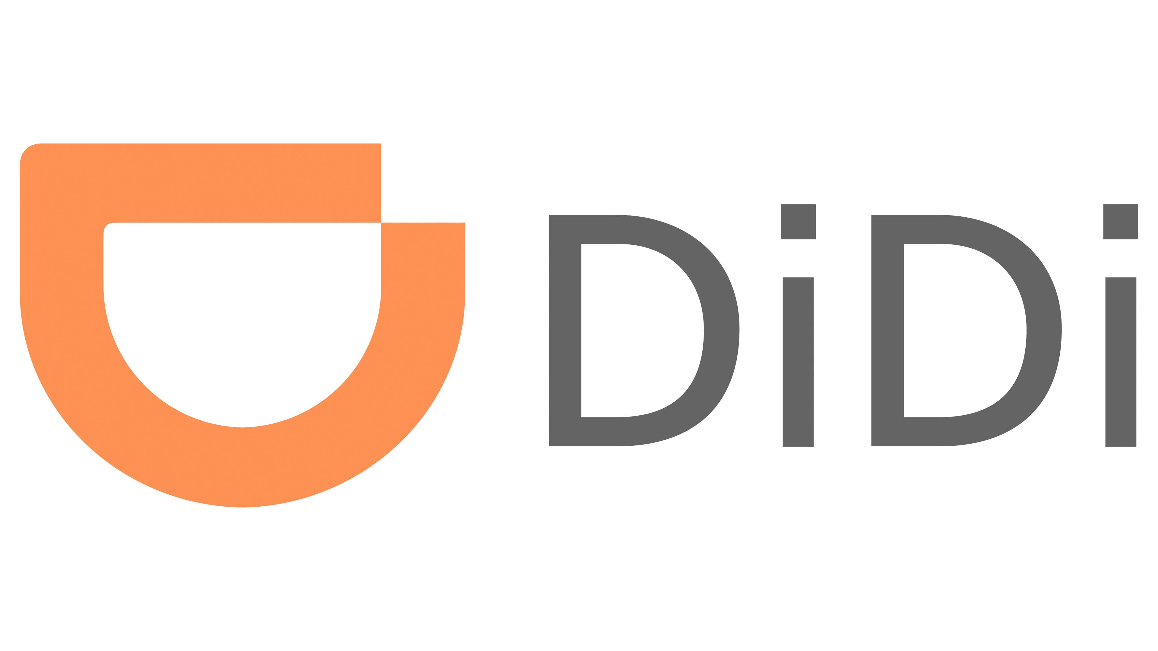
In 2018, the DiDi emblem was updated to reflect modernity and technological progress. The symbol, shaped like an inverted “D,” adopted a pastel coral shade, adding a sense of optimism. The abstract figure still conveys the impression of a wide, friendly smile, representing:
- The company’s friendliness;
- The platform’s universal accessibility.
- The joy of satisfied customers.
The minimalist design highlights the brand’s commitment to simplicity, essential for those seeking a taxi or renting a car. At the same time, the logo reflects the company’s international presence, global reach, innovation, and convenience. The stylized “D” symbol communicates DiDi’s core principles in transportation services: dynamism and efficiency.
The logo designers removed the slogan, leaving only the short brand name on the right side. It is written in an updated, non-italicized font. The clean, sharp letters evoke a sense of confidence and reliability that the company provides to its customers. The dots above the “i” s were made square to better support visual balance. The gray color of the text, combined with the minimalist font, is associated with stability, calmness, safety, and simplicity.