


 FMC Logo PNG
Agriculture faces risks that affect crop yields, including weeds, pests, and plant diseases. Climate-specific chemical and biological agents help protect crops. The FMC logo is associated with a company that develops and manufactures agrochemical products to protect crops and improve agricultural productivity.
FMC Corporation dates back to 1883. At that time, inventor John Bean founded the Bean Spray Pump Company in Philadelphia. His innovative pesticide spray pump became a technological breakthrough for American farmers. In 1928, the company adopted a new name, Food Machinery Corporation. It began producing agricultural and food processing equipment.
During World War II, the company manufactured LVT amphibious vehicles for the U.S. Army. After the war, it entered the chemicals market by acquiring Westvaco Chlorine Products in 1948. In the 1960s and 1970s, the company evolved into a conglomerate with interests in chemicals, engineering, and defense.
In the 1980s, FMC expanded the production of industrial chemicals and Bradley armored vehicles. In the 1990s, the company began focusing its business on chemicals. In 2001, FMC was divided into FMC Corporation and FMC Technologies. This separation distinguished the chemical and engineering segments.
Since the 2010s, the company has focused on agricultural chemicals. In 2017, FMC acquired DuPont’s agricultural division for $ 1.6 billion. In 2018, the company sold its Health and Nutrition and Lithium divisions. After that, it became an agricultural chemical producer exclusively.
From 2020 to 2022, FMC invested in biological products and digital solutions for farmers. The 2023 decline in agrochemical prices forced the company to reduce capacity and adapt production.
The company is among the world’s largest producers of crop protection products. It offers innovative agricultural solutions in more than 100 countries.
Meaning and History
What is FMC?
An American agrochemical corporation headquartered in Philadelphia, FMC is among the world’s largest producers of crop protection products. It manufactures insecticides, herbicides, fungicides, biologicals, and seed-treatment formulations for various crops. Competitors include Bayer, Corteva, BASF, and Syngenta. Strengths include proprietary active ingredients, innovative formulas, and strong positions in Latin America and Asia.
1883 – 1929
The story of what would become FMC Corporation’s first logo began with a fruit-tree spray pump. In 1883, John Bean founded Bean Spray Pump Company in California. His pump sprayed insecticides to control scale insects affecting local orchards. The inventor’s surname became part of the company name, alongside a product description. Later, the company expanded from sprayers into food-processing equipment, leading to the abbreviation FMC. Today, the American company FMC Corporation operates in crop protection.
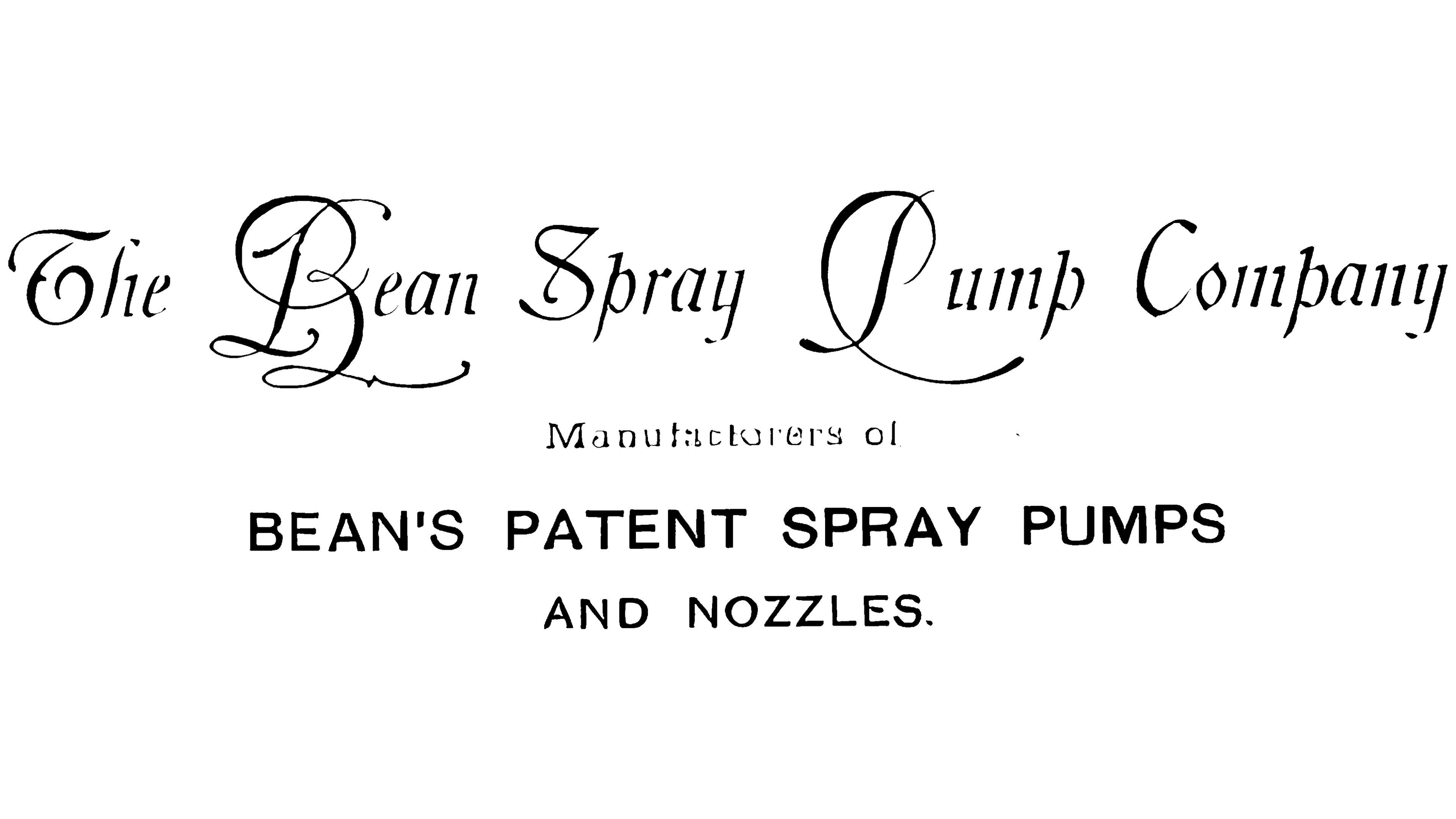
The first logo featured three tiers of text that identified the company and described its products. The upper line read “The Bean Spray Pump Company” in lettering reminiscent of Zanerian and Spencerian calligraphy. The words varied in size and weight, while their slant gave the name a handwritten appearance. Fine connections alternated with heavier strokes and decorative serifs. The capitals “B,” “P,” and “C” extended into long flourishes, some sweeping beneath neighboring letters. Interwoven lines brought the separate words together into an ornamental inscription.
The two lower tiers added a product description. A small, lightly set “Manufacturers of” connected the company name to “BEAN’S PATENT SPRAY PUMPS AND NOZZLES.” The latter identified Bean’s patented pumps and spray nozzles. Upright sans-serif capitals resembling early grotesque typefaces and Franklin Gothic contrasted with the elaborate script above, distinguishing the company name from information about its products.
The design appeared on company letterhead in 1910. Its three tiers presented related business information. Bean’s surname identified the equipment’s inventor, the patent reference pointed to his invention, and the product list explained what the company made. The extended inscription described both the business’s origins and its equipment.
1929 – 1941
The business expanded in 1928, and the Bean name became Food Machinery Corporation. The company acquired Anderson-Barngrover and Sprague-Sells, both canning equipment manufacturers. A competition was held to find a new name. The winning entry identified the business as a manufacturer of food-industry machinery. The initials of its three words formed FMC, which soon became the emblem’s main feature.
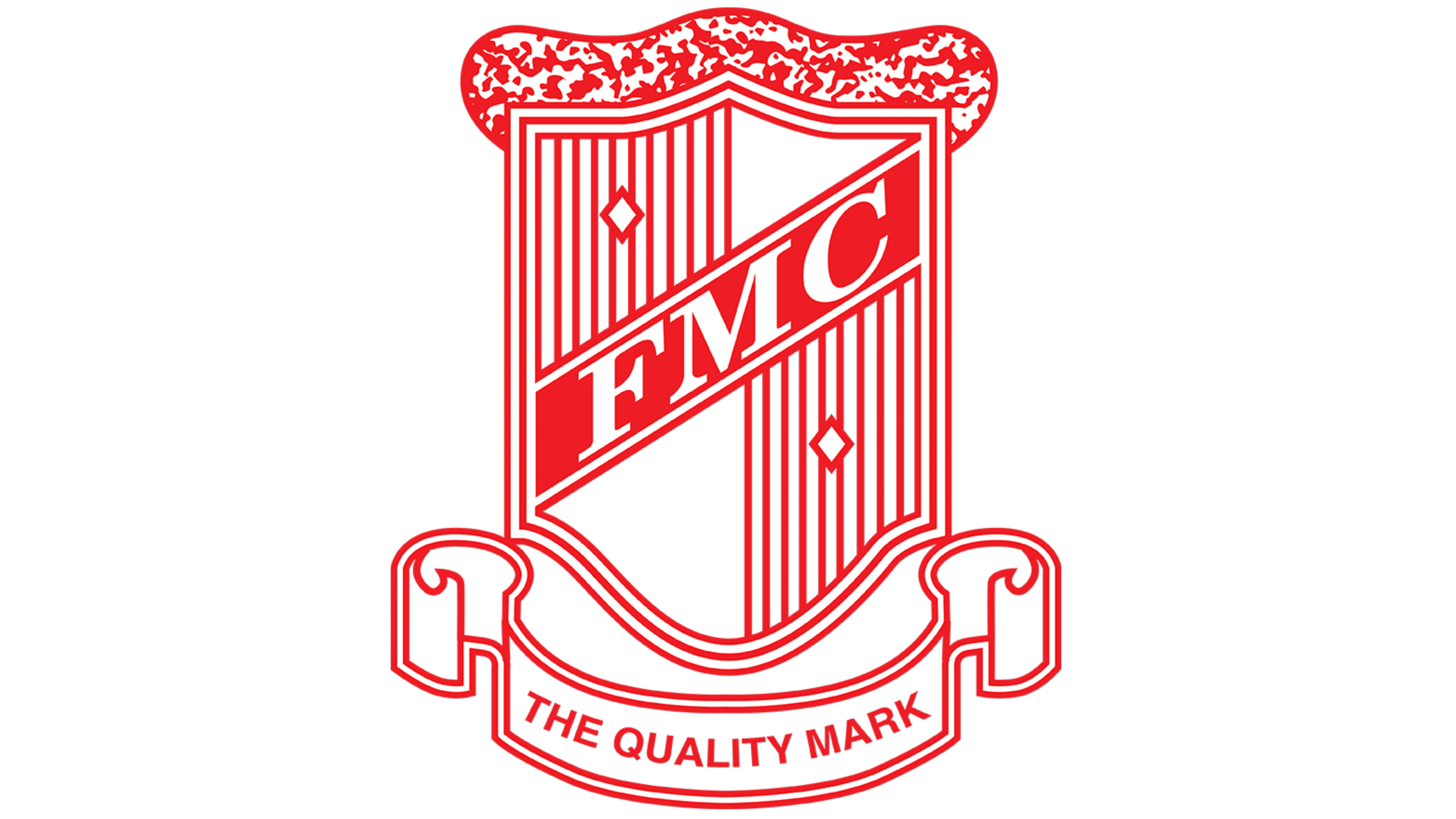
In 1929, the company introduced a red shield-shaped logo. A diagonal band rose across its center from left to right, carrying white serif letters spelling “FMC.” The abbreviation replaced the extended name and connected the emblem to the company’s new identity. Fine vertical hatching filled the fields around the band, with two small white diamonds among the lines. The letters and diamonds stood out against the red background, while the closely spaced strokes added detail to the shield’s interior.
The design remained richly ornamented. A wavy decorative border with fine detailing ran along the top, and a ribbon with curled ends framed the bottom. “The Quality Mark” supplemented the initials with a statement about product quality. Used to mark industrial products, the shield connected the new corporate name to that promise.
1941 – 1945
By 1941, the FMC shield had acquired a more angular outline while retaining its familiar red-and-white combination. A pointed projection appeared at the top, changing the emblem’s silhouette. The diagonal band with white “FMC” lettering still crossed the center. Together with the heraldic shape, it connected the updated design to the previous logo.
Most of the changes affected the interior fields. A grid of intersecting horizontal and vertical lines replaced the vertical hatching. It filled the upper-left and lower-right sections, each containing a small circle. The remaining areas were white. Gridded fields alternated with white sections around the diagonal lettering.
The ribbon beneath the shield retained “The Quality Mark,” referring to product quality. Its side curls became larger, adding depth to the lower border. The update changed the contours, field patterns, and proportions of the ornaments while preserving the abbreviation and quality statement.
1945 – 1946
The 1945 changes affected the FMC emblem’s colors and framing. The lower ribbon and motto were removed. Orange, black, and white replaced the previous single-color drawing. A thick black outline separated the shield from its background, while orange filled the interior fields.
The diagonal band became black. White serif “FMC” lettering remained, connecting the revised logo to its predecessor. The patterns also changed position. The grid moved to the upper-right and lower-left sections, while two white circles appeared in the open orange areas. Gridded fields alternated with colored sections containing circles.
Removing the ribbon reduced the emblem’s height and made its proportions more compact. “FMC” became its only text. Black borders and the diagonal band unified the design, orange filled the fields, and white distinguished the initials and paired circles.
1946 – 1947
The 1946 FMC update retained the shield and diagonal abbreviation but removed the fine patterns. Large solid areas replaced the grid, circles, and interior decorative lines. Yellow replaced orange, while a thick black border continued to define the shield’s outer edges.
A white diagonal band crossed the yellow field, carrying heavy black “FMC” lettering. Sans-serif letters replaced the earlier serif style. The lettering and band colors were reversed from the previous version. The initials remained in the same position as in the earlier logo. Still, the design now consisted of an outline, colored fields, and large letters.
1947 – 1948
Red returned to the FMC logo in 1947, replacing the orange and yellow treatments of the earlier shields. A vertical rectangular frame with rounded corners replaced the heraldic shape.
Slanted lowercase “fmc” lettering occupied the upper white field. A tall “f” with a curved top rose above the narrow “m” and “c.” Below, “Food Machinery Corporation” appeared in white on two lines against red. Instead of a motto, the logo now included the company’s full name to explain the abbreviation.
1948 – 1961
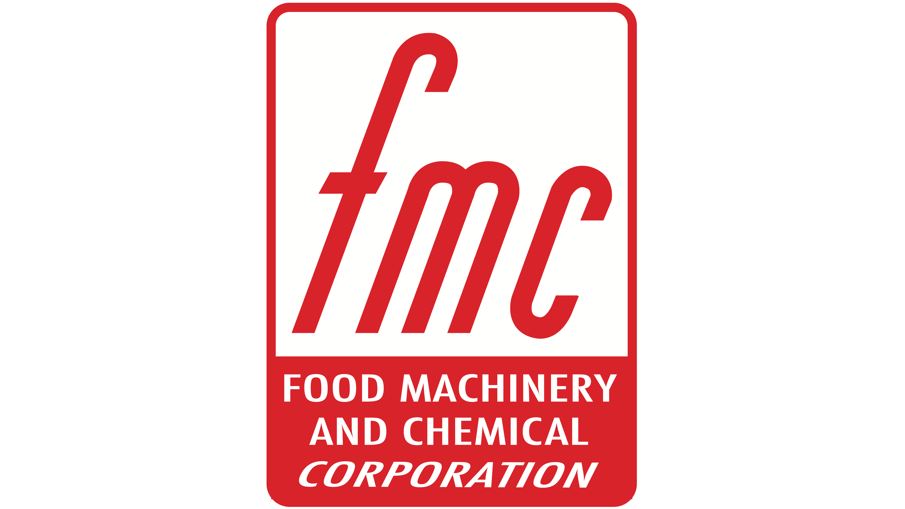
The 1948 acquisition of Westvaco Chemical Corporation changed both FMC’s name and the wording in its logo. The company became Food Machinery and Chemical Corporation. Adding “Chemical” reflected the growth of its chemical manufacturing business.
The new name appeared on three lines in the emblem’s lower portion. “FOOD MACHINERY” and “AND CHEMICAL” used upright capitals, while the final “Corporation” appeared in slanted serif lettering. The red frame and lowercase “fmc” above remained unchanged.
1961 – 1973
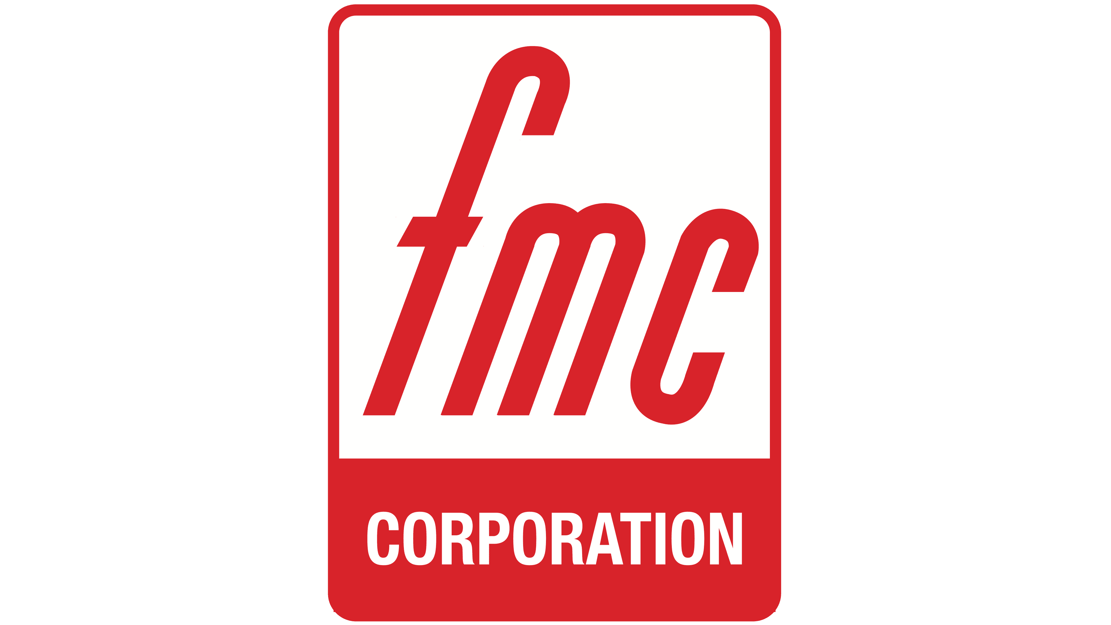
In 1961, the company became FMC Corporation, incorporating the historic abbreviation into its official name. The company removed “Food Machinery and Chemical” from the emblem’s lower block, leaving “CORPORATION.”
The white descriptor used narrow sans-serif capitals. The letters stood upright, with uniform strokes and tight spacing. The rest of the design remained, including the red lowercase “fmc” on the white field at the top of the rectangle.
1973 – today
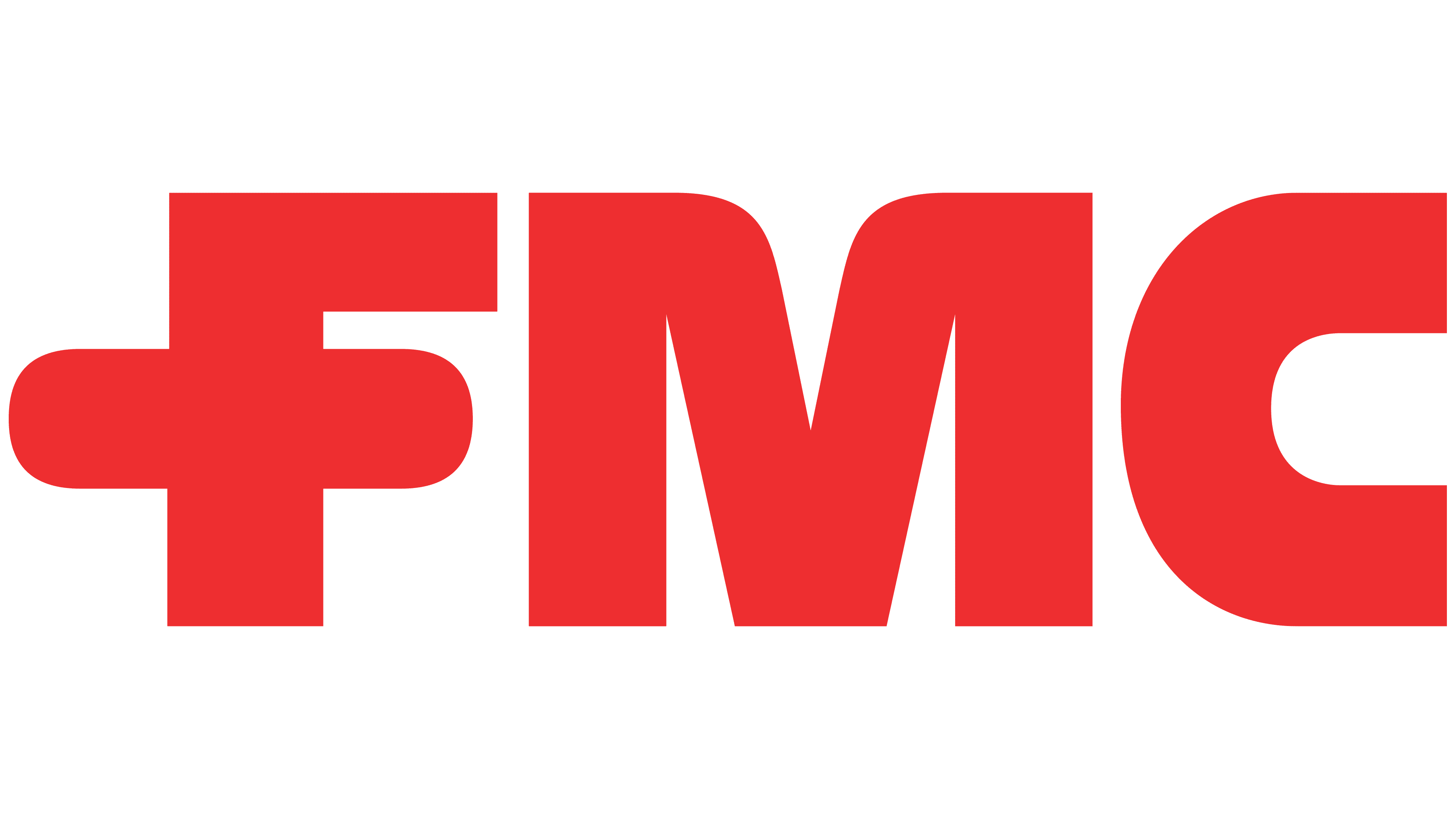
FMC’s logo update was part of a program to bring its numerous divisions and acquired brands under a shared identity. Inconsistent names and emblems made the corporation’s scale difficult to recognize. President and CEO Robert H. Malott led the program in 1972, commissioning New York agency Lippincott & Margulies to develop it. The agency established consistent rules for naming divisions and placing the corporate logo alongside their names.
On March 30, 1973, bright red “FMC” lettering replaced the earlier rectangular design and “Corporation” descriptor. The three large capitals were custom-designed, combining upright forms, heavy strokes, and rounded sections. The middle bar of the “F” crossed its vertical stem and extended equally far to the left and right. Its rounded ends gave the intersection a cross-like appearance. Through the letterforms, Lippincott & Margulies expressed an idea of technological precision shared across FMC’s businesses.
2019 – today
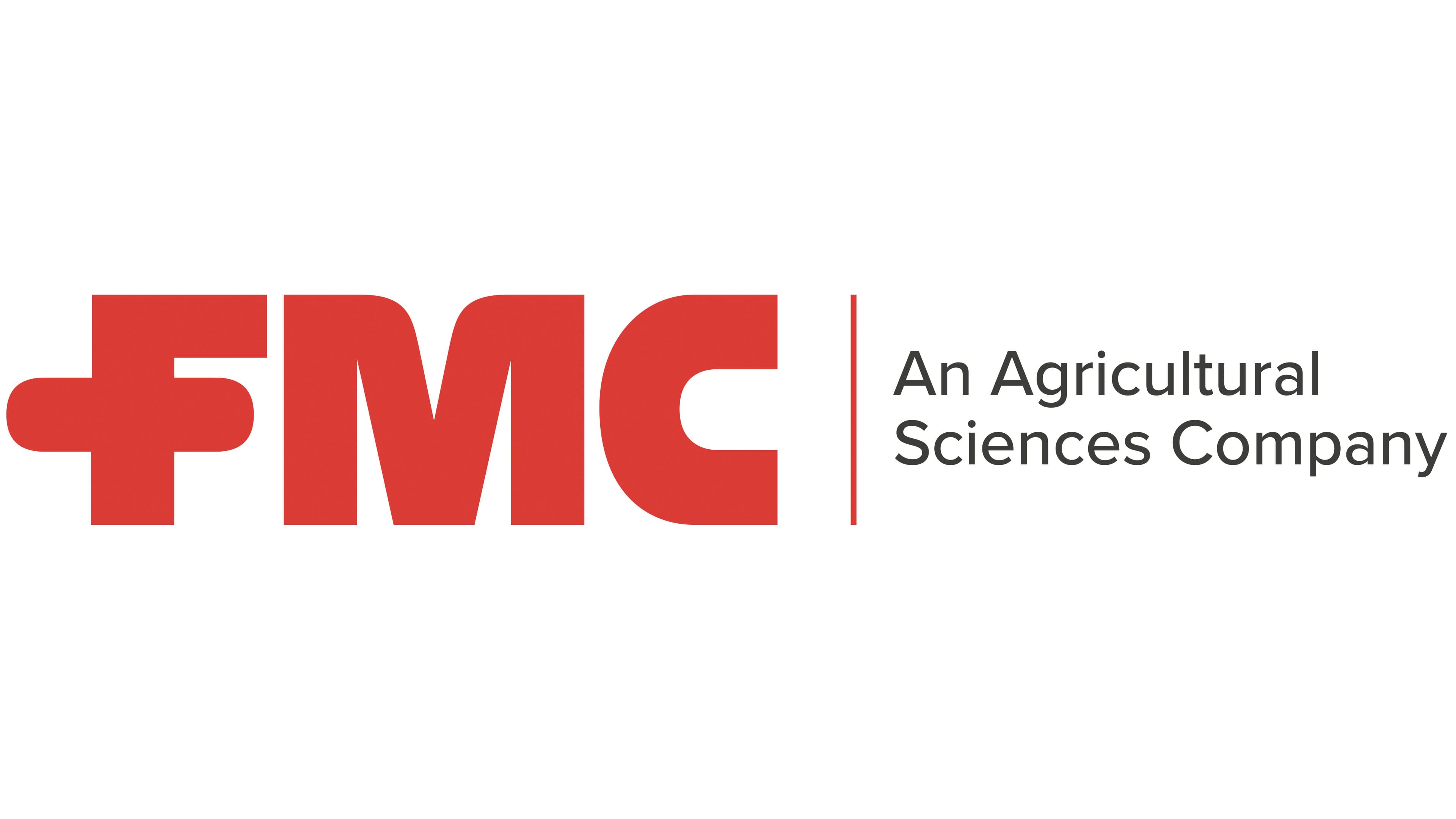
FMC built its unified identity around red and gray. Solid and outline versions of the logo were prepared for print, signs, vehicles, and metal casting. The guidelines called for a gradual phaseout of the earlier brands. As they retired their names, they increased the distance between the names and the corporate abbreviation.
In 2019, the logo added “An Agricultural Sciences Company.” International brand consultancy Siegel+Gale carried out the rebrand. The update reflected FMC’s focus on agriculture after it separated its lithium business, Livent, in March 2019. The red letterforms remained unchanged. A thin red vertical line appeared to their right, followed by a two-line gray descriptor. “An Agricultural” sat above “Sciences Company.”
The primary version specified PMS 032 CVU red, with the digital color code #EF3E33. Black and reversed white versions were also permitted. The width of the rounded projection to the left of the “F” defined the logo’s clear space. The version with the descriptor had a minimum width of 3.48 centimeters, allowing viewers to distinguish the small two-line text beside the large abbreviation.