


 Hitachi Construction Machinery Logo PNG
Construction equipment is used in mining, infrastructure projects, and large-scale construction, where machines operate under heavy loads. Excavators, bulldozers, and cranes perform tasks that require durability and reliable operation. The Hitachi Construction Machinery logo is associated with a company that manufactures heavy construction and mining equipment.
Hitachi Construction Machinery was founded in 1951 as a subsidiary of the Japanese conglomerate Hitachi Ltd. It began by producing construction equipment. In 1970, the division became independent. That same year, it began producing crawler cranes. It gained demand in various countries.
On August 1, 1972, the European subsidiary Hitachi Construction Machinery Europe was established in the Netherlands. It became the main service and sales center in Europe, Africa, and the Middle East. By 1981, the company provided full technical support for its equipment and had sold 500 units.
In 1986, the company began cooperating with Fiat. By 1988, the first jointly produced excavator was released. In 1987, the company introduced the large EX3500 excavator weighing 328 tons. This became a major achievement in the industry’s development.
During the 1990s, the company strengthened its position in the mini excavator market. By 1999, Hitachi had completed the acquisition of Euclid. This expanded its operations into mining equipment and heavy-duty trucks. After ending its partnership with Fiat in 2002, the company continued to grow independently in international markets.
In 2009, Hitachi acquired Wenco International Mining Systems Ltd. This expanded its expertise in managing digital mine equipment. In 2015, Hitachi gained full control of Kawasaki Construction Machinery and expanded its wheel loader lineup.
Since 2018, production facilities have been restructured in North America, India, and Japan. In 2020, the company closed its Oosterhout plant and increased hydraulic excavator production in Japan.
At Bauma 2025, Hitachi Construction Machinery Europe unveiled the LANDCROS One excavator concept. This project reflects a new direction in developing intelligent construction machinery and improving human-machine interaction.
Meaning and History
What is Hitachi Construction Machinery?
An international manufacturer of construction and mining equipment that is part of a Japanese industrial group. The product range includes excavators, loaders, mining dump trucks, crawler cranes, and machinery for infrastructure and industrial projects. The company is among the top three global leaders in excavator production, manufacturing machines ranging from compact models to 800-ton units.
before 2027
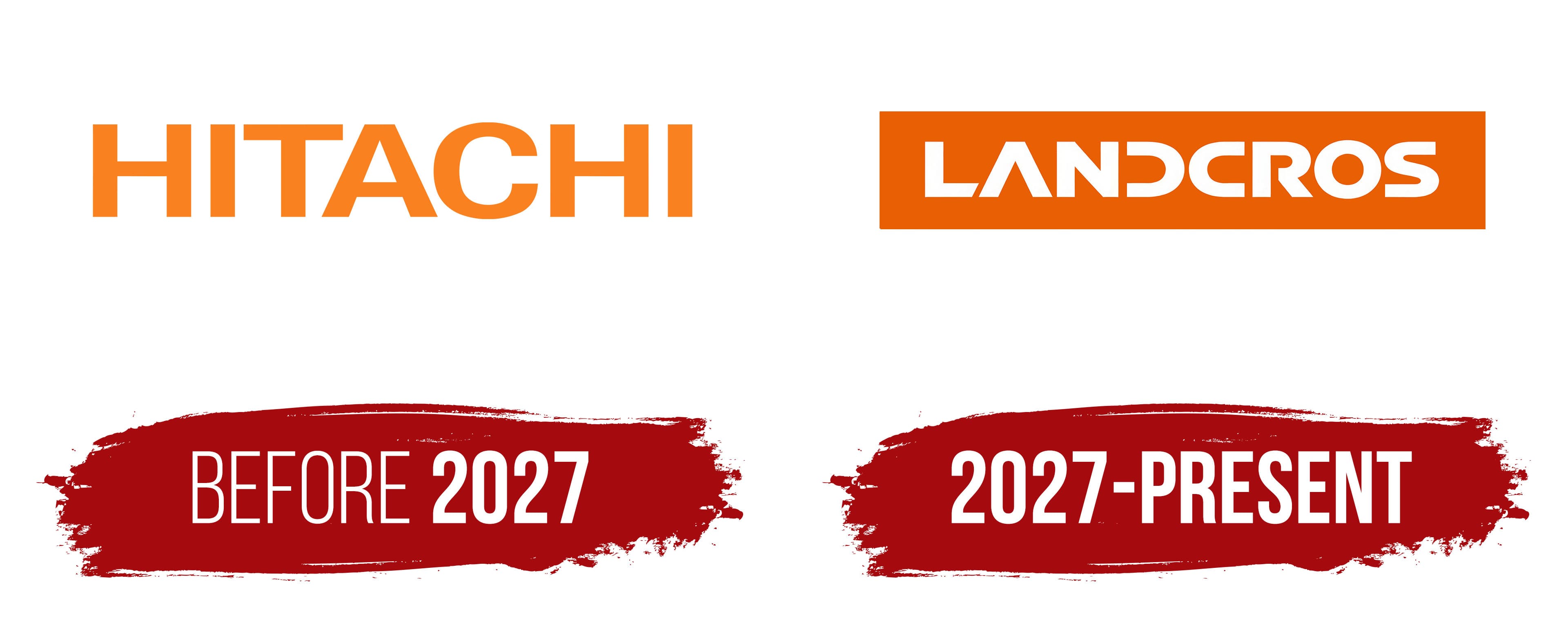
The orange HITACHI lettering on construction equipment inherited a name associated with the rising sun. The Japanese name combines the characters 日 and 立. The first means “sun,” while the second conveys “rise” or “stand.” Hitachi founder Namihei Odaira brought them together in the parent group’s circular emblem. Four projections around its edge represented solar flares. The design expressed the idea of the business rising with the sun. The construction equipment operation later became Hitachi Construction Machinery, with English words identifying its business.
The company grew out of Hitachi’s construction equipment manufacturing. The company began mass production of the U06 cable-operated excavator in 1950. Hitachi Construction Machinery Service was established in 1955, and the manufacturing, sales, and service operations were combined into Hitachi Construction Machinery Co., Ltd. in 1970. The company produces excavators, loaders, and mining dump trucks for construction and mining. Retaining the parent group’s name, the manufacturer used the Latin-letter HITACHI wordmark as its primary equipment branding.
The wordmark uses large sans-serif capitals. Straight lines and consistent stroke weight give the name a formal appearance. Heavy vertical strokes in the “H” and “I” combine with the long crossbar of the “T,” the triangular opening in the “A,” and the rounded “C.” The upright letters share a common height, forming an elongated horizontal line. Their design resembles Helvetica Bold, Univers, or Akzidenz-Grotesk.
In the orange version, “HITACHI” stands freely against the background. The design focuses on the lettering, its color, and its forms. The brand’s orange is called Reliable Orange. It connects the logo to the machines’ paint color, which customers use to recognize the manufacturer’s products. On equipment bodies, the HITACHI name stands out through the contrast between the lettering and the surface. Together, the orange paint and name identify the manufacturer.
An extended corporate version added “Reliable solutions” to HITACHI, promising dependable technical support. By 2011, one version featured a large black name above a white tagline on an orange horizontal band. The upper line retained sans-serif lettering, while the lower line used serifs. The manufacturer’s name and customer message differed in letter size, stroke weight, and capitalization. The orange band connected both lines to the construction equipment’s paint color.
2027 – today
Preparations to change the Hitachi Construction Machinery name began long before the renaming announcement. In late 2017, international expansion and new customer demands prompted management to reconsider the company’s purpose and how it differed from competitors. Its future depended on comprehensive support for construction and mining operations, digital services, automation, and equipment support throughout the equipment’s operating life. After leaving the Hitachi group in August 2022, the company continued developing a separate corporate identity.
Employees from different countries participated in the naming process. More than 3,000 people submitted approximately 5,000 ideas, including LANDCROSS. During discussions, the final “S” was dropped, producing LANDCROS. In late 2022, the board approved the name along with revised company principles. The board presented the new name and the ideas behind it publicly on July 4, 2024.
The eight-letter name combined the company’s vision for its business and customer relationships. “LAND” referred to the earth and the ambition to support communities’ future well-being and the places they inhabit. “CROS” came from the initials of “Customer,” “Reliable,” “Open,” and “Solutions.” These represented customer focus, reliability, open collaboration, and comprehensive technical assistance. “Open” referred to working with outside partners and sharing technology, knowledge, and experience. “Solutions” encompassed servicing, digital tools, and support for production processes. Alongside manufacturing machines, the company intended to help customers organize their equipment operations.
For the 2024 introduction of LANDCROS, an orange rounded rectangular emblem was prepared. A white line read “Hitachi Construction Machinery Group” at the top, the new name sat in the middle, and “Japanese Excellence” and “Reliable Solutions” appeared below. The group name identified the emblem’s affiliation, while the lower phrases connected Japanese engineering origins with a promise of dependable support. Initially, LANDCROS was intended to appear alongside the Hitachi brand. It was used on business cards and decals near construction equipment cabs.
Custom lettering formed the emblem’s basis. All eight letters were uppercase and sans-serif, with extended horizontal strokes and heavy lines. Unlike the familiar HITACHI wordmark, LANDCROS broke up its letterforms. The two diagonal sides of the “A” met at the top, leaving the space between them open. The “D” lacked its left vertical stem, leaving its rounded contour open on the left. The “C” was horizontally elongated, while the “O” retained a closed circular outline. The open sections of the “A” and “D” gave the name distinctive letterforms.
On April 7, 2025, the new name appeared on the LANDCROS One concept excavator, unveiled at Bauma in Munich. The company developed the project with Granstudio, an automotive and transportation design studio led by Lowie Vermeersch. Before the company renamed itself, the LANDCROS brand appeared on a machine embodying its vision for future equipment. The concept combined AI assistance, autonomous control, remote operation, and new ways for the operator to interact with the excavator.
Hitachi Construction Machinery announced its transition to the LANDCROS corporate brand and its forthcoming name change on October 28, 2025. The 2024 explanatory lines were removed from the primary logo. White LANDCROS lettering remained inside an elongated orange rectangle. The designers were tasked with maintaining a connection to the previous identity while giving the new name distinctive letterforms. Heavy strokes continued the tradition of the bold HITACHI wordmark, while the orange field retained the manufacturer’s familiar color.
The orange paint connects the new identity to the brand’s long history and the appearance of its machines on construction sites. A version featuring both names was prepared for the transition. Black HITACHI lettering appears on the left, with white “Reliable Solutions” text on an orange band beneath it. Orange LANDCROS lettering sits on the right. A thin orange vertical line separates the two parts. Beginning in April 2027, the new name will start replacing the old one on equipment and in the corporate identity.