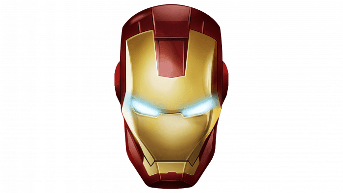
A distinctive feature of superhero visualization has become the creation of memorable personal symbols. For instance, the Iron Man logo is distinguished by its metallic texture and shine in a three-dimensional font, reflecting important traits of the character and symbolizing his restraint and inflexibility.
Iron Man: Brand Overview
Iron Man was created for Marvel Comics in 1963 by writer Stan Lee, illustrator Don Heck, and writer Larry Lieber. The character Tony Stark made his debut in Tales of Suspense #39 in March 1963. The superhero was developed during the Cold War, reflecting the era’s focus on technology and the military-industrial complex. Tony Stark, a wealthy and brilliant weapons manufacturer, suffers a life-threatening injury that leads him to rethink his life and create a high-tech suit to fight evil.
Stark’s injury occurred during the Vietnam War in the early comics, forcing him to build an electromagnetic chest plate that eventually evolved into the iconic armor. Throughout the 1960s and 1970s, the character’s popularity grew, solidifying his role as a key member of the Avengers. The suit saw several upgrades, each showcasing the latest in technological advancements.
The 1980s brought a deeper exploration of Tony Stark’s character, particularly in the “Demon in a Bottle” storyline, which dealt with his struggles with alcoholism. This storyline is considered one of the most important in comic book history, adding complexity to the superhero’s persona.
In the 1990s, Tony Stark continued to evolve, with new versions of his armor, like the “Modular Armor,” and storylines addressing corporate responsibility and the ethics of technology. The 2000s saw a major shift with the Extremis miniseries by Warren Ellis, which updated the hero’s technology and backstory, influencing future adaptations.
The character’s place in popular culture was cemented with the release of the 2008 film Iron Man, starring Robert Downey Jr. The movie kicked off the Marvel Cinematic Universe (MCU) and was a huge success, grossing over $585 million globally. Downey Jr.’s portrayal brought Tony Stark to life with a mix of charm and wit, making the character iconic.
Following the film’s success, Tony appeared in numerous MCU films, including Iron Man 2 and Iron Man 3 sequels. His role in the Avengers movies became central to the MCU’s overarching narrative, particularly his relationship with Captain America.
This superhero’s legacy continued to evolve in the comics alongside his film appearances. New characters like Ironheart (Riri Williams), a young inventor who creates her version of the advanced suit, have carried on his legacy.
Tony Stark’s story in the MCU culminated in Avengers: Endgame (2019), where his character arc concluded with a powerful sacrifice. Despite this, he remains beloved in video games, animated series, and ongoing comic book stories. Over the years, the character has transformed from a straightforward superhero into a complex figure representing technology, personal responsibility, and redemption themes.
Meaning and History
The literary prototype of the character is Anthony Edward “Tony” Stark, a genius, scientist, playboy, and business magnate. He conceals himself under the mask of Iron Man, which he created to protect justice. When kidnappers attempt to force him to develop weapons of mass destruction, he creates a unique automated armor for himself. With its help, the inventor wants to escape captivity and hide from enemies. In subsequent versions of comics and movies, Anthony Edward uses the armor to protect the world as Iron Man.
The superhero owes his appearance to the Avengers, of which he was a member. A standalone version of the logo was launched simultaneously with the publication of Adventures in May 1968. Five seasons have been dedicated to him: they were released intermittently from 2008-2012. Then came the series The Invincible Iron Man, which lasted until 2014.
Subsequently, the recognizable image, embodied in a personal emblem, was used in movies, games, cartoons, and TV shows. Interestingly, the prototype logo on the debut cover of the magazine contained the beginnings of future elements of personal symbolism: spikes, seams, and other metallic elements.
The true logo of Iron Man was hand-drawn by the superhero himself. Initially (in “The Avengers”), it had simplified graphics – a mask composed of geometric shapes. The head in the helmet was depicted after the first movie’s release. It is characterized by straight lines, sharp angles, and protrusions – all as in real metal products.
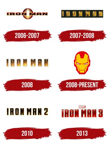
However, before reaching the final version, representatives of Marvel Studios had to study a vast number of drafts. The main focus is on metallic textures and gradients. As a result, the emblem received a graphic sign and a stylized inscription. It is dated several years, as it appeared simultaneously with the release of another movie – in 2008, 2010, and 2013.
What is Iron Man?
It is a superhero from popular movies and comics, so named because of his massive metallic armor. He is one of the main heroes of the Marvel universe and a member of the Avengers team. Beneath the protective suit with jet engines and high-tech weaponry hides the brilliant billionaire Tony Stark. Iron Man debuted in 1963, with the character’s concept created by Stan Lee and brought to life by artists Jack Kirby and Don Heck.
2006 – 2007
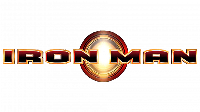
In the era when this logo appeared, the world was introduced to a new type of superhero—technologically advanced, with an unyielding spirit and ready to face any threat. The logo, which became the symbol of the film “Iron Man,” first appeared on the project’s website and later adorned themed merchandise. The emblem caught attention with its raw power and intensity, perfectly reflecting the main hero’s character.
The central element is a metallic ring emitting a dazzling glow. This light shines onto beige-red stripes in the center, creating the impression of a powerful energy source.
The emblem’s background is the film’s title, designed in a matching style: dark red letters with a gradient and beige outline. These massive, wide letters, all capitalized, convey a sense of strength and invincibility, as if each letter were forged from solid metal, emphasizing the connection to the image of Iron Man.
2007 – 2008
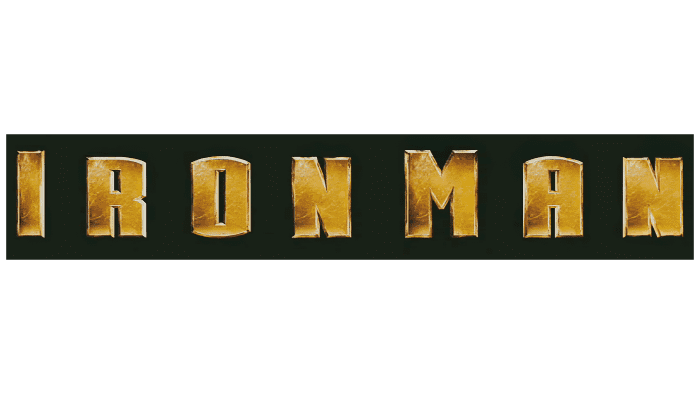
When creating the film, it was crucial to convey the harshness and technological prowess of the main character, who symbolizes strength, reliability, and modernism. The copper letters, as if carved from metal, perfectly embody this idea and highlight the uniqueness of a hero ready to fight and protect the world.
The logo featured in the image is an early version of the modern emblem for the film “Iron Man.” This variant was used exclusively in early promotional materials. The designers chose large capital letters with a rough texture and noticeable wear marks. Each letter is designed with a relief effect, giving the impression of durability and solidity, as if they were forged from metal.
A distinctive feature of this emblem is that the first letter of each word is slightly taller than the others. This design choice helped to make the words stand out, as they are written together without spaces. The copper letters against a black background create a striking and impressive image that draws the eye and emphasizes the power and seriousness of the brand.
2008
The logo reflects a modern style and strength, technological superiority, and resilience, perfectly aligning with the image of Tony Stark—a genius, billionaire, and superhero. The developers updated the visual design in this version, making it more dynamic and vibrant. The letters were elongated, adding a sense of power and massiveness. The gradient shadows shifted upwards, creating a backlit effect that enhances the metallic texture and sheen. This emphasizes the technological and futuristic qualities of the character and his armor.
To create additional depth and a three-dimensional effect, the designers outlined all the symbols with another line, giving the emblem depth and making it stand out against the background. The title “Iron Man” is written as two separate words, but they are positioned very close together, creating a sense of continuity and cohesion.
2008 – today
2010
2013
Iron Man: Interesting Facts
Iron Man is a superhero from Marvel Comics who has been super cool to fans for a long time. He’s got a fancy suit and an interesting story. Stan Lee came up with Iron Man, and he first showed up in a comic book way back in 1963.
- How It All Started: The character was created during the tense Cold War era. Tony Stark, a wealthy and brilliant inventor, was captured but used his intellect to build a suit to escape, symbolizing the use of technology for protection.
- Evolving Armor: Tony Stark has developed many different suits over time, each one more advanced than the last, from bulky early models to sleek designs incorporating nanotechnology.
- Facing Personal Struggles: One of the most compelling aspects of the character is his battle with personal demons, such as his struggle with alcoholism, famously depicted in the “Demon in a Bottle” storyline.
- Avengers Founder: Tony Stark was one of the key members who helped form the Avengers. His intelligence and resources make him indispensable to the superhero team.
- Movies Boost Fame: The character’s popularity skyrocketed when Robert Downey Jr. portrayed him in the 2008 film, leading to a series of blockbuster movies that made the character a household name.
- Inspiring Real-Life Innovation: The concept of high-tech armor has inspired real scientists to explore technologies like exoskeletons and advanced prosthetics.
- Stan Lee’s Pride: Stan Lee, the creator, considered this superhero one of his favorites, enjoying the challenge of making a wealthy industrialist relatable to readers.
- The Lifesaving Suit: The original armor was crucial for escape and keeping Tony Stark alive, protecting his heart from shrapnel.
- Philanthropic Hero: Beyond fighting villains, Tony uses his wealth to better the world, focusing on projects like clean energy.
- A Sci-Fi Icon: The character has left a significant mark on science fiction and superhero narratives, blending advanced technology with ethical dilemmas about power and responsibility.
Font and Colors
Each element of the logo is executed in a restrained style – strict, with a small number of broken or curved lines. Everything is extremely rigid and sharp to emphasize the character’s inflexibility. Even the inscriptions are made with a metallic shine – by the image of Iron Man.
The word used in the first action movie (2008) was developed under the guidance of Josh Greenstein from Paramount Studios. He received this assignment from his colleague Nancy Goliger at the film studio. Symbols in uppercase, iron textures, and reflections from metallic surfaces characterize the inscriptions.
The color of the logos is associated with the type of font: to emphasize iron, artists chose rusty shades of red, brown, and orange, combining them with classic black and white.
