 Jardine Matheson Logo PNG
This diversified holding company brings together businesses in retail, real estate, hospitality, and finance, managing assets across Asia. This structure lets the company develop multiple business lines simultaneously and allocate resources across them. The Jardine Matheson logo represents a company that manages a group of enterprises across various industries and maintains a long-term presence in regional markets.
William Jardine and James Matheson founded Jardine Matheson on July 1, 1832, in Canton. After the British East India Company lost its monopoly on trade with China in 1834, Jardine Matheson became the first private firm to supply Britain with tea. In 1842, after Britain ceded Hong Kong, the company moved its headquarters there. It became one of the region’s largest trading houses.
From the late 19th century, the company invested in China’s infrastructure, energy, and transportation. In 1890, it helped create the Hong Kong Electric Company. In 1898, it co-founded the ferry company, Star Ferry. At the turn of the century, Jardine Matheson had become the largest British conglomerate in the Far East, with branches in China, Japan, and other countries of the region.
After World War II and the loss of the Chinese market in 1949, the company shifted its focus to new business areas. In the 1960s, it listed on the stock exchange, launched the Mandarin hotel chain, and founded the investment bank, Jardine Fleming. In the 1970s and 1980s, Jardine Matheson expanded its operations. It acquired the construction company Gammon Construction and the car distributor Zung Fu. During the same period, it opened offices in Australia and Indonesia.
In the 1990s, the group strengthened its position in Asia and acquired stakes in Cycle and Carriage and Tata Industries. In 1991, it moved the listing to the London Stock Exchange. This ensured the protection of corporate interests under British law.
The company remains an international holding with assets in the automotive, construction, hospitality, and insurance sectors. In 2020, net profit attributable to shareholders amounted to $ 1.085 billion. In the first half of 2025, this figure rose 45 percent to $798 million.
Meaning and History
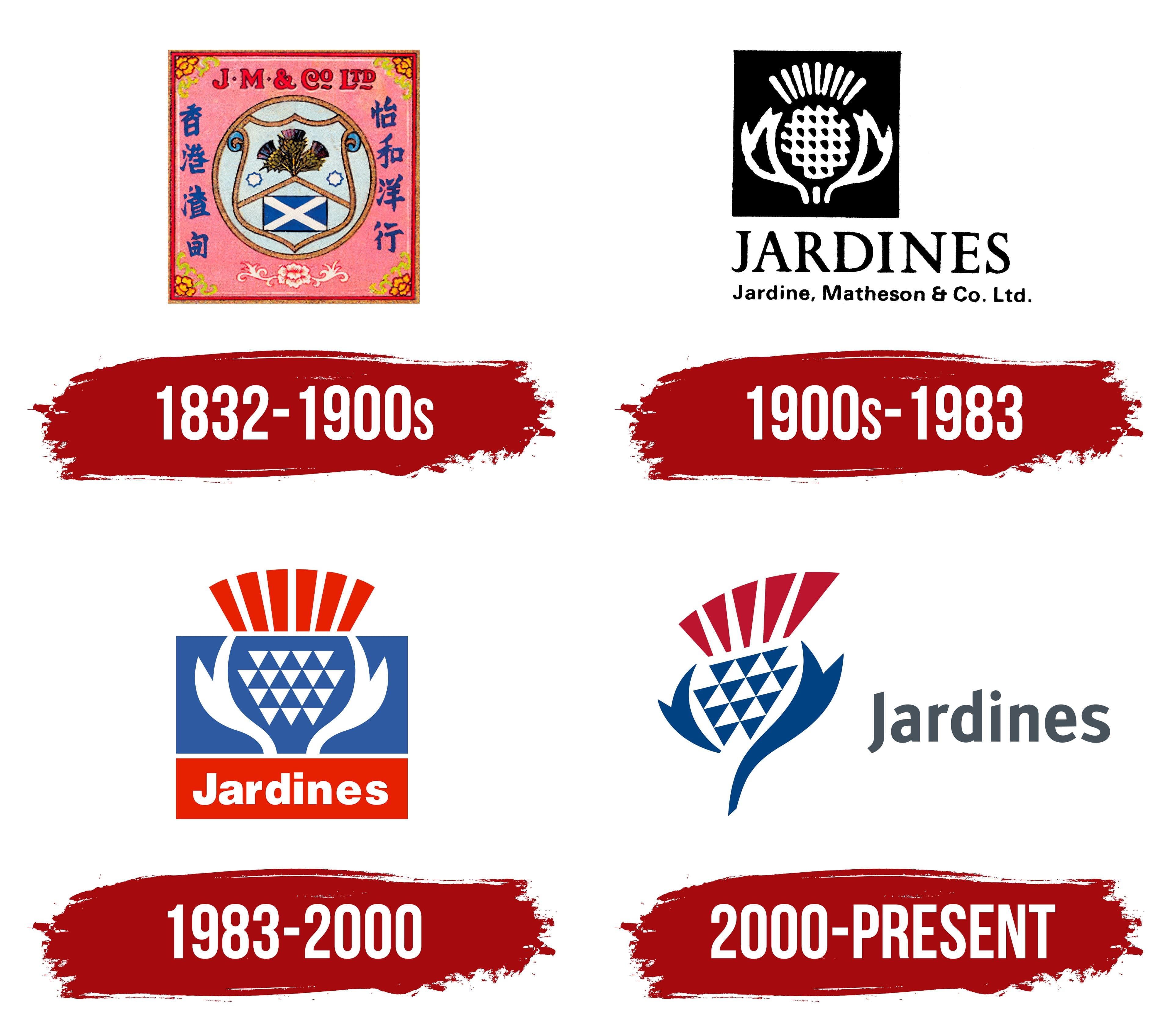
What is Jardine Matheson?
An Asian conglomerate registered in Bermuda and headquartered in Hong Kong that grew from a trading house supplying tea, cotton, and coal. Today, the group operates in retail, real estate, construction, transportation, finance, and hospitality. Its portfolio includes Hongkong Land, Dairy Farm International, Mandarin Oriental, Astra International, and Jardine Cycle & Carriage. Through Jardine Pacific, it controls Gammon Construction, Jardine Engineering, Jardine Schindler, Jardine Restaurant Group, which operates the Pizza Hut franchise, and Jardine Shipping Services, which operates in more than 200 ports across Asia.
1832 – 1900s
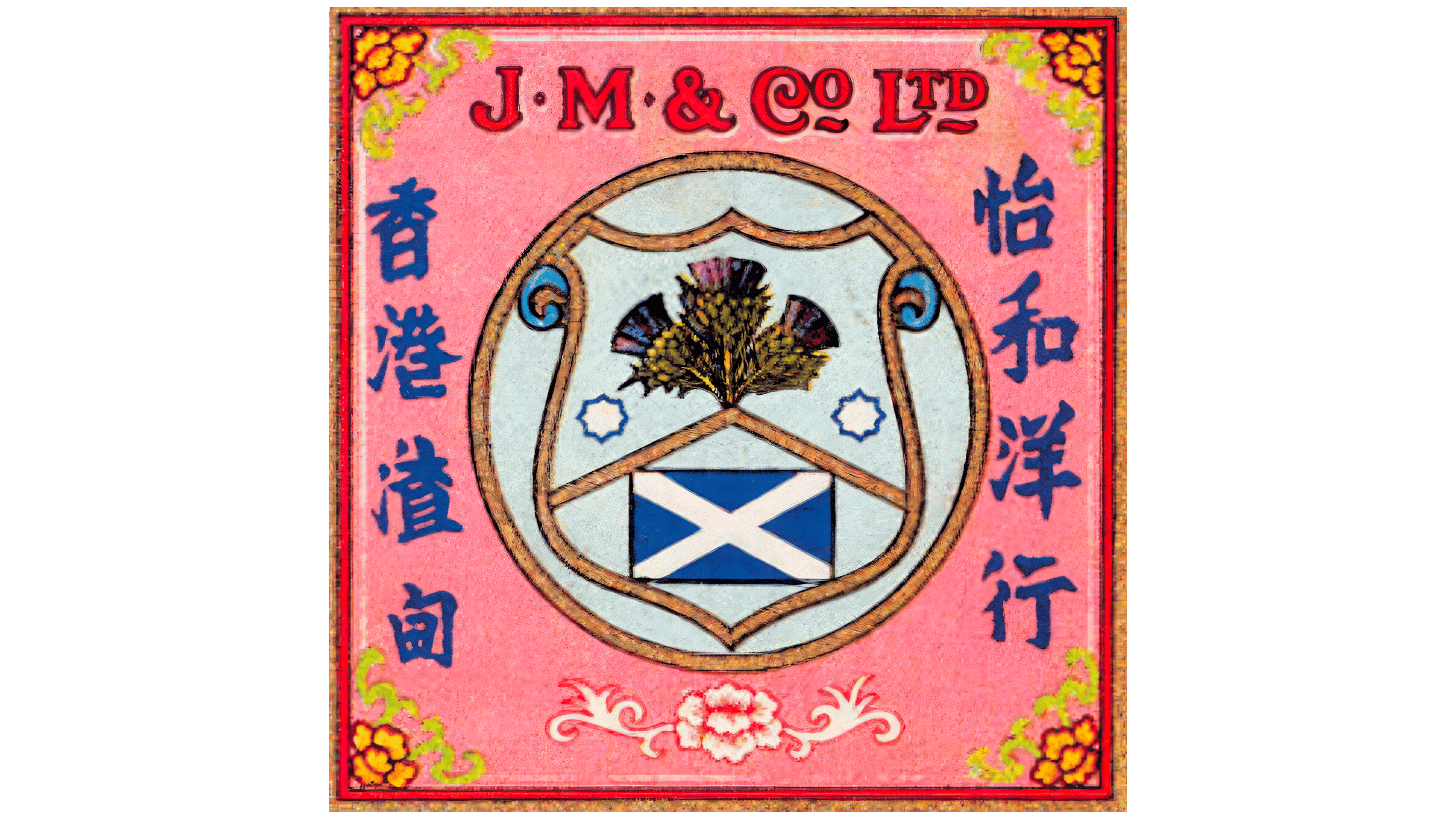
Jardine Matheson used both English and Chinese names. The name 怡和 is pronounced Yee Wo and means “happy harmony.” It originated with Ewo Hong, an early business owned by the Cantonese merchant Howqua. The English name Jardine, Matheson & Co. came from the last names of the senior partners, William Jardine and James Matheson.
The Scottish entrepreneurs founded the company in Canton on July 1, 1832. After the British East India Company’s monopoly ended in 1834, the trading house shipped one of the first privately exported consignments of Chinese tea to England. Jardine Matheson later grew into a major Asian group with businesses in shipping, real estate, manufacturing, retail, and other industries.
The early emblem combined the founders’ Scottish heritage with the company’s operations in China. A shield surrounded by a double circular border appeared in the center. Diagonal lines crossed its light blue field. The upper section featured a sheaf with fan-shaped figures on either side, while two small eight-pointed figures appeared below. The bottom section had a blue background with a white diagonal Saint Andrew’s Cross associated with Scotland’s Saltire flag.
The inscription “J. M. & Co Ltd.” appeared above the shield. The red uppercase serif letters had black outlines. Vertical blue Chinese characters appeared on both sides. The English and Chinese elements introduced the trading house to European partners and local customers. The abbreviated form “J. M. & Co. Ltd.” allowed the long corporate name to fit within a compact design.
A thistle associated with Scotland appeared alongside the heraldic composition on historical flags and other materials. In 1982, Jardine Matheson published The Thistle and the Jade to mark its 150th anniversary.
1900s – 1983

In 1906, Jardine, Matheson & Co. became a limited liability company and added “Limited” to its legal name. Corporate materials used the full name alongside the shorter form “Jardines,” which had become a familiar name for the group. During the 20th century, the abbreviated name moved to the top line of the logo, while a thistle replaced the elaborate coat of arms.
The flower had a symmetrical shape and a monochrome design. In the reversed version, a white silhouette appeared against a black background. An elongated oval with a row of small oblong openings occupied the center. Long pointed petals rose above it to form a fan-shaped crown. Two large curved forms resembling leaves appeared on the sides. In some versions, the center was closer to a diamond shape.
The word “JARDINES” appeared below the thistle. It was set in large black uppercase letters with heavy serifs. The traditional serif style continued the company’s earlier visual identity. Its large size made the shortened name the most prominent part of the logo.
The bottom line contained the full name, “Jardine, Matheson & Co. Ltd.” It appeared in a smaller sans-serif typeface. The capital letters “J,” “M,” “C,” and “L” marked the beginning of each major word, while the remaining letters were lowercase. Differences in size and type style separated the legal name from the larger “JARDINES” inscription while preserving the company’s legal designation.
1983 – 2000

For Jardine Matheson’s 150th anniversary, the historic thistle was redesigned for use across the group’s extensive business network. Landor Associates developed the design in 1982, and implementation began in late 1983. Materials from the project are part of the Landor Design Collection at the Smithsonian Institution’s National Museum of American History.
The logo consisted of two vertically stacked colored blocks. The upper blue field contained a geometric thistle. At the bottom was a mirrored pair of white curved forms resembling open leaves. Between them was a central pattern made from rows of white isosceles triangles pointing downward. Together, they resembled a flower bud or pinecone. The triangular grid distinguished Landor’s design from the earlier flower. At the same time, the blue and white colors maintained a connection to Jardines’ Scottish heritage.
A fan of six red-orange rays rose above the blue field, representing the thistle’s pointed petals. The lower block used the same red-orange color and contained the white word “Jardines.” The name was set in Helvetica, with rounded sans-serif forms and a heavy weight. The capital “J” was taller than the remaining lowercase letters. The short name suited the group’s many different businesses.
Landor continued working on the Jardines identity during the 1990s. The basic structure of the thistle remained unchanged, while its proportions and the placement of the name were adjusted. By the end of the decade, companies in several industries were using the emblem. “Jardines” was registered as a trademark for business management, transportation, logistics, aviation services, and other areas of the group’s operations.
2000 – today

In 2000, Landor redesigned the Jardines thistle and removed it from the two colored blocks. An open composition replaced the two-level arrangement with a blue upper field and a red nameplate. This update became the basis of the current logo. It supported the group’s transition to a unified corporate identity in Asia and other international markets.
A stylized thistle with an asymmetrical outline appears on the left. Two outer blue forms curve upward and inward like open leaves. The lower right stroke extends downward, bringing the composition together as a vertical flower bud. Trademark documents describe the outer elements as distorted chevrons.
The center features a triangular mosaic that replaced the previous shingle-like pattern. The visible structure contains 22 cells, including 12 blue and 10 white triangles. They alternate to create several diagonal rows. Trademark records separately identify 12 triangles in the inner area. Five dark red segments fan out across the top. The documents describe them as triangular elements, although their shapes more closely resemble trapezoids with rounded upper edges.
The dark gray word “Jardines” appears on the right. The name begins with a capital “J,” followed by lowercase letters. The sans-serif typeface has rounded terminals, medium-weight strokes, and upright letterforms. The open layout leaves ample space around the wordmark. It allows the thistle to be used either with the name or independently as a corporate identifier.
The thistle reflects the Scottish heritage of William Jardine and James Matheson. The full name, Jardine Matheson, preserves the founders’ last names, while the shortened form, Jardines, appears in the logo. The group’s legal name is Jardine Matheson Holdings Limited. It operates as an investment holding company focused primarily on Asia.