An alternative to hamburgers is the chicken of the KFC restaurant chain, whose logo reveals the essence of the acronym, demonstrating a commitment to its history. The smiling portrait of the founder, the frame in the shape of a cup, and the color palette evoke a sense of warmth and hospitality.
KFC: Brand overview
KFC is a fast-food restaurant known worldwide. Colonel Sanders founded the brand, and it has existed since 1930. The restaurant chain is part of the Yum! Brands is a company headquartered in Louisville, Kentucky.
In the 1930s, Harland Sanders, working from a small service station in Corbin, Kentucky, created a fried chicken recipe to revolutionize fast food. His secret mix of 11 herbs and spices was so good it laid the foundation for the Kentucky Fried Chicken brand.
In 1939, the Kentucky governor honored Sanders with the title “Colonel,” recognizing his culinary impact. This title became synonymous with Sanders and an iconic part of the KFC brand. KFC’s expansion began in earnest in 1952 with the opening of its first franchise in Salt Lake City, Utah, setting the stage for its global presence.
The 1960s and 1970s were pivotal decades for KFC. By 1963, it had expanded to over 600 restaurants in the US and Canada. In 1964, at 74 years old, Sanders sold the company for $2 million to a group led by John Y. Brown Jr., which spurred further growth and standardization of the KFC brand.
KFC’s international expansion accelerated in the subsequent decades, with outlets opening across the UK, Mexico, Japan, and beyond. Ownership changes in the 1980s and 1990s, including being acquired by PepsiCo in 1991, positioned KFC for further growth, especially in China, a key market for the brand.
In 1997, KFC underwent a significant rebranding, shortening its name from Kentucky Fried Chicken to KFC, aligning with shifting consumer health perceptions. The 2010s were marked by innovation, with KFC updating its menu to include healthier options and embracing digital technology and service innovations, especially in China with high-tech restaurant features.
Despite modern advancements, KFC has maintained its connection to its origins, with Colonel Sanders’ image remaining a central part of its branding. Today, KFC is a global fast-food giant with over 25,000 locations in 145 countries, staying true to its original chicken recipe while adapting to local tastes and dietary trends.
From its humble beginnings in a Kentucky roadside kitchen to becoming a worldwide culinary empire, KFC’s journey is a testament to Sanders’ entrepreneurship, culinary innovation, and branding power. KFC’s enduring success and expansion globally affirm that as long as there’s a love for flavorful chicken, the brand’s legacy will continue to grow.
Meaning and History
The KFC logo has always consisted of two main elements: the brand color palette and a portrait of the founder. Over the years, it has changed five times. These were not radical changes but adjustments that can rightly be called the evolution of the trademark.
What is KFC?
KFC is a company that popularized chicken in the fast-food industry, offering an alternative to popular hamburgers. It was founded in 1930 when Harland David Sanders opened his first restaurant. The expanded name of the company is Kentucky Fried Chicken.
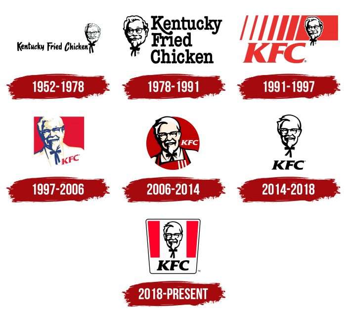
1952 – 1978
The emblem of this period can be considered a debut since it laid the foundation for a series of recognizable corporate symbols. It consists of a graphic and textual part, executed in black and white.
The first is a minimalist portrait of the brand’s founder and owner, Colonel Sanders. The drawing depicts only his head with a bow tie, which forms the image of a funny little man since the bow resembles the hands and legs of a cartoon character.
The second fragment is the expanded name of the fast-food restaurant Kentucky Fried Chicken. It translates as “Fried Chicken from Kentucky” and indicates the main ingredient on the menu. The font is capitalized “K,” “F,” and “C.”
1978 – 1991
In 1978, the logo underwent noticeable changes. Designers moved the graphic symbol to the left and placed it in front of the phrase, arranged in a three-tier column. The face was enlarged, and its expression became kinder and softer to make a pleasant impression on potential visitors. As a result, a usual redesign turned into a profitable marketing move. The typography was also modernized: “K” was emphasized with an elongated stem extending beyond the “C.”
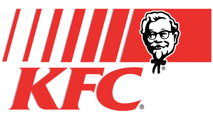
1991 – 1997
The owner changed the name during this period, officially leaving the abbreviated version. This was done for two reasons. The first – the fast-food point was already recognizable and did not require detailed decryption. The second is that it’s a small word that fits better into expensive advertising space. The main feature of the badge of those years was the brand color palette, which was always present on the logo. It’s a combination of red, black, and white colors.
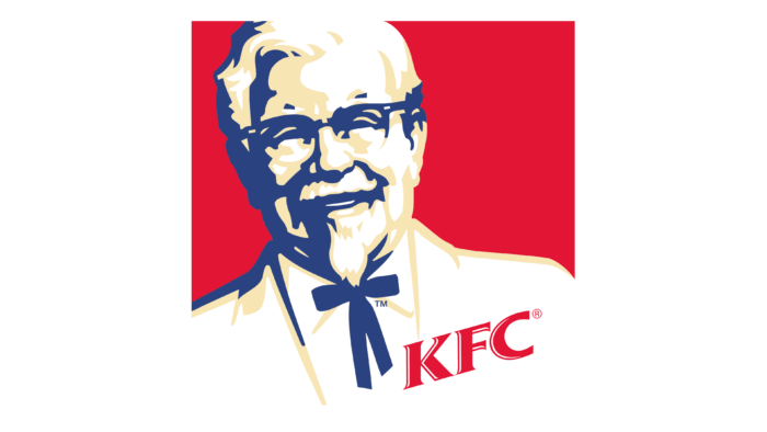
In 1997, a new accent appeared in the visual appearance of KFC – a “photograph” of the restaurant chain owner. The colonel is depicted realistically, and his portrait is done in blue and white tones, close to the pastel palette. The square emblem has a solid red background.
1997 – 2006
The logo of this period is the result of the work of the company Landon Associates. At the end of the period, it is replaced by a round symbol with a kind smile on Colonel Sanders’ face in the form of a stylized pencil portrait. The formal jacket is replaced with an apron with three vertical stripes, and the abbreviation “KFC” is located to the left of the central image, slightly above the shoulder.
2006 – 2014
In 2006, the dark red circle with an elegant image of the colonel in an apron, not a tuxedo, was still relevant. Nevertheless, an official replacement was being prepared in parallel.
2014 – 2018
The monochrome version of the KFC logo is a tribute to the original emblem from 1952. The difference between the previous and the current versions is that the modern variant contains a brief form of the name, located under the friendly smiling head with the characteristic bow tie.
2018 – today
The latest redesign of the KFC branding occurred in 2018. Developers changed the logo’s shape to trapezoidal and improved the portrait. The white and red background now consists of a black contour surrounding three wide vertical stripes and the face. The graphic sign is placed on the central stripe – white. The abbreviation KFC is highlighted in italics. Thanks to the trapezoidal shape, the logo resembles glass – one of the main elements of the fast-food chain’s restaurants, evoking a sense of warmth and hospitality.
KFC: Interesting Facts
KFC, short for Kentucky Fried Chicken, is famous for its delicious fried chicken.
- How It Started: Harland Sanders, or Colonel Sanders, started KFC in 1930 in Kentucky. During the Great Depression, he sold fried chicken from his place.
- Secret Recipe: KFC’s chicken is special because it has 11 herbs and spices. This secret recipe has been the same since the 1940s, and it’s so secret that people say it’s kept safe in a vault in Louisville, Kentucky.
- First KFC Franchise: The first KFC store that wasn’t originally opened in 1952 in Salt Lake City, Utah. It was opened by Colonel Sanders’ friend Pete Harman, who also invented the name “Kentucky Fried Chicken.”
- KFC Around the World: KFC has grown significantly and has over 24,000 restaurants in more than 145 countries.
- Colonel Sanders Today: Although Colonel Sanders passed away in 1980, his picture is still used by KFC everywhere, including in ads and on their logo.
- The Bucket: In 1957, KFC started putting its chicken in a bucket, a new idea. Now, when people see that bucket, they think of KFC.
- Christmas in Japan: In Japan, there’s a tradition of eating KFC on Christmas Eve. This started in the 1970s because of a clever ad campaign, and it’s still a big thing.
- Helping Out: KFC helps people through the KFC Foundation, giving money for education and helping KFC workers in need.
- Different Menus: KFC changes its menu for different places. For example, in Asia, they have rice bowls; in the Middle East, they offer halal meat; and in India, they even have vegetarian options.
So, KFC went from a single restaurant in Kentucky to a huge name worldwide, known for tasty chicken and much more.
Font and Colors
Regardless of the year, design, and style, all logo variants feature the smiling face of Colonel Sanders, the founder of the fast-food restaurant chain. The friendly emotion sets diners in a favorable atmosphere. This also speaks of the great hospitality and delicious food prepared here. Another factor in this design is the signboard. The emblem is used not only as an original brand name but also as a decoration for the building facade where signature dishes are served, following the principles of the first owner.
The abbreviations have always been written in one style—italics, uppercase font with serifs. The color continues the positive emotions: the friendly smile of the owner is emphasized by non-aggressive red. Black strokes depict Colonel Sanders’s head and bow tie, clearly visible on a white background.
FAQ
What is the KFC symbol?
The KFC logo features Colonel Harland Sanders, a recognizable figure. He’s depicted with glasses and a bow tie against a red background. This red color attracts attention and suggests warmth and appetite, which invites people.
The logo highlights the Colonel’s face with thick lines, giving it a standout, almost 3D effect. This design pays homage to KFC’s unique and delicious recipes. The Colonel’s smile and red chef apron emphasize KFC’s commitment to quality food and service. It reminds us that Colonel Sanders was KFC’s original chef and driving force. While the KFC logo has evolved, its essence remains constant.
What is KFC stand for?
KFC, standing for Kentucky Fried Chicken, was begun by Harland Sanders in the early 1930s in Corbin, Kentucky. It has become one of the largest and most recognized fast food chains globally. Its name reflects its Southern origins and its signature dish, fried chicken, which is famous for a secret blend of 11 herbs and spices created by Sanders. This distinctive flavor has won fans worldwide.
In 1991, KFC started using its initials to refresh its brand. Despite this, many still refer to it as Kentucky Fried Chicken. The chain has expanded globally, operating thousands of outlets that serve its renowned chicken alongside menu items catering to local preferences. KFC’s growth underscores the global affection for its chicken and Colonel Sanders’ legacy of quality and hospitality.
Why is the KFC logo important?
The KFC logo represents the brand and its values. It features Colonel Harland Sanders, connecting KFC’s history to its present image. The Colonel’s image makes KFC appear friendly and reliable, reminding customers of the brand’s origins and famous chicken recipe. Keeping Colonel Sanders’ face on the logo has made KFC’s image strong and recognizable globally. Even when the logo changes, Colonel Sanders’ smiling face remains, making it easy for people to identify and feel comfortable with the brand.
The logo’s red color and the straightforward design of the Colonel aim to catch your eye and welcome you. Red is used because it symbolizes warmth and affection, aligning with how KFC wants customers to see them. Featuring Colonel Sanders, the logo underscores KFC’s commitment to tradition and quality, distinguishing it from competitors by highlighting its authentic and high-quality food.
What does the K in KFC stand for?
The “K” in KFC stands for Kentucky, where the restaurant began. Colonel Harland Sanders started KFC in the 1930s in Corbin, Kentucky. He invented a unique way to cook chicken using a pressure fryer, quicker than traditional pan frying and kept the chicken juicy and tasty. This method made KFC’s chicken different and better than other fast food. It offers a special taste influenced by Kentucky’s rich culinary culture, making KFC a genuine and original choice for fried chicken lovers. KFC, becoming a worldwide brand with thousands of locations in over 145 countries, maintains its strong connection to Kentucky.
What does the KFC logo represent?
The KFC logo is famous in the fast food industry. It features Colonel Harland David Sanders, who founded KFC and created its signature fried chicken recipe, which has won fans worldwide. Sanders’ smiling image evokes warmth and friendliness, nodding to KFC’s Southern cooking heritage.
Featuring Sanders on the logo makes the brand feel more personal, connecting customers to KFC’s origins and unique recipe. The logo’s design is memorable, with Sanders’ image set against a distinctive background. It draws attention to Sanders and suggests that KFC is a welcoming place to eat.
Is the KFC logo a body?
The KFC logo features Colonel Harland Sanders’ smiling face, and there are interesting details some people notice: his bow tie might look like a cartoon body. The bow tie’s wider parts could resemble arms, and the narrow ends might seem like legs. However, KFC has never confirmed if this design was intentional. The company stays quiet, leaving it as an intriguing theory. This quirky feature sparks imagination and contributes to the brand’s unique identity.
What does the KFC Logo symbolize?
The KFC logo is known for its eye-catching design and colors that signify more than just a place to eat. The logo’s use of the color red, alongside clean lines and simple shapes, aims to make people think positively about KFC.
Red dominates the logo because it’s an attention-grabber, stimulates appetite, and evokes warmth and excitement. Colonel Sanders, the face of the logo, adds a personal touch, reminding customers of KFC’s origins and the unique chicken recipe that made the brand famous. The logo features “KFC,” a memorable abbreviation linking the brand to its heritage and renowned chicken recipe. Combining the logo’s color, shapes, the image of Colonel Sanders, and the brand name collectively ensures KFC’s recognition and popularity worldwide.
Why did KFC choose its logo?
KFC’s logo, featuring Colonel Harland Sanders’ smiling face, is designed to make the brand seem friendly and inviting. This design choice helps to attract people and gives off a vibe of enjoying tasty food in a pleasant environment. Initially, Sanders’ face was placed against a white background, which didn’t convey the warmth KFC aimed for. To enhance this, a bright red background was introduced to make the logo softer and evoke feelings of warmth and appetite, making it more attractive.
The red color was specifically chosen for its association with energy, love, and hunger, aligning with KFC’s goal of being viewed as a place for enjoying good food in a cozy, welcoming space. Using red and Sanders’ smile ensures the logo captures attention and creates an emotional connection. It’s a well-thought-out design that plays a crucial role in KFC’s.
What does the new KFC logo represent?
In 1991, KFC updated its logo to align with modern trends and address people’s health concerns related to fast food. The major adjustment was to abbreviate “Kentucky Fried Chicken” to “KFC.” This change aimed to simplify the logo and reduce the emphasis on the word “Fried” to mirror the growing desire for healthier options. This adjustment was crucial for keeping KFC attractive to customers.
Further, in 2018, KFC refreshed its logo to make it more welcoming. The redesign reintroduced the color red around Colonel Harland Sanders’ portrait, an iconic part of KFC’s branding. The intention was to make the portrait more appealing and strengthen the customer bond. The logo now includes the bucket, an iconic symbol of KFC that suggests not just the food but also the importance of sharing meals and community. The latest logo, with its straightforward name, red color, and inclusion of the bucket, bridges the past and present.
Why is an elderly man depicted on the KFC logo?
The KFC logo features Colonel Harland David Sanders, who started it all. His face has been part of the logo since 1952, showing his importance to the brand. Originally used for advertising, Sanders’ image quickly symbolized KFC’s heritage and values.
Colonel Sanders played a key role in KFC’s success, starting his journey during the tough times of the Great American Depression. He sold chicken in a small Kentucky cafe with a special recipe and cooking method, which laid the foundation for a global brand. Having Colonel Sanders in the logo does a few things: it honors his work, shows KFC’s commitment to tradition, assures quality, and sets KFC apart with his unique image of a white suit and bowtie.
Who is depicted on the KFC logo?
The KFC logo shows Colonel Harland David Sanders, who started Kentucky Fried Chicken. He’s important because he represents the brand’s values. People who see his smiling face on the logo feel welcome and trust the brand.
Sanders’ style, like his bow tie, makes him look friendly and easy to talk to. The bow tie is shaped so that it seems to have arms and legs, making the logo feel even more inviting. The smooth lines and Sanders’ genuine smile make him feel like a friend to those who go to KFC.
Colonel Sanders is central to KFC; he reminds customers of KFC’s goal of offering delicious, high-quality chicken, following the founder’s original plan. His picture on the logo isn’t just for show; it’s a sign of KFC’s commitment to being the best.
What does the red color in KFC mean?
The KFC logo uses red to catch people’s eyes and draw them in. This strategic color choice helps KFC shine in the crowded restaurant scene. Red does a lot for the brand. It stands for a passion for food and adds energy and a warm vibe, making the logo with Colonel Sanders pop.
Red impacts how we feel, too. It’s known to make people feel hungry, which is great for a place that serves yummy fried chicken. By choosing red, KFC sends a message that tasty meals await, making people want to stop by.
The color also brings excitement and a sense of action, which KFC wants its diners to associate with eating at their spots. It suggests a fun, inviting place to enjoy good food. Red’s warmth makes customers feel welcome and comfortable in a friendly setting.
