 Leidos Logo PNG
Working with cybersecurity, IT systems, and analytics requires precise calculations and strict data control. Such tasks arise in the defense sector, government projects, and complex technology programs. The Leidos logo represents a company that develops digital solutions, analyzes data, and maintains infrastructure for government and corporate clients.
Leidos traces its origins to the company Science Applications International Corporation. Physicist J. Robert Beyster founded it on February 3, 1969, in La Jolla, California. He founded the enterprise on an employee-ownership model. Shareholding became the main tool for motivating and retaining personnel.
The company began with projects for the U.S. government in nuclear security and defense research. In 1984, it was renamed Science Applications International Corporation. After that, the organization became one of the country’s largest technical contractors.
By the early 2000s, SAIC had tens of thousands of employees and revenue exceeding $ 10 billion. The company worked on intelligence, energy, and technology programs. In 2006, it held an IPO while maintaining employee control.
In 2012, management decided to divide the business. In September 2013, SAIC split into two independent companies. The first company retained the name Science Applications International Corporation. The second, named Leidos, focused on defense, healthcare, and high-tech projects.
After the restructuring, Leidos became a leading contractor for the U.S. federal government. In 2016, it merged with Lockheed Martin’s Information Systems and Global Solutions division. This merger doubled its scale and strengthened its position in the defense industry.
In 2020, Leidos acquired Dynetics for $1.65 billion. In 2021, it purchased Gibbs and Cox, which specializes in shipbuilding technologies.
Today, the company operates four main divisions. These include civil systems, healthcare, defense, and intelligence. The company’s headquarters is located in Reston, Virginia. Annual revenue exceeds 14 billion dollars.
Meaning and History
What is Leidos?
An American technology corporation that works mainly under government contracts, including orders from the Department of Defense, intelligence agencies, and the National Security Agency. It produces radars, electronic modules for missile and laser systems, cybersecurity and network management solutions, and supports military operations and intelligence activities. Civil projects include cooperation with the Federal Aviation Administration and the Transportation Security Administration, where its technologies support air traffic control. The company develops IT services for the Department of Defense’s medical structures and the Department of Veterans Affairs, is listed in the Fortune 500, and competes with Lockheed Martin, Northrop Grumman, and BAE Systems.
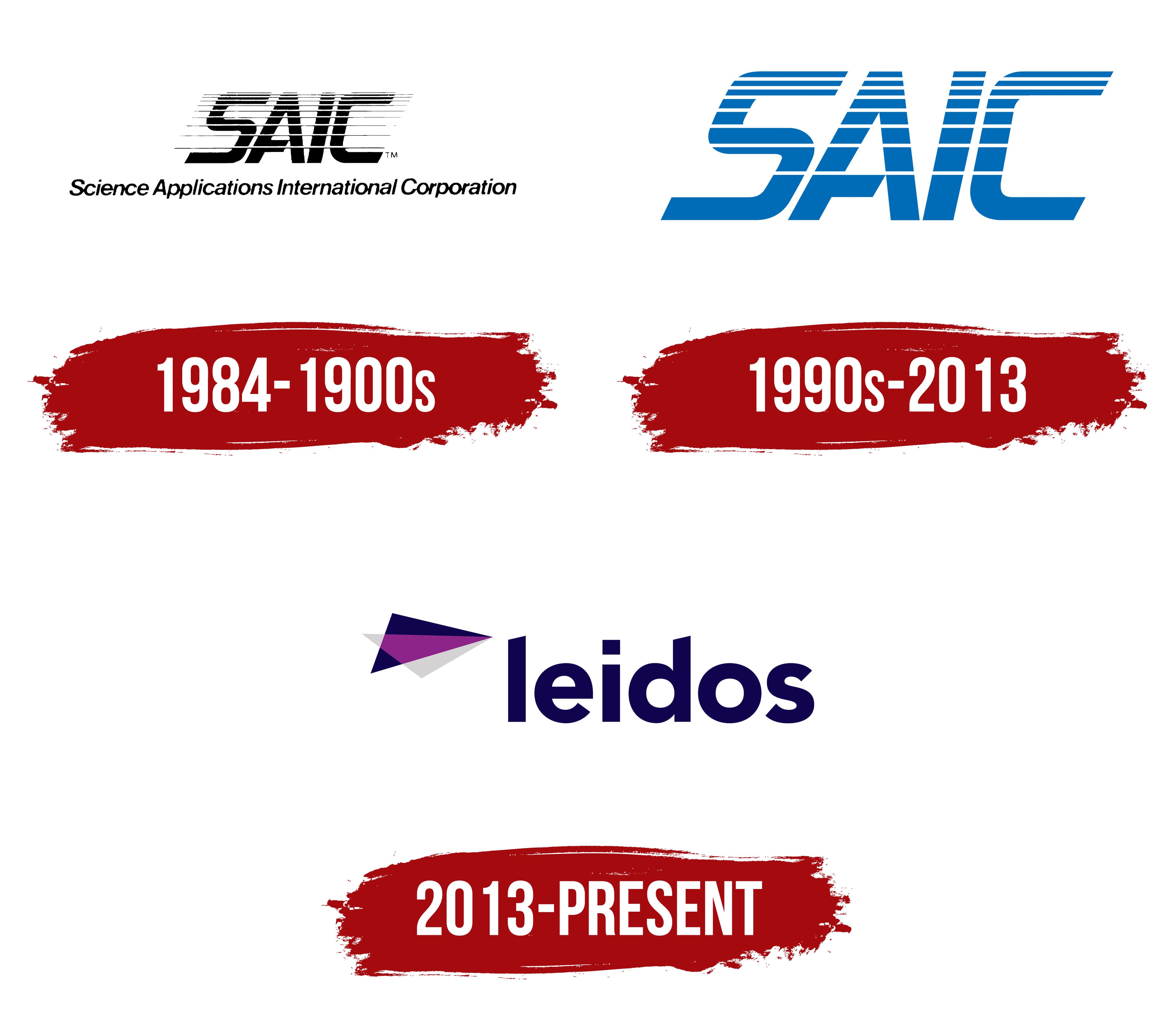
1984 – 1900s
The company that preceded Leidos began in La Jolla, California, on February 3, 1969. Physicist J. Robert Beyster founded Science Applications Incorporated, commonly known as SAI. The company conducted scientific research and completed engineering projects for U.S. government clients. Under Beyster’s model, employees owned the company’s stock.
The organization later became Science Applications International Corporation and adopted the abbreviation SAIC. Leidos considers the 1969 company the predecessor of its present business. The first confirmed use of its corporate logo dates to 1984, 15 years after the company was established. A large SAIC abbreviation occupied the upper part of the composition, with the full name beneath it.
The letters “SAIC” were black, uppercase, and slanted to the right. Their heavy extended style resembled Eurostile Extended and Microgramma Bold Italic. Numerous thin horizontal lines crossed all four letters at even intervals. They divided the black surfaces into narrow strips and brought the abbreviation together as a dense, technology-oriented construction.
The line “Science Applications International Corporation” appeared beneath SAIC. It used a thin black italic sans-serif typeface. The smaller lower inscription spelled out the abbreviation with the full corporate name. The heavy striped initials formed the upper level, while the light italic line occupied the lower one. Both parts followed the logo’s horizontal layout.
1990s – 2013
The long line “Science Applications International Corporation” was removed, changing the logo’s hierarchy and leaving the large SAIC abbreviation. The initials became blue and increased in scale. The full corporate name disappeared from the composition, allowing four letters to represent the company.
The uppercase characters had wide, heavy strokes and tall proportions. The entire wordmark leaned to the right. Straight lines with slightly rounded corners formed the letters. Their construction resembled Microgramma and Eurostile Extended.
Thin white stripes crossed the upper portions of the “S,” “A,” “I,” and “C.” They cut through the blue surfaces, creating a sequence of openings within the word. Parallel rows of light lines brought the abbreviation together into one form. The treatment continued the approach used in the previous SAIC mark.
The abbreviation occupied the logo’s full height. Its slant, extended forms, and white cuts joined the four characters into a compact wordmark. Blue replaced black, while the linear motif from the earlier version remained part of the updated identity.
2013 – today
The Leidos name appeared before the SAIC separation was completed. The new brand needed to distinguish a large part of the business from the former corporation and give it an independent identity. In August 2012, SAIC management announced plans to create two publicly traded companies. The technical, engineering, and corporate information services business would retain the historic SAIC abbreviation. The national security, healthcare, and engineering technology operations would receive a different name. The project carried the internal designation “Gemini.” The reorganization reduced conflicts of interest that had limited the divisions’ access to government contracts.
SAIC hired Interbrand to develop the new name. Its specialists conducted about 50 employee interviews and considered approximately 3,400 options. Following legal review and testing in international markets, the company selected Leidos, a shortened form of “kaleidoscope.” The kaleidoscope image represented cooperation among different disciplines, ideas, and approaches. The process took about 18 months. SAIC spent approximately $1 million on Interbrand’s services.
Interbrand prepared 10 logo options. The final version used an abstract figure to illustrate the name’s origin. A layered shape made from two triangles appeared to the left of the wordmark. Their overlap created a third colored area, while the right-facing points resembled a prism or faceted wedge. The upper surface used a dark blue-purple tone, the lower surface was light gray, and the overlapping area was bright magenta. The designers associated the triangular geometry with change, the overlapping layers with a kaleidoscope, and the combination of different approaches. Magenta distinguished Leidos from defense contractors, which generally used different color schemes.
The lowercase word “leidos” appeared on the right in rounded dark blue sans-serif letters. Medium-weight strokes, flowing contours, and a lowercase initial connected the name with the geometric figure. Together, they formed a horizontal corporate signature. The layered figure represented the name’s origin. At the same time, the short wordmark identified the company in materials intended for customers, employees, and government partners.
The separation took effect on September 27, 2013. The former SAIC, Inc. became Leidos Holdings, Inc., while Science Applications International Corporation became Leidos, Inc. The spun-off technical and information technology business began operating independently under the historic name Science Applications International Corporation. Leidos retained a legal connection with the company established by J. Robert Beyster in 1969. The Leidos name and identity emerged through Project Gemini.
The company kept the logo after it expanded in 2016. On August 16, Leidos completed its combination with Information Systems & Global Solutions, formerly owned by Lockheed Martin. The transaction nearly doubled the business. IS&GS employees and divisions joined the organization under the Leidos brand, which retained its existing logo.
The identity program covered emblem guidelines, corporate templates, training materials, and brand management. Leidos completed the work with Implementation Management Partners. The identity development received a silver award in the technology, media, and telecommunications category at the 2024 Transform Awards North America. The corporate creative program received a bronze award.