 Live Nation Entertainment Logo PNG
Organizing a concert requires coordinating the venue, ticket sales, technical support, and artist management. Behind stadium and club performances is a system that integrates tour management, event promotion, and venue infrastructure management. The Live Nation Entertainment logo represents a company that organizes concerts, sells tickets, and manages concert venues in various countries.
Live Nation Entertainment’s history began in the 1960s. At that time, media magnate Robert Sillerman began buying radio stations and concert venues. In 1996, he founded SFX Entertainment. It united regional promoters and became the largest live events operator in the United States.
In 2000, Clear Channel Communications acquired SFX for $4.4 billion. After the deal, the company renamed the concert division Clear Channel Entertainment. In 2005, the company was spun off as a separate entity under the Live Nation brand. The CEO was Michael Rapino.
Starting in the mid-2000s, the company entered a period of growth. The company signed contracts with famous artists, including Madonna and Jay Z. At the same time, it acquired major concert venues. In 2007, Live Nation purchased the House of Blues club chain and the British promoter Festival Republic.
In 2009, the company announced a merger with Ticketmaster, the largest ticket seller. After the deal was approved in 2010, the company formed a new entity, Live Nation Entertainment. It combined concert organization and ticket sales within a single system.
The company later expanded through a series of acquisitions. In 2011, it purchased Front Line Management Group. In 2012, the company acquired Big Day Out. In 2013, AC Entertainment joined. In 2016, it merged with OCESA Entertainment. In 2018, it acquired ScoreMore Shows. The company also invested in the Bonnaroo and Rock in Rio festivals.
In 2021, Live Nation expanded its digital segment by acquiring the live-streaming platform VEEPS. In 2022, Argentine promoter DF Entertainment joined the company. In 2023, the structure faced criticism after Ticketmaster failures during ticket sales for Taylor Swift’s tour.
Today, the company holds leading positions in the global live entertainment market. It combines concert operations, ticketing services, and venue management.
Meaning and History
What is Live Nation Entertainment?
The largest international live entertainment company was created by merging a concert promoter and a ticketing market leader. It controls most global ticket sales and operates more than 200 venues, including stadiums, arenas, and House of Blues clubs. Every year, it organizes tens of thousands of events and sells hundreds of millions of tickets. The main business areas include concerts and festivals, ticket distribution through online platforms, and sponsorship projects.
2010 – 2017
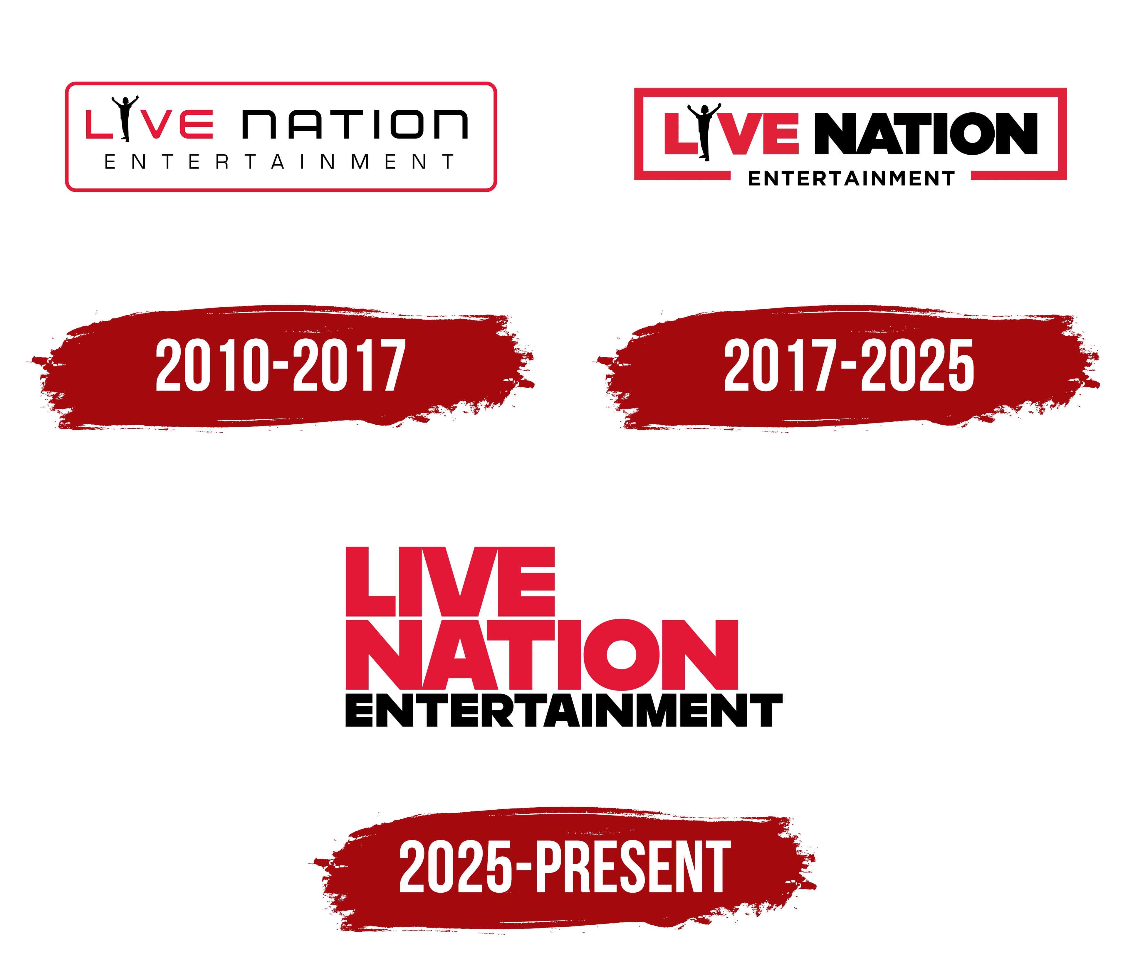
In the Live Nation logo used beginning in 2010, a concertgoer with raised arms replaced the letter “I.” The brand guidelines called the figure “Fan Man.” The letters “L,” “V,” and “E” were red, the person remained black, and “NATION” continued the line in black letters. The pose resembled a concert audience member’s reaction and connected the company’s name with the live entertainment experience.
The Live Nation Entertainment corporate signature had two levels. “LIVE NATION” occupied the upper line, while “ENTERTAINMENT” appeared below in thin black uppercase letters. The lower inscription extended across the width of the main name. An elongated red frame with rounded corners surrounded the composition. Brand guidelines established its proportions to maintain a consistent format across different applications.
Gotham Ultra formed the basis of the lettering. Its shapes were modified for the final wordmark, creating a custom set of letters derived from the Gotham family. Heavy sans-serif characters in the upper line were paired with the thin “ENTERTAINMENT” inscription. “NATION” appeared in uppercase, although the shape of the “N” resembled a lowercase letter. The system included a horizontal signature with Fan Man, a separate letter-based version, and a vertical arrangement for narrow formats. Red, black, and white served as the primary colors.
The company began as SFX Entertainment, founded in 1997 by Robert F. X. Sillerman. The business consolidated concert promoters and venues across the United States. Clear Channel Communications acquired SFX in 2000 and transferred its assets to the Clear Channel Entertainment division. Five years later, the entertainment business separated from its parent group and became a publicly traded company. It adopted the Live Nation name on December 21, 2005. Its shares began trading on the New York Stock Exchange under the ticker “LYV” on December 22. The name referred to the live events industry and replaced the Clear Channel Entertainment corporate identity.
The “ENTERTAINMENT” line became part of the corporate logo following the merger with Ticketmaster Entertainment. The transaction closed on January 25, 2010. On the same day, Live Nation, Inc. legally became Live Nation Entertainment, Inc. The new name reflected the combination of Live Nation’s concert business, Ticketmaster’s ticketing infrastructure, and relationships with artists. Both brands continued operating commercially under their existing names within the combined group. The two-level logo represented the merged company to investors, partners, and business audiences.
2017 – 2025
By 2017, Fan Man still replaced the letter “I” in “LIVE,” while the Live Nation Entertainment corporate signature had become more compact. The large “LIVE NATION” name occupied the upper line, with the smaller “ENTERTAINMENT” below. The red, black, and white color scheme maintained continuity with the company’s previous identity.
“LIVE” consisted of heavy red sans-serif letters. A black silhouette of a person with raised arms replaced the “I.” The pose resembled a concertgoer’s gesture and connected the emblem with the audience at live events. “NATION” appeared in black uppercase letters of similar weight. Both parts occupied the same upper line and shared the same height.
“ENTERTAINMENT” moved closer to the main name. Its black uppercase letters became more tightly spaced than in the earlier version while remaining smaller and lighter than “LIVE NATION.” The line break separated the commercial Live Nation brand from the full corporate name Live Nation Entertainment. Gotham Ultra remained the basis of the lettering.
The red frame became thicker, and sharp corners replaced the rounded ones. Its outline enclosed both lines and closed the composition along the sides. A gap in the middle of the lower border provided space for “ENTERTAINMENT.” The revised proportions brought the lettering and Fan Man together in a compact, elongated block suited to corporate materials and partner communications.
2025 – today
Live Nation introduced an updated logo in May 2025, restoring a conventional letter “I” to the word “LIVE.” Fan Man, the concertgoer with raised arms, had previously occupied its place. The red frame was removed in favor of an open layout. The corporate signature moved away from a narrative emblem and adopted a heavy typographic construction centered on the company name.
Live Nation developed the new system with the New York studio Mrs&Mr. Designer Holden Kao joined the agency team. The project was created for the group’s many divisions, international tours, and new programs. Shared guidelines coordinated the identity across countries and formats associated with concerts, artists, and live event audiences.
The name is arranged in two large lines. “LIVE” occupies the upper row, while “NATION” appears below and matches its width. Tight spacing brings the words together in a compact block surrounded by open space. A smaller “ENTERTAINMENT” inscription below the main wordmark provides the complete corporate name. All letters are uppercase, sans serif, and heavy, with broad, even strokes. Restoring a standard “I” gave the word “LIVE” a consistent typographic structure.
Mrs&Mr retained red, black, and white but changed how the colors were distributed. Black took the leading role, while red continued to appear in accents and communication materials. The single-color logo uses solid black. In the combined version, “LIVE NATION” is red and the lower “ENTERTAINMENT” line remains black. Multiple versions allow the logo to appear in corporate materials, divisional programs, and international tour branding.