 Martin Marietta Logo PNG
The Martin Marietta logo emphasizes the company’s innovation, utilizing advanced technologies and offering next-generation building materials. The emblem reflects the strength, reliability, and high quality of the brand’s products.
Martin Marietta traces its roots to 1909, when Glenn L. Martin founded the Glenn L. Martin Company in Santa Ana, California. The firm began as an aircraft manufacturer and later moved to Los Angeles in 1912. Military contracts during World War I supported its early expansion and helped turn it into a recognized aviation producer.
In the 1920s and 1930s, the company built bombers and seaplanes for military and commercial use. During World War II, production increased sharply as the Glenn L. Martin Company supplied the United States armed forces with the B-26 Marauder and other aircraft. After the war, the business moved into missiles and space technologies, which became one of its main directions in the 1950s.
In 1961, Glenn L. Martin Company merged with American Marietta Corporation, a producer of chemicals and construction materials, forming Martin Marietta Corporation. During the 1960s and 1970s, the company worked on spacecraft, launch vehicles, and equipment for NASA. One of its major projects was participation in the Viking program, which sent spacecraft to study Mars.
In the 1980s and 1990s, Martin Marietta expanded in aerospace, defense, electronics, and information technologies. In 1993, it acquired General Electric’s aerospace electronics division. In 1995, it merged with Lockheed, forming Lockheed Martin. In 2006, the building materials business was separated as Martin Marietta Materials. After the 2014 merger with Texas Industries, the company grew through deals with Bluegrass Materials, Lehigh West Region, Tiller Corporation, and Lehigh Hanson West Region. In 2022, it set a 30% emissions reduction target for 2030, followed by SOAR 2025 in 2023.
Meaning and History
What is Martin Marietta?
It is an American company specializing in manufacturing and supplying construction materials, primarily aggregates such as crushed stone, sand, gravel, cement, and concrete. The company serves various markets, including infrastructure, commercial, residential, and industrial construction projects. It is known for its quality, customer service, and providing materials required for the construction and maintenance of infrastructure. In addition, the company operates in other sectors, such as magnesia chemicals and lightweight aggregates, and is a key player in the construction industry across the United States.
1961 – 1995
Martin Marietta was created by the merger of the American-Marietta Corporation and the Glenn L. Martin Company, but chose not to adopt either visual identity. It was important for the newly formed company to assert its independence from its predecessors, so designers developed a unique logo that remained in use until 1995.
This emblem had a futuristic look, as Martin Marietta’s operations were tied to future technologies: the corporation was involved in the development of spacecraft, missiles, unmanned aerial vehicles, and experimental aircraft. The aerospace manufacturer reflected its commitment to progressive technologies and innovative engineering solutions in its branding.
The slanted shape of the letter “M ” suggests the company’s innovation, conveying a sense of rapid flight. It also conveys the idea of progress, improvement, and continuous forward motion. Above it, a parallelogram is slightly offset to the right, aligning with the angles of the “M” and appearing as a natural extension of its diagonals. This design makes the four-sided figure seem to fly quickly, not following the glyph but pulling it along.
Designers intentionally placed the large “M” at the center of the emblem, as both words in the company’s name begin with this letter. The parallelogram can also be interpreted as the top horizontal of a “T,” tying this abstract shape directly to Martin Marietta.
The logo’s foundation is a large black circle. Its color evokes a sense of seriousness and gravity, helping to establish the image of a stable brand. The internal elements are white, the color of innovation and stability. They contrast with the dark background, making the design as striking as possible.
The emblem’s dynamic elements serve as a visual metaphor for flying planes, rockets, and spacecraft. Without using specific thematic symbols, the designers conveyed the company’s connection to the aerospace industry and its significant ambitions, which unfortunately did not fully materialize.
1995 – today
In 1995, the original Martin Marietta ceased to exist after merging with Lockheed Corporation. Together, they formed a new aerospace manufacturer named Lockheed Martin. Interestingly, the Lockheed Martin logo features a five-pointed star, a symbol of quality, success, and great potential, which echoes the emblem of the Glenn L. Martin Company, one of Martin Marietta’s predecessors.
The modern emblem features not a classic star but a creative interpretation. There are only two complete points, while the others are left unfinished. This creates the appearance of an incomplete pattern formed by two sharp angles that point in opposite directions and intersect at three points.
The star is intentionally presented in this form because its sharp lines are filled with energy, especially the longest horizontal stroke. These lines resemble speed lines trailing behind something in motion. In this case, they represent the company’s military aircraft, spacecraft, missiles, and UAVs. The abstract emblem effectively emphasizes their speed and swiftness.
To reflect Lockheed Martin’s key areas of operation, the designers made the star blue, which symbolizes trust, stability, and safety, and is also associated with the sky. Unlike the graphic symbol, the brand name is rendered in a neutral gray, which gives the logo a serious appearance. This grayness doesn’t come across as dull; instead, it highlights the discipline of a company that develops high-tech solutions for the defense and aerospace industries.
The “LOCKHEED MARTIN” text is in bold, italicized sans-serif font. It resembles Univers 85 Extra Black Oblique, a versatile typeface combining formality with dynamism. The capital letters appear substantial due to their thick lines, but the noticeable slant adds a sense of lightness. On the one hand, this conveys the brand’s authority and strength, while on the other, it symbolizes a drive toward progress.
2014 – today
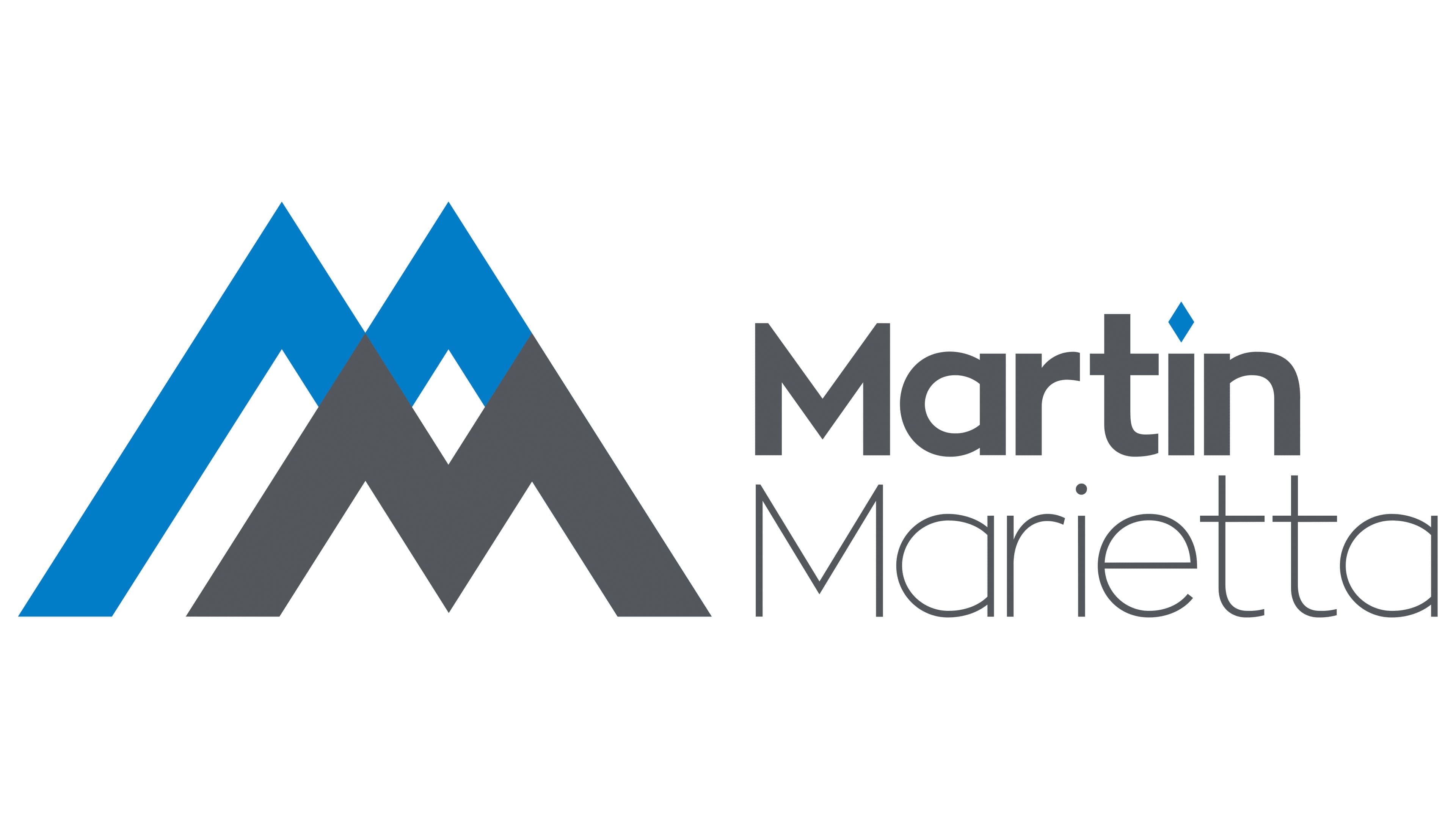
This logo belongs to Martin Marietta Materials, which spun off from Lockheed Martin in 1996. The company is unrelated to the aerospace industry and focuses on selling aggregates for concrete, such as gravel, sand, and crushed stone. Therefore, its emblem features a stylized depiction of quarries that extract natural construction materials.
The designers approached the task creatively, playing with the two “M”s that begin the brand name. A smaller gray “M” is in the foreground, partially covering a larger blue “M” behind it. Their right diagonals align, symbolizing support and cooperation. This suggests that the American company is ready to assist its customers by supplying the necessary aggregates for building foundations, sidewalks, roads, and bridges. The connected lines also evoke a sense of strength, hinting at the materials’ reliability.
Both “M” s have tall, sharp peaks with a steep incline. The central part of the gray letter extends down, touching an imaginary boundary with its pointed angle. Some may think this represents stylized mountains, but the designers depicted deep quarries, giant pits from which Martin Marietta extracts loose construction materials. The colors were chosen intentionally:
- Gray is associated with asphalt, concrete, and cement, which the company produces.
- Blue symbolizes technological progress and evokes a sense of calm.
Additionally, this palette demonstrates the brand’s historical connection to Lockheed Martin, as blue and gray were also used in its logo. These two colors complement each other, creating a pleasing visual contrast.
Next to the stylized “MM” abbreviation is its full form: the “Martin Marietta” inscription. The words are split into two lines, left-aligned, giving the logo a structured and formal appearance. The designers used two different fonts for the company name, connected only by the absence of serifs. Otherwise, they are distinct:
- “Martin” is in a bold sans-serif font with clean lines. This font conveys simplicity and seriousness, emphasizing the professionalism of the construction materials supplier.
- “Marietta” is composed of thin, delicate letters that appear light and elegant. It stands out from the logo’s overall geometry, drawing attention.
Both parts of the text are gray except for one detail, a small blue diamond. This is placed above the “i” instead of the usual round dot, highlighting the font’s modern character. It’s a decorative element and a carefully designed accent that makes the emblem easily recognizable. The diamond’s straight lines create a sense of precision and stability, which is crucial for a construction materials manufacturer.