


The bee is among the oldest and most beautiful symbols associated with harmony, perseverance, and creativity. In many cultures, it has been revered as a messenger of the gods, bringing well-being and prosperity. This tiny creature can create a true masterpiece, honeycombs, a unique natural structure of perfect geometry. Therefore, the bee symbolizes order, teamwork, and mutual support.
In Logos, the bee is popular among a wide range of companies, from luxury fashion houses and cosmetic brands to sports clubs and food manufacturers. Brands use it to emphasize the natural origins of products, the skill of their employees, or team spirit. The bee symbol helps communicate that quality, precision, and responsibility have been invested in a product or service for customers.
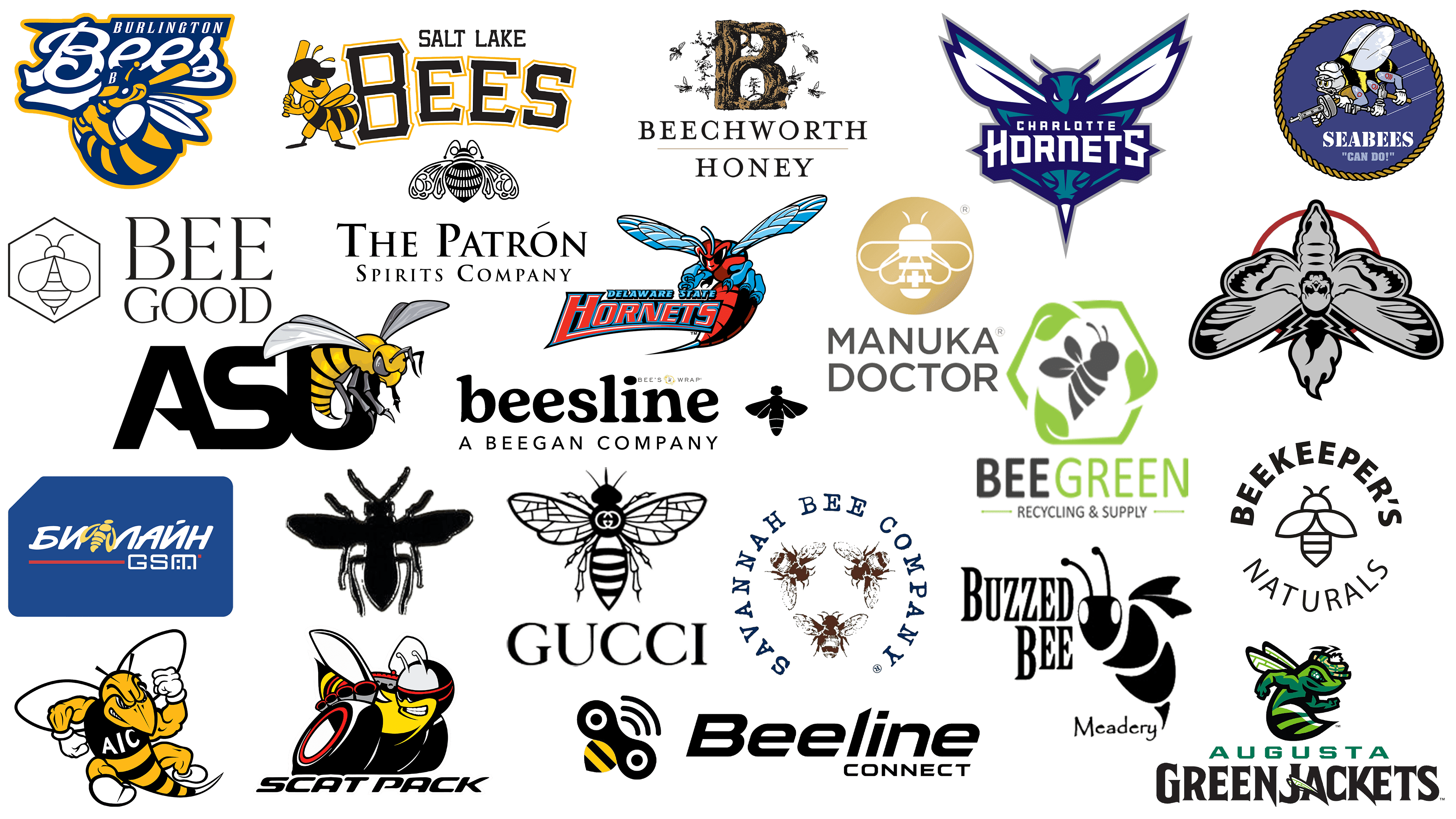
Despite its attractiveness and deep symbolism, the bee image is not the most widespread in design. Perhaps this is because not every brand manages to integrate it organically into its visual style. However, the companies discussed in this article have done so extraordinarily well. They use the bee in their logos creatively and subtly, adding charm and meaning and transforming the insect into the true face of their brand.
Dior
![]()
The bee in Dior’s logo is directly connected to the history of Christian Dior, who was deeply fond of bees and drew inspiration from them in his creative work. The couturier often described his atelier as a hive and his assistants as hardworking insects creating magnificence together with him. The brand chose a graphic bee depicted in strict black lines, emphasizing sophistication and haute couture. The geometric style symbolizes diligence, order, and harmony, which are characteristic of the brand.
Salt Lake Bees
![]()
The sporty character of the Salt Lake Bees is conveyed through a cheerful yet serious bee aiming to send a baseball flying beyond the field. The insect wears a stylish baseball cap and tightly grips a bat, showing readiness to play. The black and yellow colors underscore the team’s confidence, combining athletic excitement and vibrancy. The brand name adds dynamism and team spirit to the logo, with large geometric letters that reinforce associations with victories and a competitive attitude.
Beeline Connect
![]()
Through the bee image, Beeline Connect demonstrates dynamism and modern technology. The emblem offers an interesting solution: instead of an insect’s head, wave-like communication lines create associations with signals and connectivity. The striped black-and-yellow segment of the bee’s body complements the brand’s overall perception as technologically oriented and mobility-focused. The pointed letter “L” in the name resembles a bee’s stinger, amplifying the company’s feeling of speed and determination.
Charlotte Hornets
![]()
The energetic hornet in the Charlotte Hornets logo reflects the team spirit and fast-paced style of the North Carolina basketball players. The bee’s appearance is aggressive and assertive: sharp wing angles, bold lines, and cool shades of blue and teal intensify the sense of power and dynamism typical of NBA teams. The hornet symbolizes decisiveness and defensive and offensive skill, emphasizing the playing style of Charlotte’s basketball players.
Beekeeper’s Naturals
![]()
The visual style of Beekeeper’s Naturals conveys the simplicity and clarity of the brand’s ideas. The outlined bee figure, neatly centered within the composition, symbolizes the purity and the naturalness of the company’s products. A modern, strict font encircles the image, emphasizing contemporary approaches and a commitment to quality. The logo expresses transparency and openness, emphasizing care for consumers and the environment.
Bray Wyatt
![]()
The emblem of the wrestler Bray Wyatt has a dark, mystical atmosphere. The bee image is transformed into something frightening and mysterious. A black-and-white depiction of a bee with red accents evokes anxiety and mystery, reflecting the wrestler’s persona and his charismatic, often eerie characters. This symbol emphasizes Wyatt’s style, outlaw image, and being outside conventional perception, helping distinguish the wrestler among WWE’s many vivid personalities.
Manuka Doctor
![]()
Manuka Doctor uses the bee image in its logo, connecting it to the renowned healing properties of manuka honey, which made the brand famous. The bee is depicted with thin white lines inside a gold circle, creating a sense of premium quality and tranquility. The harmony of graphic lines and the restrained elegance of the font highlight the natural origins and high quality of the brand’s products, suggesting a commitment to health and beauty rooted in natural resources.
Buzzed Bee Meadery
![]()
The Buzzed Bee Meadery logo features stylish, refined graphics. The black-and-white depiction of a bee is concise and graceful, emphasizing the meadery’s traditional and authentic character. Next to it is the company’s name, set in a strict, neat typeface, while “Meadery” is in a light, airy handwritten style. The bee symbolizes the drink’s origins and the care that goes into making honey-based beverages, conveying a sense of naturalness and attention to detail.
Augusta GreenJackets
![]()
Augusta GreenJackets chose an unusual image, a green bee. The strange, slightly fantastical coloring evokes venomous insects, emphasizing the excitement of sports competition. The character in the logo looks lively and energetic, gazing forward, and the cap hints at distinctive local elements. Green and black stripes on the body blend seamlessly with the dynamic letters of the name, creating an image filled with competitive spirit and baseball enthusiasm.
Beeline 2002
![]()
Beeline is a telecommunications brand owned by VimpelCom. The bee in its logo is rendered in soft, smooth yellow lines that flow seamlessly into the brand name. The symbol closely aligns with mobile communication services, suggesting a unified network that brings users together, much like bees in a hive. The entire concept emphasizes the brand’s core idea: connection and communication.
Alabama State Hornets
![]()
The Alabama State Hornets’ bee conveys the athletic spirit and assertiveness of Alabama’s university teams. The insect appears aggressive and confident, perched atop the letters “ASU,” highlighting the team’s readiness for competition and victories. The bee’s black-and-yellow coloring symbolizes energy and activity. Teams united under this logo share a drive for leadership and notable achievements, expressed through the formidable yet appealing bee image.
Bee’s Wrap
![]()
Bee’s Wrap uses a bee to represent naturalness and environmental care. The thin lines of the bee and its wings harmoniously complement the elegant honeycomb, creating an airy, light symbol. The image is surrounded by a yellow honeycomb ring, visually connecting the name within a unified design. The brand’s overall imagery emphasizes the natural origin of its materials and an eco-friendly approach to product packaging, showcasing a delicate connection to the bee world and respect for nature.
Burlington Bees
![]()
The Burlington Bees sports team selected a bee image to showcase strength and athletic enthusiasm. The mascot, designed in vivid orange and blue tones, wears a baseball uniform and holds a bat, highlighting a fighting spirit and determination. The bee appears energetic and cheerful, symbolizing the team’s character, attitude, drive for victory, and competitive excitement. The brand’s name is set in a striking, dynamic style that complements the image’s liveliness and vibrancy.
Patrón Tequila
![]()
Patrón Tequila features an elegant bee illustration to highlight the natural origin of its products and the brand’s premium status. The delicate and precise patterns on the insect’s wings and body reflect the craftsmanship and attention to detail central to tequila production. The bee in Patrón’s logo evokes the natural ingredients, Mexican traditions, and the sunny atmosphere of Jalisco, where the beverage originated. It creates a festive, natural feel that aligns harmoniously with the product’s high quality.
Seabees
![]()
The U.S. Naval Construction Forces division logo, the Seabees, features an unusual image of a bee-soldier ready to accomplish any task. The bee, wearing military gear and a helmet and flying with tools in its hands, symbolizes speed, professionalism, and determination. The inscription “Can Do!” reflects the unit’s motto and underscores its ability to tackle the most challenging missions. A dark background and rope-like border add formality, enhancing the logo’s military and technical character.
Bombas
![]()
Bombas, a U.S. brand that produces socks and underwear, chose the image of a bee wearing a crown to express its social responsibility and the importance of caring for others. The bee’s blue hue is unconventional, setting the company apart from other bee-related brands. The crown above the bee symbolizes the brand’s noble mission: helping those in need through clothing donations. The brand actively supports community initiatives, assisting others with every product purchased, making the bee a symbol of care and solidarity.
Delaware State Hornets
![]()
The Delaware State University team’s logo features a hornet depicted in an active, combative pose. The vivid contrasting colors red and blue symbolize the energy, speed, and aggression necessary for victory in NCAA Division I athletic competitions. The Hornets’ spread wings underscore Delaware teams’ readiness to compete and demonstrate their character on the field and court. The image expresses resilience, team spirit, and the will to win characteristics of the university’s athletes, united by a common symbol: the formidable and brave hornet.
Beesline
![]()
Beesline has chosen a restrained style, depicting a bee created through the contrast of solid black shapes and thin white lines that neatly divide the insect into segments. The bee symbol is positioned alongside the name, which uses a soft, rounded font to convey the tenderness and naturalness of the brand’s cosmetics. The company manufactures products with bee-derived ingredients, and its logo conveys care and attention, naturally complementing the image of a nurturing, natural brand.
Scat Pack
![]()
Bright, powerful, and dynamic, the Scat Pack bee stands out from the rest. Dodge selected a hornet to highlight the aggressive nature of the Charger and Challenger cars. In the logo, the insect transforms into a fierce racer, wearing striking racing goggles and a helmet, which reflects the spirit of speed and excitement. The colors used, black, red, and yellow, intensify the feeling of energy, power, and adrenaline for which the brand’s vehicles are renowned.
Bee Green Recycling
![]()
Bee Green Recycling uses the bee to convey care and responsibility toward nature. The gentle contours of the insect and the leaves forming a hexagon around it recall nature’s recycling cycle and harmony. Themes of rebirth and renewal unite the bee’s wings and leaves. The green shade of the symbol and lettering complements the company’s environmentally friendly character, making its image more friendly and trustworthy.
Gucci
![]()
Gucci drew inspiration from Italy’s history and traditions, borrowing the bee from the coat of arms of the ancient and influential Barberini family. Originally, the coat of arms depicted horseflies, but Gucci opted for a more noble insect representing perseverance and diligence. The bee in the logo is meticulously drawn, highlighting the brand’s refinement and status. The symbol reflects the company’s pursuit of excellence, becoming an emblem that connects luxury with respect for heritage.
Bee Good
![]()
Bee Good uses minimalist sophistication to convey the naturalness and purity of its products to the audience. The outlined bee enclosed within a hexagon replicates the honeycomb shape, creating a harmonious symbol of gentle care for nature. The lightness of the lines emphasizes the brand’s commitment to simplicity. The name is written in an elegant serif font, accentuating the aesthetic image and enhancing the perception of high-quality, natural products.
Savannah Bee Company
![]()
Through its logo, Savannah Bee Company tells a story of close ties to nature and careful respect for beekeeping traditions. Three gracefully depicted bees, positioned inside a circular frame of letters, resemble an antique engraving. The warm brown hue highlights the natural origin of the company’s products and its ecological focus. Bees in this emblem symbolize diligence and respect for natural processes, while the blue typewriter-style text lends harmony and completeness to the composition.
AIC Yellow Jackets
![]()
The bee in the AIC Yellow Jackets team logo presents an intriguing paradox: aggression combined with humor. With yellow-and-black stripes, a sports jersey bearing the letters “AIC,” and a bold smile, the insect appears ready to enter the ring for a match against its opponent. The winged character shows confidence in victory, and its muscular limbs underscore determination and readiness for battle. This combination of irony and fighting spirit gives the team distinctive recognition, making it a fan favorite.
Beechworth Honey
![]()
Beechworth Honey has an unusual logo that portrays a brand closely connected to nature and the craft of beekeeping. The main symbol, a letter “B” resembling a tree around which bees flutter, adds liveliness and naturalness to the composition. The graphics are detailed, rendered in natural brown shades, and surrounded by small black bee figures, hinting at honey gathering in its natural environment. The brand emphasizes its origin, associating its products with authenticity and respect for nature.
Conclusion
Logos featuring bees embody vibrant symbolism, combining nature, organization, and collective interaction. Companies choosing the bee as their symbol aim to express respect for nature and tradition, emphasize internal discipline, or highlight team unity. The bee inspires brands to tell stories of care and creativity, adding warmth and emotionality to their logos. Visual imagery featuring bees is memorable because it appeals to universal meanings familiar to everyone: hard work, honesty, and cooperation. That is why brands using the bee symbol are perceived not as formal, but with affection and trust, earning genuine audience loyalty in return.