 New Holland Logo PNG
The New Holland logo embodies the spirit of innovation that drives agricultural machinery manufacturers to invent high-tech systems such as Opti-Clean, Sensitrak 4WD, SuperSteer, and Opti-Fan. At the same time, the emblem symbolizes the commitment to developing and improving the agricultural sector.
New Holland began in 1895 in New Holland, Pennsylvania, where blacksmith Abram Zimmerman opened a repair shop for local farmers. In 1899, he developed a portable feed mill, followed by a stone crusher in 1907 and a self-propelled forage harvester in 1926. After surviving the Depression, the company introduced a mechanical hay baler in 1940.
Sperry acquired the business in 1947 and financed expansion into Europe during the 1950s and 1960s. In 1964, the brand was combined with Belgian manufacturer Claeys, broadening its machinery range and European presence. The 1970s brought a twin-rotor combine. Ford Motor Corporation bought Sperry’s agricultural division in 1986 and merged it with Ford Tractor Operations as Ford New Holland.
In 1991, FIAT acquired 80 percent of Ford New Holland, bought the remaining shares in 1993, and renamed the company New Holland NV. The 1999 merger with Case created CNH Global, one of the largest agricultural and construction equipment groups. It became CNH Industrial in 2013, while New Holland retained its name.
Recent launches included CR Revelation in 2014, T7 Heavy Duty in 2015, the Methane Power concept in 2016, FR Forage Cruiser in 2017, expanded PLM functions in 2018, and NHDrive automation with T8 Genesis in 2019. T6 Methane Power entered production in 2020, followed by CH Crossover Harvesting in 2021, updated T7 HD tractors in 2022, and a new PLM Intelligence system in 2023, alongside work on hydrogen and biodiesel machinery.
Meaning and History
What is New Holland?
It is a global brand of agricultural and construction equipment known for its wide range of equipment used in agriculture, construction, and related industries. The brand offers tractors, combine harvesters, balers, hay mowers, sprayers, and construction equipment, including loaders and excavators. The company is part of CNH Industrial, a leading manufacturer of capital equipment. It supports farmers and builders with reliable and efficient machinery that increases productivity and efficiency.
1895 – 2008
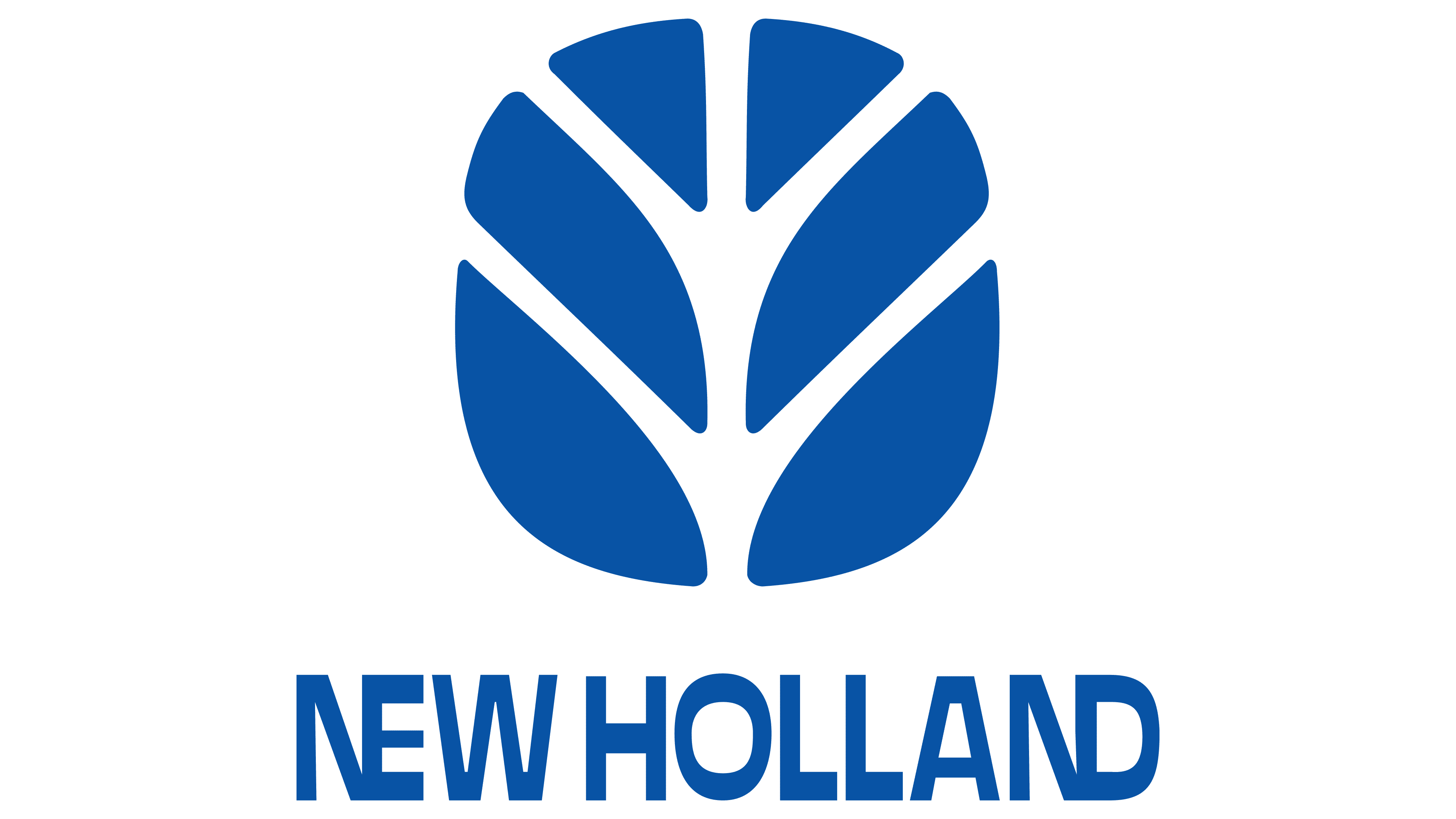
This logo was created in 1993, replacing numerous word marks and monograms that came before it. Its clarity, strength, and freshness reflected the evolution of the Italian agricultural machinery manufacturer. The emblem’s design is inspired by the Fiatagri brand symbol because, in the 1990s, the brand was affiliated with New Holland through their shared parent company, Fiat. The designers simply replaced orange with blue to achieve a sense of novelty.
The focus is on a stylized leaf, symbolizing life, growth, renewal, and a love for nature. It is depicted as six blue polygons arranged in pairs and divided by white lines. The design appears harmonious because the left side mirrors the right, like a reflection. Vertical symmetry is associated with stability and reliability, while the streamlined oval shape emphasizes the brand’s innovation and gives the logo a modern appearance.
Beneath the stylized leaf is the name “New Holland” in the same blue color. The inscription consists only of uppercase letters, which makes it look confident, powerful, and solid. It highlights the company’s reliability and the high quality of its products. The wordmark uses a minimalist font, reflecting the machinery manufacturer’s commitment to simple and effective solutions.
The glyphs are formed by straight lines with sharply defined angles at the ends. This geometric style makes the text more noticeable and well-suited to a representative of the engineering field, where precision, meticulousness, and strict adherence to standards are important. However, the font itself is not entirely standard, as the strokes of some letters vary sharply in thickness. Even the oval “O” appears convex, as its sides are too thin compared to the top and bottom.
The logo features very narrow spacing between the glyphs and the words. This reduces the legibility of the inscription but also increases the brand’s recognizability. To make the emblem more creative, the designers connected both “N” s with the adjacent “E” and “D.” The merged “NE” and “ND” combinations resemble complex structures, an abstract nod to New Holland’s agricultural machinery and innovative engineering solutions.
The deep, dark blue color also symbolizes progress. It is used for all logo elements as a unifying link that ties the text and image together. This color creates a sense of stability and confidence, fostering trust in the company’s products. The rich blue shade is also associated with quality, durability, professionalism, and modernity.
2008 – today
In 2008, New Holland’s branding underwent a radical overhaul that prompted a fresh perspective on the old brand. The logo’s structure became more complex with the addition of new elements. The only constant was the stylized leaf, shaped as six blue polygons. Though the pictogram was reduced and moved to the corner, it remains one of the company’s most important visual symbols.
The manufacturer of tractors, combines, self-propelled sprayers, and other agricultural machinery uses the leaf as a multifaceted symbol with several meanings:
- It represents the company’s connection to the agricultural sector, emphasizing its commitment to natural resources.
- The system of interconnected segments reflects the complex structure of New Holland, integrating various brands, including Fordson, Fiat Trattori, and Claeys.
- The leaf is associated with novelty and freshness, aligning with the international brand’s goal of creating innovative technologies to simplify farming tasks.
- The design resembles a tree with branches and a spreading crown, hinting at the company’s continuous growth, which is deeply rooted in the agricultural machinery market.
- The emblem reflects the rich heritage of the tractor and combine manufacturer, whose history dates back to the 19th century.
Thus, the leaf symbolizes growth and illustrates the unity of nature and technology, where modern innovations blend with agricultural traditions. Next is the inscription “NEW HOLLAND,” done in a new rectangular geometric font.
This is a bold, grotesque style featuring diagonal cuts at the base of the “L,” a slightly rounded “E,” and a unique “O” that mirrors the shape of the stylized leaf. The capital letters appear heavy due to their wide lines, but this visual weight does not detract from the impression, as it is associated with large and powerful vehicles. The word “AGRICULTURE,” in white at the bottom, has a completely different look. It consists of thin, sans-serif letters and appears elegant due to its smoothly curved lines. This part of the inscription balances the company’s name, preventing the logo from being overly bold.
The text and pictogram are placed inside a horizontal rectangle with rounded corners. The base is divided into two parts: a golden top and a blue bottom. They differ in color and texture, as the upper half of the emblem features a linear gradient. A light stripe transitions into yellow and orange, creating a sense of depth. The image appears shiny and convex, and the gold color characterizes New Holland as a progressive manufacturer of high-tech agricultural machinery.