 NN Logo PNG
Insurance and investment products include pension plans, savings, and long-term income protection. These services support future planning and personal finance management. The NN logo represents a company that provides insurance and investment solutions for private clients and businesses.
The company De Nederlanden van 1845 was founded in Zutphen. This event marked the beginning of NN Group’s history. Initially, the organization provided fire insurance and created its own volunteer fire brigades. In 1857, De Nederlanden opened an agency in Batavia.
In 1863, the city of Rotterdam saw the founding of Nationale Levensverzekering Bank. It became the first organization in the Netherlands specializing in life insurance. In 1880, the company introduced a group pension program. After World War II, both companies helped rebuild the country’s economy.
In 1963, the companies merged and adopted the new name Nationale Nederlanden. The merger created the Netherlands’ largest insurer. In the 1970s, the company began expanding beyond Europe, entering the markets of North America, Australia, and Japan.
In 1991, Nationale Nederlanden merged with NMB Postbank Group. This merger created ING Group. After the 2008 financial crisis, the insurance division was restructured into an independent entity called NN Group. In 2014, the company began trading on Euronext Amsterdam. In 2016, NN Group fully separated from ING and became independent.
In 2017, the company acquired Delta Lloyd. This deal strengthened NN Group’s position in the life insurance and pension markets. The client base grew significantly. In 2022, the company sold NN Investment Partners to Goldman Sachs for 1.7 billion euros. After that, NN Group focused its operations on insurance.
The company employs 15,000 people and serves 18 million clients. Its main areas of activity include life insurance, pension programs, and asset management. It operates in the Netherlands, Europe, and Japan. In the first half of 2025, NN Group achieved record results in operating capital generation. Customer satisfaction also increased, confirming business growth.
Meaning and History
What is NN?
A Dutch financial group based in The Hague, providing life insurance, pension programs, asset management, and banking services. It serves 18 million clients across Europe and Japan. The company originated from insurers De Nederlanden and Nationale Levensverzekering-Bank and later became part of ING Group. Its main business areas include insurance, asset management, and banking products. About 80 percent of revenue comes from insurance premiums, and assets under management exceed €300 billion. Goldman Sachs bought NN Investment Partners for €1.7 billion.
1970 – 1980s
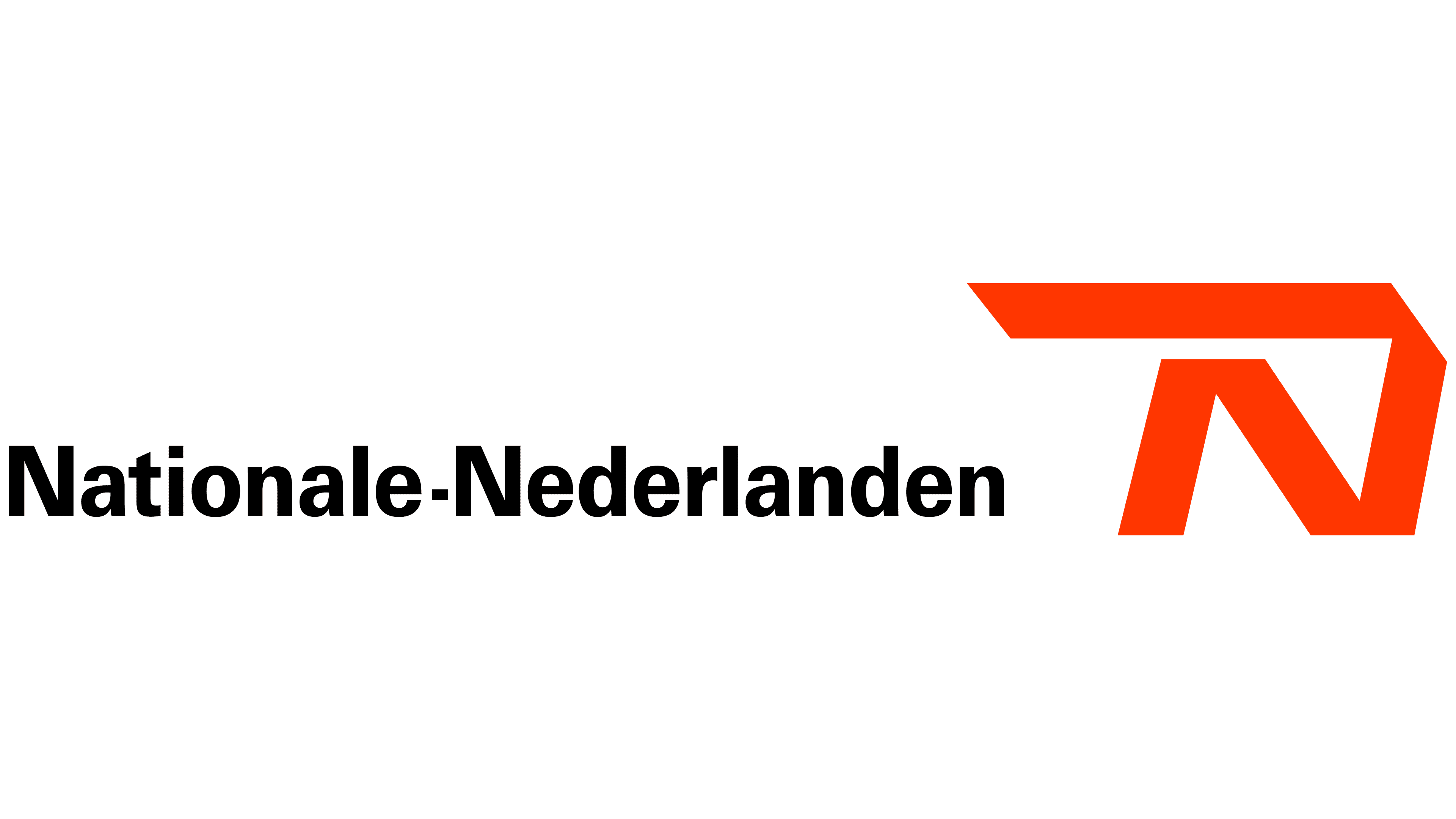
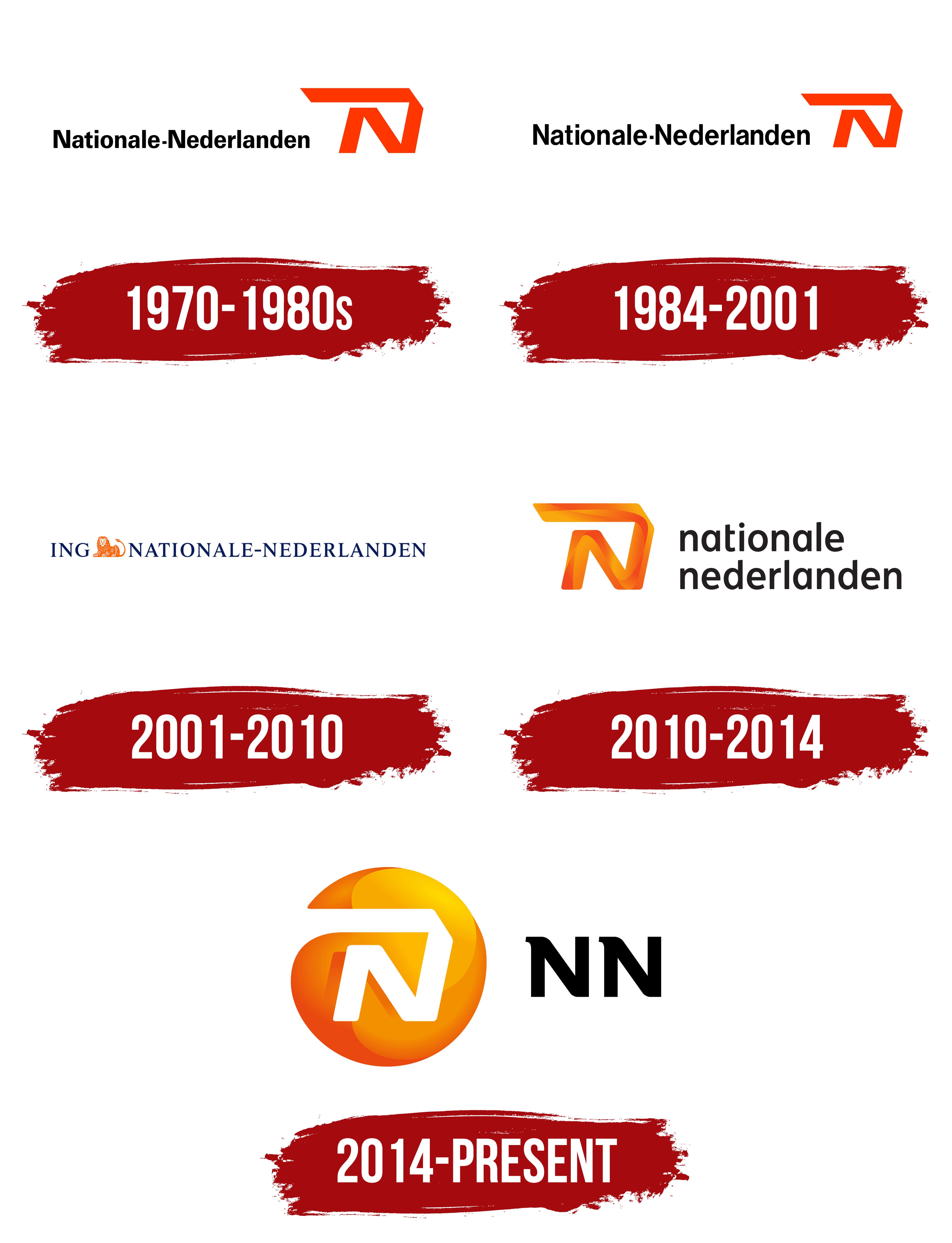
The orange “N” appeared seven years after the merger of two insurance companies and became Nationale-Nederlanden’s unified corporate signature. Introduced in 1970, the common identity replaced the former organizations’ separate branding and remained the brand’s foundation for many years. NN Group associates the rebranding from this period with the company’s growing presence in advertising and sponsorship programs.
The emblem appeared to the right of the full name and used vivid orange. Its shape consisted of an angular ribbon folded into the letter “N.” The upper stroke extended to the left, forming a long horizontal line above the lower section. A slanted leg connected with a diagonal stroke to create the monogram’s rigid geometry. Open ends suggested a continuous ribbon, while the plain background separated the figure from the text.
The black name “Nationale-Nederlanden” appeared on the left. It was set in Univers, an upright sans-serif typeface. Both words began with capital letters, followed by lowercase characters. A short hyphen at the center of the line connected the two parts of the compound corporate name. The restrained lettering balanced the large orange figure and kept the full name beside its abbreviated letterform.
The first company in the merger began in Zutphen on April 12, 1845. Gerrit Jan Dercksen and Christiaan Henny founded Assurantie Maatschappij tegen Brandschade, an insurance company specializing in fire damage. It later became De Nederlanden van 1845. The company provided insurance and promoted fire prevention. Its employees formed a volunteer fire brigade.
Nationale Levensverzekering-Bank was established in Rotterdam in 1863 and specialized in life insurance. It merged with De Nederlanden van 1845 in 1963. The combined organization became Nationale-Nederlanden, a name formed from parts of both companies’ names. Beginning in 1970, the shared name appeared with the orange “N” in customer materials, partner communications, and public advertising.
1984 – 2001
Nationale-Nederlanden adjusted the proportions of its corporate signature during the 1980s while retaining the orange “N” and horizontal arrangement. The changes affected the emblem’s letter size, spacing, and scale. The brand continued the identity introduced in 1970 with the same primary symbol.
The Nationale-Nederlanden name appeared on the left, while the orange “N” occupied the right side. The emblem became more compact, and its upper horizontal section grew tighter. The wordmark and figure formed an elongated block suitable for business materials, insurance documents, and outdoor applications.
The wordmark used Helvetica in a bold sans-serif style. The letters increased in size while maintaining tight spacing. The dense line balanced the broad upper section of the orange “N” and brought the long compound name together in one signature.
Nationale-Nederlanden merged with NMB Postbank Group in 1991. The merger created ING. The Nationale-Nederlanden name remained with the insurance division, while the banking operations adopted the ING name. The insurance business continued using its established brand with the orange “N.”
2001 – 2010
In the 2001 version, the ING lion replaced the orange “N.” The new emblem connected the insurance brand with its parent financial group. Nationale-Nederlanden retained its name, while the corporate identity adopted ING’s blue and orange colors. Designer Joop Bergmans created the version.
The composition used a single horizontal line. The dark blue letters “ING” appeared on the left, followed by an orange lion and the large name “NATIONALE-NEDERLANDEN” on the right. The animal separated the “G” from the initial “N” of the second name and served as the shared emblem. The inscription used uppercase serif letters set in Times New Roman with classic proportions and tight spacing.
The orange lion appeared in profile with its head turned left. White strokes crossed the massive body, depicting the fur and internal details of the silhouette. Its front legs extended forward, while the tail rose upward and curled at the end. A large mane defined the head within the elongated figure. The lion came from the ING identity and referred to the group’s Dutch origins.
The two names became connected after Nationale-Nederlanden merged with NMB Postbank Groep in 1991. The new holding organization was named Internationale Nederlanden Groep, later shortened to ING Group. The abbreviation “ING” comes from Internationale Nederlanden. Nationale-Nederlanden continued operating in insurance under its historic name.
2010 – 2014
After a period under the shared ING signature, the letter “N” returned as the foundation of the Nationale-Nederlanden brand. The 2010 update restored a separate emblem for the insurance company and introduced a new typographic system connected with the 1970 identity. Total Identity, later renamed Total Design, developed the project.
A stylized “N” made from an angular ribbon appeared on the left. Its upper section extended to the left and formed a horizontal overhang above the lower parts. A slanted leg connected with a diagonal stroke, repeating the structure of the historic monogram. The revised treatment gave the ribbon depth and a layered form.
The color transitioned from red-orange through rich orange to yellow. Translucent sections overlapped, while the changing shades separated the planes of the monogram. The flat “N” from the earlier period gained a three-dimensional appearance without losing its original angular structure or connection with the orange emblem introduced in 1970.
The name “nationale nederlanden” appeared on the right in two lines. “nationale” occupied the upper line, while “nederlanden” appeared below. Both words used lowercase black sans-serif letters aligned to the left. The two-level arrangement created a compact block beside the tall colored emblem. It appeared in materials for customers and partners.
2014 – today
Two black “N” letters beside an orange sphere became the insurance business’s signature as it transitioned from ING to an independent organization. The group introduced the short name on October 2, 2013. It launched the new identity on March 1, 2014, based on a project by Total Design. The abbreviation came from Nationale-Nederlanden and maintained continuity with the historic brand. Its short form suited international businesses operating under different local names.
NN emerged through ING’s restructuring after the 2008 financial crisis. The European Commission required the group to separate its banking and insurance operations. Insurance and investment businesses began moving into an independent organization with a new name and corporate identity. NN Group listed its shares on Euronext Amsterdam in 2014 and became publicly traded.
A circular figure appears on the left, with colors transitioning from red-orange to yellow. Translucent layers and changing shades give the sphere depth. White negative space inside forms an angular “N.” Its upper stroke extends to the right, then drops sharply and continues into a diagonal leg. The open interior repeats the structure of the historic Nationale-Nederlanden monogram.
Two large black letters, “NN,” appear on the right. They use a heavy sans-serif style with broad strokes. A short projection on the left side of both letters distinguishes the inscription from standard typesetting. The horizontal arrangement combines the circular colored emblem with a short name suited to markets using different languages.
The orange color and white “N” continued the Nationale-Nederlanden identity introduced during the 1970 rebranding. The spherical treatment separated NN Group from the earlier ING brands while preserving its historical connection with the insurance company. The corporate system centered on the principles “Care,” “Clear,” and “Commit,” established when the group became independent.
NN Group announced the transition of its international insurance divisions to the shared identity in February 2015. Most ING Insurance businesses began operating under the NN name. The Dutch Nationale-Nederlanden brand was aligned with NN Group’s identity. The transition took place in stages during 2015 and 2016. In the resulting structure, NN represents the group’s insurance businesses in several European countries and Japan. At the same time, Nationale-Nederlanden operates in the Netherlands, Poland, and Spain.