 Palm Logo PNG
The Palm logo is associated with a brand that was foundational to the modern mobile device era. It evokes the era of early handheld computers, which became a convenient part of daily life.
Jeff Hawkins founded Palm Computing in 1992, and it initially developed software for other companies’ devices, including Casio’s Zoomer and Apple’s Newton. The company’s first device, the Palm OS-running Pilot 1000, launched in 1996 after U.S. Robotics acquired it. The Pilot stood out for its affordable price and Graffiti handwriting input. In 1997, 3Com acquired the brand; the founders then left to start a competitor, Handspring, and released the Visor devices.
In 2000, Palm went public and briefly achieved a massive market capitalization, surpassing Apple and Amazon at the time. Following the dot-com crisis, Palm split into PalmSource (the operating system) and PalmOne (the hardware division). Shortly after, PalmOne acquired Handspring, reclaimed the Palm name, and released the successful Treo smartphones.
In 2009, Palm introduced the revolutionary multitasking webOS and the Palm Pre smartphone, but sales were limited due to an exclusive agreement with Sprint. In 2010, Hewlett-Packard acquired the brand, but it soon discontinued Palm devices and the webOS operating system. LG bought the OS rights, and TCL, a Chinese company, acquired the Palm brand. In 2018, TCL released a small smartphone under the old name, although it did not achieve significant success.
Meaning and History
What is Palm?
It was an American company and one of the first producers of handheld computers featuring handwriting recognition systems. Its products led the market due to their compact size and functionality. Later, the company released smartphones but failed to withstand competition and eventually ceased operations.
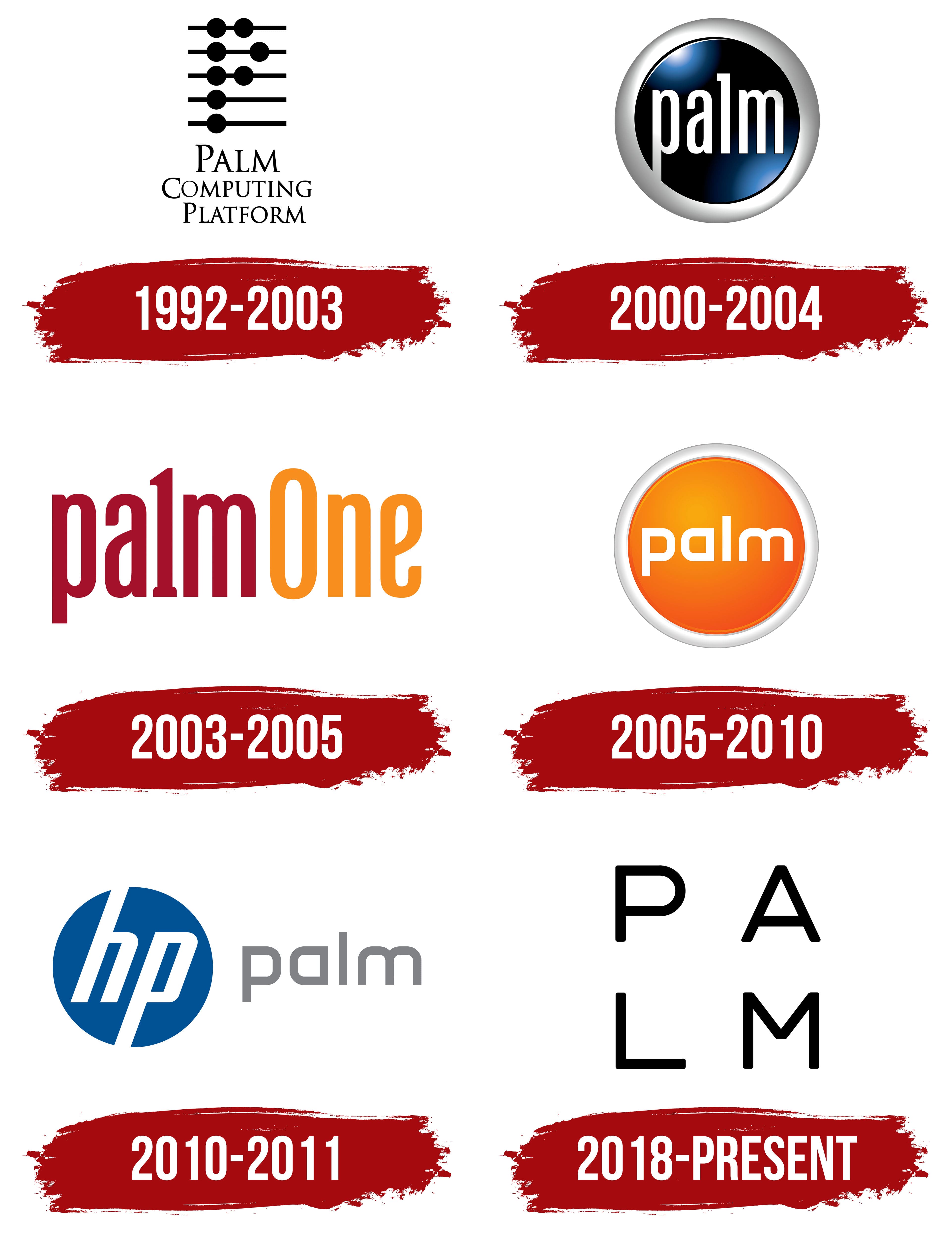
1992 – 2003
The brand began not with text but with a symbolic cipher. Five thin horizontal lines with black circles created a simple illusion holding a deeper meaning. Founder Jeff Hawkins designed it to represent digital technologies.
Two circles appeared on the first three lines, followed by one circle below. Together, they visually formed the letter “P,” the initial of “Palm.” The logo is simple yet intriguing, reflecting the brand’s innovative style.
Without the explanatory phrase “Palm Computing Platform” underneath, the brand message was hard to understand. The phrase appeared concisely below, emphasizing the platform’s foundational role. Minimalism and functionality highlighted the company’s advanced technology in its early years.
2000 – 2004
The company focused on modernity and a futuristic style rather than loud design. They chose a button-like style with a soft, metallic finish and a dark blue inner area. Visually, it resembled a round button on a high-tech device, reflecting the brand’s direction toward creating futuristic gadgets.
The word “palm” was set in a simple, unadorned font, emphasizing accessibility and user-friendliness. The only font accent was the elongated letter “l” with a small serif, providing subtle contrast with the other letters.
The blue color symbolized trust, stability, and technology, reflecting key brand values in the early 2000s. The metallic frame with a slight 3D effect reinforced innovation while maintaining practicality.
2003 – 2005
The design became simpler yet more expressive, emphasizing the new name. The combination of burgundy and orange colors reflected the brand’s warmth and uniqueness in the mobile device market. Abandoning the previous button-like style indicated a commitment to minimalism.
The brand name retained the previous sans-serif font but featured a modified letter “l,” resembling the numeral “1,” symbolizing leadership and unity after merging with Handspring. Adding the word “One” highlighted unity as central.
The logo redesign reflected the strategic shift following the 2003 merger. The new logo’s simplicity shows a focus on core elements, recognition retention, and a tradition of innovation.
2005 – 2010
The brand unexpectedly returned to the “button” style. The logo adopted a saturated orange color, highlighting the brightness and accessibility of the company’s digital devices. The round shape continued to symbolize ease of use, evoking the feel of a physical button.
The typography became concise and sans-serif, without smooth curves. White letters contrasted against the orange background. The color scheme symbolized optimism, enthusiasm, and technological advancement.
The return to “Palm” without the addition of “One” marked a new era. The new style aimed for a cleaner, simpler brand perception, reflecting the move toward contemporary mobile solutions and reinforcing the company’s market status in electronics and mobile devices.
2010 – 2011
After Hewlett-Packard acquired it, the brand adopted a corporate identity. The left portion featured HP’s round emblem in its signature blue. This symbol represented the new owner’s technological strength, merging HP’s technology with Palm’s mobile solutions.
The name kept its minimalist font, now in gray, appearing calm and businesslike. The bright “button” disappeared. The font color symbolized the shift from independence to inclusion within a major technology conglomerate.
This update was the brand’s last: Palm gradually integrated and then fully dissolved into HP’s product portfolio by 2011, leaving only a legacy in technological history and design.
2018 – today
The updated Palm logo marked the start of a new stage in the well-known technology brand’s history. The company abandoned its previous style and symbolism, adopting a simple, concise visual approach. The San Francisco studio Character created the design, which embraces contemporary minimalism.
The logo’s main image consists of four letters: P, A, L, M. They are arranged in a square, with two letters in the top row and two in the bottom row. The placement of the characters reflects the brand’s technological focus and reinforces the emphasis on compactness. Each letter sits at an equal distance from the others, creating a harmonious structure and symmetry.
The typeface used in the name is Lineto’s grotesque Brown. It is distinguished by simplicity and clean lines. Black conveys restraint and the company’s business profile, reflected in convenient digital devices and tools that simplify users’ everyday tasks.
The square text layout emphasizes convenience, order, and practicality. The new Palm logo is minimalist and clear.