 Pandabuy Logo PNG
The Pandabuy logo represents a platform that makes international shopping easy and accessible. It symbolizes the service’s flexibility, making it easier for sellers to deliver rare items to buyers.
Pandabuy was founded in 2017 in Hangzhou, China, as a platform that helps foreign customers shop on Chinese marketplaces, including Taobao, Tmall, 1688, and Weidian. The company operated with a small team, streamlining ordering and shipping processes for international customers.
By 2018, Panda Buy had opened its first warehouse in Huizhou, thereby accelerating logistics and implementing quality checks before shipping. In 2019, Panda Buy Ltd. was registered as a legal entity, significantly expanding its product and service offerings.
In 2021, Hangzhou Panda Technology introduced a mobile app that enabled customers to easily track their orders. The following year, the employee count rose to 2,200, and the company established warehouses in five Chinese cities.
In March 2024, a data leak affected 1.3 million platform users. In April of the same year, Chinese authorities raided the company’s premises and uncovered millions of counterfeit goods intended for overseas customers.
The consequences severely restricted the platform’s operations, effectively halting its business. In January 2025, a U.S. court lifted asset restrictions on Pandabuy, but the company never resumed operations.
Meaning and History
What is Pandabuy?
It was a Chinese online intermediary service for international shopping, popular among Western youth for affordable replicas of fashionable brands. After government intervention, the platform shut down, causing financial losses for users because orders went unfulfilled.
Old

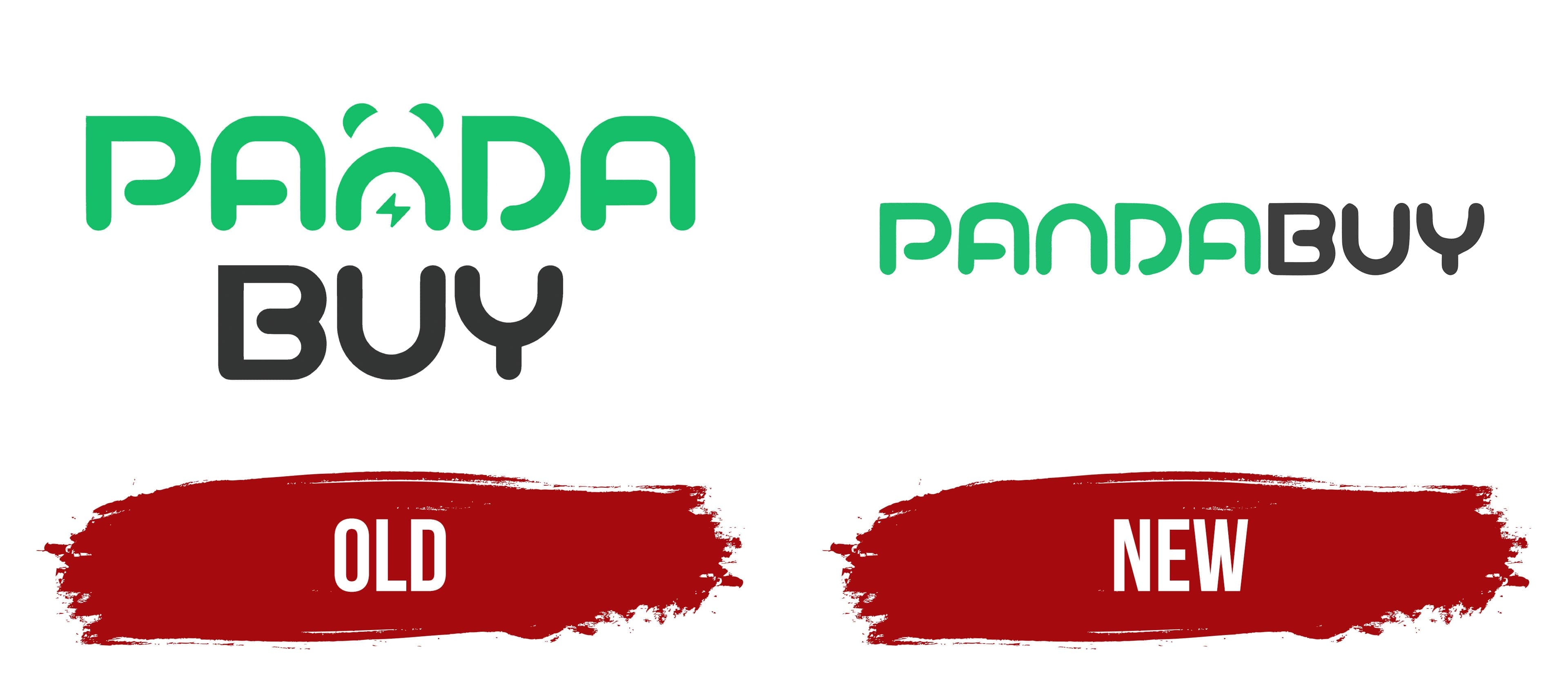
The Pandabuy logo reflects the company’s nature, combining online shopping with recognizable panda imagery. The logo features the company name arranged in a unique two-level format. On the upper level, the word “Panda” appears in green, rounded lettering. The letter “n” forms the visual profile of a panda, complete with distinctive ears at the top and a small lightning bolt in the center. The lightning symbol suggests the company’s speed and efficiency in e-commerce, implying fast delivery and prompt service.
The lower part, “Buy,” appears in dark gray in a simpler style that emphasizes the brand’s commercial aspect. The design conveys a friendly impression, presenting an accessible online service for purchasing a wide range of goods. The green-and-dark-gray color combination underscores the platform’s modern direction, blending the energetic feel of shopping with the reliability of online commerce.
New

The new version of the Pandabuy logo became concise and simple. The company abandoned the previous symbols in the composition, specifically removing the panda graphic and the lightning bolt integrated into it, leaving only the typography.
The platform name appears as a single inscription, PANDABUY, with the typeface taking center stage. The letters have soft, rounded contours and smooth lines. Color divides the word into two parts. The left half, “PANDA,” is rendered in a soft light green, while the right half, “BUY,” is in a dark gray.
The green color of the first part symbolizes the platform’s accessibility and openness. The gray of the second part creates a businesslike feel and emphasizes the brand’s commercial focus. The visual image became easy to perceive, highlighting the platform’s practicality.