 PLDT Logo PNG
Communication on the islands requires a robust infrastructure for data transmission, phone calls, and internet access across different regions. Cable lines, mobile networks, and digital services connect users and support daily communication and work. The PLDT logo represents a Philippine telecommunications company that provides communication services, broadband access, and digital solutions for residential and business customers.
PLDT was founded in 1928 as the Philippine Long Distance Telephone Company. American and Filipino investors, with support from General Telephone & Electric, established it. The company received a government franchise for domestic and international long-distance communication. This became the foundation for building the country’s communications system.
In the 1930s, the company built lines connecting Manila, Cebu, Davao, and Iloilo. During that period, it also installed undersea cables linking the Philippines with the United States and Japan. During the Japanese occupation from 1942 to 1945, the infrastructure was destroyed. Reconstruction began in 1945.
After the Philippines gained independence in 1946, the company continued to operate as a private entity. In 1967, PLDT was listed on the Philippine Stock Exchange. In the 1970s and 1980s, it modernized its networks and implemented digital systems.
In 1991, it established a subsidiary, Smart Communications. It became one of the country’s largest mobile operators. In 1999, Hong Kong-based First Pacific Company acquired a controlling stake in PLDT.
In the 2000s, the company invested billions of dollars in developing 3G and fiber-optic networks. In 2010, Japan’s NTT DoCoMo bought a 14 percent stake in PLDT for $2.5 billion. In 2011, it launched commercial LTE 4G service.
In 2016, following criticism from President Rodrigo Duterte, the company accelerated infrastructure development. In 2018, PLDT announced a program of annual investments exceeding $ 3 billion.
In 2021, PLDT began the commercial rollout of 5G networks. In 2022, it invested in undersea cable systems. In 2023, the company faced rising expenses. In 2024, PLDT expanded its fiber network and launched new digital services.
The company remains the largest telecommunications operator in the Philippines. Through Smart Communications, it provides fixed-line, mobile, and corporate services.
Meaning and History
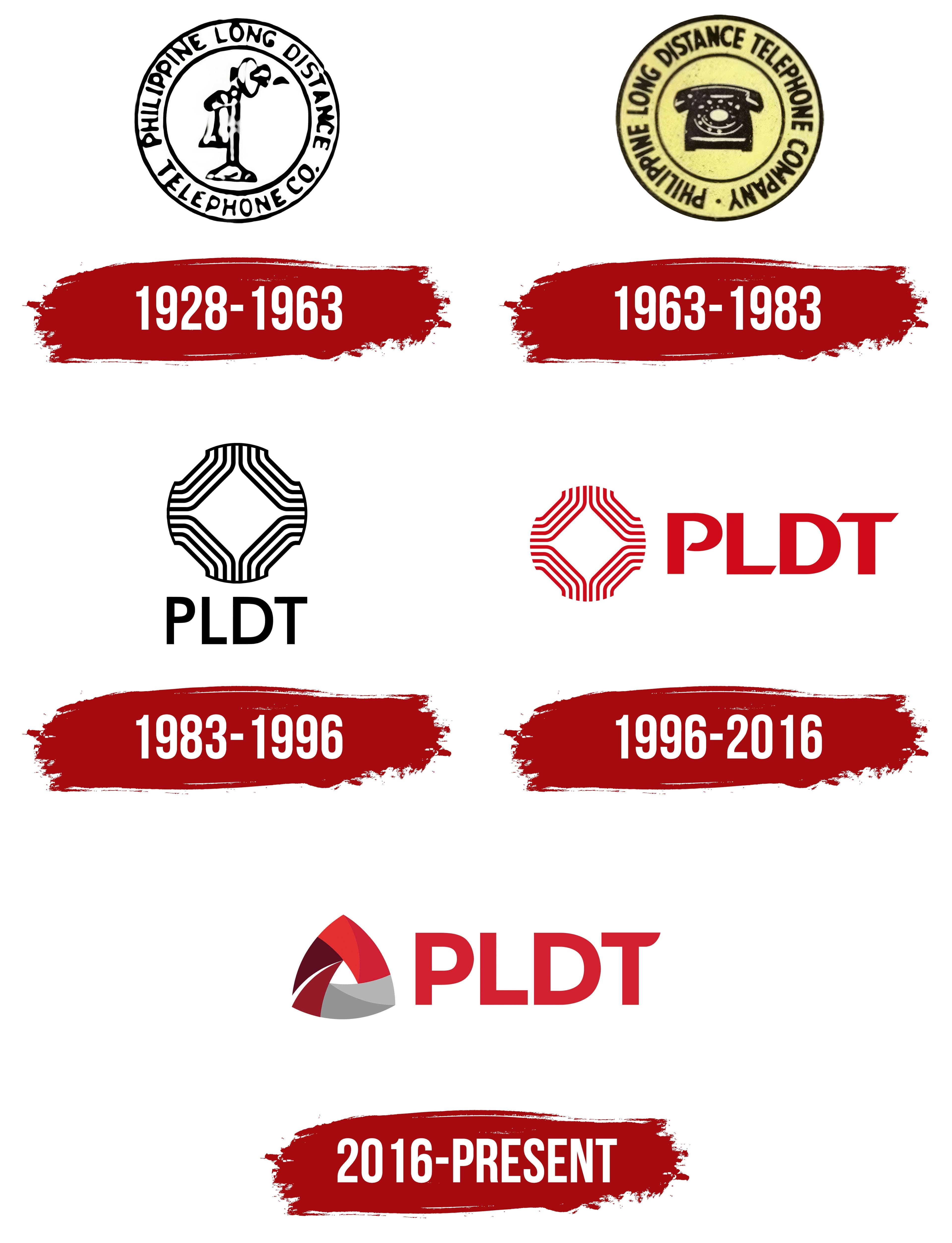
What is PLDT?
The largest telecommunications operator in the Philippines is headquartered in Makati, Manila. Founded in the late 1920s, it is controlled by First Pacific, Nippon Telegraph and Telephone, and JG Summit Holdings. It serves more than 70 million mobile users and about 2 million broadband internet subscribers. PLDT Home’s main areas of activity include fixed and mobile communications, digital services, and cybersecurity. The mobile division includes Smart Communications, TNT, and Sun Cellular. The group also includes media assets under MediaQuest Holdings and the fintech project Voyager Innovations.
1928 – 1963
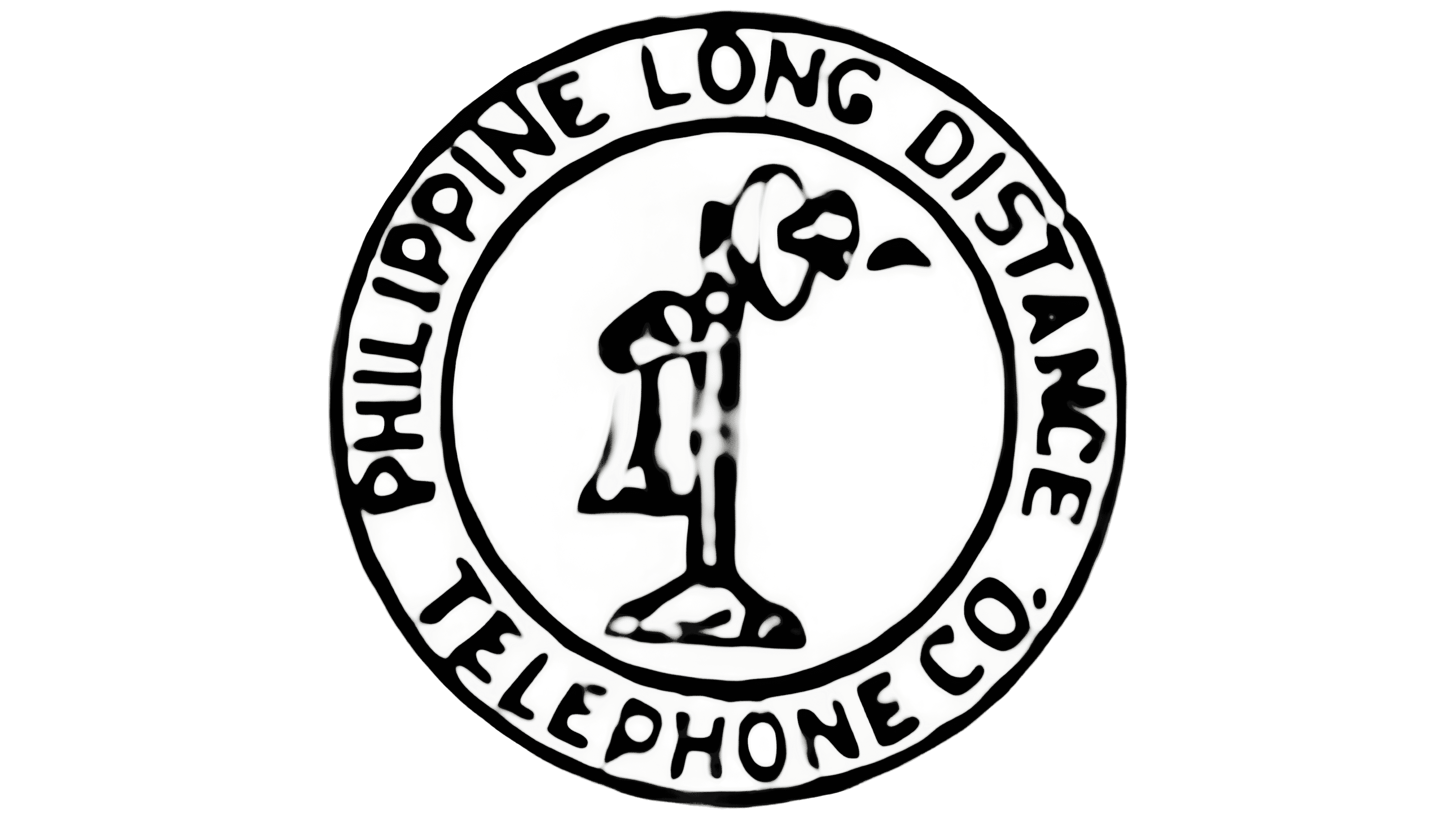
A candlestick telephone stood at the center of PLDT’s first emblem. A separate receiver hung from its side, and a flared mouthpiece sat at the top. Two rings surrounded the telephone. Between them, PHILIPPINE LONG DISTANCE TELEPHONE CO. followed the circular border. PHILIPPINE LONG DISTANCE occupied the upper portion, while TELEPHONE CO. appeared below. The sans-serif capitals and telephone illustration formed a seal-like design.
The full name described the company’s original purpose, providing long-distance telephone service in the Philippines. The company was established on November 28, 1928, through the merger of 4 telephone companies under shared American ownership. It connected communities located far apart. The operator later expanded into mobile communications, internet access, and digital services, preserving its historical name in the abbreviation PLDT.
The black telephone against a light background identified the company’s original line of business. Its silhouette used thick lines and uneven fills to depict shadows and highlights. The circular lettering spelled out the company’s full name, while the telephone illustrated its main service in its early years.
1963 – 1983
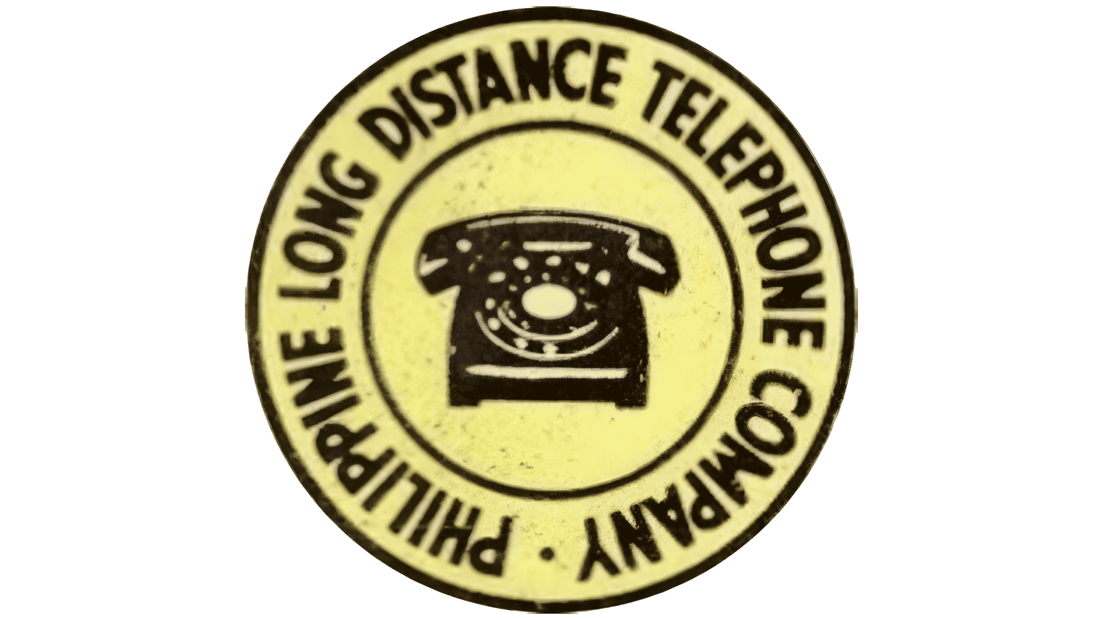
From 1963 to 1983, Philippine Long Distance Telephone Company used a circular emblem featuring a desk telephone. A substantial body with a rotary dial replaced the candlestick model. The handset rested horizontally across the top. The telephone was shown from the front. White lines within the black silhouette defined the dial, body details, and contours. The newer telephone model updated the image of communication within the existing circular emblem.
The name followed the ring between 2 black circles. PHILIPPINE LONG DISTANCE TELEPHONE occupied the upper arc, with COMPANY completing the lower portion. The abbreviated “Co.” was replaced by the full word “Company.” A small black dot separated the end of the wording from its beginning. Narrow, heavy sans-serif capitals followed the curve of the border. In the color version, the lettering and telephone appeared against a pale yellow background. The full company name described long-distance telephone service, while the central telephone represented the operator’s main offering.
1983 – 1996
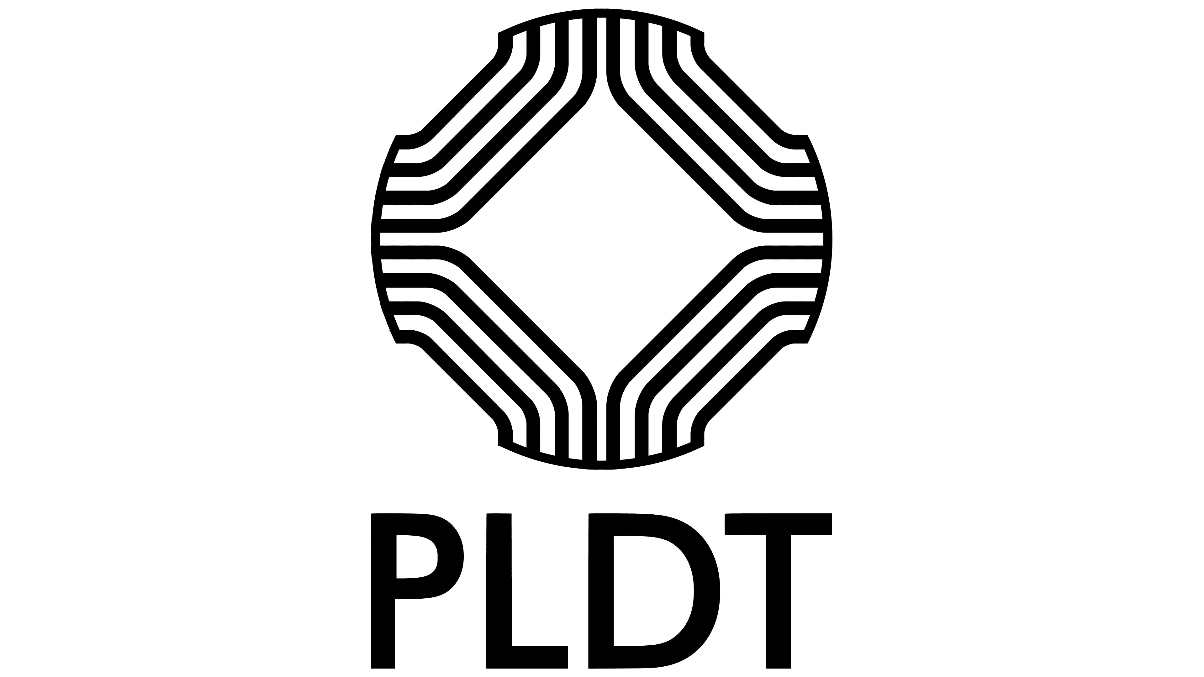
In 1983, Philippine Long Distance Telephone Company adopted the PLDT name and introduced a logo built around those 4 letters. The long circular inscription spelling out the company’s full name gave way to a large abbreviation beneath the emblem. The sans-serif capitals had thick, even strokes. The entire design was black. Design Systemat, the agency later renamed Systembrand, developed it.
Above the lettering were 4 identical modules, with their curves facing inward. Each module consisted of 4 parallel lines of equal thickness. Their smooth turns echoed the outline of a telephone handset. A white square remained open at the center, appearing diamond-shaped because the surrounding parts were arranged diagonally. The pattern’s outer edges formed a nearly circular silhouette. Repeated handset outlines replaced the detailed telephone illustration, maintaining a connection to PLDT’s telephone heritage.
1996 – 2016

For PLDT’s 68th anniversary in November 1996, the previously black logo became red and adopted a horizontal arrangement. The emblem of repeated handset outlines appeared on the left, with the abbreviation on the right. The company associated red with energy, warmth, friendliness, speed, and life. The enclosing outline was removed. The open edges expressed a willingness to embrace change amid global competition and the approaching new millennium.
The 4 groups of lines retained their diagonal arrangement around the square opening. Each group consisted of 4 parallel bands of equal thickness. Their curves faced inward, while their outer edges formed a rounded silhouette. Removing the outline left the band ends open, preserving the telephone handset motif.
The red PLDT lettering used large sans-serif capitals. Thick strokes were combined with angled cuts in certain sections. The lower portion of the “P” bowl was open. The ends of the “L” and the “T” crossbar were cut at an angle. The letters and emblem shared the same color. The angular lettering complemented the smooth curves on the left.
2016 – today
The 3 sides of PLDT’s new emblem represent employees, innovation, and customers. The triangle refers to the Greek letter delta, associated with change. Curved ribbons with rounded edges replaced the repeated handset outlines. Red, burgundy, and gray sections surround a small white opening. Overlapping ribbons and differences in shade give the figure depth.
The changes extended to the company’s name. In April 2016, the company removed “Long Distance Telephone” from its legal name, Philippine Long Distance Telephone Company. The name PLDT Inc. reflected the shift toward data services and the integration of fixed-line and wireless capabilities. The historical abbreviation remained, although its original expansion referred to long-distance telephony. On June 13, 2016, PLDT and its mobile subsidiary, Smart, introduced related logos at the Shangri-La Hotel in Makati. Group head Manuel Pangilinan attended the presentation. Their shared triangular shape expressed the closer relationship between the companies. Color distinguished the identities, with red for PLDT and green for Smart.
To the right of the emblem, PLDT appears in large red sans-serif capitals. In the revised lettering, the rounded bowl of the “P” was closed, the lower stroke of the “L” was cut straight, and the right end of the “T” crossbar gained a smooth curve. During the presentation, projection mapping displayed the new emblems on the PLDT building’s facade in Makati.