


 Popsicle Logo PNG
The Popsicle logo evokes a sense of fun and joy. The emblem, created in bright colors, grabs attention and instantly lifts the mood. Its circular shape symbolizes friendliness and invites everyone to enjoy a delicious treat. The vibrant shades remind us of the company’s various flavors, making the selection appealing to all ages. The logo also conveys the idea of togetherness, inviting friends and family to gather and enjoy sweet treats that make every moment special.
Popsicle began in Oakland in 1905, when 11-year-old Frank Epperson left water, sugar, and a stirring stick outside overnight. The frozen mixture became his “Epsicle.” He patented the idea in 1924 under the name Popsicle, then sold the rights to the Joe Lowe Company in 1925, enabling wider production, advertising, and distribution.
During the 1930s, the five-cent price helped sales through the Great Depression. Double-stick versions were marketed for sharing, while Fudgsicle appeared in 1939. Wartime sugar restrictions reduced output, but sales recovered after 1945. Creamsicle joined the range in the 1960s, combining vanilla ice cream with flavored ice.
Good Humor, controlled by Unilever, acquired the line in 1989. Lower-sugar and lower-calorie products followed in the 1990s and 2000s. A 105th-anniversary campaign ran in 2010, Popsicle Shots launched in 2011, and sugar-free products arrived in 2013. Packaging changed in 2015, while dragon fruit and passion fruit editions appeared in 2016. An online flavor-voting campaign followed in 2019.
The Fun Finder app arrived in 2020, Fruit Twisters in 2021, and the Centennial Collection in 2022 to mark 100 years since the patent. Cocktail-inspired, nonalcoholic flavors such as Mojito and Piña Colada appeared that year. In 2023, the Customizer platform let users create flavor combinations, while direct online sales expanded distribution and campaigns on Instagram and TikTok targeted younger consumers.
Meaning and History
What is Popsicle?
It is an American ice cream and frozen treats brand owned by Unilever. The brand name has become synonymous with ice cream, and “popsicle” is often used as a generic term for any frozen treat on a stick. The company offers frozen treats, including classic two-stick popsicles, single-stick varieties, and more complex frozen treats. The brand is known for its bright colors and fruity flavors, with cherry, orange, grape, and lime being popular. Over the years, the company has expanded its product line to include sugar-free options, creamy pops, and pops with characters that kids love. The brand’s treats are popular for their refreshing flavor, especially during the hot summer, and are often associated with childhood nostalgia. The company continues to innovate with new flavors and formats while maintaining its status as the favorite frozen treat brand in the United States.
1905 – 1941

The first Popsicle logo had a rather strict appearance, with a black rectangle as its base. This color likely symbolized night, the key to the product’s invention. On that night, 11-year-old Frank Epperson accidentally left a mixture outside on the back porch, and by morning, it had frozen, eventually leading to the creation of the frozen treat.
Although the ice pop idea originated in 1905, the logo appeared much later, when Epperson had children and decided to bring the frozen juice to market. The yellow lettering on the black background stood out clearly, and the pointed ends of the letters resembled ice crystals, emphasizing the product’s frozen nature.
The frozen treat was initially intended to be named “Eppsicle” after the inventor’s last name. Still, Epperson’s children insisted on a friendlier name, “Popsicle,” replacing part of the last name with “pop,” which added a family-oriented and warm character to the brand.
1941 – 1969
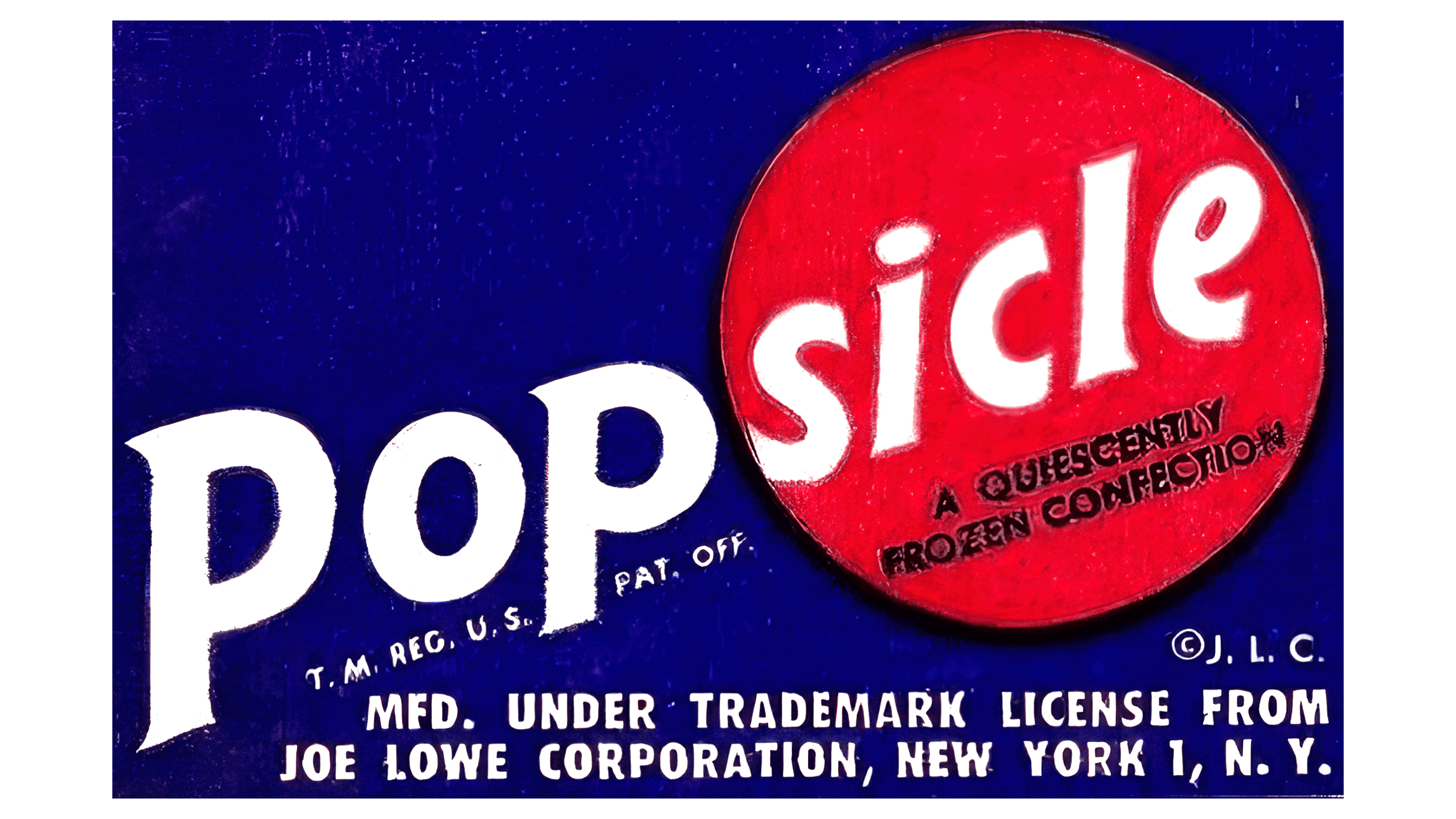
In 1941, the Popsicle logo changed after Joe Lowe Corporation acquired the brand. The dark blue background replaced the black, creating a more pleasant atmosphere associated with water and freezing. The blue shade symbolizes coldness and freshness, making the emblem appealing and calming.
A red circle, reminiscent of the product’s shape, was added to the top of the logo. This color highlights the rich flavor and hints at the presence of fruit ingredients. The red circle symbolizes a rising sun, reflecting the brand’s popularity and success. A descriptive inscription was added to the circle, indicating that Popsicle is a frozen confectionery treat.
The brand name was adapted to the new composition: the word “Pop” remains on the blue background, while “sicle” is placed inside the red circle. The gradual reduction in letter size creates an upward movement effect, symbolizing the brand’s ambition to reach new heights.
At the bottom of the emblem, information about the legal aspects of the product’s release is included, emphasizing Joe Lowe Corporation’s rightful ownership of the ice cream production. This inscription adds confidence in the product’s quality and authenticity, making the logo visually appealing and informative.
1969 – 1986
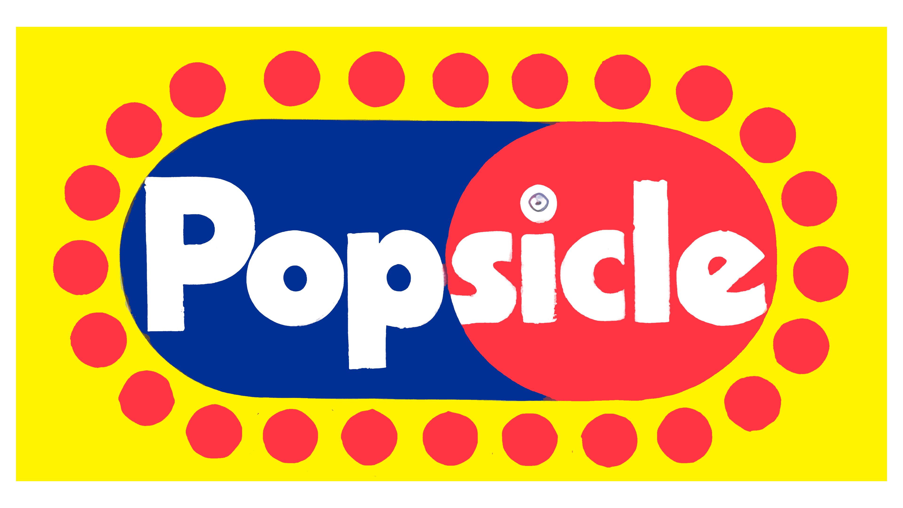
When Consolidated Foods Corporation acquired the Popsicle brand in 1969, it underwent a rebranding. The new logo became bright and attractive while retaining key elements of the previous design.
The composition is based on a vibrant yellow background, creating a festive mood and drawing attention. A cold, blue ice pop is turned toward the viewer, showcasing its bright red fruit filling. This visual accent highlights the product’s rich flavor and quality.
Surrounding the ice pop are red circles that seem to dance around the central element, emphasizing its uniqueness. These circles can be interpreted in various ways:
- As small portions of fruity sweetness are intended for consumers,
- As berries are used to make the juice for the ice pop,
- Or as ice chips cooling the product.
The ornament adds dynamism and livens up the image inside the dot of the letter “i.” A blue snowflake is depicted, symbolizing the ice pop’s cold, refreshing effect.
1986 – today
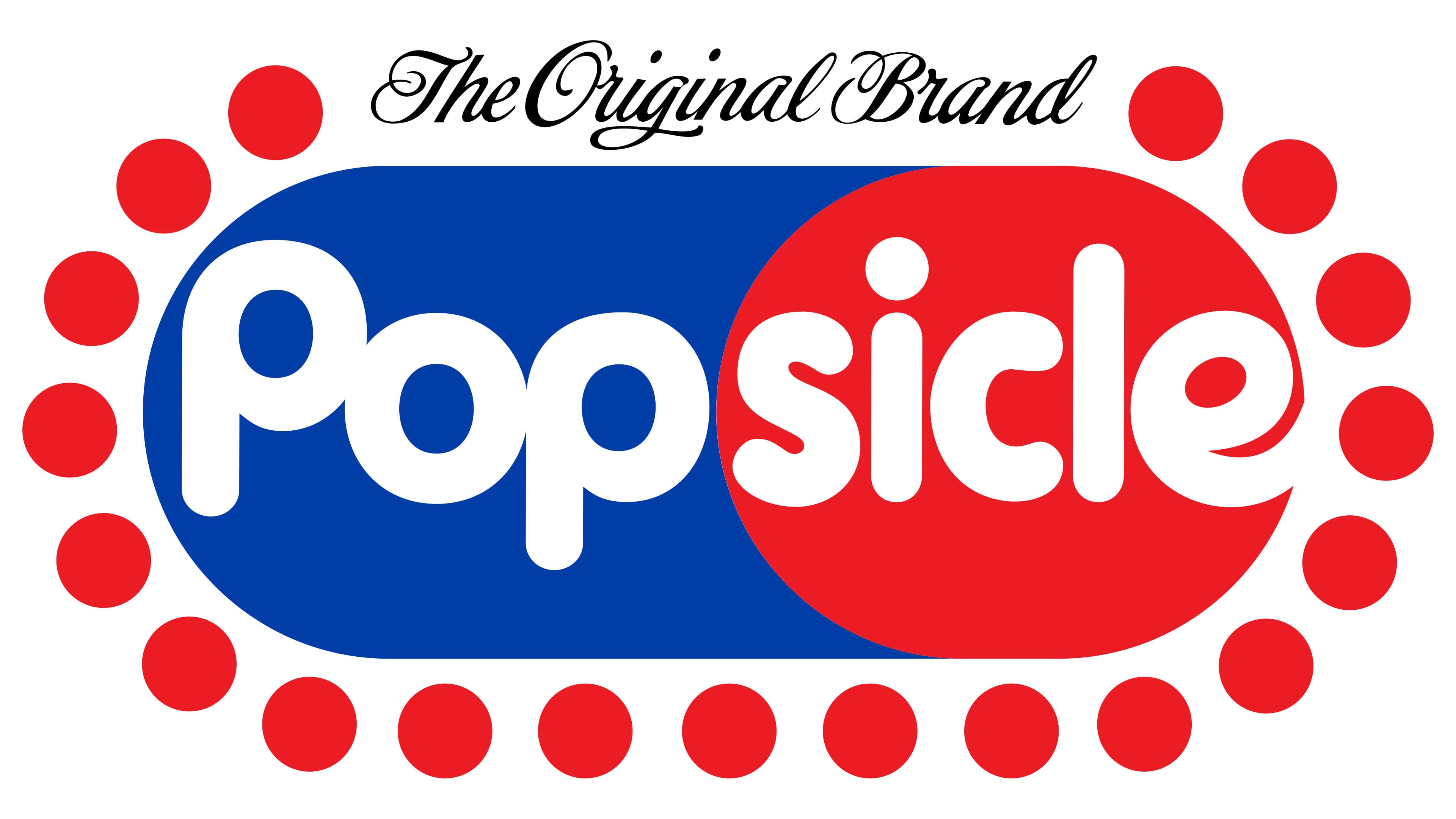
Since 1986, the logo has been updated to a more stylish and modern version. The background removal allowed the focus to shift to the main design elements. The rounded, smooth edges of the letters harmonize with the ice pop’s rounded shapes, creating a visually pleasing, balanced composition. The circles at the top of the logo were replaced with a cursive inscription that reads “Original Brand,” emphasizing the product’s long and rich history.
The design’s bright colors and clean lines point to time-tested recipes and high-quality ice cream, making the logo modern while maintaining a connection to the brand’s traditions.