


 Raisinets Logo PNG
The Raisinets logo is concise and conservative, conveying the company’s entire philosophy through the brand name alone. Designers highlighted the company’s reliability and customer focus with the bright nine letters. The vibrant, fire-red letters on a white background look striking, conveying confidence in the future and the company’s dynamic development.
Most importantly, they remind us that Raisinets’ delicious products are essential to watching a new movie in American theaters. The logo emphasizes Nestlé’s stable, authoritative position in the global market.
Raisinets began in 1927, when Blumenthal Chocolate Company of Philadelphia developed one of the earliest chocolate-covered-raisin candies. The company, founded in 1900, was already known for chocolate products, but pairing raisins with chocolate was still an unusual idea. The mix of sweet coating and the sharper fruit taste helped the product stand apart from other sweets of the period.
During the 1930s, Raisinets remained affordable throughout the Great Depression and maintained a place among buyers seeking inexpensive treats. In the 1940s, the broader candy market grew with wartime supply needs and demand from returning soldiers. By the 1950s, the product had become strongly linked with movie theaters, where its compact packaging and snack format made it common among cinema audiences.
In 1967, Ward Foods acquired Blumenthal Chocolate Company, opening the way for wider distribution. During the 1970s, television advertising helped keep the candy visible. In 1984, Nestle bought Raisinets from Ward Foods, bringing the brand under the umbrella of a larger food company with stronger marketing and production resources.
In the 1990s, the brand emphasized its fruit content as interest in healthier snacks increased. The 2000s brought cranberry-raisin versions and dark chocolate options, while the 2010s focused on more natural ingredients. Later updates included vintage-style packaging for the 93rd anniversary in 2020, sustainably sourced cocoa plans in 2021, Raisinets Trio with blueberries, cranberries, and raisins in 2022, recyclable packaging in 2023, and the “Raisin Through the Decades” online campaign in 2024.
Meaning and History
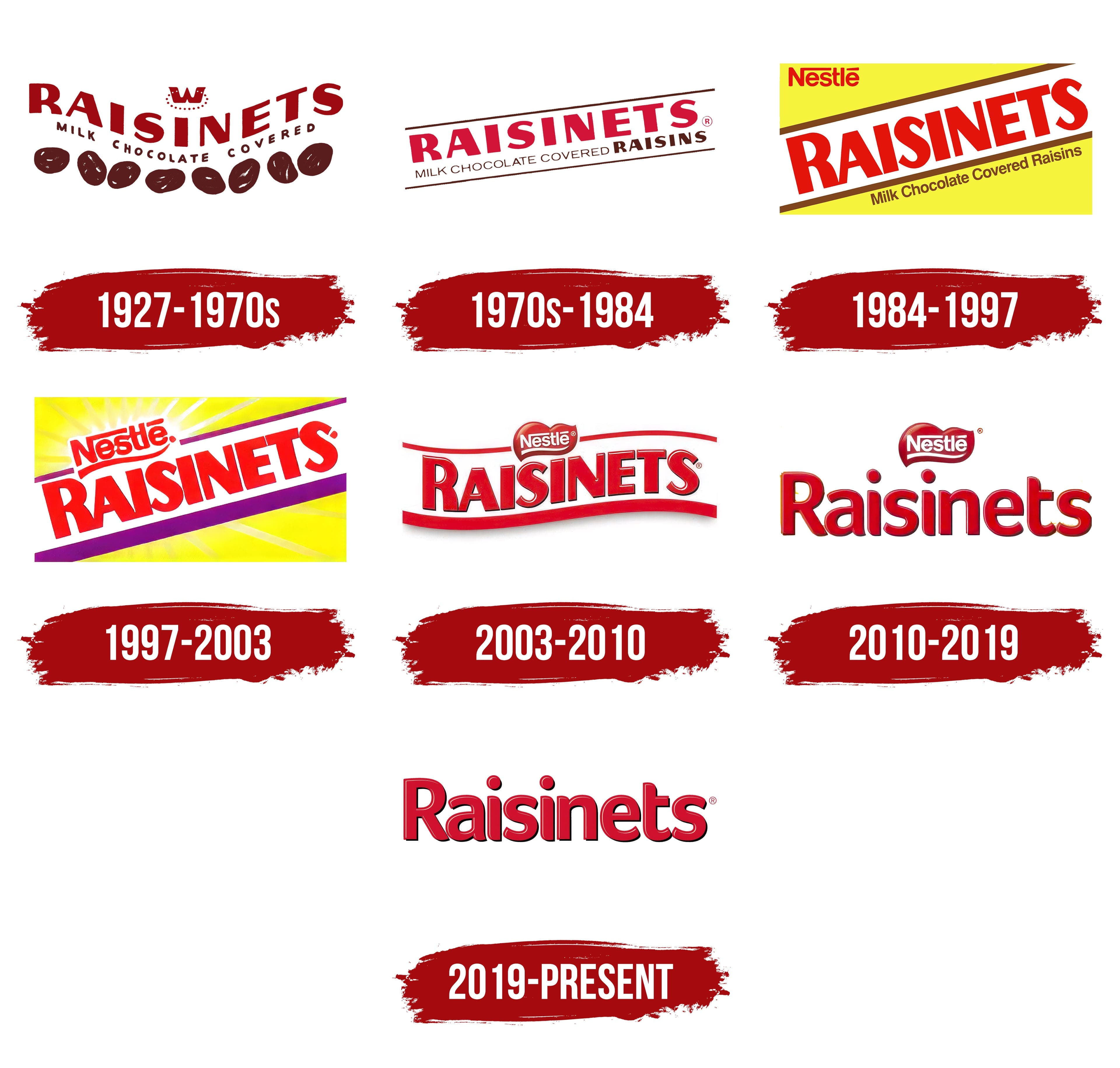
What is Raisinets?
It is a brand of chocolate-covered raisins produced by Ferrero Group, a global confectionery company known for its products. The brand offers a popular snack that combines juicy raisins with smooth milk or dark chocolate. It has long been known as a tasty and convenient treat, often offered at movie theaters and as a snack on the go. The company emphasizes quality in its confectionery products, making them a favorite choice for consumers. The brand’s products are widely available in supermarkets, stores, and online stores.
1927 – 1970s
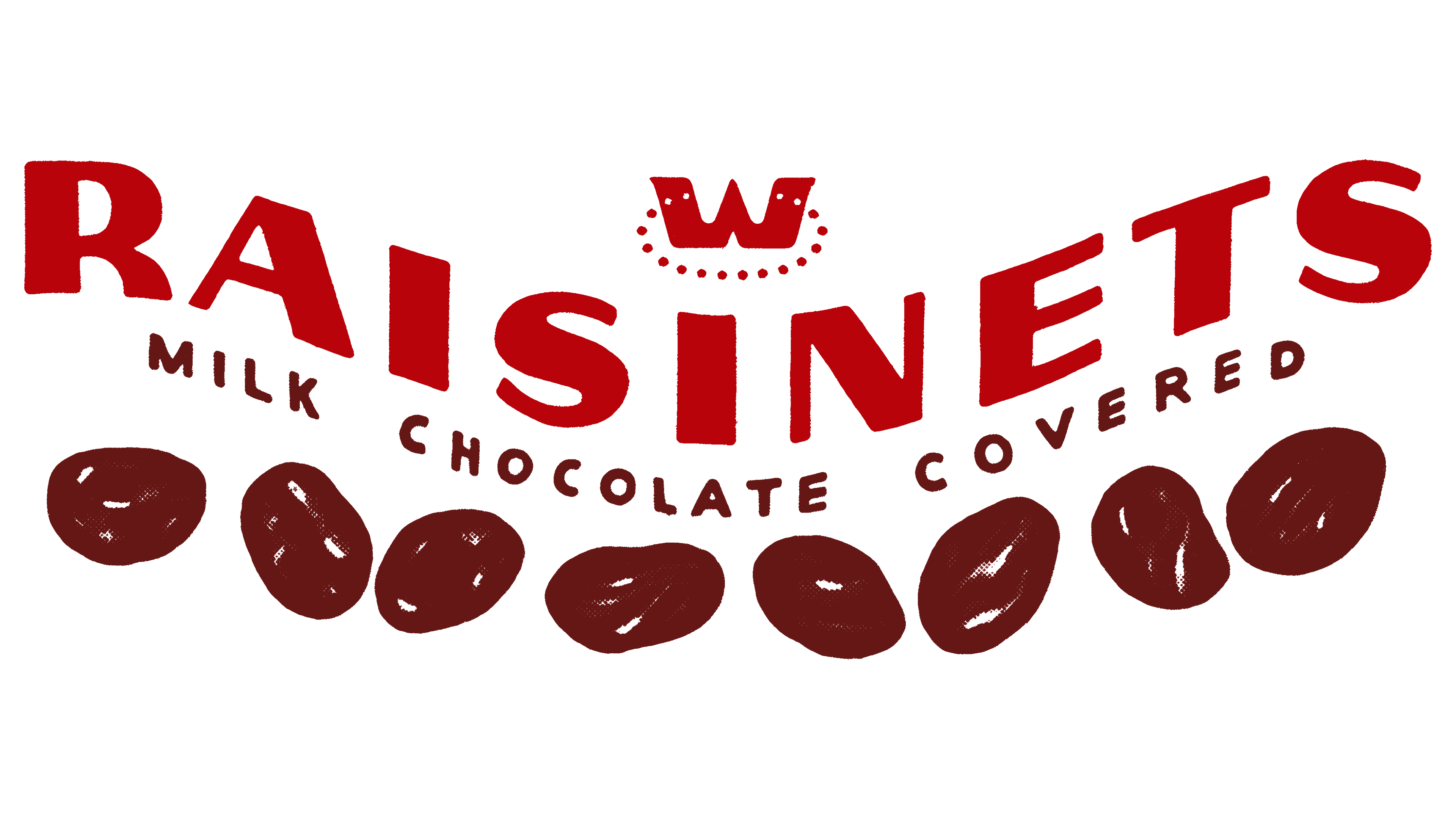
The brand originally introduced itself as a producer of unique chocolate-covered raisins, although it was not its creator. The company achieved a leading market position due to the high quality and excellent taste of its products. Those who tried this unconventional chocolate for the first time were forever captivated by its charm and aftertaste.
A crucial aspect of the brand was the proper visual representation of its key aspects. The identity needed to reflect all significant elements and features. Therefore, special attention was given to the color scheme. The red letters drew attention, while the brown, close to chocolate, evoked a desire to try the product. White was used in two ways: as a background for the text and as a highlight element on the chocolate-covered raisins.
The logo had sufficient information: more than three keys and several additional elements. The name of the candies, placed at the center of the logo, guided the buyer in choosing which sweet product to buy. The crown, highlighted with dots in a circle, symbolized the company’s reliability, grandeur, and competitiveness. The inscription “MILK CHOCOLATE COVERED” indicated the taste and superiority of the product, emphasizing its confectionery perfection.
Eight raisins on the logo caught attention and sparked a desire to try this delicious treat from a well-known company.
1970s – 1984
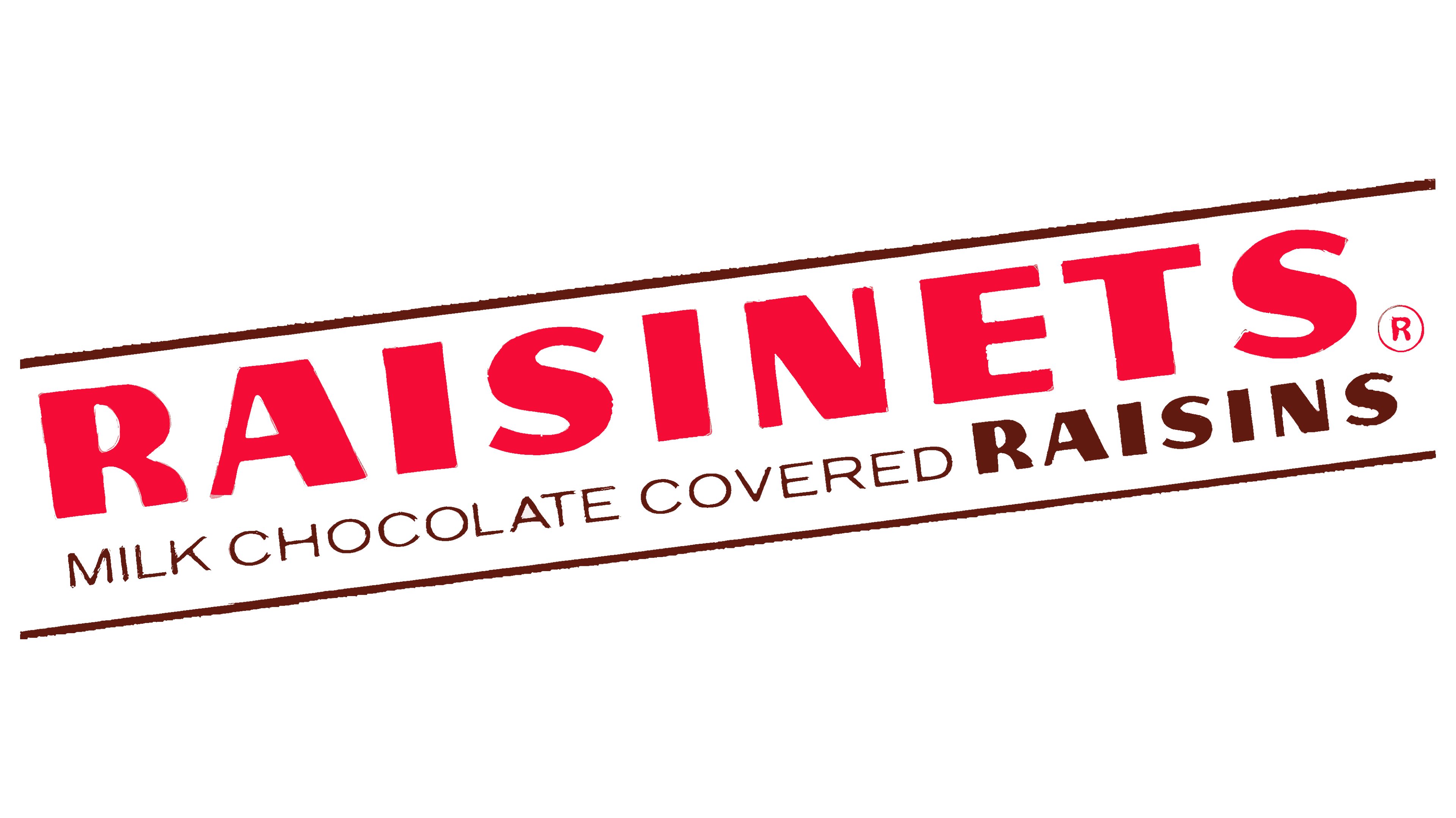
In 1970, the brand’s identity changed. The logo no longer featured the prominent raisins and the crown element. By this time, the product no longer needed popularization, as the raisins had become beloved in various cities, and attention needed to be focused on other aspects.
The brand name became clearer and brighter. The inscription detailing the raisins’ composition was refined, and its style was acquired. Red and brown remained the priority colors, with white continuing to serve as the background.
All words were written in a single line that rose from the left corner to the right, clearly expressing geometry. Two horizontal lines appeared, one above the words, the other below. These lines formed an elegant frame, drawing attention to its content.
The overall perception of the logo became more harmonious and balanced while maintaining the identity’s dynamism.
1984 – 1997
One of the most striking logos in the company’s history appeared in 1984. Yellow was introduced into the identity, attracting attention like the sun. It became the background for the main part of the logo, while white was used for the frame. The letters were red, representing the company’s and brand’s names. Each word had its own style, font, and scale.
The inscription “MILK CHOCOLATE COVERED” was placed below the lower line, whereas previously, it was on the same plane as the brand name.
The word “Nestlé” was positioned horizontally in the corner, in a classic font with no letter spacing. The first and last letters were distinguished by their originality with unique embellishments.
The brand name, highlighted in red, was placed centrally and diagonally. All the letters were straight, elongated, and quite massive.
1997 – 2003
Bright colors are often used in confectionery branding, and logo design involves creativity and originality. An example is the logo created in 1997, in which the dynamic use of colors is the main element in attracting customers’ attention.
This logo is a unique experiment in contrast and color. The primary tone is a rich red, which is used for the text elements. Yellow is applied in optimal proportion to white and red.
The sun symbolizes the flavor’s brightness and the company’s prominence, with its rays highlighting the Nestlé name. Purple acts as a marker, helping to set accents properly.
Interestingly, the purple lines in the new logo vary in thickness. This variation ensures that the creator of these exquisite treats stands out when looking at the product.
2003 – 2010
This logo can rightfully be called the most romantic. Its appearance evokes a range of positive emotions and is associated with love. The primary color is red, which stands out conceptually against the white background used for displaying the name and the frame, which consists of two horizontal lines that are not connected. The parent company’s name is written in white letters and enclosed in a romantic shape resembling a heart.
The trend towards simplicity and minimalism is evident in the absence of additional drawings and images. The only element enhancing the logo’s presentation is the slightly rounded letters. The brand name seems to float on waves, creating a sense of movement.
The new logo’s visual perception is pleasant and positive, with hints of passion and love. This imagery brings to mind the delicious raisins covered in the smoothest chocolate.
2010 – 2019
In 2010, sweet lovers witnessed a major transformation of the logo. The manufacturer demonstrated a commitment to tradition while striving for perfection and innovation.
The new logo’s identity leans towards sophistication and emotional excitement. The brand name seems somewhat provocative due to the red color’s distinctive tonality. The letters on the white background are striking and easy to read. Each element of the logo is simple and clear.
The information presented is sufficient: the stylized letters convey reliability and confidence in the future. The flowing motifs from one logo to another attest to the consistent quality of the sweet products.
2019 – today
The modern logo gravitates toward a more restrained beauty. It is bright enough while maintaining the brand’s traditions, with the letters remaining a rich shade of red. This consistency signifies the company’s stability and its leadership position.
The white background conveys harmony, embodying gentleness and purity. It symbolizes the company’s careful attention to customers and responsiveness to their needs. Red and white have been used together since the company’s inception, symbolizing continuity across time and generations. The taste of the raisins is familiar to people of all ages, and they hold a special fondness for their favorite treat.
The font draws special attention. The graceful initial capital letter is elegant, and the two identical “i” letters stand out with two proportionate dots shining above them. The rounded edges of all the letters add a touch of softness and playfulness to the inscription.