 Regal Rexnord Logo PNG
Industrial equipment includes drives, bearings, and components that power conveyors, ventilation systems, and manufacturing facilities. These components are used in various industries where process continuity depends on their operation. The Regal Rexnord logo is associated with a company that designs and manufactures mechanical and electrical components for industrial applications.
Regal Rexnord was formed in 2021 from the merger of Regal Beloit and Rexnord’s industrial division. Regal Beloit began in 1955 in Wisconsin, producing electric motors. In the 1960s, the company added gearboxes and drives. In the 1970s, the company began a series of acquisitions to consolidate its market position. In 1985, Regal Beloit went public, raising funds to expand and modernize.
In the 1990s, the company entered the international market by acquiring manufacturers in Europe and Asia. In 2000, Regal purchased the General Electric motor division. In 2004, it acquired Genteq, strengthening its position in the HVAC sector. In 2011, Regal acquired Baldor Electric for $ 3.1 billion. In 2013, further European acquisitions expanded its range of automation solutions.
In 2018, Regal acquired Nicotra Gebhardt, expanding its presence in the European market. At the same time, Rexnord, founded in 1892 as the Rex Pulley Company in Milwaukee, evolved from a belt-drive manufacturer into a diversified industrial group. In 1965, the company merged with Nordberg Manufacturing. In the 1970s and 1980s, Rexnord restructured and renewed its production lines.
In 2002, the company was acquired by Apollo Global Management. In 2006, it was acquired by the Carlyle Group for $ 1.8 billion. In 2012, it raised $500 million in an initial public offering. In 2018, the company announced it would split its business into water infrastructure and industrial components.
In October 2021, Regal Beloit acquired Rexnord’s industrial segment for $ 4.3 billion. After the transaction, Regal Rexnord was formed with an annual revenue of about $6.5 billion. In 2022, systems integration and production optimization were carried out. In 2023, the company invested in digitalization and equipment automation.
In 2024, Regal Rexnord continued development in robotics and renewable energy.
The company operates in more than thirty countries and ranks among the world’s leading industrial engineering corporations alongside ABB, Siemens, and Emerson Electric.
Meaning and History
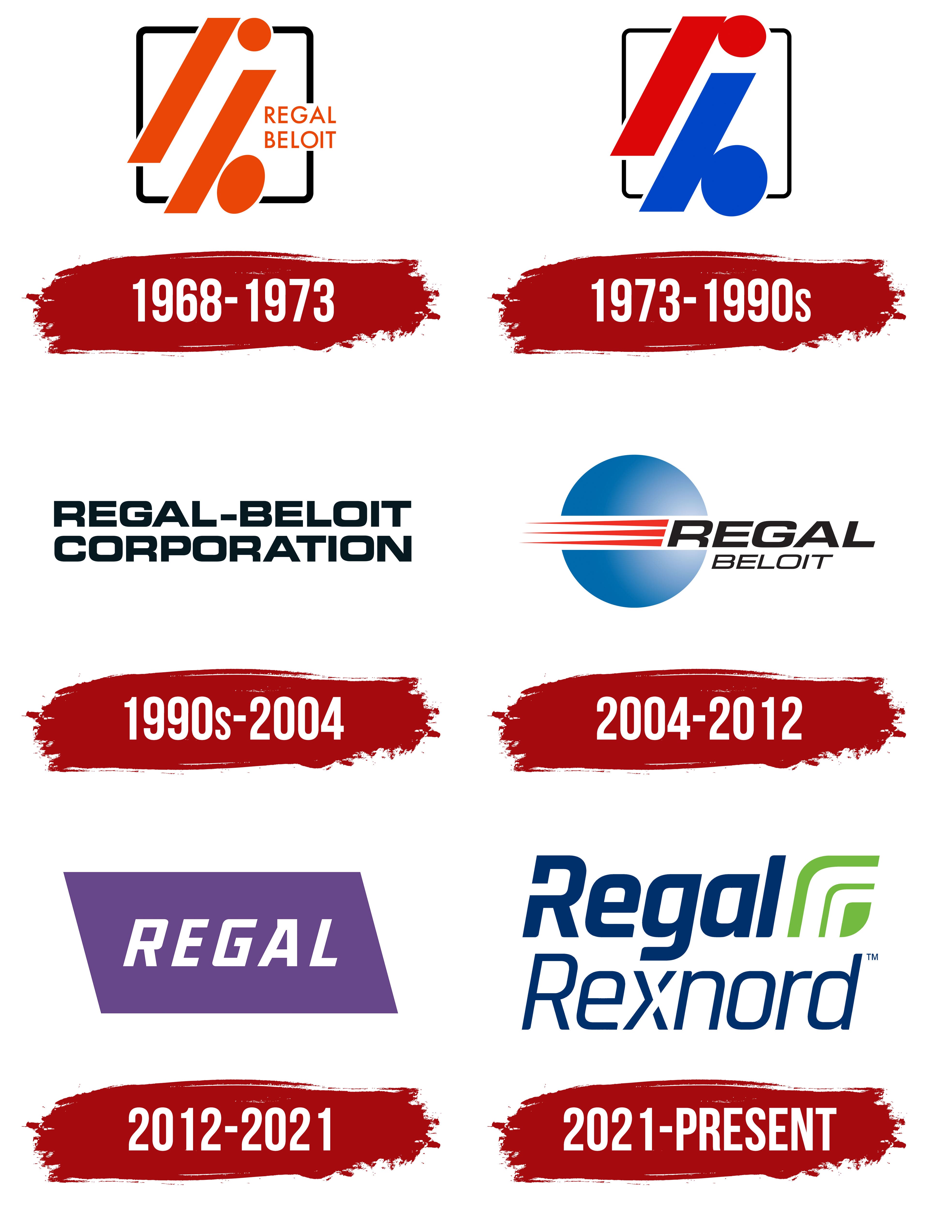
What is Regal Rexnord?
An American industrial corporation based in Milwaukee, formed by the merger of two equipment manufacturers. It produces electric motors, power transmission systems, and automation systems, with revenue exceeding $ 6 billion. The main divisions are Industrial Powertrain Solutions and Power Efficiency Solutions. The first manufacturer, Rexnord, produces chains, gearboxes, and conveyor systems, while the second, Link-Belt, produces electric motors, generators, and adjustable drives. The company serves the HVAC, shipbuilding, and semiconductor industries.
1968 – 1973

The name Regal Beloit combined the company’s founding city with the English word “regal,” meaning royal or majestic. The business began in Beloit, Wisconsin, in 1955. Kenyon Taylor founded it as Beloit Tool Company to manufacture cutting tools. A former roller-skating rink served as one of its first production facilities. The company became Regal Beloit in 1969.
The early logo shortened the name to an orange monogram formed from the letters “r” and “b.” Two parallel diagonal bands, a circle, and an oval suggested their shapes. The bands were equally thick and rose at the same angle. The circle sat to the right of the upper band, while the oval appeared beside the lower band and followed its slant. Gaps separated the four shapes, turning the initials into an abstract symbol.
A black square frame with rounded corners enclosed the monogram. The orange bands crossed its boundaries, breaking the outline. To the right, the full name “REGAL BELOIT” appeared on two lines. The upright sans-serif capitals matched the monogram’s orange color and helped identify it as an abbreviation of the name.
In 1971, the company’s name appeared on a unit-conversion ruler. The white cardboard ruler carried “REGAL BELOIT” lettering alongside orange and black sections. Swani Publishing Company manufactured it, and Regal Beloit distributed it. The Swani-Regal division produced educational materials about the metric system. The company’s name now appeared on engineering calculation tools and industrial products.
The current name, Regal Rexnord Corporation, emerged in 2021 after Regal Beloit combined with Rexnord’s Process & Motion Control business. The American manufacturer of electric motors, drives, and industrial equipment components brought Regal and Rexnord together in its name. Rexnord’s name traces back to 1970, when Rex Chainbelt acquired Nordberg Manufacturing. The Rexnord name appeared in 1973 as part of a new corporate identity program.
1973 – 1990s
Beginning in 1973, Regal Beloit’s monogram used two colors. The upper “r” became bright red, while the lower “b” became bright blue. The full “REGAL BELOIT” name was removed, leaving the letter-based emblem within a black square frame. The rounded shapes moved closer to the diagonal bands, making the initials more compact.
The monogram consisted of two parallel diagonal bands of equal width and two ovals. The red band sat higher on the left and angled upward. A horizontal red oval appeared to the right of its upper portion. The blue band sat lower, with a diagonally elongated blue oval beside it at the lower right. Together, the bands and rounded shapes suggested an “r” and a “b.”
Thin, uniform black lines formed the square frame, with rounded outer ends. The monogram extended beyond the frame, leaving breaks in the square’s sides. “RB” was registered as a trademark on March 2, 1982.
1990s – 2004
The next Regal-Beloit Corporation logo replaced the colored monogram with the full company name. The logo consisted of two lines of black lettering. “REGAL-BELOIT,” with a hyphen between the words, appeared above “CORPORATION.” Both lines spanned the same width, forming a single block of text.
The sans-serif capitals had heavy, uniform strokes and broad proportions. Rectangular forms with slightly rounded corners, combined with tight spacing, gave the lettering a compact appearance. The frame and separate symbol were removed, leaving the company name as the basis of the logo.
2004 – 2012
By 2005, Regal Beloit used a logo pairing a two-line name with a colored circular emblem. On the left, a white horizontal band divided a blue circle into two semicircles. The blue shifted from a rich shade at the left edge to pale blue on the right. The gradient gave the circle depth.
Three red wedges crossed the white band. They tapered toward the left, with their pointed ends extending beyond the circle. Unlike the gradient-filled blue circle, the red shapes used a solid fill. The initial “R” overlapped the white band, connecting the name to the emblem.
“REGAL” appeared to the right in large black letters. Its bold, right-slanting sans-serif lettering resembled Eurostile or Microgramma Italic. “BELOIT” was centered beneath it in smaller, thinner letters of the same style. The logo was accompanied by the phrase “At the Heart of What Drives Your World.”
2012 – 2021
At the PTC Asia trade show in Shanghai in 2012, the company introduced a logo using the shortened name Regal. Company head Mark Gliebe explained that international audiences had difficulty pronouncing and spelling Beloit. Customers and employees were already using the shorter name, Regal. The full legal name remained unchanged at the time of the update.
White “REGAL” lettering appeared inside a purple parallelogram. Its top and bottom edges were parallel, and its sides slanted to the left. The sans-serif capitals had heavy strokes, compact forms, and a slight rightward slant. Generous spacing separated the letters. A solid-colored panel replaced the previous gradient treatment. The blue circle, red bands, and “BELOIT” were removed, leaving the name inside a single shape.
The identity redesign accompanied the One Regal program, intended to unite the company’s many acquired businesses under a shared corporate name. The purple emblem represented the corporation, while individual product brands continued to appear alongside it. At launch, the familiar Marathon, Genteq, Fasco, Unico, and Century names remained in use.
In 2015, the company changed its legal name from Regal-Beloit Corporation to Regal Beloit Corporation. Removing the hyphen standardized the name across documents, product names, and brand identifiers.
2021 – today
Regal Beloit’s combination with Rexnord’s Process & Motion Control business was completed on October 4, 2021. The company became Regal Rexnord Corporation. Brand Innovation Group, which had previously worked with Regal, developed the new identity. The agency prepared the logo, naming options, and a corporate and product-brand system, along with print templates and presentation designs. The shared name was intended to unite the company while preserving the industrial brand names customers already knew.
Dark blue lettering and a green leaf symbol replaced the purple panel. “Regal Rexnord” was set in slanted sans-serif letters. Both words begin with a capital “R,” followed by lowercase letters. “Regal” uses thick strokes, while “Rexnord” uses a lighter weight. In the two-line version, “Regal” sits above “Rexnord”; in the horizontal version, the words appear side by side. A horizontal break interrupts the left stem of the initial “R” in “Regal.”
The leaf beside the name consists of a large curved line, a smaller line inside it, and a small solid leaf shape. White gaps separate the three parts while preserving the overall silhouette. The lettering is dark blue on white and white on dark blue. The leaf remains green in both versions. A trademark application for the two-line logo was filed on October 6, 2021.
The new identity was accompanied by the phrase “Creating a Better Tomorrow.” The leaf appeared on corporate apparel without the name. Covers and badges carried the full Regal Rexnord name.