


 Renault Korea Motors Logo PNG
The Renault Korea Motors logo embodies the strength and reliability of modern vehicles. It symbolizes bold innovations, dynamism, and energy, characteristic of the Asian brand. The emblem’s elegant shape emphasizes the vehicles’ prestige, which became popular during Samsung’s ownership.
The company’s history began in 1994, when Samsung Group entered the South Korean automotive industry as part of a broader diversification plan. In 1995, Nissan Motor Company signed a technical cooperation agreement with the new-car business, granting it access to engineering knowledge, platforms, and production experience from an established automaker.
In 1996, construction began on the Busan plant, planned to produce 240,000 vehicles annually. The 1997 Asian financial crisis disrupted the project and forced the parent group to reconsider its investment in cars. Even under financial pressure, the first model, SM5, was released in 1998. It used the Maxima platform and was received well in the Korean market. However, the company still faced serious financial problems.
In 2000, Renault acquired 70% of the business, giving the company a new structure and a French-Korean identity. The model range expanded under the new owner. SM3 arrived in 2002 on a Megane base, and QM5 followed in 2004 as the company’s first SUV, exported as Koleos. During the 2010s, the lineup expanded to include QM3, QM6, and updated versions of SM3, SM5, and SM7.
In 2018, the company announced plans to modernize its products and increase exports. In 2020, the French owner raised its stake to 80%, and in 2022 the business received its current name. In 2023, it announced electrification plans, including a first fully electric model planned for 2025. It updated the SM6 sedan, sold globally as Talisman. In 2024, the Busan plant was linked with future Alpine production for Asian markets.
Meaning and History
What is Renault Korea Motors?
This division of the Renault Group specializes in producing various passenger cars for export and the Korean market. The company creates vehicles that meet global standards and local tastes, combining French automotive engineering with Korean manufacturing expertise. Sedans, SUVs, and electric vehicles are all part of the company’s lineup, which often modifies Renault’s platforms and technologies to cater to the preferences of Korean buyers. The company has made a name in the Korean automotive market by creating reliable, stylish cars that blend European design with traditional Korean sensibilities.
1994 – 2000
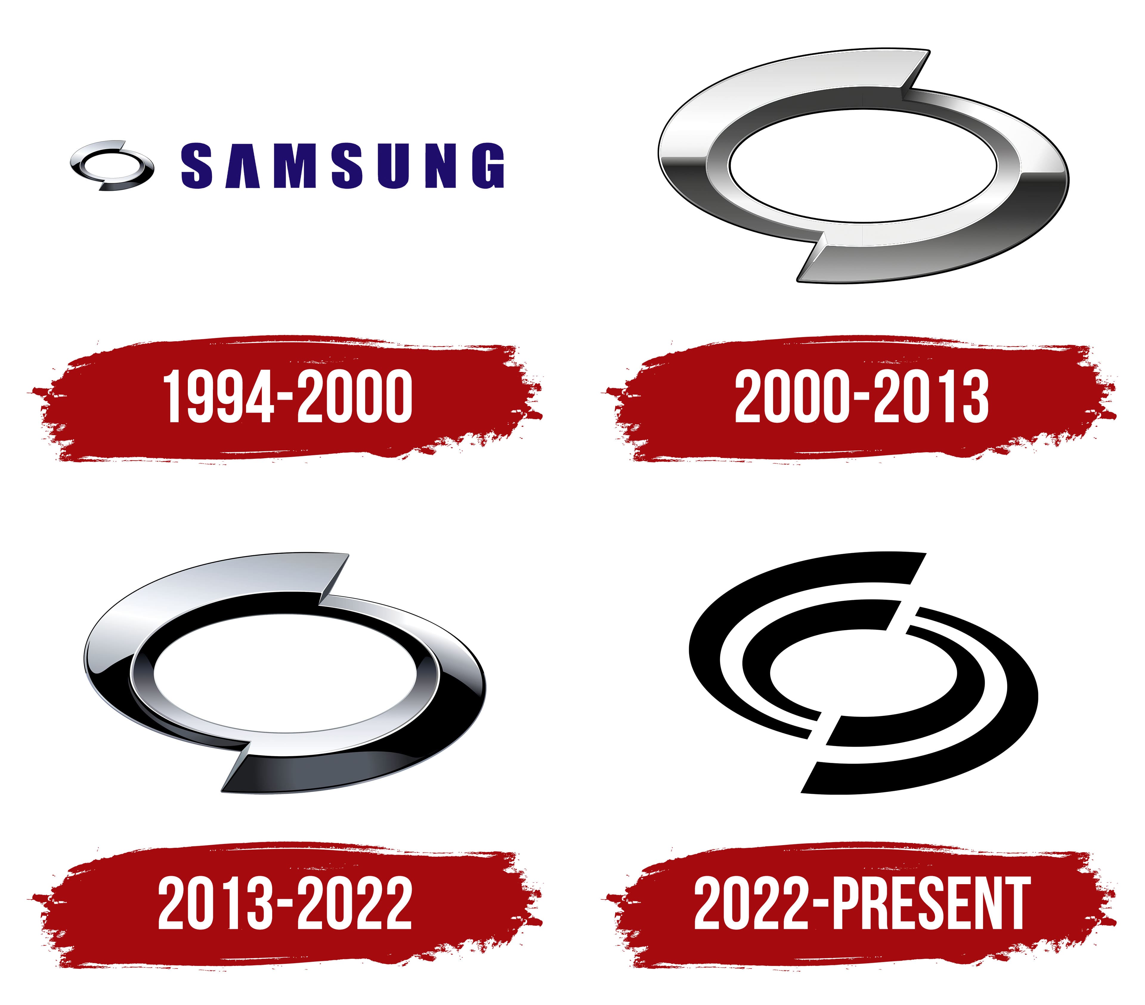
Renault Korea Motors was founded by the conglomerate Samsung and thus used its wordmark, a strict blue inscription composed entirely of capital letters. The font, inspired by the confident lines of Helvetica, delights minimalism enthusiasts. Symmetrical glyphs impress with their shape, combining wide, even strokes, refined curves, and sharp angles.
The massive elements convey a sense of reliability and stability, while the smooth, rounded lines indicate the brand’s dynamism. The “A” without a crossbar reflects a modern aesthetic that welcomes the absence of unnecessary details. The logo is also characterized by:
- Vertically elongated font
- Sans-serif style
- Wide spacing between letters
- Futuristic design
The automaker used the Samsung wordmark because it was known as Samsung Motors from 1994 to 2000. To differentiate itself from the parent company, it added an individual symbol resembling a primitive shuriken with two points. The old emblem of the South Korean conglomerate inspired its oval shape.
The graphic mark looks like two boomerangs connected at their free ends. They are associated with lightning speed, effectively conveying the energy of moving vehicles. The oval element is very small compared to the inscription, but its metallic texture is visible even in this reduced version. The silver gradient with black shadows and white highlights creates a sense of three-dimensionality. This symbolizes the innovations the brand strives for.
2000 – 2013
In 2000, the word “SAMSUNG” was removed from the logo after the company was acquired by Renault and renamed Renault Samsung Motors. The rebranding culminated in an updated emblem highlighting the car manufacturer’s individuality. Designers chose not to create something new but to reinterpret the existing graphic symbol, giving it a new life.
As a result, the silver oval separated from the inscription and became an independent visual symbol. It looks like it was cut in half and then reconnected with mismatched ends, giving the figure a sense of lightning-fast energy, like a flying shuriken. This metaphorical image fits the automotive brand well because the oval with two pointed protrusions creates the illusion of movement. The internal void adds lightness to the logo, which is associated with speed and the absence of obstacles on the way to the goal.
Designers retained the emblem’s metallic texture to show the company’s modernity and connection with innovative materials. However, the gradient became smoother, making the oval less shiny; it now resembles chrome metal. The outer side of the figure is clearly divided into two parts: a dark bottom and a light top. The boundary runs along a straight horizontal line, which was not present before. This geometric precision symbolizes balance and orderliness.
2013 – 2022
The company did not change the emblem’s shape because this makes it recognizable. The elliptical figure with two pointed protrusions perfectly reflects the dynamics of high-speed cars. It creates a sense of continuity and completeness, characterizing Renault Samsung Motors as a cohesive and trustworthy brand.
However, the desire for change led the company to experiment with the gradient. There’s nothing new here; the logo precisely replicates the old emblem used before 2000. Its texture mimics a smooth metallic surface, which is associated with the latest technologies in the automotive industry, reliability, and quality.
The silver color evokes metal parts, symbolizing strength and durability. The smooth transition of shades gives the emblem sophistication, making it more expressive. The chrome shine creates the illusion of three-dimensionality, enhancing the sense of dynamism.
In this version of the logo, the color difference is very noticeable. The silver areas transition to white and black, with gradient lines that are not perfectly smooth. This contrast makes the oval more noticeable and expressive.
2022 – today
In 2022, the company was renamed Renault Korea Motors due to the expiration of the agreement to use the Samsung trademark. This inspired another rebranding, which took a path of simplification. The new logo lacks metallic texture, gradients, and three-dimensionality. It fully embraces a minimalist style.
Designers aimed to convey the old shape using four black arcs. Their arrangement makes them appear like halves of two ovals, cut diagonally. The curved lines symbolize a forward-looking approach, and the wide gap between them indicates openness and readiness for change, which is crucial in the automotive industry.
The emblem’s symbolism is based on ideas of movement and continuous progress, so the oval halves are shifted in opposite directions. This asymmetry characterizes Renault Korea Motors as a progressive brand that is flexible in its decisions and unafraid of experimentation.
To adhere to a minimalist aesthetic, designers made the logo black-and-white. These colors give it a sense of rigor and elegance. Black represents strength, stability, and reliability. White, on the other hand, signifies purity, simplicity, and modernity. The contrast between them makes the automotive brand’s symbol more noticeable.