 Nissan Motor Corporation Logo PNG
People use cars in cities and on highways to commute, transport cargo, and handle everyday tasks. Production includes model development, assembly, and worldwide distribution. The Nissan logo represents a Japanese company that manufactures passenger cars, commercial vehicles, and electric vehicles.
Nissan Motor traces its origins to 1911, when Masujiro Hashimoto founded the Kwaishinsha Co. plant in Tokyo. In 1912, it created the first car, the DAT. In 1931, the Datson model was introduced and later renamed Datsun. On December 26, 1933, Tobata Casting Co. merged with Dat Jidosha Seizo Co. On June 1, 1934, the company was renamed Nissan Motor Co., Ltd. The first factory was built in Yokohama in 1935, where car and engine production began.
In the late 1930s, under pressure from the military government, Nissan was forced to focus on producing army vehicles. At the same time, the company continued making civilian models, including the luxury Nissan-70. After World War II, the enterprise resumed production. In 1952, a licensing agreement was signed with Austin Motor Company. In 1958, the company began exporting cars to the United States. In 1962, exports to Europe expanded. In 1959, the company opened its first overseas facility in Taiwan.
In 1970, the Lambda-4S rocket powered by a Nissan engine launched Japan’s first satellite, Osumi, into orbit. In the 1970s and 1980s, the company became one of the world’s largest automakers. In the 1990s, poor management led to a crisis. In 1999, Renault acquired a controlling stake in Nissan. Carlos Ghosn implemented the Nissan Revival Plan, which stabilized the business and restored profitability.
In 2016, the Renault-Nissan-Mitsubishi alliance was formed. It combined the production and technological resources of the three companies. In 2013, Nissan revived the Datsun brand and focused on affordable models for emerging markets. By 2024, the company will rank second among Japanese automakers after Toyota. It produces vehicles under the Nissan and Infiniti brands. The headquarters remains in Yokohama.
Meaning and History
What is Nissan Motor Corporation?
A major Japanese automobile manufacturer from Yokohama, formed through the merger of Kwaishinsha and Jitsuo Jidosha. It is part of an alliance with Renault and Mitsubishi and sells over 3 million vehicles per year. The company produces passenger, premium, and budget models and has manufacturing facilities in 20 countries. In the late 1990s, the company faced a crisis, after which Renault acquired a 43 percent stake. Beyond automobile production, it develops shipbuilding, rocket engines, financial services, and motorsports through Nismo.
1934 – 1982
The Nissan name originated within an industrial group. At the same time, the sun disk in its early automotive emblem came from Datsun’s identity. These two histories converged in the Japanese automaker Nissan Motor Corporation. In 1928, industrialist Yoshisuke Aikawa reorganized Kuhara Kogyo and renamed it Nihon Sangyo, meaning “Japan Industries.” The opening parts of “Nihon” and “Sangyo” formed the abbreviation, Nissan. Rather than using his surname, Aikawa chose a name reflecting his vision for the enterprise. Shareholders across Japan owned the group, and it was intended to serve the public interest.
Nissan’s automotive roots trace back to Kwaishinsha, a workshop Masujiro Hashimoto founded in 1911. In 1914, he completed a small car called the DAT. The name combined the initials of three investors who supported the business: Kenjiro Den, Rokuro Aoyama, and Meitaro Takeuchi. The compact Datson followed in 1931. Its name meant “son of DAT,” connecting the new car to its predecessor. However, the English word “son” sounded like a Japanese word meaning loss. By the time sales began in March 1932, the ending had changed to “sun.” The Datsun name later inspired the sun motif in Nissan’s emblem.
On December 26, 1933, Nihon Sangyo and Tobata Imono established the automotive company Jidosha Seizo. Nihon Sangyo subsequently became its sole owner. On June 1, 1934, the business became Nissan Motor Co., Ltd., adopting the shortened name of Aikawa’s industrial group.
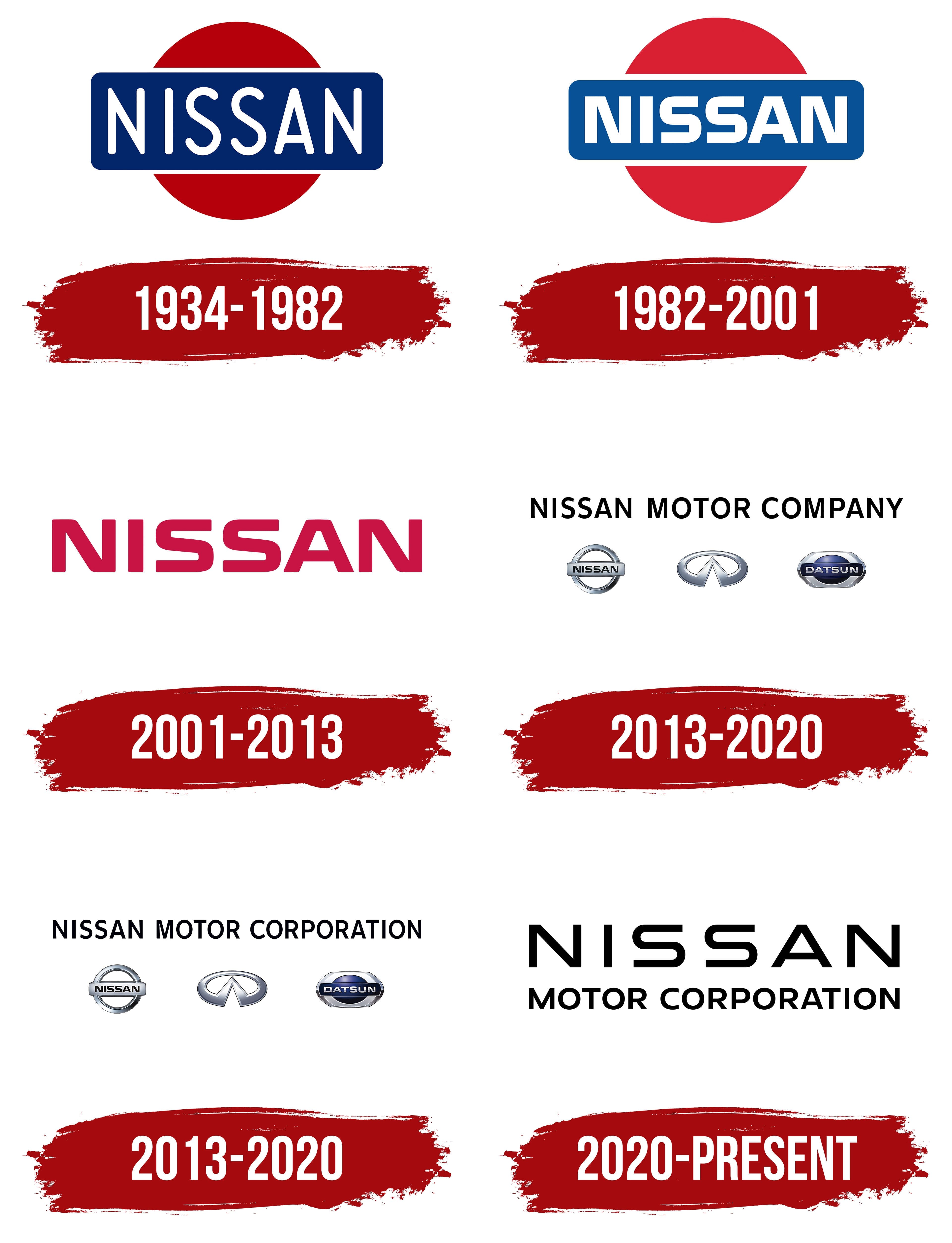
The 1930s logo featured “NISSAN” crossing the center of a red circle on a blue horizontal panel. The white lettering, blue field, and red sun disk came from Datsun. The rounded rectangle overlapped the circle, leaving its upper and lower segments visible. The name used tall, narrow sans-serif capitals. Thin strokes with rounded endings contrasted with the solid colored shapes behind them.
The red disk represented the rising sun, while the blue field conveyed sincerity. Nissan associated their combination with the phrase “sincerity brings success,” reflecting the company’s original guiding principle.
1982 – 2001
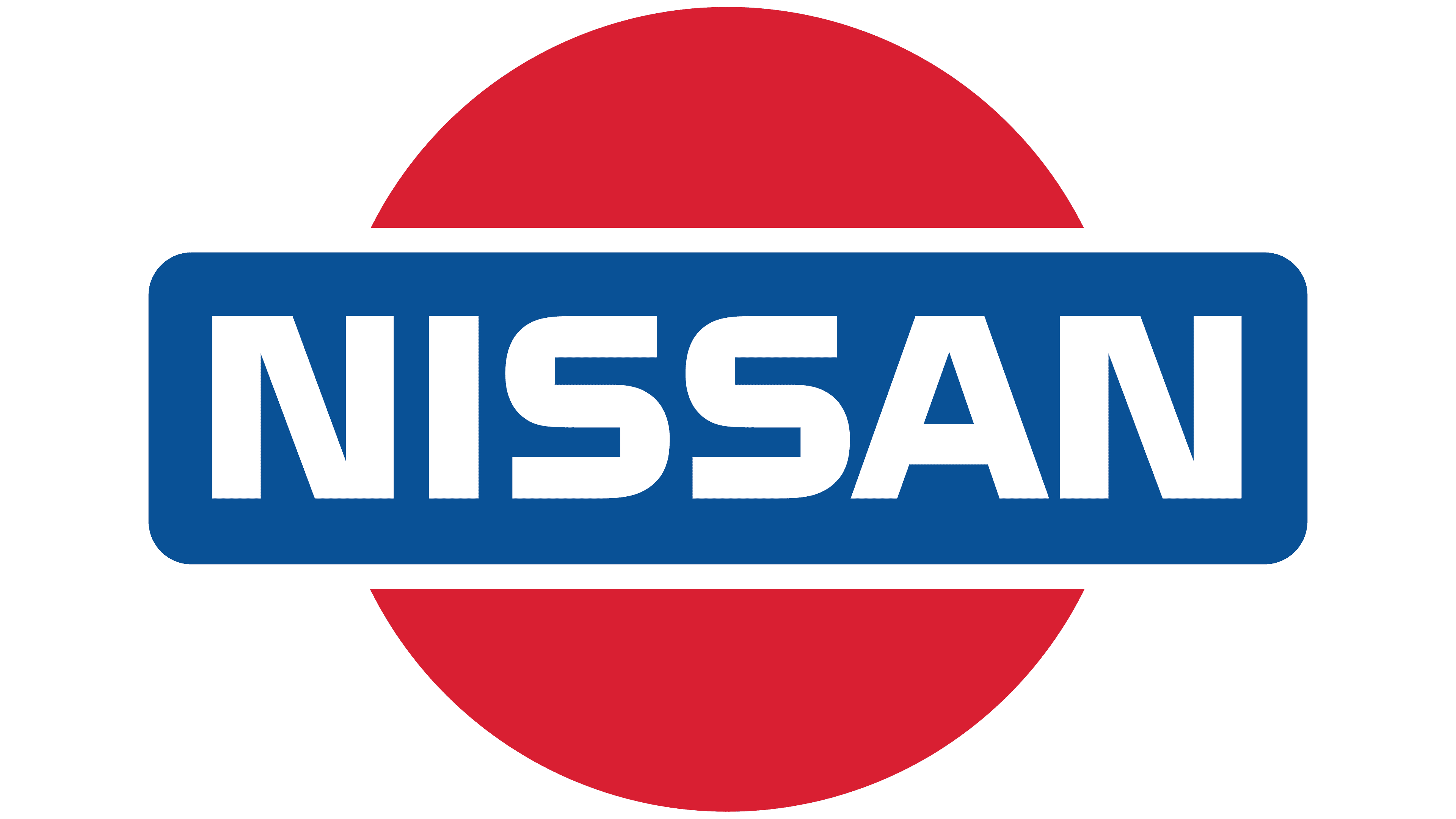
Nissan’s move toward a single name in international markets called for updated logo lettering. In July 1981, the company announced that it would adopt the NISSAN name in overseas markets where its cars had previously been sold as Datsuns. The new identity was intended to unite the manufacturer’s name and its vehicle brand. Colin Forbes, a co-founder of Pentagram, worked on it in 1982 with type designer Matthew Carter.
The red sun disk, blue horizontal panel, and white name retained their existing arrangement, but the colors changed. The dark red became one or two shades lighter, and blue replaced the previous dark blue. Most of the redesign focused on the letters. Carter created custom Nissan lettering, replacing the thin, elongated name with heavy, wider capitals.
The upper and lower sections of both “S” letters became flatter, their curves shortened, and their overall shapes became more rectangular. The diagonal strokes of the “N” and the sides of the “A” were adjusted to match the weight of the other strokes. The heavy letters formed a compact wordmark, while the sun motif maintained a connection to the earlier emblem.
2001 – 2013
In Nissan’s next corporate identity, the name was separated from the colored shapes. The blue panel and red sun disk were removed. The formerly white letters became burgundy red and appeared in open space. “NISSAN” retained its heavy, wide capitals and the distinctive forms of the two “S” letters.
One version paired the large name with a smaller line reading “MOTOR COMPANY,” identifying the business as an automaker. The size difference emphasized “NISSAN.” This corporate wordmark was used alongside the vehicle emblem, which retained a circular form.
In 2001, Nissan standardized its vehicle emblems across international markets. The name appeared on a horizontal metal bar crossing a three-dimensional silver ring. An open circle replaced the solid sun disk. Highlights, shadows, and darker edges suggested a metallic surface and gave the ring and bar depth.
The shared standards covered typography, colors, surface finishes, and emblem placement. Previously, the treatment had varied by model, including italic lettering and gold finishes. After the update, emblem size and position on the body continued to be adapted to each vehicle. The “Z” and “GT-R” badges retained their separate designs.
2013 – 2020
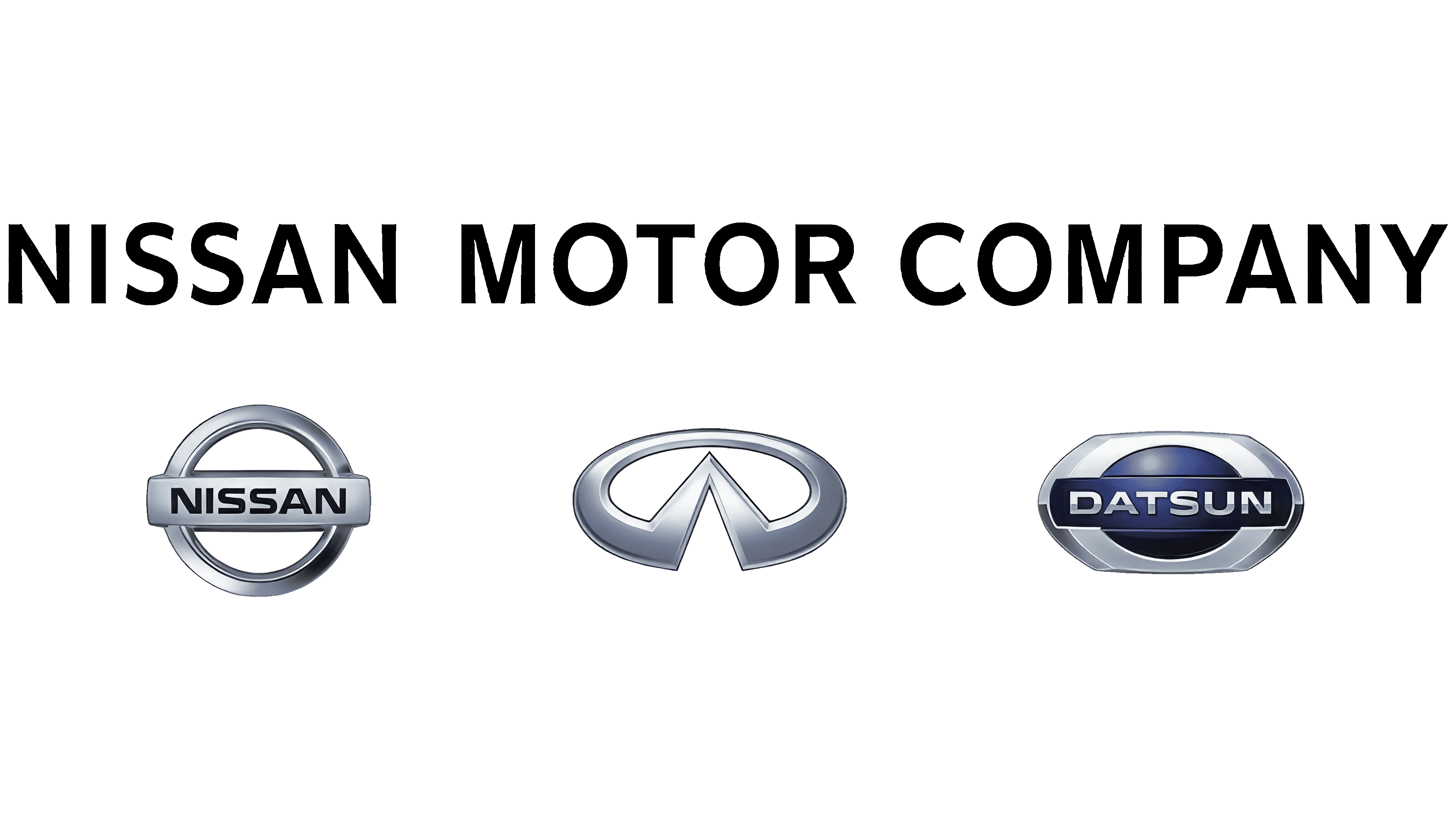
The return of Datsun expanded the range of brands represented in Nissan’s corporate logo. The company was preparing to revive the historic name for affordable vehicles in emerging markets. In May 2013, it introduced an identity featuring the Nissan, Infiniti, and Datsun emblems. At the shareholders’ meeting on June 25, Carlos Ghosn announced that the corporate logo had been updated at the beginning of the fiscal year. The update was intended to present the company to different audiences under a shared name.
“NISSAN MOTOR COMPANY” appeared above the three automotive brands. Its black sans-serif capitals had uniform stroke weight and resembled neutral typefaces such as Helvetica or Arial. Beneath the company name, three-dimensional emblems sat in a single row. The flat upper line represented the corporation, while the lower row preserved the individual identities of its brands.
On the left, Nissan’s chrome ring was crossed by a horizontal rectangular bar bearing “NISSAN.” Infiniti’s oval with two converging diagonal lines occupied the center. On the right, Datsun’s blue oval sat in a silver frame. Metallic surfaces and depth distinguished the lower row from the black lettering above. Their individual shapes made the three brands distinguishable within the shared corporate identity.
The development of an illuminated vehicle emblem began with a three-dimensional version. The designers added lighting, then translated the illuminated area’s outline into a flat image. They adjusted the contour’s thickness so the form would remain recognizable with the lighting either on or off.
For its electric vehicles, Nissan developed an emblem with 20 LEDs. The company linked that number to the 20-year interval between vehicle logo updates.
2013 – 2020
A corporate logo version reading “NISSAN MOTOR CORPORATION” appeared in 2013. “CORPORATION” replaced “COMPANY,” lengthening the upper line. The corporation’s name remained above the row of three automotive emblems. Their order, proportions, and appearance stayed unchanged. Only the wording changed, preserving the relationship between the company name above and its brands below.
2020 – today
On July 15, 2020, Nissan introduced two updated logos, one corporate and one automotive. In the corporate identity, “NISSAN MOTOR CORPORATION” replaced the row of three emblems. The name was divided into two lines. A large “NISSAN” appeared above “MOTOR CORPORATION,” set in small, closely spaced letters. The thin lettering in the upper line had wider spacing. It retained the shapes of the two “S” letters, connecting it to previous versions.
The primary corporate logo became black on white. The identity guidelines allow black-and-white lettering, with a white version on red permitted in certain applications. A lighter weight replaced the previous name’s heavy strokes. The difference in line sizes distinguished Nissan’s name from the “MOTOR CORPORATION” descriptor.
Work on the vehicle emblem began in the summer of 2017. Global design chief Alfonso Albaisa initiated the project with three guiding ideas: thin, light, and flexible. Tsutomu Matsuo, deputy general manager of the advanced design department, led the team. Thin outlines replaced the metallic depth. The ring was divided into upper and lower arcs with short horizontal ends, and “NISSAN” sat between them. The solid panel was removed, leaving the letters in open space. The design was developed for screens, print, and illuminated vehicle badges.
Nissan’s vehicle emblem became the foundation for a broader identity system. Nissan United and Design by Disruption, divisions of the TBWA agency network, developed its two- and three-dimensional applications. The illuminated white version was associated with vehicle electrification. The Ariya electric crossover, unveiled alongside the updated logo, became the first model to carry the new emblem.