Restaurant Brands International (RBI) Logo PNG
Large restaurant chains rely on a management system that integrates brands, franchising, and operations across countries. A single structure develops dining locations, ensures compliance with standards, and expands the network. The Restaurant Brands International logo represents the company that manages chains such as Burger King, Tim Hortons, and Popeyes and coordinates their international operations.
Restaurant Brands International was created in 2014 after the merger of Burger King and Tim Hortons. The deal was valued at approximately $ 11 billion. The investment company 3G Capital initiated the merger, with participation from Warren Buffett’s fund. The company is headquartered in Canada.
Burger King was founded in 1954 in Miami. The chain became one of the largest in the fast-food industry. It is known for the Whopper burger and the Have It Your Way campaign. In 2010, 3G Capital acquired the chain for $ 4 billion. After that, the company underwent restructuring, menu updates, and changes to its restaurant format. Hockey player
Tim Hortons was founded in 1964. The company became a national symbol of Canada. It specializes in coffee and donuts. After separating from Wendy’s in 2006, the chain continued to grow and became one of North America’s largest coffee shop operators.
After the merger, Restaurant Brands International managed 23,000 restaurants under two brands. In 2017, the company acquired Popeyes Louisiana Kitchen for $ 1.8 billion. In 2021, it purchased Firehouse Subs for $1 billion.
By the 2020s, RBI had invested in digital services, delivery, and restaurant modernization. In 2019, Burger King introduced the plant-based Impossible Whopper. In the same year, Tim Hortons changed the format of its coffee shops.
Restaurant Brands International operates more than 30,000 restaurants in 100 countries. The group includes four brands: Burger King, Tim Hortons, Popeyes, and Firehouse Subs. The company remains one of the largest players in the global fast-food market.
Meaning and History
What is Restaurant Brands International?
A Canadian corporation that brings together the Burger King, Tim Hortons, Popeyes, and Firehouse Subs chains. It manages more than 30,000 restaurants in 100 countries, with total sales of about $ 35 billion. It was created after the merger of Burger King and Tim Hortons and later included Popeyes and Firehouse Subs. Its main business model is franchising. The company owns only a small portion of its restaurants and earns income from royalties, rent, and ingredient and equipment supply.
2014 – 2019

Restaurant Brands International was established as a Canadian parent company for Burger King and Tim Hortons. The chains retained their separate names, menus, and franchise systems. The agreement to combine Burger King Worldwide and Tim Hortons was announced on August 26, 2014. The transaction was valued at approximately C$12.5 billion, or US$11.4 billion at the exchange rate at the time.
3G Capital, which had previously acquired Burger King and restructured its international franchise model, would become the principal shareholder. Berkshire Hathaway provided $3 billion in preferred equity financing. Warren Buffett and Berkshire Hathaway handled the financial side of the transaction, while the combined company’s leadership managed the chains.
Burger King CEO Daniel Schwartz became chief executive officer. Alex Behring, managing partner of 3G Capital, became executive chairman. Tim Hortons CEO Marc Caira became vice chairman.
The name Restaurant Brands International was unveiled on December 9, 2014, after Tim Hortons shareholders approved the transaction. The 3 words described the holding company’s industry and structure. “Restaurant” identified the restaurant business, “Brands” referred to ownership of separate brands, and “International” indicated its global scope. At the time of the announcement, the combined system included more than 18,000 restaurants in 100 countries.
The neutral name supported both chains’ expansion beyond their core markets. Burger King and Tim Hortons continued serving customers under their historic names, while the new brand represented their owner. The first letters of Restaurant Brands International formed the abbreviation RBI.
The transaction closed on December 12, 2014. Separate trading in the former companies’ shares ended, and the holding company’s shares began trading on the New York and Toronto stock exchanges on December 15. The ticker was QSR, short for “quick-service restaurant,” an established term for restaurants offering fast service. The initials RBI referred to the company’s name, while QSR referred to its industry.
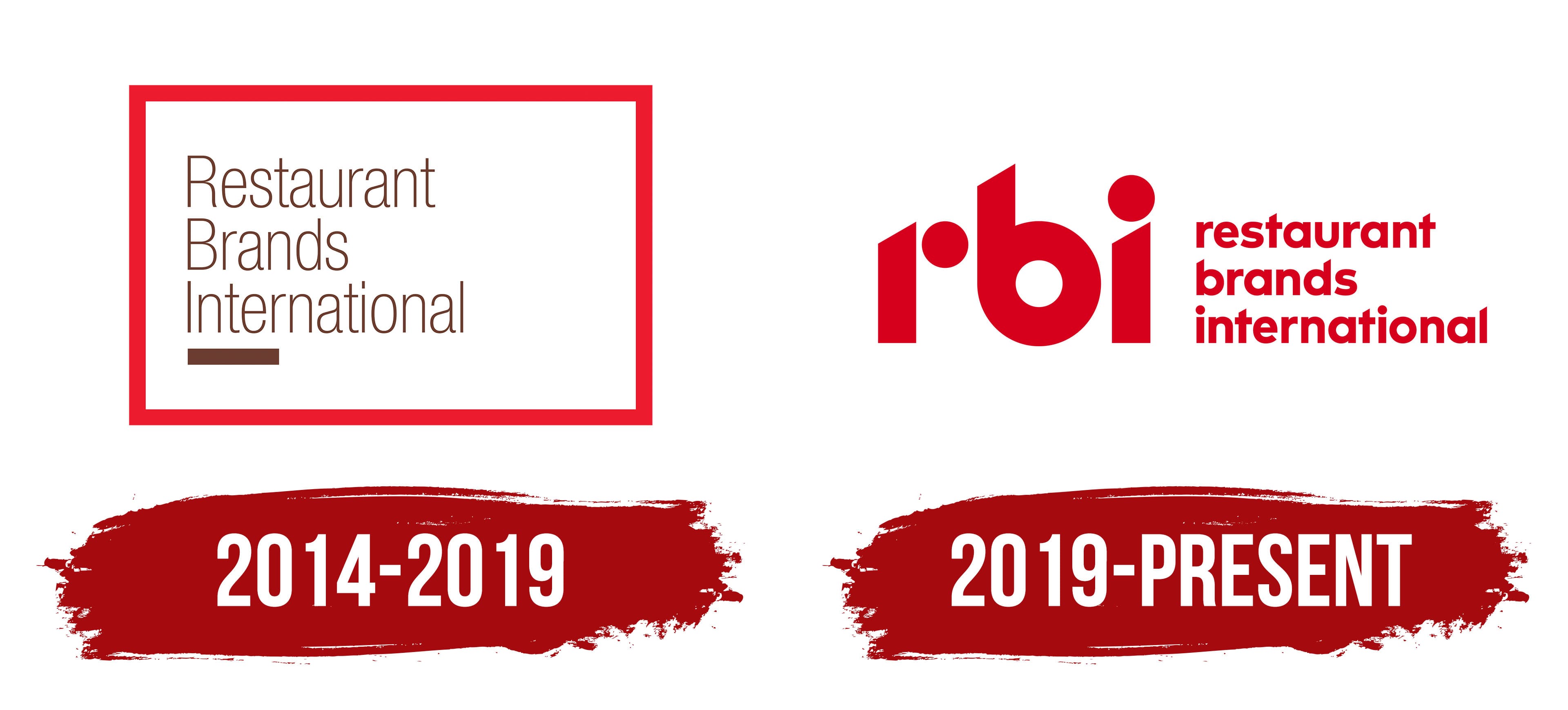
The first logo appeared in December 2014. The long name was divided into 3 lines inside a red square frame. “Restaurant” appeared at the top, “Brands” in the middle, and “International” at the bottom. All lines were left-aligned. The words began with uppercase “R,” “B,” and “I” letters, followed by lowercase letters.
The lettering used a narrow sans-serif style with thin strokes. Brown distinguished the text from the bright red frame. A short horizontal line in a similar shade appeared beneath the name. Its solid form stood out beside the thin letters and completed the inner text block.
The frame had a uniform stroke weight and 90-degree corners. Open white space separated the outline from the text. The square brought the long name together in a compact emblem, while the word arrangement preserved the reading order. Thin typography and open space distinguish the corporate logo from the more elaborate visual identities of restaurant chains.
The red-and-brown version on a white background appeared on business materials and presentations. The 2017 acquisition of Popeyes Louisiana Kitchen increased the holding company’s chain count to 3. After the 2021 purchase of Firehouse Subs, the group comprised 4 brands. The group retained the Restaurant Brands International name and the logo’s square arrangement.
2019 – today
In 2019, Restaurant Brands International updated its logo, giving the abbreviation RBI prominence. The holding company already included Burger King, Tim Hortons, and Popeyes. The corporate brand represented the parent company alongside the separate restaurant chains. The transition to the abbreviation coincided with the group’s expansion and a shift in its positioning.
A horizontal arrangement replaced the long name inside a square frame. Large lowercase “rbi” lettering appeared on the left, with the full “restaurant brands international” name on the right. The border and lower line were removed, and red replaced brown. Size and placement distinguished the abbreviation from its expanded form.
The “rbi” letters were constructed from heavy geometric shapes. In the “r,” the circular section is separate from the vertical stroke. The tall stem of the “b” has an angled top and connects to a large rounded bowl. The vertical stroke of the “i” also ends with an angled cut, with a round dot above it. The circles in the “r” and “i” echo the counter of the “b.” Repeated vertical strokes unite the letters in a shared design created for the holding company’s short name.
The full name was divided into 3 lines, with one word per line. All the words were set in lowercase and aligned to the left. A heavy, bold sans-serif replaced the previous thin lettering. Lines of similar length form a compact block to the right of “rbi” and explain the abbreviation.
Both parts were rendered in bright red. The shared shade connects the geometric abbreviation to the full name. At the same time, the difference in scale preserves the leading role of “rbi.” Single-color versions were prepared for production and digital applications with limited color reproduction.
The short logo suited placement alongside the Burger King, Tim Hortons, and Popeyes brands, maintaining equal standing among the chains. After the acquisition of Firehouse Subs in 2021, the existing arrangement continued for the expanded group.