The Spider-Man logo appears flexible and dangerous, perfectly conveying the hero’s strength and unique abilities. The emblem emphasizes the physical power and incredible agility that define this character. It elevates the superhero image, giving him the aura of a protector and world savior. This symbol embodies justice, showing how the hero fights against crime, preventing villains from doing their dark deeds. The logo symbolizes reliable protection and strength, always ready to stand on the side of good.
Spider Man: Brand overview
The history of Spider-Man began in 1962 when writer Stan Lee and illustrator Steve Ditko created the character for Marvel Comics. The superhero first appeared in Amazing Fantasy #15 in August 1962. At a time when most heroes were adults, the idea of a teenage protagonist was revolutionary.
An ordinary high school student, Peter Parker, gained his superpowers after being bitten by a radioactive spider. This event gave him unique abilities, including superhuman strength, agility, and the ability to stick to walls. One of his defining traits was his web-shooting skill, which he developed using his knowledge of chemistry.
Due to the success of his debut, a stand-alone comic series called The Amazing Spider-Man was launched in March 1963. It quickly became one of Marvel’s most popular titles. Lee and Ditko created a rich cast of supporting characters, including Aunt May, love interest Mary Jane Watson, best friend Harry Osborn, and famous villains like the Green Goblin, Doctor Octopus, and Venom, Iron Man, Captain America.
The first animated series aired in 1967, helping to boost the character’s popularity beyond comic books. Many catchphrases and moments from the show became iconic.
The hero continued to evolve throughout the 1970s and 1980s, with memorable storylines like the “Death of Gwen Stacy” in 1973. This pivotal moment in comic book history marked the end of the “Silver Age” of comics.
The character’s popularity grew even more in the 1990s, especially with the 1994 animated series, which many fans consider one of the best adaptations. This series introduced a new generation to Peter Parker’s world.
A major milestone came in 2002 with Sam Raimi’s film adaptation, starring Tobey Maguire. The movie was a massive box-office success, leading to a trilogy that concluded in 2007. These movies solidified the character’s place as one of the world’s most beloved superheroes.
In 2012, Andrew Garfield played the web-slinger in a reboot titled The Amazing Spider-Man. This film and its 2014 sequel offered a more modern interpretation.
The hero’s story took another turn in 2016 when he joined the Marvel Cinematic Universe (MCU). Tom Holland debuted as Peter Parker in Captain America: Civil War and starred in Spider-Man: Homecoming 2017.
In 2018, Spider-Man: Into the Spider-Verse introduced audiences to Miles Morales, a new version of the iconic character. The animated film received widespread praise and won the Academy Award for Best Animated Feature.
In 2021, No Way Home became a major event by bringing together Tobey Maguire, Andrew Garfield, and Tom Holland, uniting different character versions. The film was a huge box-office hit and a cultural phenomenon.
As of 2023, the web-slinging hero remains one of the most popular superheroes worldwide. His story continues to evolve across comic books, movies, TV shows, and video games, captivating new generations of fans and maintaining a special place in popular culture.
Meaning and History
Spider-Man has become the third most beloved superhero worldwide, despite arriving on the scene decades after icons like Superman and Batman. His character resonates deeply with a diverse community of people who see their lives, challenges, and ambitions reflected in his story.
What is Spider Man?
This legendary superhero has made his way into popular culture, captivating audiences in comics, films, TV shows, and video games. This web-slinging superhero, created by Marvel Comics, is a beloved figure because he combines superhuman abilities with realistic human struggles. After being bitten by a radioactive spider, Peter Parker, the alter ego of Spider-Man, becomes a bright but socially awkward young man who develops remarkable powers. He possesses superhuman strength, agility, wall-crawling abilities, and a “spider-sense” that alerts him to danger. Using his self-made web-shooters, he battles a diverse cast of renegades while fighting crime in New York City.
1963 – today
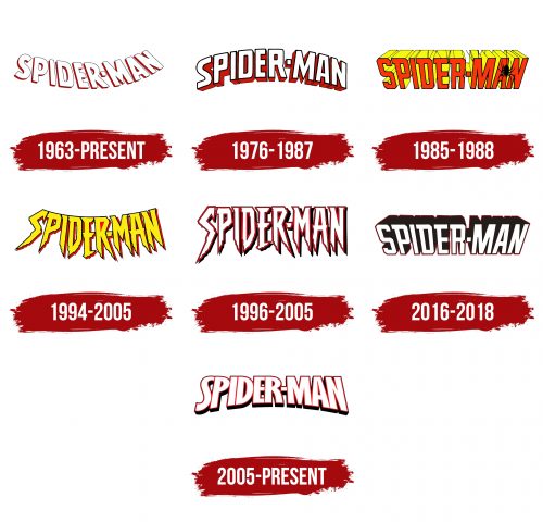
The first Spider-Man emblem appeared alongside the release of his comic series, “The Amazing Spider-Man.” The logo featured bold white letters with an orange backdrop beneath, mimicking a shadow that precisely followed the contours of the characters. This element created a sense of dynamism and movement.
The text arches smoothly as if flying into the distance, visually resembling Spider-Man’s signature web shot. The emblem conveys a sense of lightness and flight, while the shadow below emphasizes that the superhero operates high above, battling among skyscrapers.
The black outline of the letters makes them more striking, hinting at the hero’s nighttime adventures, as most of his feats take place after dark. The bright white shades, in contrast, symbolize the fight for good and justice. The yellow in the design alludes to streetlights and the original plan for the hero’s costume, which was initially considered in orange tones. The white letters also reference the character’s first name, which was conceived by the creators in the 1950s—Silver Spider.
1976 – 1987
For the second comic series, The Spectacular Spider-Man, a new logo was developed, which appears more majestic and solid. This emblem reflects the hero’s growing popularity and recognition, emphasizing his significance in the world of superheroes.
The character’s name is rendered in monumental white block letters with red sides, which ties in with the colors of the hero’s iconic costume. The white symbolizes the web and the hero’s commitment to good, highlighting his unwavering moral stance.
The text is arched in a rainbow shape, adding a sense of protection and safety and reinforcing the hero’s mission to guard the city against crime. This design creates a visual association with the hero’s guardianship over the citizens, emphasizing his role as a protector. Each letter in the logo exudes strength and invincibility, making the emblem reflect Spider-Man’s confidence and heroism.
1985 – 1988
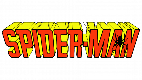
The new logo, designed for the third comic series “Web of Spider-Man”, featured a fresh visual approach. The main characteristic of the lettering was that it appeared as if the viewer was looking at it from above, creating a sense of depth and perspective. The letters remained large and bold but now were done in a yellow-orange color scheme, adding brightness and energy.
The key element of the logo was the image of a spider. A web wraps around the letters, and the spider dangles down from one side of the text as if ready to leap. This visual detail highlights the hero’s dynamic nature and readiness for action. On the original cover of the series, the entire title was suspended on a web, enhancing the feeling that the viewer was observing it from above — as if looking from the rooftop or window of a skyscraper, places where the character typically moved.
This logo design brought the viewer closer to the superhero, immersing them in the hero’s fantasy world. It reflected his ability to use his web effortlessly to swing from place to place.
1994 – 2005
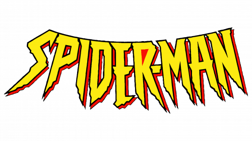
The short-lived series, consisting of only four issues, attempted to reboot the third part under the name “Web of Scarlet Spider.” A new logo was created, which became more menacing and vibrant, reflecting the story’s dark themes. At the center of the plot is a clone of Spider-Man, created by villainous characters, giving the narrative a bloodthirsty and darker tone.
The logo’s letters are sharpened at the bottom, resembling teeth or daggers’ sharp blades, emphasizing the upcoming battles’ brutality and epic nature. The entire symbol resembles a sinister, twisted grin, symbolizing the clash between good and evil, where villains attempt to mock righteousness and gain the upper hand.
Despite its intimidating design, the logo’s yellow and red color scheme softens it slightly, hinting that, in the end, the hero’s clone turns to the side of good and becomes a warrior of light.
1996 – 2005
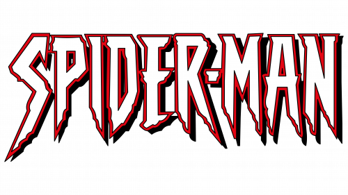
After the closure of the third series, “The Sensational Spider-Man” was launched. The new series’ logo retained the main features of the previous one but underwent some changes. Instead of being curved, the lettering became straight, and the white letters are now outlined in red, resembling bloodied daggers. The serrations at the ends of the characters evoke the small hairs that allow a spider to cling to vertical walls, while the sharp edges hint at the hero’s new abilities, such as shoulder spikes.
The emblem reflects the chaos and disorder the hero must face as he dives into new battles. The return to a white color scheme emphasizes the attempt to bring the original Peter Parker back into the story, again placing him at the center instead of his genetic clone. The logo conveys the events’ tension and enhances the hero’s sense of change and challenges.
2016 – 2018
A new logo was created for the reboot of “The Amazing Spider-Man” series, preserving elements of the previous style. The approach to the emblem remains similar to the original—a top-down view of bold, powerful letters, giving a sense of strength and importance. The black sides of the characters emphasize the darkness that conceals monsters, perfectly reflecting the grim aspects of the superhero’s universe.
Viewers have seen many variations of Spider-Man, and the hero doesn’t always wear his classic red-and-blue suit. Some versions of the character, like Peter Parker’s clone, were born from the heart of evil. The black-and-white color scheme of the logo symbolizes the ongoing battle between good and evil that unfolds in the stories and reflects the hero’s inner conflict. This contrast highlights the complexity of his character and the weight of the decisions he must face.
2005 – today
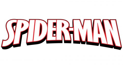
The “Spider-Man” logo in the image, used on comic book covers, conveys the character’s dramatic and heroic atmosphere. This logo first appeared on the cover of the Essential Peter Parker, The Spectacular Spider-Man series, symbolizing significant changes in the hero’s life. Unlike the original 1976 version, the color palette has been altered—the black sides of the letters and the thin red outline create a sense of nighttime darkness.
The red outline on a white background symbolizes blood and the hero’s internal struggles. The black edges of the letters hint at the darkness and dangers surrounding Peter Parker. The shift in color scheme from red to black reflects the character’s evolution. This visual choice conveys the idea of the life trials and tragedies that have toughened the hero, made him stronger, and allowed him to become a symbol of hope in a world full of villains.
The emblem demonstrates the contrast between light and darkness, the battle between good and evil, in which Peter Parker finds his place.
