


 The Addams Family Logo PNG
The Addams Family logo immerses us in the dark yet charming world of an eccentric family. It conveys an atmosphere of mystery, humor, and the characters’ unique charm. Like the characters, the logo is memorable for its style and evokes images of peculiar traditions and the family’s unusual life. Since its debut, the brand has captivated audiences with its unique aesthetic and an ironic take on life, symbolizing a love of the strange and mysterious.
The Addams Family began in 1938, when Charles Addams published one-panel cartoons in The New Yorker. The characters were initially unnamed and appeared in isolated dark-comedy scenes that mocked conventional American family life. During the 1940s, recurring figures and a recognizable macabre tone gradually formed around the household.
The first television adaptation premiered on ABC in 1964. It gave names to Gomez, Morticia, Uncle Fester, Grandmama, Lurch, Thing, Pugsley and Wednesday. The series ran for 64 episodes until 1966 and established the family beyond the magazine. An animated version appeared on NBC in 1973, followed by the 1977 special Halloween with the New Addams Family, which reunited actors from the original production.
A live-action film starring Raúl Juliá and Anjelica Huston revived the property in 1991, followed by Addams Family Values in 1993. Another animated series aired from 1992 to 1993, while The New Addams Family ran for two seasons from 1998 to 1999. A Broadway musical opened in 2010 and received several Tony Award nominations, adding theatre to the franchise’s long list of formats.
An animated feature introduced the characters to younger audiences in 2019, with a sequel released in 2021. Netflix launched a series focused on the family’s daughter in 2022, and it was renewed for a second season. By 2023, the property had moved through cartoons, television, film, animation, and theatre while retaining the black humor established by Charles Addams.
Meaning and History
What is The Addams Family?
This series tells the story of an unusual family that challenges conventional ideas about the American way of life, becoming a unique phenomenon in pop culture. The story centers on eccentric characters: the charming Gomez, the elegant Morticia, their children Wednesday and Pugsley, and vibrant relatives Uncle Fester, the mysterious Grandmama, the unusual butler Lurch, and the animated hand named Thing. Created by the talented artist Charles Addams, this story stands out for its gothic style, dark humor, and an original take on family values, in which traditional norms seem exotic, and what is typically considered strange or frightening is presented as entirely normal.
1991
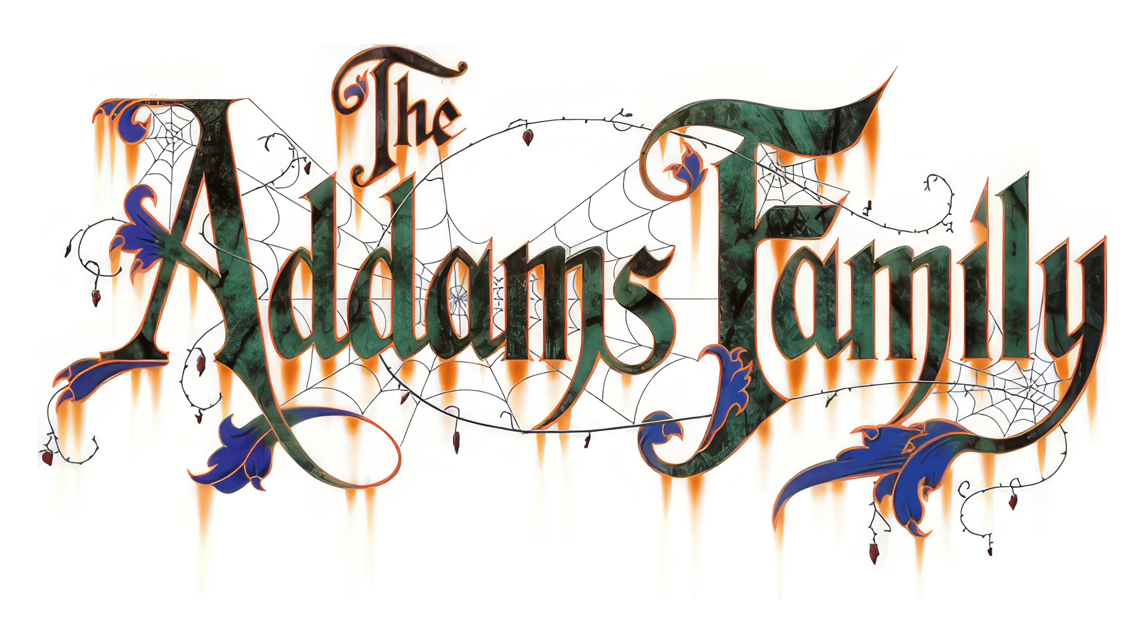
The 1991 Addams Family logo is a work of art that captures the atmosphere of mystery, humor, and a touch of horror associated with this iconic family.
“Addams” is written in large, ornate lettering with elongated, gothic curves. Each letter appears stretched upward as if reaching for something mysterious. The letter edges are slender, resembling fangs or claws, giving the font a hint of menace and a nod to the family’s dark humor. The font shows the influence of the classic Gothic style, traditionally associated with mystique and dark tales. Against this heavy typography, the word “The” appears playful and fluid, as if hiding among webs and flourishes, suggesting an old-fashioned style and a connection to the past.
The emblem is adorned with delicate, almost invisible cobweb threads winding around the letters. The web adds a sense of neglect and decay as if the inscription is coated in the dust of time and centuries-old secrets. This element evokes images of ancient castles and dark corners, fitting perfectly with the Addams’ home, where time seems to stand still.
From the cobwebs, droplets hang as if coming to life, resembling ink spots or tiny water droplets, adding a touch of eerie charm and mystery. Attention to detail underscores the family’s unique style, where every detail has its place and meaning.
The primary colors are green, purple, and orange.
- The green lettering hints at something mysterious and slightly toxic, evoking images of green swamp lights, ghosts, and the inexplicable.
- Purple patterns and swirls add sophistication and a hint of mystique. In culture, purple is associated with magic and mystery, which perfectly suits the Addams family, which is surrounded by intrigue and oddities.
- The orange glow around the letters resembles flames or candlelight, illuminating the logo with a mysterious shimmer. This effect brings it to life and creates the impression of glowing in the dark, adding a Halloween-like mystique.
Additional decorative elements, such as thin swirls and leaves, lend the visual sign the style of an old crest or seal. These swirls hint at antiquity, suggesting that the family is an entire dynasty with a centuries-old history. Vines entwine the inscription, emphasizing that the family is part of a dark nature, something rooted in the ground and nourished by secrets and shadows.
The name “The Addams Family” symbolizes a peculiar yet cozy world where darkness and humor walk hand in hand. The family has become a cultural phenomenon, with their surname embodying the courage to be unique. The logo’s entire aesthetic personifies a world where every detail is mysterious, and dark elements become part of everyday life.
2019
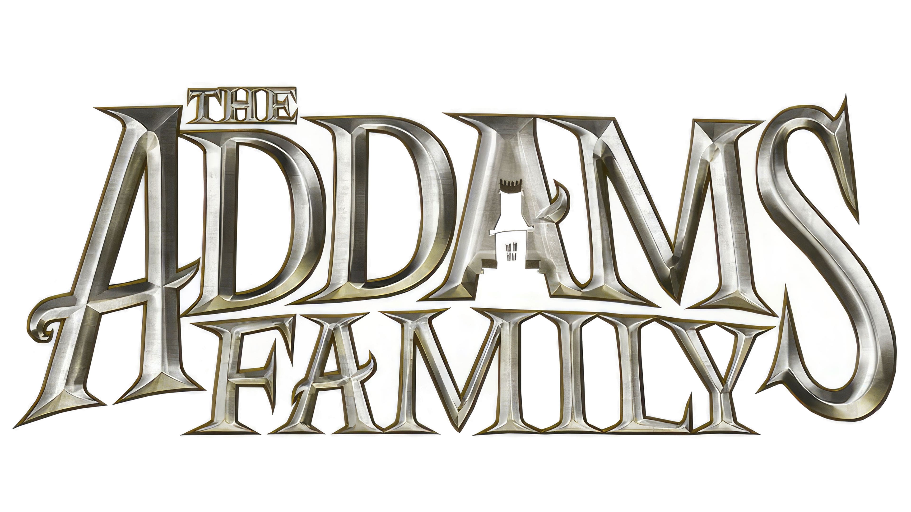
The 2019 Addams Family logo conveys a gothic style, dark elegance, and an atmosphere of dark humor that permeates the entire history of this unusual family. Every detail, from the letter shapes to the metallic shine, is designed to evoke a sense of grandeur and mystery.
The inscription is set in a bold Gothic font. The letters appear both angular and elegant, with sharp edges, as if carved from cold metal. These shapes symbolize severity and antiquity, evoking family castles and dark corridors where every shadow holds a secret. The tall and slightly tilted letters “A” and “D” stand out, adding a sense of majesty and a kind of “elevation” to the logo.
The color and texture resemble polished metal or antique silver. This metallic sheen enhances the sense of mystique and nobility. The visual sign glows with a dim gray light, as if situated in a hall with subdued lighting, adding an air of mystery. The metal represents the Addams family’s strength, durability, and resilience to time and change.
In the center of the emblem, between the letters “A,” you can see a small house. This element adds charm and mystery. The house resembles an old mansion where the light is always dim, shadows seem alive, and everything around is eerie. The shadow cast by the letters falls at an angle, emphasizing dimension and making the visual sign more dramatic, coming alive in the half-light.
The logo is rendered in shades of silver and gray, conveying the family’s dark atmosphere. This cold, metallic tone highlights the uniqueness of their style, suggesting that the Addams are ancient, mystical, and timeless. The metallic hue adds a sense of longevity, as if the logo could be engraved on the gates of an old estate.
The Addams Family emblem combines gothic, dark elegance, and classic horror aesthetics, immersing the viewer in a world where darkness and humor intertwine in a single design.