


 Tom and Jerry Logo PNG
The Tom and Jerry logo evokes the fun, carefree chase game that viewers worldwide love. The bright and mischievous characters seem to come to life on the emblem, constantly chasing each other. The dynamic design effectively highlights the playful and restless nature of the cat and mouse, whose antics always bring laughter and charm. However, behind each of their tricks lies a bit of chaos, which proves costly for their owner, adding spice to the action. The visual mark captures the adventurous spirit, where the never-ending chase remains exciting and entertaining.
Tom and Jerry began in 1940, when Metro-Goldwyn-Mayer (MGM) hired William Hanna and Joseph Barbera to develop a theatrical cartoon series able to compete with rival studios. Their first short, Puss Gets the Boot, premiered on February 10, 1940. The cat was named Jasper, while the mouse had no name. The film received an Oscar nomination.
A studio contest later gave the duo their permanent names, proposed by animator John Carr. The Midnight Snack, released on July 19, 1941, became the first cartoon officially presented under the Tom and Jerry title. During the 1940s and 1950s, Hanna and Barbera produced more than 100 shorts based on physical comedy, limited dialogue, and repeated conflict between the cat and mouse. Between 1943 and 1953, the series won seven Academy Awards.
The studio closed its animation department in 1955, ending the original production cycle. New episodes appeared in 1961 through Gene Deitch and Rembrandt Films in Czechoslovakia. In 1963, Chuck Jones and Sib Tower 12 Productions took control and created 34 shorts with revised designs. Hanna-Barbera Productions produced television projects in the 1970s and 1980s.
Tom and Jerry: The Movie opened in 1992 and received mixed reviews. Warner Bros. acquired the rights in 2001 after the Time Warner and Turner Broadcasting merger. Later releases included Tom and Jerry Tales (2006 to 2008), The Tom and Jerry Show (2014 to 2021), and a live-action animated film in 2021.
Meaning and History
What is Tom and Jerry?
This classic animated series has captured viewers’ hearts worldwide with its timeless rivalry between a cat and a mouse. At the center is the endless chase between Jerry, a clever and mischievous mouse, and Tom, a persistent but often outwitted cat. The show’s appeal lies in its wordless humor, based on physical comedy and visual gags, making the stories accessible to audiences of all ages. The action occurs in various settings, from homes to exotic locations worldwide. Tom and Jerry’s antics often evolve into complex plots involving recurring characters, adding depth to their interactions. Despite their constant quarrels, there are occasional moments of understanding, hinting at a more nuanced relationship than just predator and prey. Over time, the brand has expanded beyond television, including feature films, video games, and merchandise, cementing its status as a cultural phenomenon that continues entertaining generations of viewers.
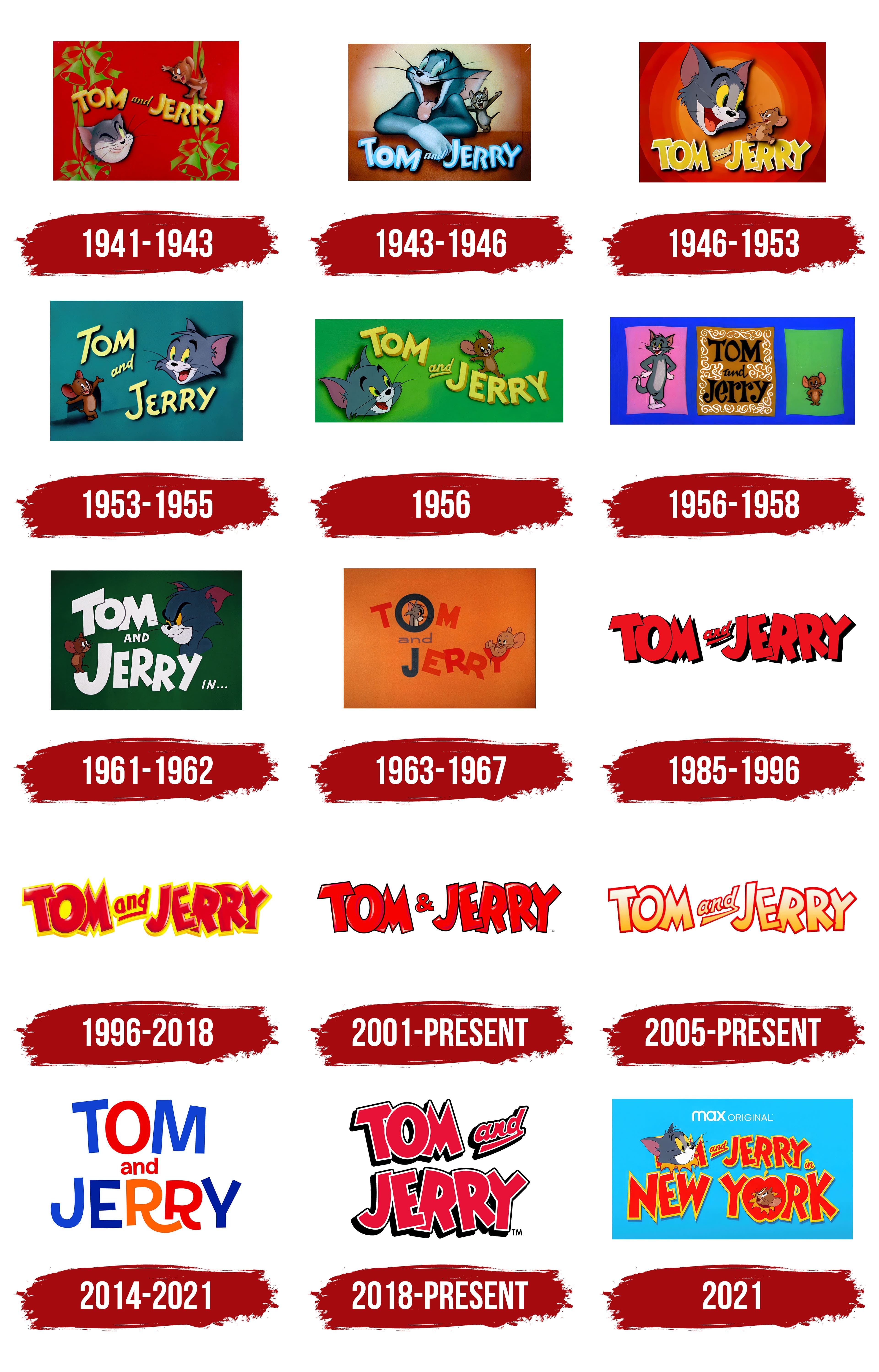
1941 – 1943
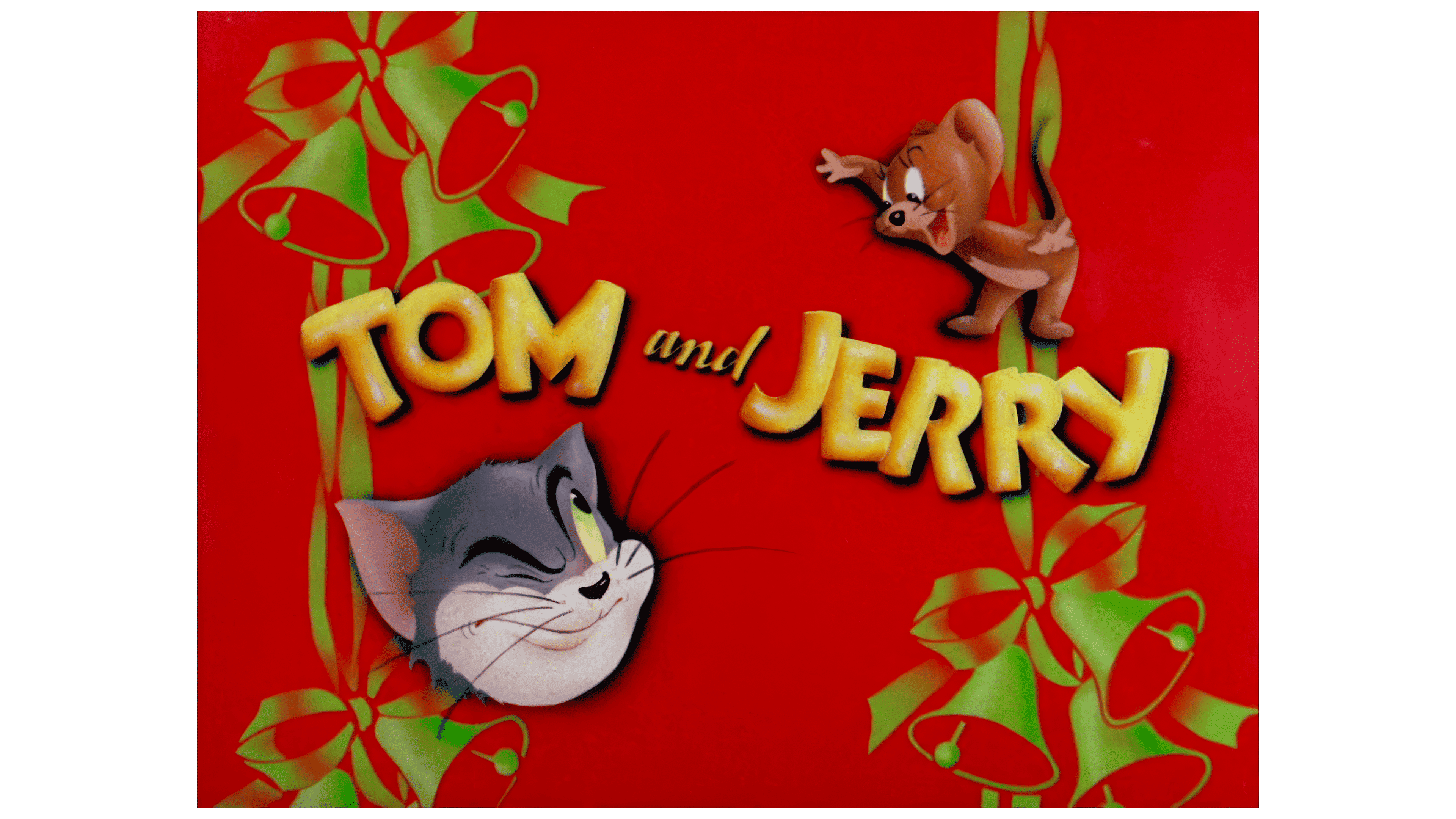
The first logo for the series appeared nearly a year after the creation of the first cartoon, although MGM did not consider the debut a success. The characters did not yet have their current names. Therefore, the official beginning of the series is considered to be the second story, The Midnight Snack, released in 1941.
The emblem was designed in a festive Christmas style. A dark red background resembling a velvet curtain created a celebratory atmosphere. Intertwined ribbons and jingle bells decorated both sides of the logo, giving it a festive sparkle. The main characters, Tom and Jerry, peeked out behind these decorative elements. At the bottom, Tom’s head could be seen looking up while Jerry playfully peeked from above.
The show’s title was written in bold yellow letters that resembled pieces of cheese, Jerry the mouse’s favorite treat. Interestingly, the characters’ names were chosen through a contest, and the winner was animator John Carr. He suggested the names Tom and Jerry, referencing two lively and mischievous characters from the 1821 play Life in London. The names also coincided with the name of a popular Christmas cocktail, which Carr remembered while selecting the names for the main characters.
1943 – 1946
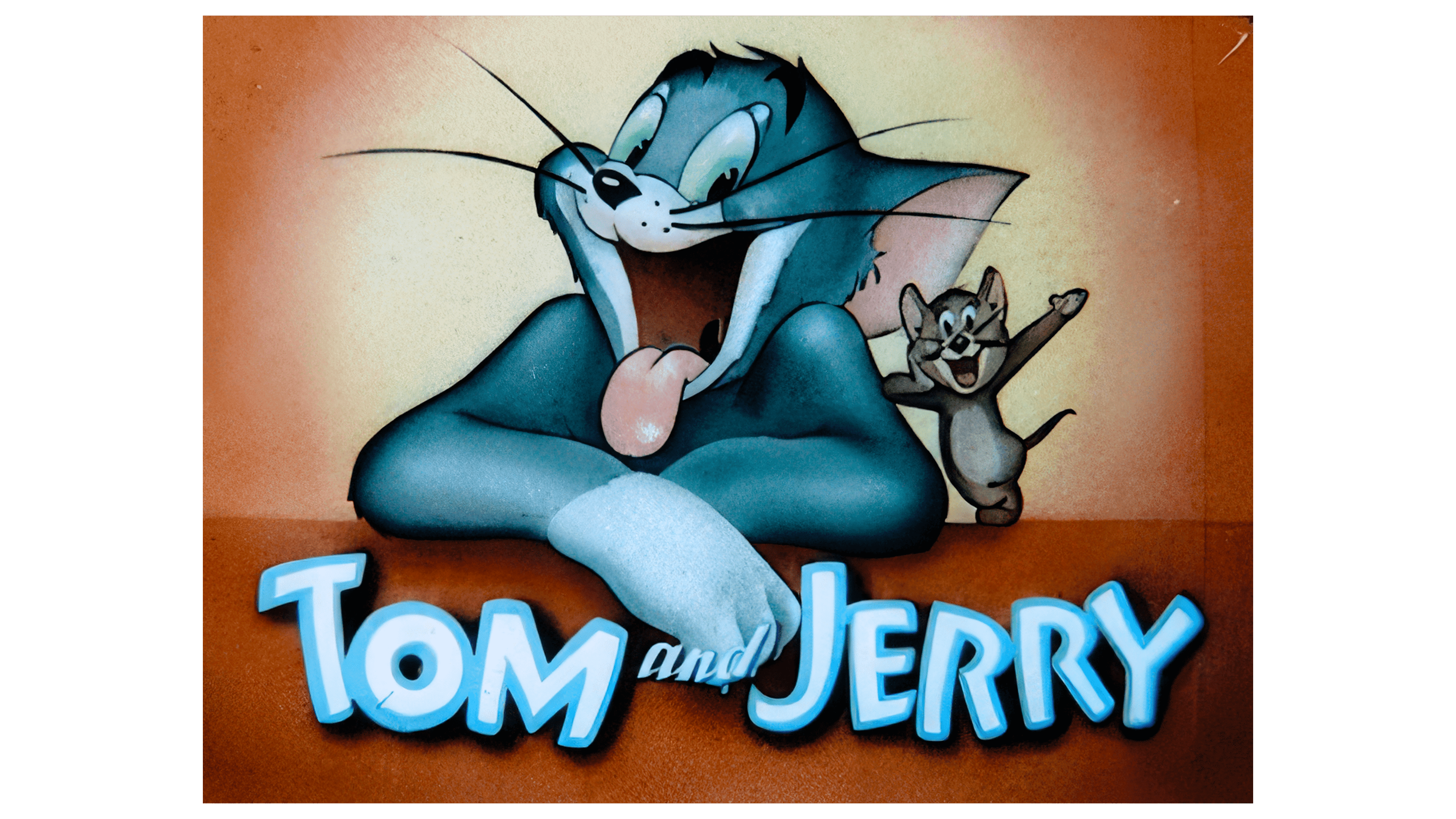
The 1943 emblem depicts Tom and Jerry in a more friendly manner, suggesting their ability to temporarily set aside their age-old rivalry to achieve a common goal. The drawing shows the cat and the mouse sitting at a table, smiling warmly and waving, as if to suggest that their primary mission is to entertain the audience.
A bright spotlight is focused on the center of the image, creating the illusion that Tom and Jerry are posing for the camera, as if they were actors playing their roles. Tom stands with his mouth open, giving the impression that as the lens turns away, Jerry might be in serious trouble. This emphasizes the show’s characteristic comedic tension, where each scene is filled with humor and mutual cunning, all for the audience’s enjoyment.
1946 – 1953
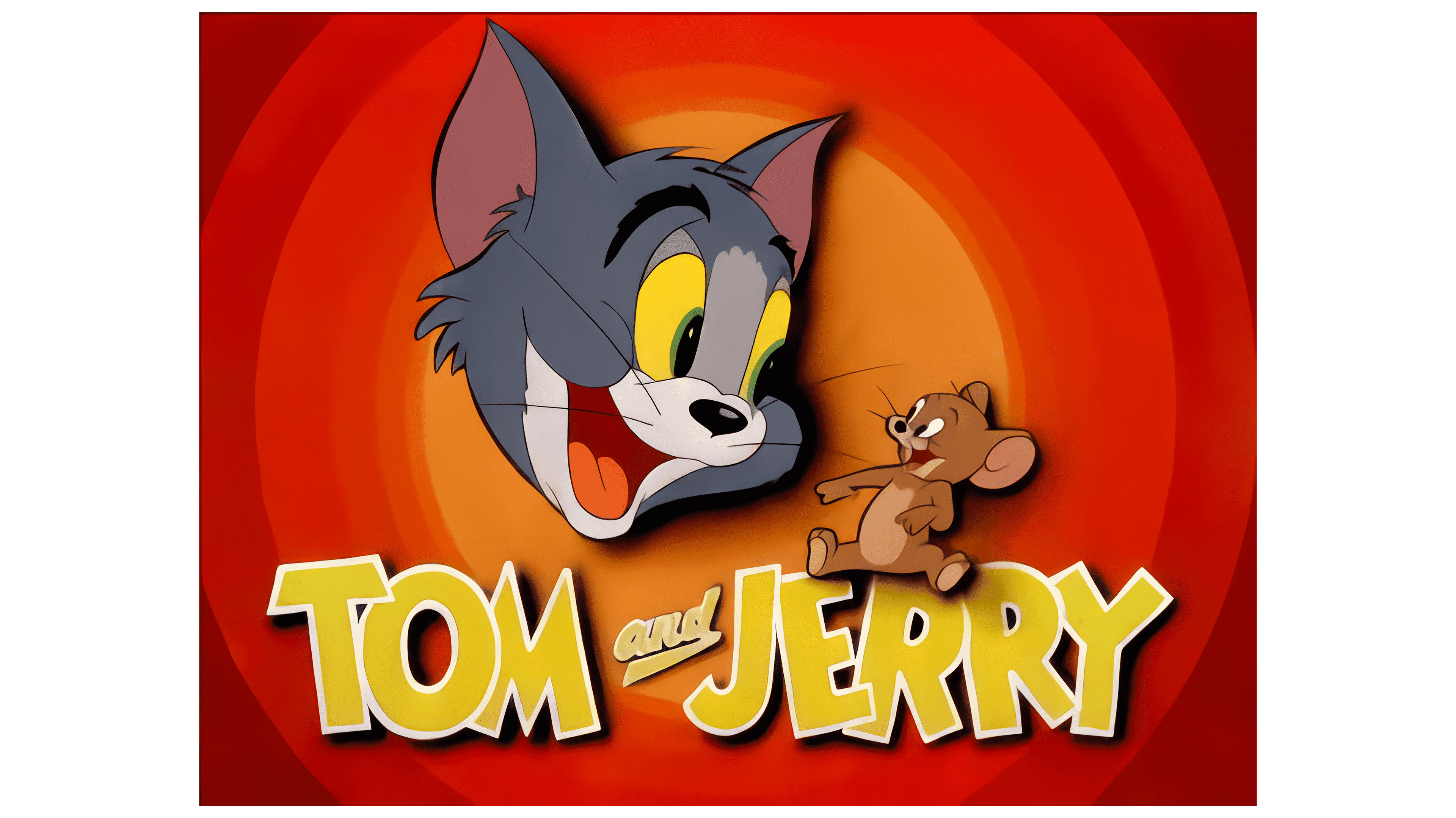
The emblem is designed in a style reminiscent of classic Looney Tunes, with the main characters positioned at the center of a record composed of concentric circles. Like in the first logo, we only see Tom’s head, whose facial expression radiates joy and fun. Next to him, sitting on the title, is Jerry, who laughs along with his eternal adversary, adding a friendly and lighthearted touch to the scene.
The show’s title is written in large yellow letters that seem to come to life, giving the impression of dancing and highlighting the energy and constant movement. Special attention is drawn to the word “and,” styled with a dynamic arrow pointing from bottom to top. This element metaphorically alludes to the fast-paced chases and endless tricks that are essential to Tom and Jerry’s relationship. Thus, the logo conveys an atmosphere of playful rivalry and lively interaction, emphasizing the exciting dynamic of their adventures.
1953 – 1955
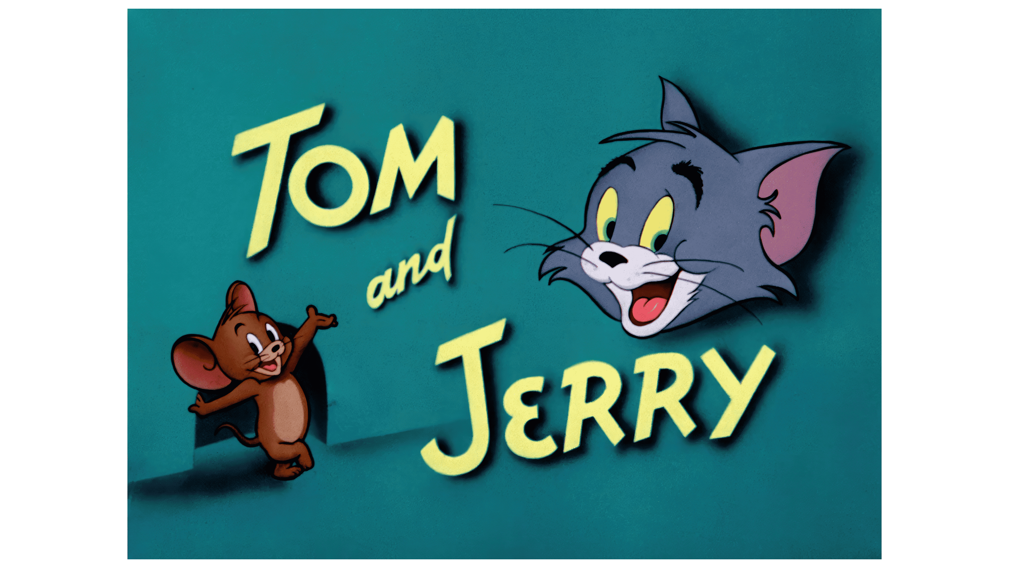
The main characters meet right at Jerry the mouse’s hole. Jerry, casually leaning against the door frame, points with his paw at the cartoon’s title as if inviting the audience into the world of their fun adventures. On the opposite side of the logo is Tom’s head, who, like his small rival, is also glancing at the viewer. This look from both characters creates an interactive invitation to join their endless pranks and playful antics.
The title’s font has become thinner, and the corners of the letters have sharpened, symbolizing sharp humor and the hidden threat of “retribution” that always awaits Tom after his failed attempts to catch Jerry. This design choice emphasizes the cartoon’s characteristic traits: funny but occasionally painful for Tom, the revenge he regularly receives for his mischief, adding a sense of dynamism and tension to the overall image.
1956
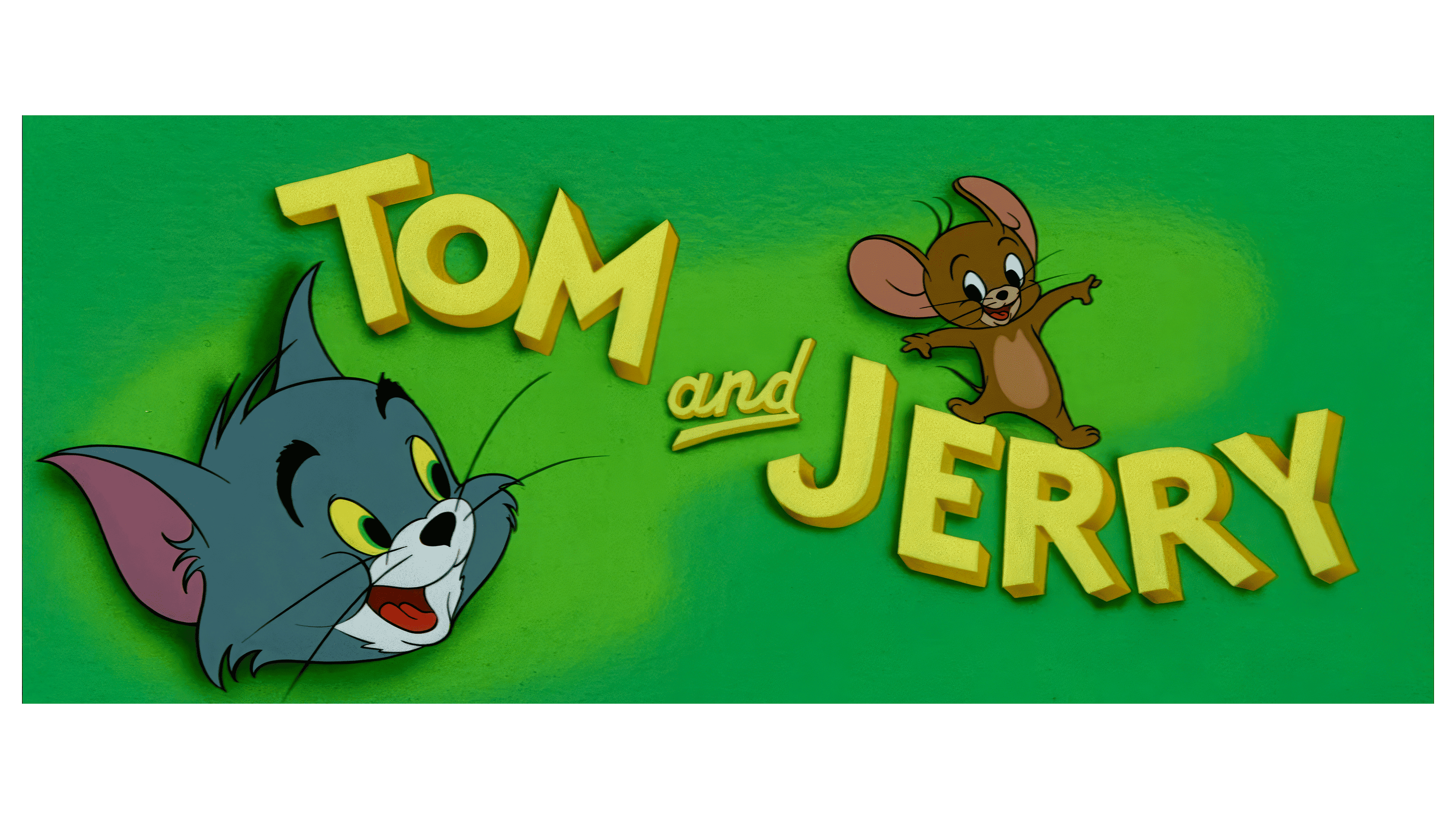
The company began re-releasing its classic cartoons, creating updated covers for them. The design has been updated to refresh the visual style and attract a new audience. In the updated images, the characters have taken new positions, giving the logo dynamism and liveliness.
On a bright lime background, resembling the slope of a slide, the cartoon’s title is placed, down which Jerry is playfully sliding. At the bottom, Tom waits, ready to catch the restless mouse, adding intrigue and a familiarly tense atmosphere. This design choice preserves the spirit of the original stories and conveys their energetic, playful dynamic, making the covers more modern and appealing.
1956 – 1958
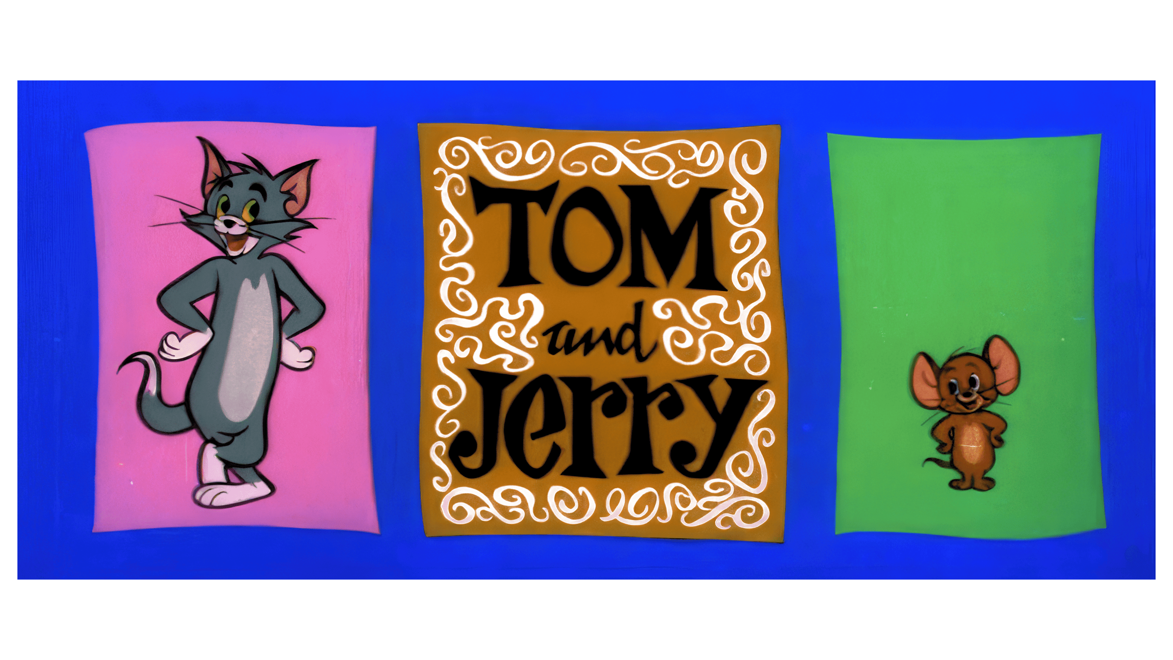
The production of the cartoon was discontinued, and an emblem in the form of a commemorative frame with a photograph was designed for the compilation releases, giving it a symbolic and nostalgic character. The cartoon’s title is centered on a brown background reminiscent of a mousetrap. This choice of color and texture subtly hints at the constant cat-and-mouse game between the main characters.
The title is surrounded by white swirls, reflecting the chaotic, complex paths of Tom and Jerry’s endless chases and highlighting their unpredictable, amusing adventures. On the sides of the logo are two windows that create balance: in the pink window on the left, Tom stands at full height, and in the green window on the right, Jerry is ready and watching his rival. This design conveys the spirit of the old episodes and symbolizes their lively, dynamic, and continuous game.
1961 – 1962
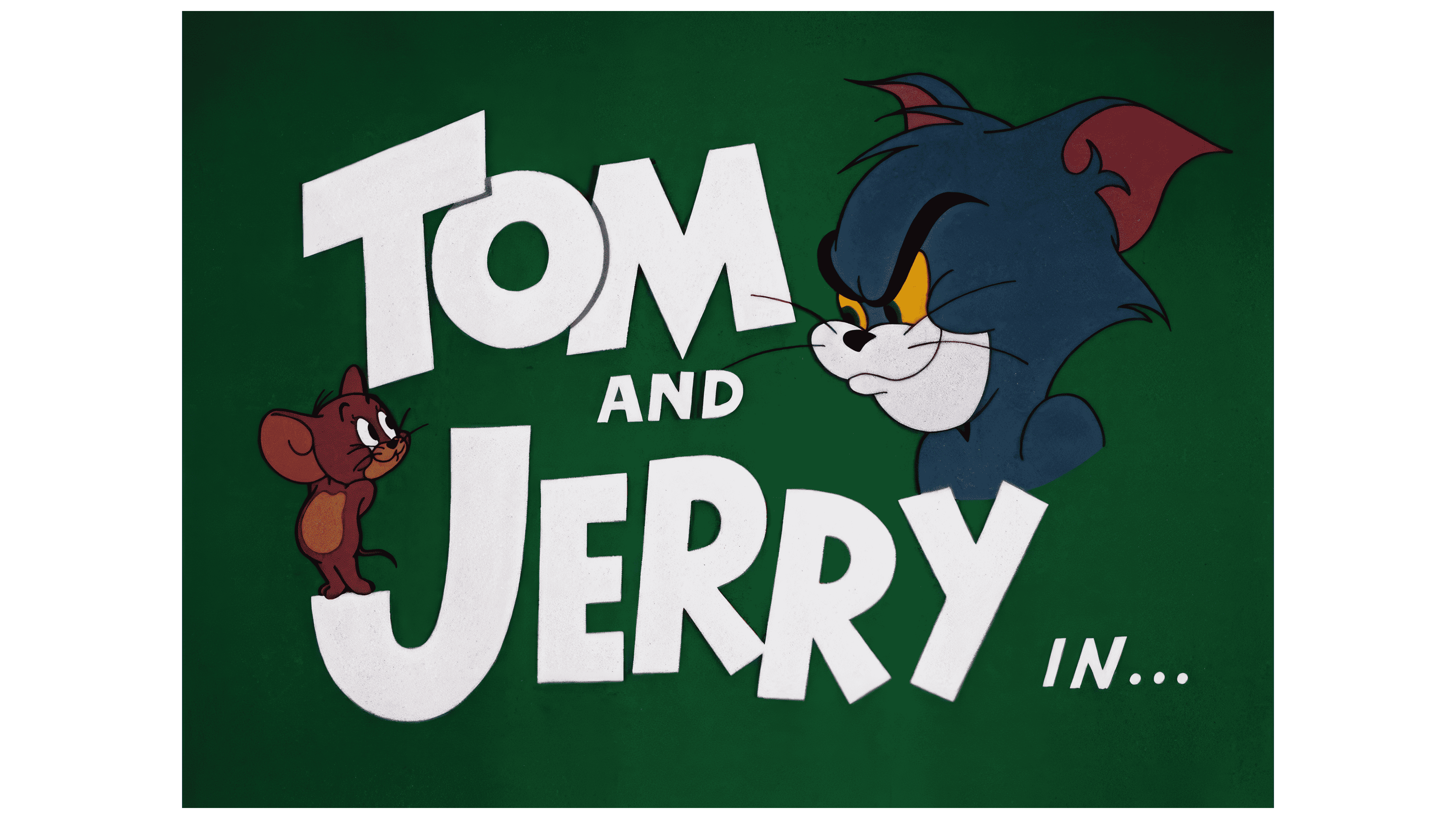
MGM transferred the production of the cartoons to another studio, Rembrandt Films, which led to a change in the emblem’s character. These changes were reflected in the characters’ style and mood.
On the updated emblem, Tom is shown angry for the first time, adding sharpness and tension to his image, while Jerry looks slightly confused, highlighting their dynamic interaction. The dark green background creates contrast, effectively making the white letters of the cartoon’s title stand out. As always, the mischievous mouse stands at the end of the glyph for the first letter of his name, adding playfulness and liveliness to the logo.
The conjunction “in” at the end of the title takes on a significant meaning, emphasizing the plot’s development. This element suggests that the characters are stepping outside their usual homes and embarking on new, even more thrilling adventures.
1963 – 1967
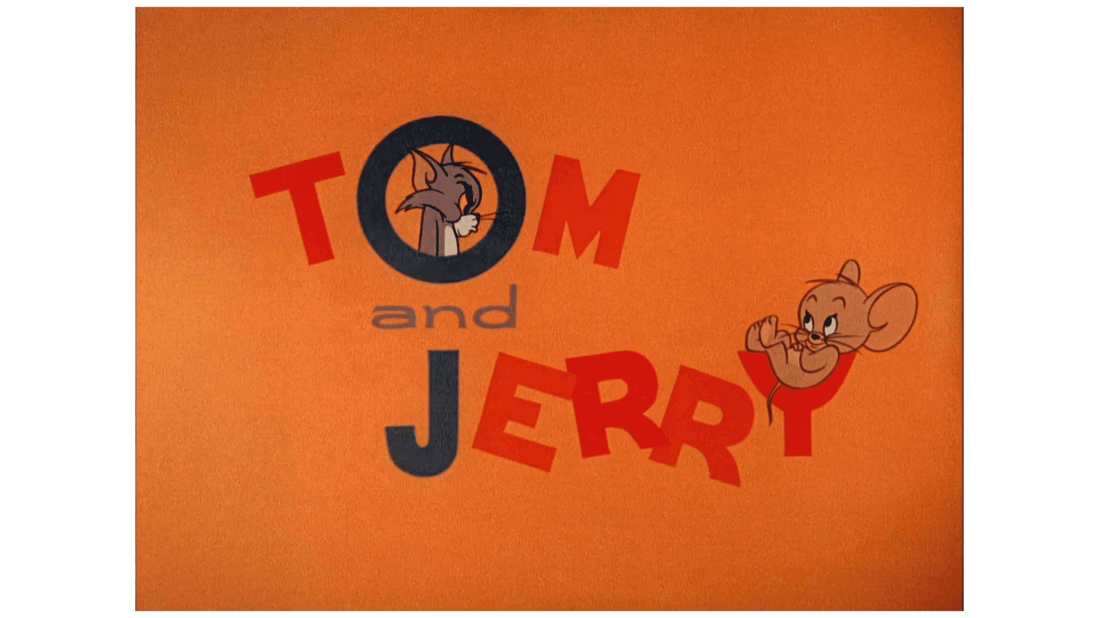
The 1963 logo continued to develop the image of the angry, defeated Tom but presented him in an entirely new, more playful style. The orange background adds warmth and cheerfulness to the composition, creating a friendlier mood. The main characters are now seamlessly integrated into the title as if inside a maze, symbolizing their endless chases.
With casual confidence, Jerry lounges inside the letter “Y” as if it were a glass, enjoying his victory. At the same time, Tom glares at him from a green window with the letter “O.” This interesting design approach was introduced by Sib Tower 12 Productions, which took over the production of the iconic series. It adds fresh dynamics and humor to the characters’ traditional rivalry.
1985 – 1996
The rights to the cartoons were transferred to WTBS, and with the new owner, broadcasting began on its channels under an updated logo. This logo retained only the name, designed in a style reminiscent of the original 1946 design but with fresh updates. The inscription is in rich red, giving the logo more energy and brightness.
The letters received a thin black outline and a dark shadow, which added depth and emphasized their visual expressiveness. This design reflected the cartoons’ dynamic, fun, and explosive nature while highlighting their popularity and the genuine love audiences have for these famous characters.
1996 – 2018
The 1996 logo is designed in a bright and playful 3D format, giving it a toy-like, childlike character. The shiny, sleek red letters of the name are set against a wide yellow background, creating depth and enhancing its visual appeal. This design was directly linked to the launch of the Tom & Jerry Kids series on Fox Kids, which explains the choice of a child-friendly design.
The emblem was perfect for a young audience and was also used in subsequent projects, including Tom and Jerry: The Fast and the Furry, released in 2005, and Tom and Jerry and Tex Avery, Too! Volume 1: The 1950s CD. The logo’s bright, three-dimensional elements highlight the cartoons’ lightheartedness and fun, making them memorable and recognizable among a young audience.
2001 – today
After the series’ rights were transferred to Warner Bros., the feature-length animated film Tom and Jerry: The Magic Ring was released. The logo returned to its traditional red color with a black outline, but the letters were now three-dimensional and glossy. This updated design makes the emblem more dynamic and gives it a cartoon style typical of the studio’s projects.
The three-dimensional, shiny letters brighten and deepen the logo, making it more visually appealing. They also highlight its connection to the classic Warner Bros. animation style while introducing a modern and recognizable design.
2005 – today
With the release of “Tom and Jerry: Blast Off to Mars,” the logo underwent another change. Now, the letters feature a gradient transition from yellow to white, symbolizing the loss of gravity as if the inscription were floating in space. This effect creates a sense of lightness and airiness as if the letters are ready to soar upward along with the characters.
However, like a gravitational field, the red outline keeps the letters in place, hinting that the characters will encounter new, amusing adventures even in zero gravity. This design emphasizes the dynamic, fun nature of the cartoon, adding a sense of space flight and exciting events ahead to the logo.
2014 – 2021
The reboot’s emblem for the Cartoon Network show was slightly retro, bringing nostalgic notes while remaining modern and vibrant. The flat letters, executed in blue, navy, orange, and red, create a lively, bright border that perfectly reflects the atmosphere of fun stories in which the characters travel to various eras and places.
The characters’ names are written one under the other, giving the emblem a neat and compact look. This design highlights Tom and Jerry’s equality, making them the central figures in each new story. The bright colors add energy and freshness, perfectly aligning with the show’s dynamic nature and adventurous component.
2018 – today
The 2018 “Tom and Jerry” logo returned to the classic colors and styles that have been popular for decades. The red letters with white and black outlines create contrast and emphasize the energy and dynamism inherent in the famous characters. This color combination symbolizes the cat-and-mouse’s constant struggle and rivalry, their eternal connection as rivals and partners on screen. The white and black outlines also add depth and volume, creating a sense of three-dimensionality and movement, which aligns well with the fast pace of the cartoon’s plot.
The emblem’s font is bold and angular, highlighting the characters’ comedic, caricatured nature and their clumsy, funny encounters. The “Tom” lettering points to the main character’s name with its dynamic line, while “Jerry” is written more evenly and steadily. This suggests the mouse’s cunning, as he always stays one step ahead of his enemy.
This logo was used to release WB Kids episodes, emphasizing short, vivid moments that captured the essence of the classic cartoon. The dynamism of the composition symbolizes the chaos and fun that always reign in the adventures, adding nostalgic touches for fans and a fresh style for new viewers.
The 2018 emblem update preserves the spirit of the classic cartoon while adapting it to modern realities, where viewers’ attention is drawn to fast, funny episodes.
2021
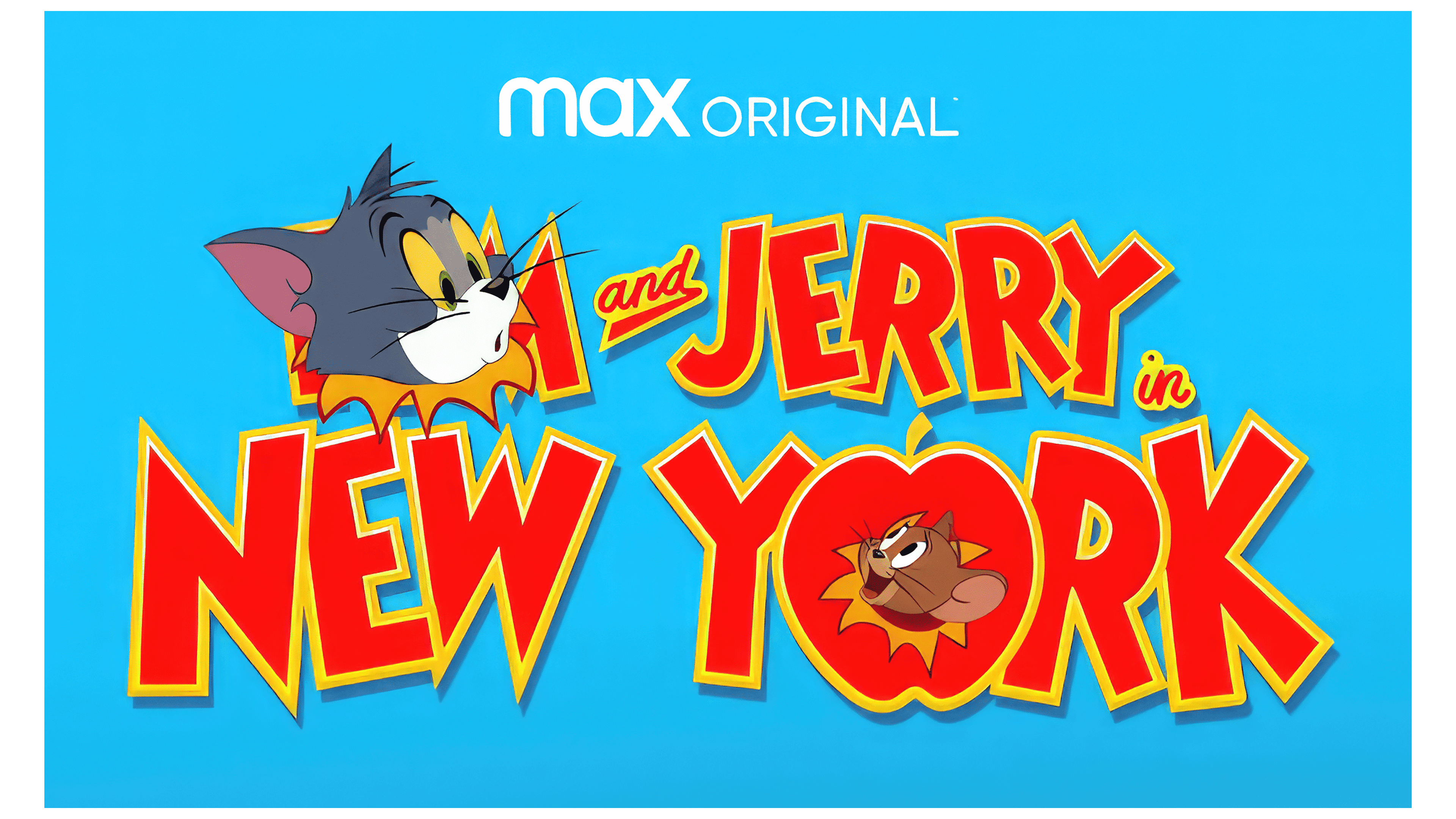
In honor of the franchise’s anniversary, a new series about the adventures of the iconic characters, «Tom and Jerry in New York», debuted. The show’s title is set against a blue background, symbolizing a television screen, creating a sense of returning to classic formats familiar to many generations.
After a long hiatus, images of the main characters were reintroduced into the logo. As if tearing through a poster, Tom’s head appears from the top of the letter “O” in the word «Tom,» adding dynamism and fun to the composition. On the other hand, Jerry peeks out from the title “New York”, where the letter “O” is replaced with a symbolic apple, a nod to the “Big Apple,” New York.
The characters’ expressions show surprise and joy at their reunion, highlighting their eternal rivalry and long-awaited return to the screen. This logo design is visually engaging and conveys a sense of novelty and renewed adventures while preserving the spirit of the classic stories.