The WildBrain logo looks as if it was created based on a child’s drawing, brought to life on screen through animation. This emblem embodies a studio that essentially “feeds” on the spirit of childhood, deeply understanding the world of children and their needs. Every line and element of the emblem conveys the energy, creativity, and endless imagination typical of a young audience. The logo highlights the company’s mission — to create vibrant, engaging, and in-demand programs for children that meet their interests and inspire discoveries.
WildBrain: Brand overview
The company’s history began in 2006 with the merger of Halifax Film Company and Decode Entertainment, forming DHX Media. This merger brought together the resources and expertise of two successful Canadian production companies specializing in family and children’s content.
Decode Entertainment, established in 1997, was known for hit shows like Naruto and Radio Free Roscoe, while Halifax Film, founded in 2004, had its notable productions. These companies created a strong presence in the children’s entertainment industry.
The newly formed company pursued aggressive growth through acquisitions and organic expansion in the following years. A key moment came in 2007 when it acquired Studio B Productions, enhancing its animation capabilities. Another major step was the 2010 acquisition of Wildbrain Entertainment, known for popular shows like Yo Gabba Gabba! and The Ricky Gervais Show. This acquisition expanded the company’s portfolio and helped lay the foundation for its eventual brand identity.
In 2012, the company acquired the Cookie Jar Group, adding iconic properties like Inspector Gadget and Caillou to its catalog. This move made it one of the largest global owners of children’s content libraries. The acquisition of Ragdoll Worldwide in 2013, the company behind Teletubbies, further boosted its global presence.
In 2014, it took a strategic step by purchasing Disney Junior, Disney XD, and Family Channel from Bell Media, gaining its TV channels to distribute content across Canada.
By 2017, the company expanded with the $345 million acquisition of Peanuts and Strawberry Shortcake from Iconix Brand Group. This move strengthened its portfolio by adding some of the world’s most recognizable children’s brands.
The company rebranded in 2019, uniting all its brands under one name to modernize and refresh its image.
Despite the challenges of 2020, the company continued to grow, particularly on digital platforms like YouTube, where it became one of the largest networks for children’s content. In 2021, the company expanded its key brands, launching new Peanuts projects on Apple TV+ and releasing new seasons of popular series like Johnny Test on Netflix.
By 2023, the company had solidified its position as a major player in the global family and children’s content market, focusing on building key brands, creating new content, and expanding across traditional television, streaming, and digital platforms.
In a short time, the company evolved from a merger of two Canadian production studios into a global leader in children’s entertainment. Through timely acquisitions and innovative content strategies, it has built a vast library of beloved shows and characters, staying profitable and relevant by adapting to the ever-changing media environment and audience preferences.
Meaning and History
What is WildBrain?
This is a leading animation studio in children’s entertainment, known for its vibrant characters and captivating stories that spark the imagination of young audiences. The studio develops, produces, and distributes original content and acquires licenses for popular franchises, creating a rich catalog of children’s programming. Its portfolio includes both classic projects and modern series, allowing it to reach multiple generations of viewers. One of the key factors in its success is its ownership of one of the largest independent libraries of children’s content, which enables the brand to significantly impact the children’s entertainment market.
2006 – 2010
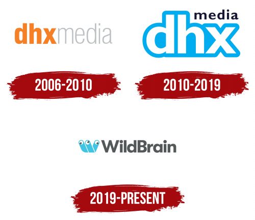
The first emblem of DHX Media is closely tied to its name and represents the merger of Decode and Halifax, the two parent companies. The abbreviation DHX is written in lowercase orange letters, which references the style of the Decode Entertainment emblem, emphasizing continuity. The orange symbolizes warmth and friendliness, creating a sense of trust and a welcoming attitude toward viewers. The word “Media” is written in thin gray letters, barely noticeable, reminiscent of Halifax Film’s style. This design approach highlights the unity and cohesiveness of the new brand, as well as its focus on professionalism.
2010 – 2019
The DHX Media logo, introduced in 2010, attracts with its simplicity and clarity. It consists of three letters: “d,” “h,” and “x,” which gradually increase in size from the first to the last. This approach reflects the company’s ambitions at the time—its drive for growth and expansion, which occurred after acquiring Wildbrain Entertainment. Each letter is highlighted in white against a blue background, reminiscent of the endless sky, symbolizing unlimited possibilities and creativity in content production.
The font is smooth, rounded, and friendly, emphasizing the company’s focus on a children’s and family audience. The bright blue at the logo’s base evokes associations with something fresh, light, and reliable, like the clear sky above. This underscores the brand’s intent to become a children’s entertainment industry leader.
The word “Media” in the upper right corner is written in small black letters, adding balance to the emblem. This element symbolizes the company’s seriousness and responsibility despite its primary focus on children’s projects. This small but significant element seems to speak to the professionalism behind all the fun and creative façade, showing DHX Media as a business with clear goals and ambitions.
The visual mark demonstrates the fusion of creative aspirations and a serious approach to content creation. It emphasizes that the company strives to remain a leader in its niche while staying true to its roots and commitment to the children’s audience.
2019 – today
The modern company logo depicts a playful creature with three eyes. The emblem is based on a modified letter “W,” which begins the name WildBrain. The image is designed in the style of children’s drawings, creating the impression of a mysterious little creature. Its eyes look in different directions, emphasizing a wild, unpredictable (“Wild”) nature.
The creature’s shape resembles the antennae of a snail, curiously and somewhat timidly peeking out to observe the surrounding world. The lines of the emblem also evoke associations with finger games, popular among young children. The pupils, reminiscent of the iconic Pac-Man character, add a playful element to the image.
The logo symbolizes a childlike character, ready to have fun with young viewers. This reflects the company’s activity, which possesses the largest library of children’s programs.
Below the image is the company name, written in gray font and capital letters. “WildBrain” refers to the brand’s successful YouTube network, named after the former Wildbrain Entertainment, which was acquired by DHX Media in 2010.
