


 Decode Entertainment Logo PNG
The Decode Entertainment logo attracts with its mystery and atmosphere of adventure. It invites young viewers to embark on an amazing journey where digital secrets and hidden heroes await. The symbol evokes the sense that something new and unusual is always lurking behind the screen, waiting to be discovered. Unraveling such mysteries and learning about unknown characters becomes truly exciting, especially when beloved animated characters created by the company join the process.
Decode Entertainment was founded in 1997 in Toronto, Canada, by Neil Court and Steven DeNure. The company focused on producing family and children’s television programs for international audiences. Its first major success came in 1999 with Angela Anaconda. This animated series used a mix of computer animation and photo collage, helping the studio gain recognition in children’s entertainment.
During the early 2000s, Decode Entertainment expanded its production portfolio with several successful projects. In 2001, the company created The Hoobs in partnership with Jim Henson Company, producing an educational preschool series that was broadcast in the United Kingdom and other markets. In 2002, Decode released Radio Free Roscoe. This live-action youth series received critical attention and won a Gemini Award for Best Youth Program.
The company continued growing in 2003 by acquiring Halifax Film Company, strengthening its production capabilities across Canada. In 2004, Decode worked with Aardman Animations on Planet Sketch, an animated comedy series that increased its presence in international markets. In 2006, Decode Entertainment merged with Halifax Film to create DHX Media, which later became WildBrain. The new company developed projects such as Super Why! and expanded into a larger producer and distributor of children’s content.
Further growth followed with the acquisition of Cookie Jar Group in 2012 and the purchase of Disney Junior, Disney XD, and Family Channel from Bell Media in 2013. In 2017, the company added the Peanuts and Strawberry Shortcake brands to its portfolio. In 2019, DHX Media changed its name to WildBrain, continuing the development of children’s animation, digital media, and entertainment projects based on the foundation created by Decode Entertainment.
Meaning and History
What is Decode Entertainment?
This Canadian company has earned a reputation for creating inventive and captivating content that appeals to young people worldwide. Its catalog includes a variety of animated and live-action series, each with its unique style and educational value. The company is known for creating characters and stories that resonate with children, subtly delivering important life lessons. This is reflected in content for different age groups, from charming programs for preschoolers to thrilling adventures for older kids. The company’s success lies in combining entertaining elements with educational aspects, allowing children to learn while enjoying fun viewing.
1997 – 1999

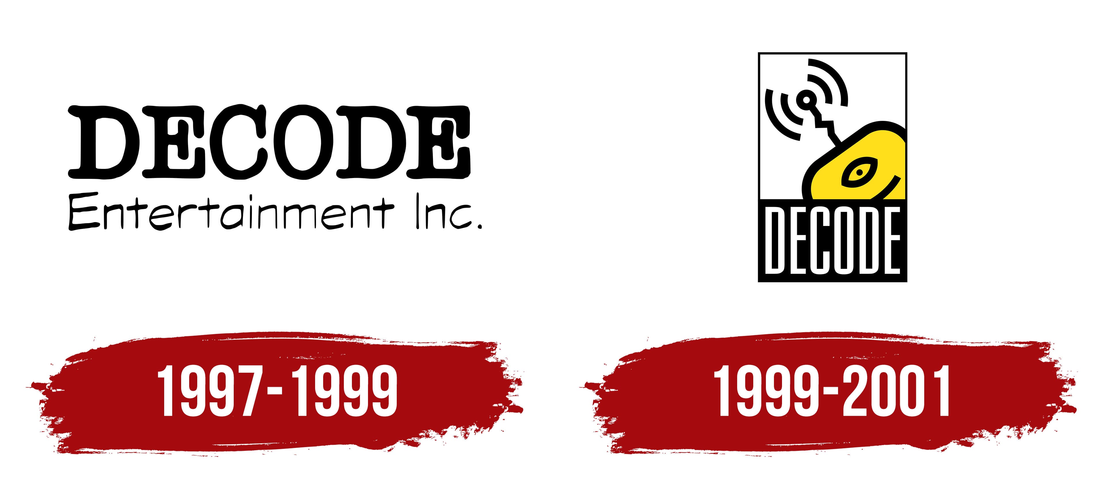
The company’s logo is designed in a simple and memorable style. It consists of an image and a large name written in a clear font. The main focus is on a yellow figure with an eye, resembling a robot part or a technological device. This refers to digital technologies and the modern media world in which the company operates. Above the figure is a signal symbol, visualizing the transmission of information, a key element in working with television, series, and multimedia.
The company name “DECODE” is written in capital letters, giving the logo strength and confidence. The font style is strict and modern, reflecting a serious approach to content production and careful development. This design emphasizes the company’s professionalism and technological focus.
The color scheme is symbolic: the bright yellow is associated with energy, creativity, and innovation, while the black background and lines add contrast and severity, highlighting the brand’s reliability and stability. The emblem demonstrates the connection between technological solutions and creative processes.
Interestingly, the name comprises parts of the founders’ last names: DeNure, Court, and Delmage, which makes this brand more personal and family-oriented. When the studio was actively developing, the focus was on creating original content and children’s TV shows, as reflected in the friendly, technological design of the visual symbol.
1999 – 2001
The updated logo of Decode Entertainment, presented two years after its founding, resembles a poster. The standout feature is a yellow character, a one-eyed robot peeking out from behind a corner. This element gives the logo a sense of dynamism and interactivity. The robot looks directly at the viewer, creating the impression that it invites us into the world of multimedia adventures. Its playful nature highlights the company’s creative and innovative approach to content creation.
The robot’s yellow color symbolizes energy, optimism, and a drive for innovation. This reflects the studio’s mission of producing vibrant, positive content for children and teenagers. At the top of the emblem, the robot’s antenna emits radio signals, hinting at the spread of information and technology and at the strong connection to the digital media projects Decode has worked on.
The lower part of the logo features a black background with the company name DECODE printed in large white letters. With its elongated characters, the font choice adds a sense of growth and progress. The contrast between black and white emphasizes the importance of balancing creativity and a serious technological approach. The emblem reflects the company’s focus on creating cutting-edge, engaging multimedia projects for children and young audiences.