 Ampere Logo PNG
The Ampere logo reflects the engineering precision and minimalism of a brand focused on technology development and innovation. It emphasizes the company’s analytical approach, shifting from mass solutions to specialized, efficient products.
Ampere grew out of Renault’s electric-vehicle operations, the French carmaker founded in 1899. Earlier models such as Zoe and Twizy gave the group experience with electric drivetrains, batteries, and vehicle software. Zoe sold widely in Europe’s compact EV class, and Twizy served the urban micromobility market. The alliance formed in 1999 with Nissan, and Mitsubishi added shared expertise, including knowledge gained from the Leaf.
In 2022, management separated the electric division into a legal entity named Ampere. The name refers to French physicist André-Marie Ampère and the electrical-current unit named after him. The structure was intended to separate electric and combustion-engine finances, allow outside investment, and support a possible stock-market listing. The new entity focused entirely on electric vehicles, batteries, and related software.
About 10,000 employees moved into the company. Ampere developed the AmpR Small platform for compact cars and AmpR Medium for larger vehicles. The architecture supported electric versions of the 5 and 4L, reviving two older model names. Battery partnerships involved LG Energy Solution and CATL, while work with Alpine extended development into electric sports cars.
Ampere faced competition from Volkswagen Group and Stellantis, both running multi-brand electrification programs. In 2024, the Scénic E-Tech Electric, developed under the reorganized electric program, received the Car of the Year title at the Geneva Motor Show.
Meaning and History
What is Ampere?
A French manufacturer of electric cars aimed at the mass European market. The company specializes in affordable electric vehicles priced under €25,000. Its main product line consists of compact city cars convenient for urban dwellers. The manufacturer combines French designs and Chinese components, reducing car prices without compromising quality.
2022 – 2023

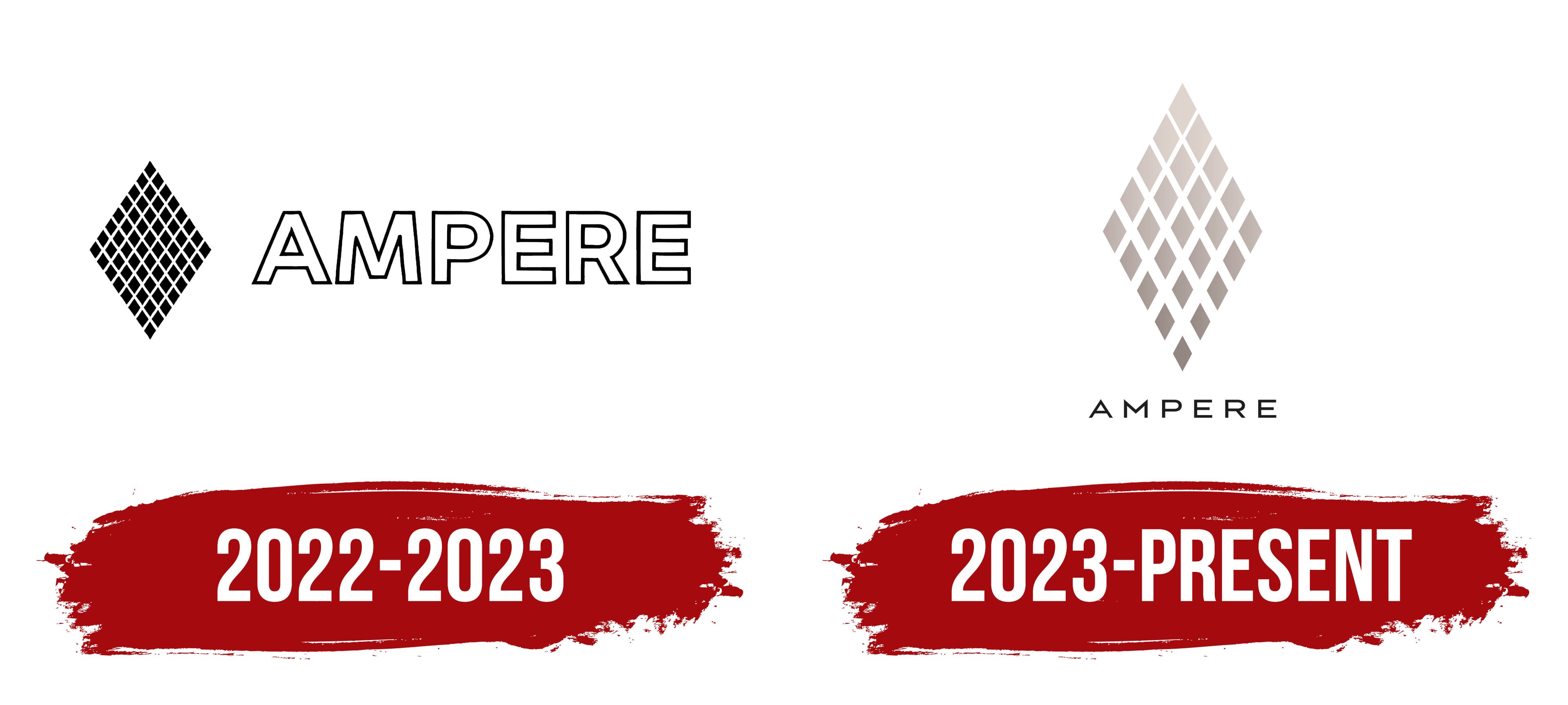
Ampere entered the market with an emblem featuring a diamond composed of numerous smaller diamond shapes. The resulting pattern resembled a crystal structure or molecular lattice.
The company name sat to the right of the symbol. The typeface is neutral, sans-serif, with wide letter spacing. The minimalistic font avoids distracting from the central symbol, highlighting the brand’s technological identity.
The diamond imagery was deliberate: Ampere focuses on electric vehicles, digital systems, software, and energy solutions. Diamonds symbolize electronics, structured circuits, and energy flow at the micro level. The brand’s name directly references André-Marie Ampère, whose surname became the unit for electric current, conceptually aligning with the logo.
The company chose a strict style for its first visual representation, emphasizing the rationality associated with engineering. The logo concept indirectly conveys the brand’s intent: developing accessible electric vehicles, emphasizing thoughtful technologies, and intuitive digital solutions.
2023 – today

Ampere introduced a new version of its logo with a revised color and a different symbol shape. Instead of the previous solid fill, the symbol is now rendered in a gradient bronze gray shade that creates a metallic effect. This conveys the company’s technological image and emphasizes its focus on the automotive industry and on producing components for electric vehicles.
The mark is based on a crystal-shaped design composed of separate diamonds of varying sizes. Compared with the previous period, the number of elements decreased, and the remaining elements grew larger, creating visual volume through shade transitions and surface highlights. The symbol is complex yet deliberate, conveying a connection to high-precision technologies.
The text portion of the logo became visually lighter. The inscription is set in a sans-serif typeface with increased letter spacing, making the letters appear lighter. The text is rendered in black.
Ampere produces components and solutions for electric vehicles. The new logo emphasizes the company’s affiliation with advanced technologies, visually linking it to engineering and manufacturing processes in electric transportation.