


 Bubly Logo PNG
The Bubly logo is instantly recognizable, much like its delicious sparkling water made from natural ingredients. The second letter in the logo, resembling a smile, has symbolized happiness and joy since the brand’s inception. The company consistently emphasizes this in the logo and various marketing campaigns, highlighting the uniqueness of its product.
According to the founders, seeing the logo once is enough to remind you of the luxurious, refreshing water. One sip brings irresistible gastronomic pleasure. The smiling letters have become a symbol of the brand, a unique and effective way devised by PepsiCo to capture the attention of a wide audience.
The product’s modernity is reflected in the logo’s stylish design. Every element and character serves as a reminder: don’t forget your happiness! The company offers more than just tasty water; it also offers health care. This is the main idea expressed in the latest interpretation of the brand’s unique identity.
Bubly started in 2018, when PepsiCo entered the fast-growing flavored sparkling water market. The brand was built as a direct competitor to LaCroix, which already had a strong position in the category. It launched in February 2018 with bright can designs, a playful tone, and eight flavors: lemon, grapefruit, strawberry, lime, mango, apple, cherry, and orange.
The formula had no calories, sodium, or artificial sweeteners, which matched demand for drinks positioned away from traditional sugary soda. In its first year, Bubly used a large Super Bowl campaign with Michael Bublé, playing on the similarity between his name and the brand name. The campaign helped the new product gain recognition in a crowded beverage market.
Flavor expansion became a major part of the brand’s development. In 2019, cranberry, peach, raspberry, and blackberry joined the line. In 2020, Bubly Bounce added caffeine from coffee beans, moving the product closer to energy drinks while keeping the sparkling water format. In 2021, the brand partnered with Miley Cyrus on a campaign targeting younger consumers and added limited-edition kiwi and watermelon flavors.
In 2022, Bubly shifted part of its packaging work toward bottles made with recycled plastic. In 2023, the brand expanded into selected European and Asian markets, adapting flavors and promotions to local tastes, including yuzu and sakura in Japan. The same year, Bubly Infusions introduced fruit and herbal extracts for buyers seeking softer flavor profiles. In 2024, interactive QR-code packaging gave users access to cocktail recipes, entertainment content, and ingredient information.
Meaning and History
What is Bubly?
It is a brand of flavored sparkling water owned by PepsiCo. The company offers a variety of refreshing, calorie- and sugar-free carbonated beverages. The product line includes a wide range of flavors such as lime, grapefruit, cherry, and blackberry to cater to different taste preferences. The brand is known for its colorful, playful packaging and use of witty, engaging lettering on cans and bottles. The brand aims to be a fun and healthy alternative to soda and other sweetened drinks, making it a popular choice for those who want to stay energized while enjoying a flavorful beverage.
2018
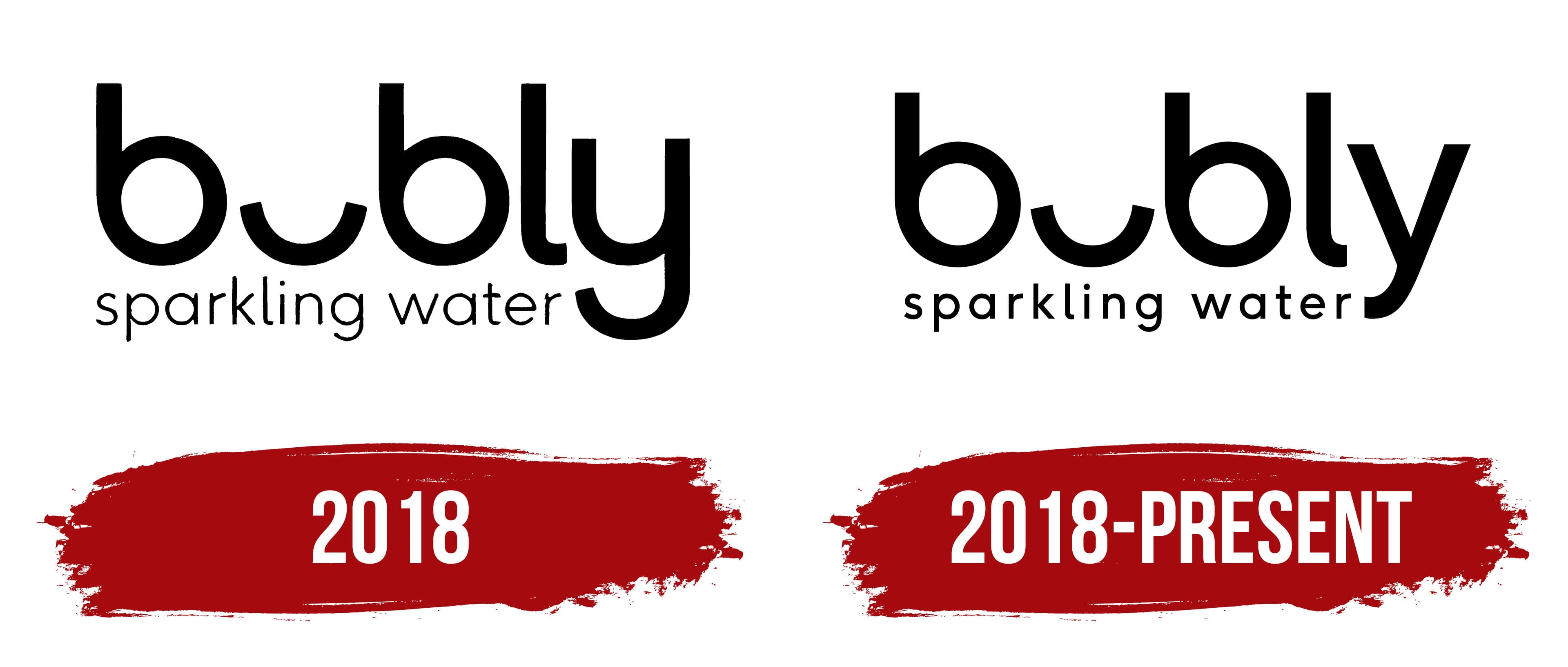
Dynamism became a priority for the creators of the innovative 2018 logo. Customers learn about the product’s quality when they try the sweetened sparkling water.
Now, everyone can enjoy a drink that promotes health and effectively quenches thirst. However, before this became possible, the new product had to be presented impressively. Conveying the full flavor brightness with just a few letters proved challenging.
The goal was clear, leading to several interpretations and solutions. The winning design was a logo that, while not brightly colored, was contrasting, classic, and distinctive. The first thing that caught the eye was black letters on a white background. The visual effect resembled a man’s reaction to a charming lady in a red dress. The restrained color scheme indicated that sparkling water is integral to everyday life, and the new, tasty water makes life more enjoyable.
The rounded letters, each with its charisma, were not uniform in size, enhancing the desire to read every word on the logo as quickly as possible, including the smaller text “sparkling water,” which serves as the product identifier.
The logo reflects freedom of expression: minimal strictness, no restrictions. All the letters are rounded and in dynamic motion. The textual presentation is perceived positively, and the smile, reminiscent of the well-known “smiley,” brings joy and inspiration.
The company achieved excellent results. The sweetened sparkling water appealed to athletes and people looking to try something new.
2018 – today
Modern logo modification is characterized by precision, conciseness, and high visual appeal. It reflects the product’s strength, impeccable quality, and competitiveness. The lettering has become smooth, aligning with contemporary trends and building an excellent reputation. Perfect happiness is also reflected: the minimized “u” with cut edges continues to convey the joy of existence.
The informational presentation was slightly altered by increasing the contrast of the color scheme. The absence of bright accents is surprising, but they are unnecessary. A friendly attitude towards customers remains evident between the lines. Adding the phrase “sparkling water” serves as the product identifier.
The new logo, style, and content coexist in a single, cohesive unit. The producer guarantees joy from every bubble and health from every sip. The audience is encouraged to keep an eye on new product offerings and choose increasingly interesting flavor combinations.