 Dentsu Logo PNG
Advertising campaigns and media strategies require audience analysis, channel planning, and communication management across different markets. These tasks integrate creativity, data, and technological tools into a unified system. The Dentsu logo represents an international group that specializes in advertising, marketing, and media planning, working with global brands and companies.
Dentsu was founded in 1901 in Tokyo by journalist Hoshiro Mitsunaga. He combined the advertising agency Japan Advertising Ltd. and the telegraph agency Telegraphic Service Company. In 1907, the organizations merged to form Nippon Dempo Tsushin-sha. By 1908, the company had taken a leading position in the Japanese advertising market. In 1909, it began publishing advertising volume statistics. By 1912, its headquarters were in Tokyo’s Ginza district.
In 1936, at the government’s request, the company abandoned its news operations and focused on advertising. After World War II, it resumed its operations and, by the 1960s, became an important player in Japan’s communications industry. In 1968, Dentsu’s order volume reached levels comparable to those of leading American agencies.
In the 1980s, the company began organizing large events and developing sports marketing. In 1984, Dentsu received exclusive rights for the Los Angeles Olympic Games for the Japanese market. In 2001, the company was listed on the Tokyo Stock Exchange. In 2002, Dentsu established a partnership with the French Publicis Groupe through the company Bcom3.
In 2012, Dentsu acquired the British Aegis Group for $ 4.9 billion. The deal was completed in 2013. As a result, the Dentsu Aegis Network was formed. In 2016, the company purchased the American firm Merkle, which specialized in data and CRM. By the end of 2020, Dentsu owned it outright. In 2018, it acquired the Latin American agency GlobalMind. In 2019, Redder in Vietnam and Happy Marketer in Singapore joined the group.
In September 2020, the company unified its international structure under the Dentsu International brand. In 2021, the company continued developing the Customer Transformation and Technology segment. In February 2024, the company presented a development plan through 2027. It focused on growth and increasing operating margins.
The company announced a reduction of 3,400 jobs in its international divisions. The measures were part of a restructuring program and the implementation of the One Dentsu model. The program aimed to strengthen its position in the global market.
Meaning and History
What is Dentsu?
One of the largest global advertising and communications holdings, founded in Japan, and managing a network of agencies around the world. The company ranks among the top five global industry leaders and dominates the Japanese market, controlling a major share of television and print advertising. It operates the brands Carat, Merkle, iProspect, Isobar, dentsuX, dentsumcgarrybowen, Posterscope, and MKTG. The holding provides full-cycle services, including media, digital marketing, PR, analytics, event projects, and content production. Its clients include Toyota, Honda, Mazda, and Mercedes-Benz.
1955 – 1986
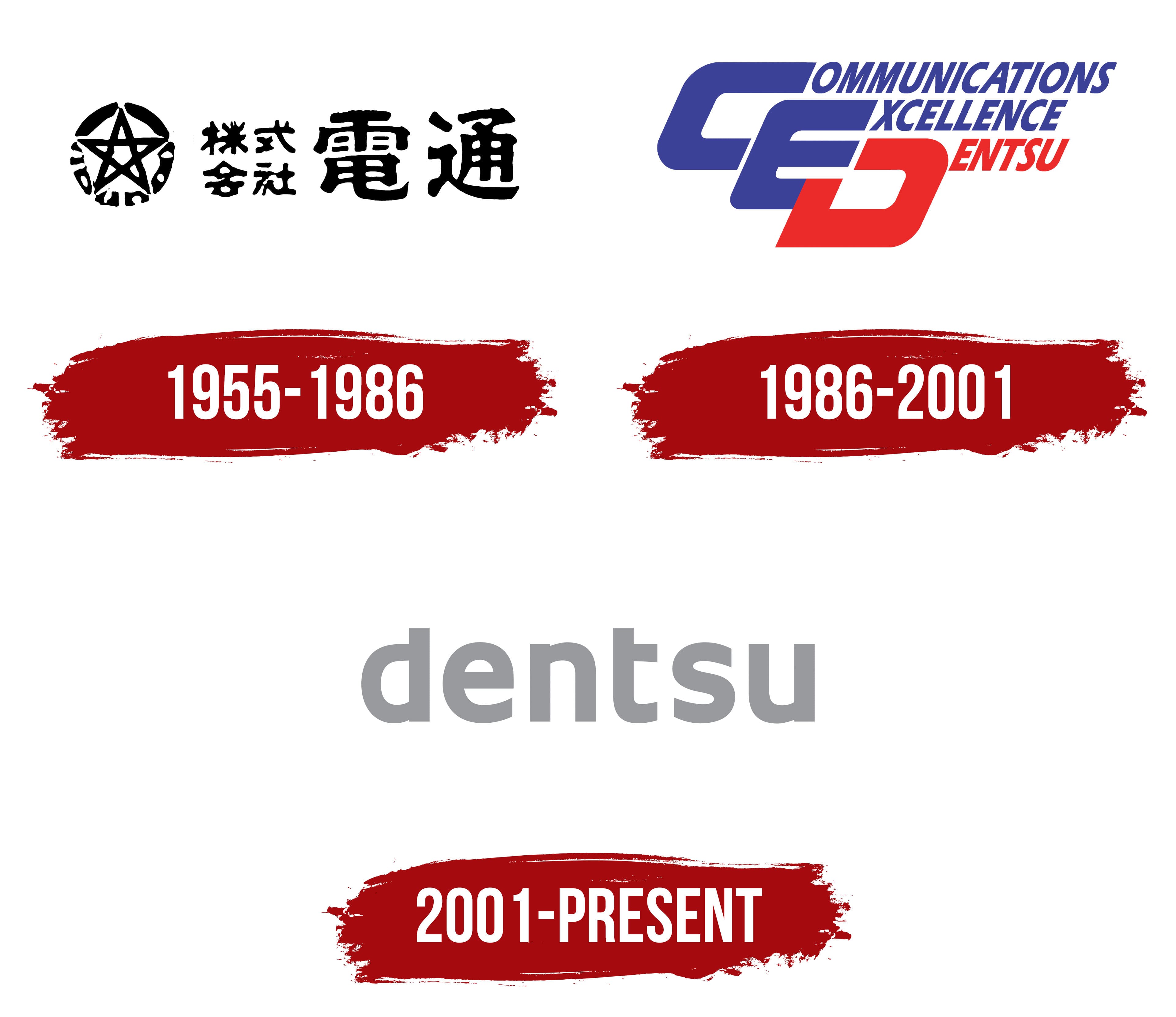
The company adopted the shortened Dentsu name in 1955 after it had already become common in Japanese business circles. The Japanese legal name changed from 株式会社日本電報通信社 to 株式会社電通, while the English form became Dentsu Advertising Ltd. A circular emblem containing a 5-point star and a brush-style Japanese wordmark accompanied the new corporate name.
The name’s history is tied to 2 businesses established by Hoshiro Mitsunaga. The journalist and war correspondent founded Japan Advertising Ltd. on July 1, 1901. Several months later, he created Telegraphic Service Company to distribute news. Advertising revenue helped finance the news service, allowing both operations to develop together.
The telegraphic agency became Nippon Dempo Tsushin-sha in 1906. It absorbed Japan Advertising Ltd. the following year. Dentsu originated from the Japanese expression 電報通信, pronounced “dempō tsūshin” and meaning “telegraphic communication.” The name preserved the company’s history of working with the telegraph, an advanced method of transmitting information in the early 20th century.
The news operation was transferred to the Domei agency in 1936, after which the company focused on advertising. The name derived from the former news service remained in use. By 1955, the shortened Dentsu form replaced the lengthy Nippon Dempo Tsushin-sha name and became the full corporate identity.
A circular black emblem resembling a seal or Japanese mon appeared on the left. Inside was a 5-point star made from heavy lines. Japanese characters followed the curve of the inner frame. The densely filled circle united the star and text into a compact ornamental composition.
The 5-point star could appear independently from the full Dentsu name. It remains on the company’s former headquarters building in Ginza and recalls the agency’s early period. The circular frame worked across seals, documents, building facades, and business materials.
The Japanese name 株式会社電通 appeared on the right. 株式会社 identified a joint-stock company, while the final characters 電通 represented Dentsu. The wordmark was rendered in brushstrokes. Dense lines varied in thickness and had soft edges, resembling ink strokes on paper.
Black united the circular emblem with the text. The single-color composition paired the geometric star with free brush lettering. The Japanese line presented the company’s legal name following the 1955 renaming.
1986 – 2001

The CED monogram replaced Dentsu’s former star as the company transitioned to the Total Communications Service model. Three slanted letters represented Communications Excellence Dentsu and brought the corporate concept into the logo. The version remained in use from 1986 to 2001 as the agency expanded beyond traditional advertising.
Preparations began in 1978 when the English name Dentsu Advertising Ltd. changed to Dentsu Incorporated. The company associated the renaming with expanded services and a new role as a communications company. Dentsu Incorporated covered different forms of communication and reduced the name’s close association with advertising alone.
The circular Japanese emblem containing the star remained in use for several more years. Under President Gohei Kogure, the company launched a corporate identity program that concluded with the introduction of its CI plan in 1986. Total Communications Service formed its foundation. The new logo presented Dentsu as a communications company offering a broad range of services.
The composition consisted of large “C,” “E,” and “D” letters arranged diagonally in steps. The “C” appeared at the top, the “E” below it, and the “D” completed the sequence at the lower right. The characters partially overlapped, forming a dense construction. A shared rightward slant connected the monogram with the explanatory lines.
The “C” and “E” were blue-purple. The “D” appeared in red, associating it with the Dentsu name. The different colors separated the company name from the first 2 concepts in the formula. The color of each large initial was repeated in the corresponding line beside it.
COMMUNICATIONS appeared beside the “C.” XCELLENCE stood beside the “E” because the large initial already supplied its first letter. DENTSU appeared beside the “D.” The opening letters of the 3 words formed CED. The monogram could stand alone, while the full text explained its meaning.
All words used an uppercase sans-serif typeface and repeated the slant of the large initials. The letters had extended proportions, pointed corners, and tight spacing. The style resembled Eurostile Extended Oblique and Microgramma Bold Italic. The small supporting lines preserved the primary role of “C,” “E,” and “D.”
COMMUNICATIONS and XCELLENCE appeared in blue-purple, while DENTSU used red. The color distribution connected each line with the corresponding initial and divided the lengthy formula into 3 levels. The circular frame and brush-style Japanese wordmark from the previous version disappeared.
Dentsu employees wore badges bearing the CED monogram, bringing the program into the company’s internal culture. The logo remained in use until 2001 during the agency’s international expansion and the development of communications services under the Total Communications Service model.
2001 – today

The lowercase dentsu name appeared at the boundary between 2 stages in the agency’s history. The company celebrated its 100th anniversary and entered the First Section of the Tokyo Stock Exchange in 2001. The new identity officially launched in 2002, though some sources cite 2001. Dentsu opened its headquarters in the Shiodome district in November 2002. The changes accompanied the company’s entry into the 21st century and ended the period of the CED monogram used since 1986.
The previous logo combined large slanted initials, explanatory words, and 2 colors. The new system centered on the corporate name dentsu. The short lowercase wordmark worked across documents, digital media, and materials used by international divisions. Japanese designer Takenobu Igarashi helped develop the identity. Shinobu Numazawa represented Dentsu’s creative division on the project and later included the work in his professional biography.
The dentsu wordmark consisted of heavy sans-serif letters. The characters had consistent stroke thickness, dense proportions, and softly rounded connections. The style resembled Helvetica Rounded and Avenir Next Rounded. All letters stood upright and aligned on a single horizontal baseline. Tight spacing brought the name together in a unified typographic block. Lowercase lettering distinguished the version from the uppercase initials and diagonal structure of the CED composition.
The standard version used light gray. Dark gray and black variants appeared on some materials. The name remained consistent while the surrounding backgrounds and color fields changed. The principle became the foundation of the internal theme “100 Colors, 100 People.”
On employee business cards, the gray wordmark appeared with 100 color variations. Dentsu associated the system with the diversity of people, professions, and ideas within the agency. The shared name represented one company, while changing backgrounds communicated differences among specialists and business areas.
The identity launch coincided with a management concept introduced by President Tateo Mataki. It described how clients, media content, and consumers interact to create shared benefits. Within “100 Colors, 100 People,” the many colors represented participants in the communications process. At the same time, the gray dentsu wordmark united them under the agency’s name.
After acquiring Aegis Group in 2013, Dentsu Aegis Network was created, while the Japanese company continued using the lowercase wordmark introduced in 2002. In 2020, the international business changed its name from Dentsu Aegis Network to dentsu international under the one dentsu model. The group’s global companies united around one name while retaining the established logo structure. A black version against different backgrounds became common in international materials.