


 Equinix Logo PNG
The Equinix logo resembles a strong, unbreakable chain of connections formed between providers and their clients through colocation services. This symbol reflects the brand’s essence: reliable infrastructure, like a powerful hub that often amplifies and distributes the signal. The emblem embodies the stability and reliability that underpin the company’s operations.
Jay Adelson and Al Avery founded Equinix in Redwood City, California, in 1998. The company was built around carrier-neutral data centers where businesses could host systems and exchange internet traffic on equal terms. Its first Internet Business Exchange facility opened in Washington, D.C., in 1999. It went public on NASDAQ in 2000, using the proceeds to build new sites in Amsterdam and London.
The dot-com crash created pressure in the early 2000s, yet Equinix continued adding customers and facilities. Peter Van Camp became CEO in 2002. From 2003 to 2006, the network expanded across the United States and Europe, then entered Singapore and Hong Kong. The $482 million purchase of IXEurope in 2007 added 14 European data centers.
Between 2008 and 2010, it opened new sites in Brazil, Australia, and Japan. Equinix bought Switch and Data for $683 million in 2010 and Telecity Group for $3.8 billion in 2015. In 2016, the company converted into a real estate investment trust. In 2017, it acquired 29 data centers from Verizon for $3.6 billion.
Expansion continued in Australia, South Korea, and Finland during 2018 and 2019. In 2020, Equinix purchased 13 Canadian facilities from Bell for $750 million. Investment in cloud and edge computing continued through 2021 and 2022. By 2023, the network covered hundreds of data centers across dozens of countries, connecting enterprises, cloud providers, and telecommunications networks.
Meaning and History
What is Equinix?
The company operates an extensive network of high-performance data centers that serve as the backbone of the Internet. This organization offers server hosting for enterprises and cloud services to connect and shape global digital interactions. Their platform provides companies with unmatched speed and flexibility in deploying, connecting, and scaling their IT infrastructure. It also offers various interconnection services that enable parties to connect directly and privately, bypassing the public Internet to enhance security and efficiency.
1998 – 2010s
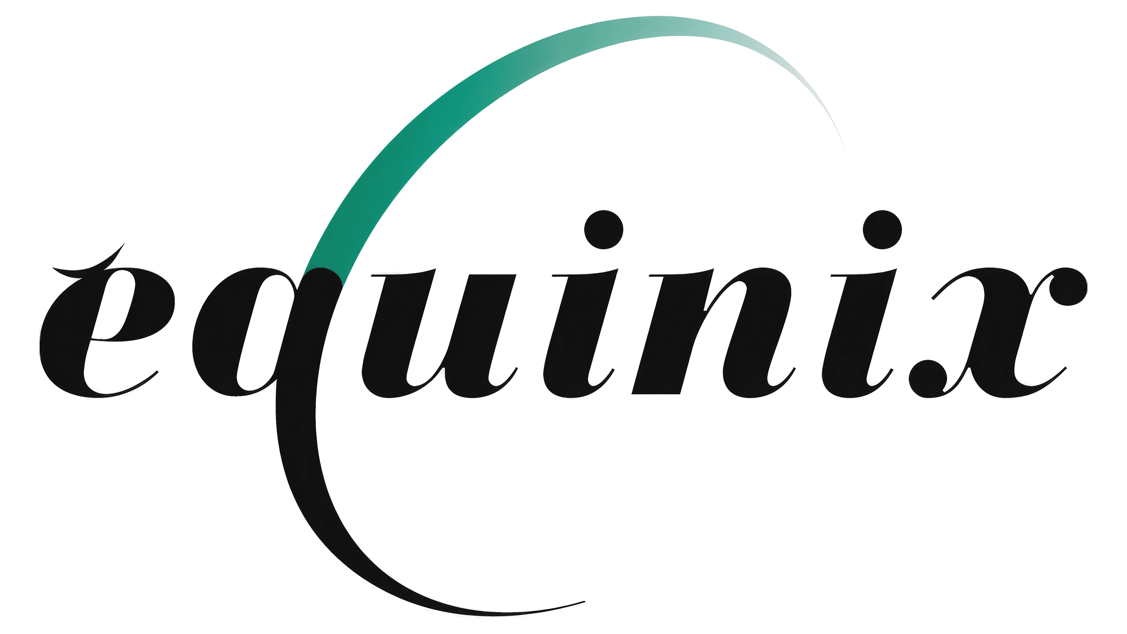
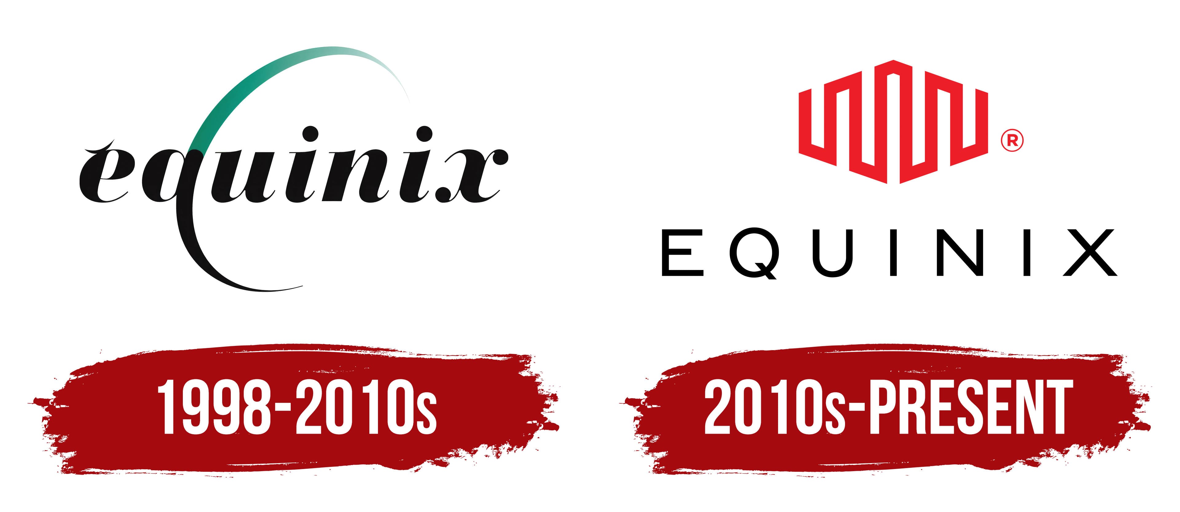
The company’s first emblem symbolizes its global ambitions. The name, written in cursive, evokes associations with journals and records, reflecting the shift from manual calculations to software-based data processing, the brand’s core service. This design choice emphasizes the technological progress and automation that the company offers its clients.
The glyph “q” in the logo is transformed into a semicircle, symbolizing the Earth and reflecting the company’s global reach. This element also hints at the colocation service, which helps providers deliver quality service to their clients. The smooth transition from black to green in the logo represents the company’s growth and development as it expands its services worldwide. This color change also signifies improved internet speed and optimization that users experience when connecting to the company’s platform.
The small stroke above the first letter “e” contrasts with the large semicircle, symbolizing the company’s journey since its founding. The company’s name conveys the idea of striving for equality, neutrality, and the free exchange of Internet data. Equinix emphasizes that its services are provided without bias toward specific networks, ensuring clients can freely and impartially exchange traffic in a neutral environment. This makes it a unique player in technology and communications.
2010s – today
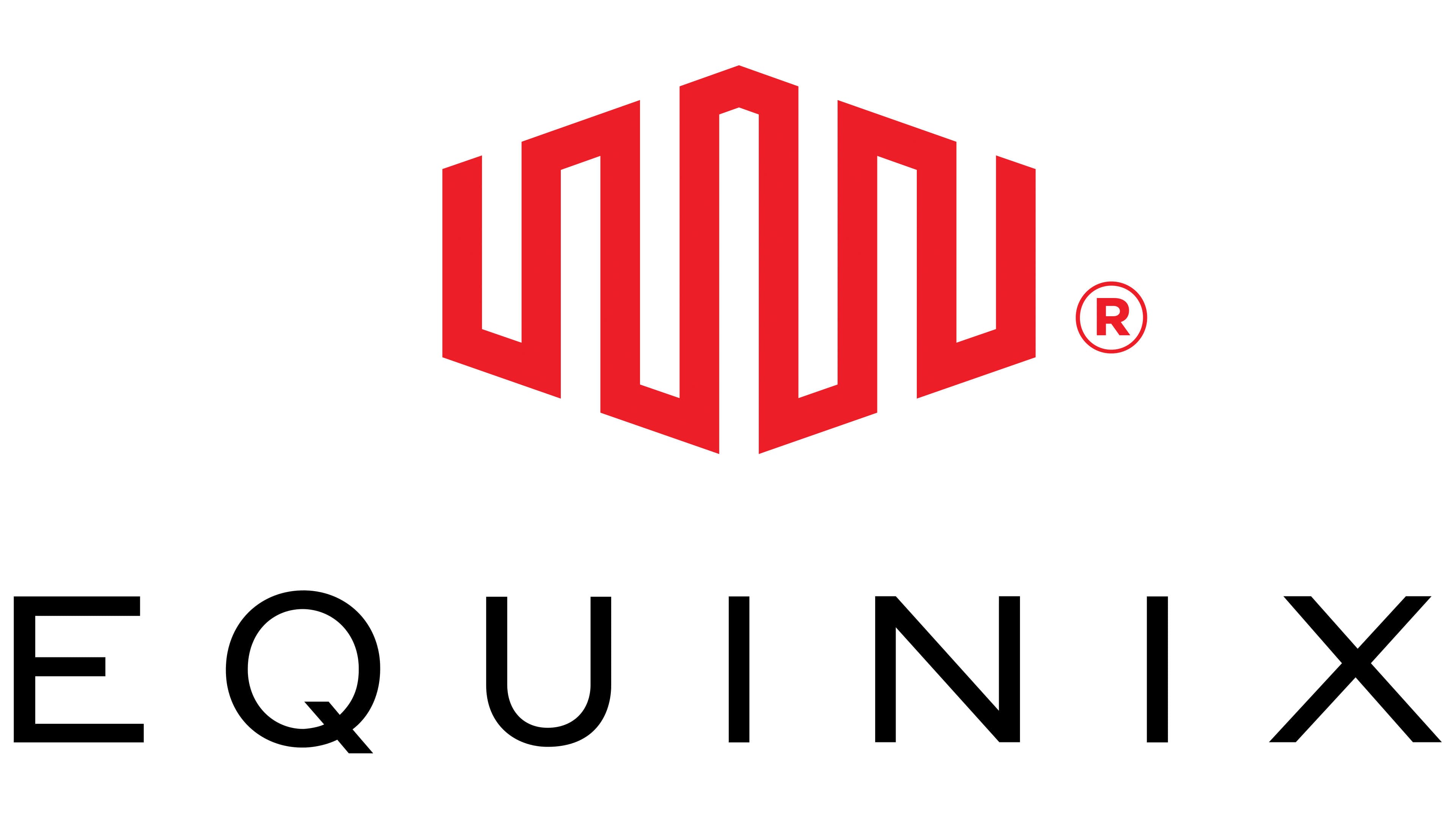
The Equinix logo is a dynamic, modern symbol that reflects its global operations and technological achievements. The geometric zigzag shape at the top of the logo resembles the form of a planet, as if it is wrapped in a network of internet connections. This element symbolizes the company’s vast reach and ability to connect people, organizations, and data worldwide. The geometric lines have no beginning or end, representing Equinix’s endless possibilities and growth potential.
The visual mark’s red color conveys speed, energy, and the brand’s innovative spirit. This color emphasizes the rapid data transmission and reliability that the company prides itself on in the tech world, where every second matters; red is the perfect choice for a brand that promises fast and secure connections.
The lower part of the emblem is presented in a thin, minimalist font. The capital letters, with wide spacing between them, convey the company’s vast network and reach. Each letter seems to be made of thin wires, symbolizing the business’s technical nature and its work with data. The wide spacing between the characters hints at the company’s global coverage, spanning the Americas, Asia, Europe, Australia, and the Middle East.
This emblem perfectly reflects the essence of Equinix, a provider of global infrastructure solutions for the internet. It speaks to the high speed, reliability, and limitless opportunities for users and businesses that extend beyond national borders and continents.