 ITT Logo PNG
Industrial equipment is used in the energy, transportation, and manufacturing sectors, where precise component operation and long service life are required. Pumps, connectors, and other components keep complex systems running. The ITT logo is associated with a company that manufactures equipment and components for industrial and engineering applications.
International Telephone & Telegraph was founded in 1920 by brothers Sosthenes and Hernand Behn. The company was created as a holding structure for its telecommunications assets in Puerto Rico and Cuba. In 1923, the company entered the Spanish market. After purchasing AT&T’s European assets in 1925, it became a leading provider of telephone services in Europe and Latin America.
Despite the challenges of the Great Depression, the company continued operating thanks to its international management structure. After World War II, ITT restored operations and expanded its presence in Canada and Western Europe.
From 1959, under Harold Geneen’s leadership, ITT became one of the world’s largest conglomerates. The company acquired about one hundred businesses, including Sheraton, Hartford Fire Insurance, and Avis. By 1971, ITT employed nearly 400,000 people in 70 countries.
In 1977, Rand Araskog initiated downsizing and restructuring. In 1995, ITT was divided into three companies. The new entities were ITT Industries, Starwood Hotels & Resorts, and Hartford Financial Services.
In the 2000s, the company strengthened its industrial division by acquiring International Motion Control and EDO. In 2011, another split created Xylem and Exelis.
Since 2016, the company has operated as ITT Inc. It focuses on technologies for industry, transportation, and aerospace. In 2022, the company acquired Habonim Industrial Valves, strengthening its position in the industrial valve segment.
The company increased revenue to $ 999 million. It reinforced its presence in the aerospace, automotive, and energy industries and continues to demonstrate steady organic growth while expanding its share in the global engineering technology market.
Meaning and History
What is ITT?
An American corporation from Connecticut that began in telecommunications and later became an industrial manufacturer. Under Harold Geneen’s leadership, it became a conglomerate that included Sheraton and Avis, then later focused on industrial solutions. The company now operates through three segments. Industrial Process produces Goulds and Bornemann pumps, Motion Technologies manufactures KONI shock absorbers and braking systems, and Connect and Control Technologies produces Cannon connectors and Enidine components.
1996 – 1998

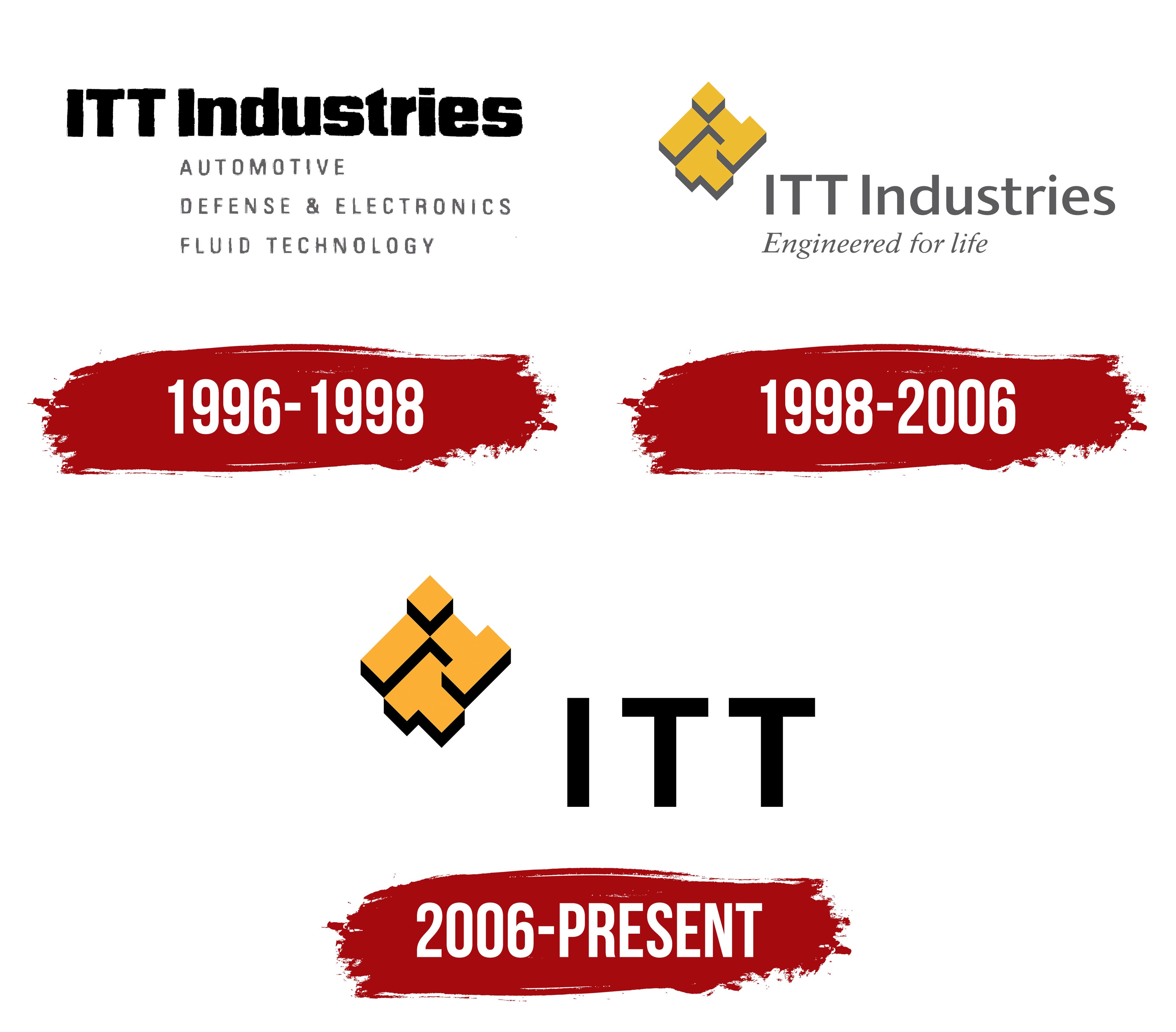
After the former conglomerate broke up, the ITT Industries identity included 3 lines identifying its business sectors. ITT Industries, Inc. received manufacturing assets in December 1995. The new company received automotive manufacturing, defense electronics, and fluid handling equipment. The corporate signature listing the industries was introduced on January 23, 1996.
The ITT abbreviation allowed the business to maintain a connection with the group founded in 1920. Brothers Sosthenes and Hernand Behn established International Telephone & Telegraph to unite telephone companies in Puerto Rico and Cuba. The full name reflected the communications industry and the company’s international plans. According to EBSCO, International Telephone and Telegraph and the ITT abbreviation were modeled after American Telephone & Telegraph, known as AT&T. The 3 letters gradually became a corporate name. They remained in use after the telecommunications assets were sold and the group was divided.
A heavy black ITT Industries wordmark occupied the upper section. ITT appeared in large uppercase letters. Industries stood on the right with an uppercase “I” followed by lowercase characters. Rounded contours softened the transition between the 2 parts of the name. Neographik Univers Condensed allowed the lengthy wordmark to fit within a compact horizontal line.
The gray lines AUTOMOTIVE, DEFENSE & ELECTRONICS, and FLUID TECHNOLOGY appeared below. Narrow uppercase letters used expanded spacing. Size and weight differences separated the lower lines from the large name. The list gave customers and business partners an overview of the company’s post-reorganization structure.
Corporate documents regulated the use of the name. ITT Industries received a perpetual license to use the ITT mark in the industries it acquired. The right remained valid under established requirements and allowed the company to use the historical abbreviation with Industries, which identified its manufacturing profile.
1998 – 2006

ITT Industries introduced an updated brand when it began trading on the New York Stock Exchange on September 17, 1998. The operational launch occurred on September 12. The company wanted to link the familiar ITT abbreviation to the group’s manufacturing profile after the former corporation’s breakup. Research found that investment community members knew the 3 letters well, while its products and business sectors required broader communication.
Landor Associates led the project, and Jamie Calderon was credited with the design. PR agency Ketchum, advertising company Doremus, and research firm Yankelovich Partners participated in the program. Their work covered corporate identity, advertising, public relations, and brand perception research. ITT Industries needed one system for its numerous businesses and commercial brands. It replaced the former signature listing AUTOMOTIVE, DEFENSE & ELECTRONICS, and FLUID TECHNOLOGY.
Landor developed a composition called Engineered Blocks. The ITT monogram consisted of angular modules arranged along a rising diagonal. The “I” occupied the upper section, while 2 “T” letters appeared below. The second “T” was inverted. Mustard-yellow faces, combined with dark gray sides and shadows, created depth. The arrangement preserved the historical abbreviation in a new geometric form.
The dark gray ITT Industries wordmark appeared on the right. ITT used uppercase letters, while Industries began with an uppercase “I” followed by lowercase characters. The sans-serif typeface had medium weight and moderate width. The italic slogan “Engineered for life” appeared below. It referred to ITT Industries’ engineering specialization and helped present different businesses under one corporate name.
2006 – today
ITT Industries adopted a shorter corporate signature following its renaming. The company became ITT Corporation on July 1, 2006. The change formed part of a global program uniting divisions under the ITT name. The historical abbreviation received the primary role, while the Engineered Blocks emblem remained to the left of the wordmark.
The monogram consisted of angular blocks forming “I,” “T,” and “T.” The “I” appeared at the top, with 2 “T” letters below. The right “T” was inverted. The modules rose diagonally from left to right. Their front surfaces were orange-yellow, while dark side faces created depth and separated the sections.
Large black ITT letters appeared on the right. The heavy sans-serif typeface used strokes of consistent thickness. All 3 characters were the same height and formed a compact horizontal block. Industries and the italic “Engineered for life” slogan from the 1998 version disappeared. The shortened format focused attention on ITT while retaining the familiar modular form.
ITT Corporation divided its operations into 3 companies in 2011. The water business became Xylem, the defense businesses became Exelis, and ITT continued producing engineered components. The Engineered Blocks monogram and letter-based signature remained with the manufacturing company.
ITT Inc. became the public issuer within the holding structure in 2016. Inc. appeared in the legal name, while the corporate logo continued to consist of the orange-and-black monogram and large ITT letters.