


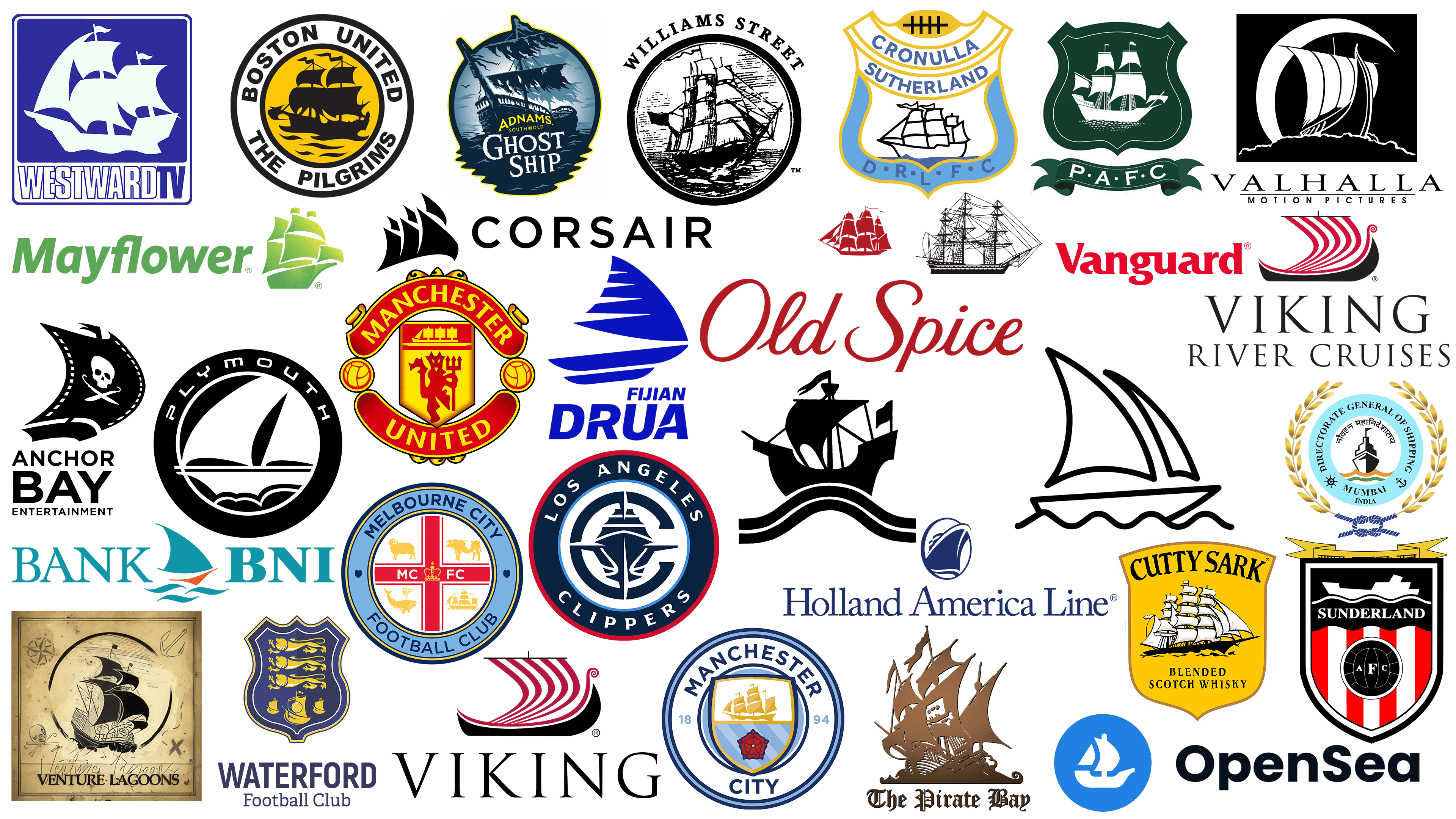
The symbol of a ship has transcended its utilitarian meaning. Its image has become associated with adventure, the discovery of new lands, and journeys that have inspired people for centuries. Today, the ship holds a significant place in the visual culture of brands, becoming a symbol of aspiration toward new horizons.
For many companies, using a ship on their emblem is not related to maritime activity but to the symbolic meaning of this image. The history of sailing intertwines with the romance of discovery, freedom, and exploration of the unknown. Recall ancient mariners who set out toward unfamiliar shores, their sailing ships carrying hopes and dreams of a better life. Thus, the ship symbolized optimism, determination, and the ability to overcome obstacles.
In different cultures, the sailing ship was interpreted differently. For instance, the Vikings saw it as a guide to other worlds, opening the doors to Valhalla. In medieval Europe, a ship represented trade prosperity, wealth, and development. Eastern cultures still view it as a talisman of fortune and abundance, decorating homes and offices with ship figures.
Today, this symbol is used by brands from various fields: financial companies, film studios, sports clubs, and cosmetic brands. In each case, the ship reflects the meanings the company aims to convey: reliability, stability, a thirst for adventure, or the aspiration to be first.
Below, we will examine the most interesting and famous logos featuring ships that you have likely encountered more than once, but perhaps haven’t considered the hidden meanings embedded in their images.
Cutty Sark
![]()
The famous whisky brand Cutty Sark borrowed its name from a legendary British clipper ship. The ship’s image is placed on a bright yellow heraldic shield, symbolizing sea voyages, adventures, and distant lands from which ingredients for the famous drink were sourced. The detailed clipper with multiple sails looks lively and refined, evoking the brand’s rich history linked to the 19th-century maritime trade routes. The brand name is written in a clear black font with a slight curve.
Manchester United
![]()
In the Manchester United logo, the ship symbolizes the club’s connection to Manchester, a city historically thriving on maritime trade. The ship silhouette appears in the upper part of the red-and-yellow shield; below is a red devil, which became the club’s nickname and symbolizes the team’s fighting spirit. The emblem maintains a bright palette, combining heraldic tradition with an energetic modern style, highlighting the significance of history and the competitive spirit inherent in the club throughout its legendary existence.
Williams Street Records
![]()
The Williams Street Records logo looks like an old engraving. An elegant ship, drawn with fine black lines, sails over a stormy sea. It is surrounded by a neat black ring with the company name engraved above in uppercase letters of a classic serif font. The logo emphasizes history and a connection to the past, recalling sea voyages and exploration traditions. Such aesthetics suit a music label known for its experimental approach to music and bold projects.
Valhalla Motion Pictures
![]()
The Viking ship in the Valhalla Motion Pictures emblem directly relates to the studio’s name, which is derived from Norse mythology. The ship is depicted in black and white, enhancing the sense of mysticism and ancient legends that inspire the studio to create its films. A crescent moon behind the ship adds mystery to the emblem, highlighting an atmosphere of adventure and the unknown. The classic font of the name harmoniously complements the image, forming an overall picture in which the Viking ship symbolizes a journey into the world of fantasies and stories told by the studio.
Anchor Bay Entertainment
![]()
Anchor Bay Entertainment, a well-known distributor of films and TV series, chose a ship as a central symbol. The ship’s sail is depicted as a segment of a filmstrip bearing pirate symbolism, a skull, and crossed sabers. The black-and-white execution conveys an atmosphere of adventure and freedom, in keeping with the spirit of the film industry, where each movie is a new journey. Minimalist graphics reflect the company’s confidence and clarity in content delivery, making the image memorable and stylish. The sail hints that the brand helps viewers embark on a world of the unknown, full of discoveries and thrilling plots.
OpenSea
![]()
The OpenSea logo is built on simplicity and clarity. A white boat on a blue background symbolizes accessibility and openness, reflecting the essence of the largest marketplace for digital asset trading. The ship in the emblem conveys the idea of free navigation through the vast world of digital collections. The blue color evokes associations of trust, security, and stability, which are essential in online trading. The minimalist design emphasizes the platform’s transparency, inviting users into the fascinating world of digital art and investment.
Bank Negara Indonesia
![]()
Indonesia is an archipelago consisting of thousands of islands surrounded by water. This fact became the foundation of the bank’s visual identity, choosing a ship as a symbol of movement and financial success. At the logo’s center is an elegant sailing ship with waves, depicted in soft blue and orange tones. The stylized ship conveys dynamism, stability, and the aspiration toward growth. The color scheme is connected to the country’s national colors, strengthening the bank’s identification with Indonesia. The sailing ship in Bank Negara Indonesia’s logo symbolizes hope, prosperity, and a journey toward a better financial future.
Plymouth Argyle
![]()
The British football club Plymouth Argyle proudly features a ship’s symbol on its emblem, linking it to the city of Plymouth, a historic port and departure point for famous maritime expeditions. A large ship with sails unfurled is positioned in the center of a green crest. White details of the image evoke old engravings and symbolize the traditions carefully preserved by the club. Below the crest is a ribbon with the abbreviation “PAFC,” executed in a classic English style, enhancing the sense of the team’s historical heritage and its unity with the city’s maritime soul.
Holland America Line
![]()
The Holland America Line logo features a strict blue silhouette of a cruise ship sailing on waves. Founded in the 19th century, the company transported passengers from Europe to the United States. The ship’s use reflects its history and highlights the company’s expertise in maritime travel. The symbol represents the reliability of a brand providing cruises around the world.
Devon County Council
![]()
Devon County Council in England uses a logo featuring a ship, emphasizing the region’s maritime history and economic role as a center of shipping and trade. A minimalist black ship with smooth lines and waves beneath it conveys a sense of stability and confidence in local governance. The design’s simplicity and severity reflect the institution’s official nature, while the sailing ship symbolizes the aspiration for growth and forward movement. The county highlights its historical identity and connection to the sea, which is significant to residents and the regional economy.
Midjourney
![]()
The minimalism of Midjourney’s logo conveys simplicity and ease. The ship is drawn with thick, smooth lines, forming a light sailing boat gently swaying on a small wave. The image conveys a sense of travel and exploration, aligning with the platform’s concept of inviting users to engage in creative experimentation. The simplicity and airy quality of the logo lines emphasize the company’s readiness to adapt to new ideas and challenges, guiding users toward inspiration and discovery.
Cronulla-Sutherland Sharks
![]()
The Australian rugby club Cronulla-Sutherland Sharks uses a sailing ship in its logo, highlighting its connection to a region along Sydney’s coast. An image of an old ship at the emblem’s center symbolizes the area’s rich heritage, where maritime traditions have been significant. The ship is drawn concisely yet includes characteristic details like billowing sails and the sea beneath its keel, conveying movement and competitive spirit. The overall style, executed in shades of light blue, creates an atmosphere of freshness, indicating the club’s proximity to the ocean and its inspiration from marine elements.
Fijian Drua
![]()
The logo of the Fijian Drua rugby club is inspired by the traditional Fijian sailing vessel called the drua, which Pacific Islanders historically used. The modern, abstract depiction of the ship features dynamic lines that symbolize speed. The deep blue color highlights the islands’ maritime nature, and the team is moving forward, reflecting the character of Fijian rugby. The shape of the drua became a symbol that connected the club to local culture and traditions, conveying the pride and strength of the island people, who are familiar with the ocean’s power and vastness.
Corsair
![]()
Corsair manufactures computer peripherals, components, and accessories, and the ship in its logo is a direct reference to the brand’s name, which translates as “pirate ship.” The symbol expresses the brand’s energy and aspiration to lead in technological innovation, with stylized ship sails pointed forward. Sharp lines of the ship’s black silhouette associate with speed and power, reflecting the company’s ambition and technological character. The font is simple and strict, emphasizing the modernity of products that combine innovation and precision.
Boston United
![]()
The football club Boston United from England uses the ship symbol, referencing the history of the city of Boston, known as the port from which many voyages to the New World began. At the center of the logo is an old ship, connecting the team with the story of the first settlers, the Pilgrims, who left England seeking a new life. The yellow-and-black palette emphasizes the club’s historical character, and the ship becomes a symbol of team spirit, striving for victory, and fan unity. The strict font and circular shape complement the traditional style, underscoring respect for heritage and the local community’s history united by a passion for football.
Waterford FC
![]()
The emblem of the Irish football club Waterford FC is rich in heraldic tradition. Three golden sailing ships underline Waterford’s connection to maritime trade and shipping in the lower part of the shield. Above the ships are three golden lions, symbolizing strength, bravery, and the team’s sporting spirit. The blue-and-gold color palette conveys the club’s stability and traditions, making the emblem attractive and recognizable and emphasizing its pride in its roots and heritage.
Plymouth
![]()
Plymouth’s automotive brand chose a ship as its symbol, communicating the spirit of freedom and discovery. The minimalist black emblem is stylized as a sailing ship over waves, enclosed within a circle bearing the brand’s name in an unusual, slightly futuristic font. The brand once symbolized the American automotive industry, and the ship underscores the aspiration toward new horizons. At one time, the company was renowned for affordable and reliable cars that earned the respect of automobile enthusiasts.
Odesa Film Studio
Odesa Film Studio selected a ship as its symbol, reflecting the city by the Black Sea’s cinematic tradition and maritime heritage. At the logo’s center is a golden-hued ship framed by a ring resembling a compass. The compass frame symbolically emphasizes the studio’s navigation in the cinematic world, discovering new plots and directions. The golden ship represents dreams and creative ambitions. At the same time, the blue border adds a sense of infinity and adventure, reflecting the atmosphere of a city imbued with freedom and the sea.
Old Spice
![]()
Old Spice uses a ship in its visual imagery to symbolize its roots associated with maritime traditions. A burgundy clipper, its sails filled by the wind, evokes travel, exoticism, and the scents of distant voyages, aligning with the brand’s masculine fragrances. An elegant font emphasizes the classic style, highlighting the company’s long history. The ship is a sign of adventure, courage, and confidence, naturally reflecting the spirit of the company’s products and its image of an authentic man.
Los Angeles Clippers
![]()
The Los Angeles Clippers logo presents a modern interpretation of a ship integrated into the abbreviation “LAC.” The ship’s outline is visible within the clear geometric forms of intersecting letters, creating a dynamic image. The ship references sailing clippers, symbolizing speed and maneuverability, matching the team’s playing style. The logo is in dark blue tones with red and white borders, underscoring the club’s affiliation with American sports and showcasing the team’s energy and ambition.
The Pirate Bay
![]()
The ship on The Pirate Bay’s logo intentionally appears pirate-themed. This well-known internet platform uses pirate symbolism to challenge the system and the fight for the freedom of information distribution. The detailed depiction of the ship includes unusual elements, with skulls and bones on the sails expressing the resource’s rebellious spirit. A copper shade adds vintage style to the emblem. At the same time, the gothic lettering highlights the atmosphere of adventure and anarchy that the platform offers users, as though they were sailing the seas of digital data.
Viking (cruise line)
![]()
The emblem of the Viking cruise company is built around the silhouette of a historic Viking ship. The hull is drawn in black, and the sail is decorated with red stripes. The Scandinavian symbol reflects the brand’s origins and the style of cruises the company organizes along Europe’s rivers. The Viking boat evokes travel and discovery, representing the company’s high-quality travel offerings.
Directorate General of Shipping
![]()
India’s Directorate General of Shipping oversees the regulation and safety of maritime transportation, so a ship was adopted as the organization’s symbol. The emblem shows the bow of a ship rising above waves, depicted in India’s national orange and green colors. A golden wreath encircling the central part and a blue rope knot emphasize the institution’s formality and maritime traditions. The ship symbol reflects the significance of shipping in the country’s economic development and conveys the authority, reliability, and security associated with the Directorate’s activities.
Venture Lagoons
![]()
The Venture Lagoons logo evokes an era of old maps and pirate legends. The central ship, depicted in black tones, sails proudly within a circle, recalling an age of discovery, treasure hunting, and adventures in tropical lagoons. The ship is surrounded by additional maritime-themed symbols emphasizing the brand’s adventurous spirit. The color scheme and details resembling ancient manuscripts and maps harmoniously support the company’s concept, offering customers exciting journeys to unexplored lagoons and mysterious islands.
Sunderland AFC
![]()
The Sunderland AFC football club’s logo reflects the character of Sunderland, a port city known for shipbuilding. The black-white-red shield emphasizes the team’s strictness and power, while the ship at the top connects the club to local history and industry. The depiction of the ship with sharp geometric lines conveys the strength and determination necessary for victory on the field. A stylized football at the shield’s bottom seamlessly unites the club’s sporting identity with regional pride, shaped historically by ships and dockworkers.
Westward Television
![]()
The logo of the British TV channel Westward Television is executed with an expressive contrast of blue shades. A white ship silhouette set against a deep blue background evokes the region’s maritime past and the channel’s aspiration to broaden viewers’ horizons. The ship symbol highlights the channel’s coverage of travel, discoveries, and news, like a ship bringing news from distant lands. The brand name’s strict, clear font supports the channel’s atmosphere of reliability and professionalism.
Mayflower Moving Company
![]()
The emblem of Mayflower Moving Company is rendered in green and depicts a stylized ship representing the first American settlers. The green shade symbolizes eco-friendliness. The company has long specialized in moving and transportation, and the ship symbol logically conveys the concept of relocating to a new residence.
Adnams Ghost Ship
![]()
The name Adnams Ghost Ship refers to an old legend from the English town of Southwold, famous for the Adnams brewery. The visual symbol immerses viewers in a mystical atmosphere: a sailing ship shrouded in shadows and torn sails seems to float through a storm, leaving behind mysterious stories and seas full of secrets. The maritime element in the symbol conveys the brand’s character, reflecting the strength of flavor and originality of English ale. Dark blue shades reinforce the mysterious image of a ghost ship, while contrasting lettering adds brightness and festivity. The brand’s symbol successfully combines urban legends with the beverage’s distinctive character, emphasizing its connection to the region’s historical heritage.
Viking River Cruises
![]()
The symbol of Viking River Cruises is a Viking ship, carefully drawn in red and black. The elegant silhouette of a sailing ship symbolizes the heritage of Scandinavian seafarers, known for their determination. Wavy lines on the red sail add lightness and dynamism, emphasizing the comfort and luxury offered by the brand’s river cruises across Europe. A strict classical font underscores the high status and quality of service, harmoniously complementing the emblem’s graphic element.
Manchester City
![]()
The ship on the football club’s emblem is associated with Manchester’s history, renowned for trade and shipping during the Industrial Revolution. The golden sailing ship on the shield conveys the spirit of exploration and development that the club has supported since its founding. Beneath the ship is a red Lancashire rose, emphasizing the team’s regional roots. The emblem’s light palette and clean lines give it elegance, reflecting the club’s desire to connect with its past while progressing toward new successes.
Melbourne City FC
![]()
The Australian football club Melbourne City chose Melbourne’s historical coat of arms, which includes a sailing ship, for its emblem. The golden ship in the logo’s lower right symbolizes the city’s role as a major port and maritime trade center. The ship appears alongside other symbols, a whale, a sheep, and a bull, reflecting the region’s wealth and diversity. The red cross at the center emphasizes the city’s British heritage, and the logo expresses the club’s goal to combine Melbourne’s traditions with the dynamic development of football in Australia.
Vanguard
![]()
The ship in the Vanguard logo refers to an 18th-century British naval vessel. The image, executed in the style of an antique engraving, underscores the company’s commitment to principles of reliability. Founder John Bogle deliberately chose the symbol to express a pursuit of stability. The company is a well-known investment group managing large funds worldwide. The sailing ship remains part of its brand identity, although its use today is rare.
Conclusion
Ship logos remain prominent symbols across many sectors and industries, extending far beyond maritime themes. They appear in sports, cinema, fashion, perfumery, and logos of financial and technological companies, highlighting their aspiration for growth and readiness for challenges.
By using this symbol, brands aim to convey stories of adventure, discoveries, or traditions, associating their names with the positive emotional context of sea voyages. Ship emblems remain recognizable over time and often become iconic, underscoring the importance of selecting symbols that reflect brand ideas.
The ship symbol carries strong emotional and cultural significance, helping companies stand out and convey meaningful messages to their audiences.