


Fruits and vegetables have accompanied humanity for thousands of years, becoming heroes of legends, fairy tales, and works of art. Their vibrant colors, taste, and aroma have always been associated with life, joy, and prosperity. Since ancient times, people have attributed special meanings to fruits. The pomegranate was considered a symbol of fertility, grapes represented the enjoyment of life, and the apple symbolized wisdom and knowledge. These images became embedded in global culture and remain alive today, continuing to exist in contemporary visual culture.
Today, fruits and vegetables still carry symbolic meaning, but their significance has expanded; now, they represent health, freshness, naturalness, and even technological progress. Many companies use fruit and vegetable symbols in their logos to create a vibrant image and evoke positive associations with their audiences.
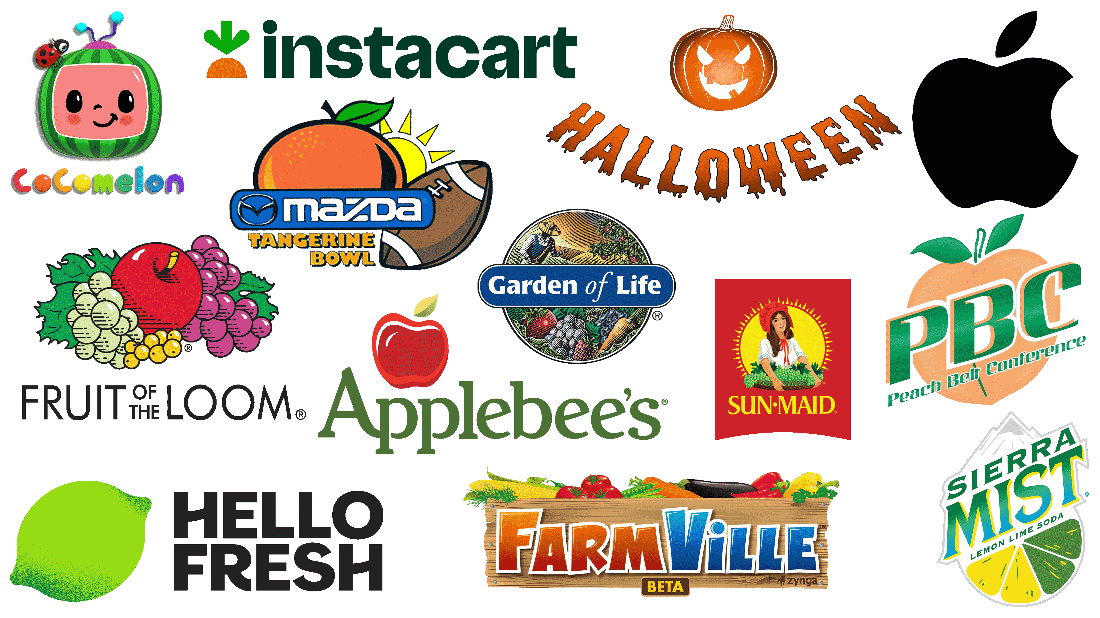
Below are some of the most interesting and recognizable logos in which fresh, juicy fruits have become part of their brands’ history, helping them convey their ideas through universally understood symbols of nature.
HelloFresh
![]()
The HelloFresh logo features a bright, stylized lime rendered in vibrant green. The fresh fruit reflects the company’s core concept: delivering fresh ingredients right to customers’ doorsteps, reminding people of the simplicity and natural appeal of home-cooked meals. This German company has become a global leader in meal kit delivery services. The lime in the emblem conveys vigor, freshness, and flavor, creating an atmosphere of summer sunshine and ease. Its greenish hue and citrus imagery evoke fresh produce and the positive emotions associated with preparing meals at home.
Sun-Maid
![]()
The Sun-Maid logo depicts a girl in a red bonnet, gently holding a basket of green grapes, set against a shining sun. Grapes in the emblem directly connect to the brand’s main product, raisins, which have been known worldwide for over a century. From the outset, the company emphasized its origins in a sunny region where grapes are grown for dried fruit production. The sun’s circle behind the girl symbolizes the natural method of raisin production: grapes are dried in the sun, preserving their beneficial properties and sweetness. The farmer girl’s image associates the brand with tradition, care for the harvest, and naturalness. Grapes symbolize the harvest, generosity, and natural benefits, connecting the brand’s identity with its long history and quality.
Halloween
![]()
The most recognizable symbol of Halloween is the pumpkin with carved eyes and a grinning mouth, known as the Jack-o’-lantern. The history of this symbol dates back to Irish legends about a wandering spirit named Jack, who lit his path with a candle set in a hollowed-out turnip or pumpkin. Since then, the pumpkin has become an essential attribute of the holiday, embodying a combination of fun and eerie mysticism. The logo represents the holiday with a bright orange pumpkin, a mischievous smile, and aggressive eyes, personifying Halloween’s playful and supernatural atmosphere. The logo features lettering in blurred, dripping fonts that resemble melted wax candles, adding a mysterious, slightly horror-like effect.
Cocomelon
![]()
The Cocomelon logo is built around the vibrant image of a watermelon stylized as a cheerful cartoon character. The watermelon appears as a television set with an antenna and a friendly face, accompanied by a cute ladybug sitting nearby. The watermelon symbol relates to the brand’s primary audience, children, evoking associations with fun, warmth, and carefree summer days. The channel appeared on YouTube in 2006 and has become one of the largest sources of educational content for children. Selecting a watermelon for the logo emphasizes the channel’s easygoing, natural, and positive atmosphere, as seen in the cartoons and songs it airs. The playful fruit character has become a recognizable childhood friend, associated with safe and friendly stories.
Garden of Life
![]()
The Garden of Life logo is filled with imagery of nature and harvest, portraying a small farm scene in which a farmer tends the land, surrounded by fertile plants and fruits. Among the featured produce are grapes, raspberries, tomatoes, and carrots, emphasizing the brand’s connection to natural and organic products. Established in 2000 in the United States, the brand specializes in vitamin complexes and supplements derived from plant-based ingredients. The images of fruits and vegetables symbolically convey ideas of fertility, vitality, and health that nature provides. The farmer in the background symbolizes careful land stewardship, highlighting the brand’s commitment to organic farming and sourcing natural ingredients. The logo’s visual composition reflects harmony between humans and nature, health consciousness, and the inherent goodness found in every plant.
Applebee’s
![]()
The Applebee’s logo features a fruit symbol: a ripe, deep-red apple with a green leaf on top. Established in the United States in 1980, the brand has become widely recognizable beyond its home country. The apple in the logo directly relates to the restaurant’s name and evokes images of home cooking, freshness, and hospitality. Visually, the fruit is rendered with soft, smooth lines, looking appetizing and evoking cozy family dinners and classic American cuisine built on simple, familiar flavors. The fruit symbol serves as a reminder of the brand’s origins, offering guests a comfortable atmosphere, friendly interaction, and tasty dishes.
Peach Belt Conference
![]()
The Peach Belt logo centers on a peach, a fruit that has become the emblem of the state of Georgia, where the organization was founded in 1990. The peach is depicted in soft pastel tones, combining the fruit’s warm, natural colors with vibrant green leaves. The peach symbolizes the region, uniting teams from various universities within the state through shared cultural symbolism. The contrast between the smooth peach and the bold, strong lettering reflects the combination of friendliness and competitive strength characteristic of sports. The logo combines local flavor and athletic achievement through the image of one of the region’s most recognizable fruits.
Tangerine Bowl
![]()
The Tangerine Bowl logo is designed around a large, juicy tangerine, a bright citrus fruit symbolizing the energy and warmth of sunny Florida, where the famous annual college football game is held. The event became an integral part of the state’s sports traditions. The tangerine in the logo appears vibrant and sunny, accompanied by a graphic of a rising sun, which emphasizes the southern climate and the invigorating spirit typical of the games. Positioned beside the fruit is a traditional brown football, connecting the fruit imagery with the event’s main theme. The logo’s color scheme is warm and cheerful, conveying the festive mood and positive energy of the sporting celebration.
Sierra Mist
![]()
The Sierra Mist logo conveys the beverage’s citrus freshness by placing stylized slices of lime and lemon at the bottom of the emblem. The brand was introduced in 1999, offering a drink with a light citrus flavor and refreshing character reminiscent of cool mountain peaks. The citrus symbolism is closely tied to the recipe: lemons and limes represent freshness, energy, and a vibrant flavor. Above them are snow-capped mountain peaks, enhancing the sensation of purity and coolness embedded in the name. The entire composition conveys a sense of freshness and ease, supporting the beverage’s concept as a refreshing thirst-quencher.
Apple
![]()
The Apple logo, featuring an apple with a bite taken out, has perhaps become one of the most recognizable fruit symbols of modern times. It first appeared in 1977 and has hardly changed since, merely losing color and detail in favor of a simpler form. The apple image connects ancient cultural motifs from the biblical fruit of knowledge to Newton’s apple, symbolizing discovery and inspiration. The company has repeatedly emphasized the logo’s link to ideas of progress and learning, hinting at the brand’s pursuit of new technologies and solutions. Despite its simplicity, Apple’s symbol has achieved iconic status in popular culture, becoming an emblem of an entire technological era.
Instacart
![]()
The Instacart logo features a minimalist image of a carrot, composed of two vibrant elements: an orange root vegetable and green, leafy tops. The carrot symbolizes fresh groceries that the company delivers directly to customers from stores, preserving their original quality and benefits. Founded in the United States in 2012, the brand quickly gained popularity among home grocery delivery services. Using a carrot in the visual design logically relates to the service’s core mission to make fresh groceries easily accessible, as if the vegetable had just been picked from the garden. The simple, friendly carrot image symbolizes accessible, natural products, emphasizing the convenience and ease of use for customers.
FarmVille
![]()
The FarmVille logo is designed as a wooden farm crate filled with colorful vegetables and fruits, including corn, tomatoes, carrots, bell peppers, and eggplants. The imagery aligns with the online game’s theme, creating a virtual farm where players cultivate crops and tend a plot of land. The game was launched in 2009 by Zynga Studios and gained tremendous popularity thanks to its simple gameplay, which lets users experience life as farmers, growing and harvesting various crops. The logo’s use of vegetables and fruits reflects the game’s atmosphere and core idea: caring for nature, harvesting, and working the land, conveying a sense of tranquility and rural comfort. The farm crate in the design feels warm and inviting, encouraging players to immerse themselves in the slow-paced, measured virtual life on their farm.
Fruit of the Loom
![]()
Established in 1851, the brand is best known today for its logo, which features a vibrant arrangement of fruit. The company’s emblem features appetizing clusters of grapes and gooseberries, with a ripe red apple at the center. The fruits symbolize naturalness and comfort, the two main concepts the brand aims to convey, as well as everyday clothing, comfortable underwear, and knitwear. The brand name hints at the combination of natural materials and high-quality manufacturing. The Fruit of the Loom logo, featuring fruits, debuted in 1893 and has undergone only minor changes since, preserving its freshness and authenticity. The colorful fruits help the company become associated with simplicity and fabric softness, conveying an atmosphere of care and natural comfort.
Conclusion
Fruits and vegetables have accompanied humans for centuries; they have become part of traditions, rituals, and cultural heritage, lending special meaning even to the most ordinary things. The symbolism of these fruits and vegetables has proven so multifaceted that brands from various industries regularly incorporate them into their visual identities.
Modern brands turn to fruit and vegetable imagery, drawing upon deep cultural meanings. Through these symbols, companies establish emotional connections with consumers, explaining the character and mood of their goods and services without words.
Fruits and vegetables play a crucial role in brand communications, highlighting humanity’s connection to nature and reminding us of the simple joys of everyday life.