 Norsk Hydro Logo PNG
Aluminum is used in construction, transportation, and packaging, and its production spans ore mining and finished-goods manufacturing. This process includes processing paw material, smelting, and supplying materials to various industries. The Norsk Hydro logo is associated with a Norwegian company that operates across the aluminum production chain and supplies products to industry and construction.
Norsk Hydro was founded on December 2, 1905, by engineer Sam Eyde with support from the Wallenberg family and French banks. The company began operations producing nitrogen fertilizers using the Birkeland-Eyde process. This method required powerful hydroelectric plants. By 1913, Norgessalpeter products were being exported to Asia. By the 1920s, the company had become one of Europe’s leading fertilizer producers.
In the 1930s, Norsk Hydro began producing ammonia and heavy water. After World War II, the state took control, and the company began diversifying its production. From 1951, it developed magnesium and polymer manufacturing. Plants were opened in Porsgrunn and Glomfjord. In 1967, the first aluminum plant, Karmøy, began operations.
In the late 1960s, Hydro entered the oil and gas industry and began exploring for oil and gas in the North Sea. In the 1970s and 1980s, the company concluded a series of international deals. Acquisitions in France, Germany, Sweden, the Netherlands, and the United Kingdom strengthened its position in the chemical and metallurgical sectors. In 1986, Hydro acquired Ardal og Sunndal Verk’s aluminum assets and the Alpart plant in Jamaica.
By the early 1990s, the subsidiary Hydro Aluminum ranked among the world’s five largest aluminum producers. In 1999, the company acquired Saga Petroleum, thereby strengthening its oil operations. In 2007, the oil and gas assets were merged with Statoil’s. As a result, the company created a new structure, StatoilHydro.
The company focused its efforts on producing low-carbon aluminum and partnering with Mercedes-Benz. In the second quarter, adjusted EBITDA reached 7.79 billion Norwegian kroner. A year earlier, the figure was 5.83 billion. By the third quarter, revenue rose to 51 billion kroner despite declining global aluminum prices. The company’s market capitalization was $ 13.9 billion.
Meaning and History
What is Norsk Hydro?
A major Norwegian corporation from Oslo that holds a leading position in the global aluminum industry. Its facilities in 40 countries produce about 6 million tons of alumina, 2 million tons of primary aluminum, and 1.5 million tons of recycled metal annually. It was founded as a fertilizer manufacturer using the Birkeland–Eyde process and later became a state-owned industrial conglomerate. The full cycle includes bauxite mining in Brazil, processing at Alunorte, and aluminum smelting in Norway, Slovakia, Qatar, Australia, Canada, and Brazil, as well as extrusion plants in Europe and the Americas. The oil and gas division was spun off as Equinor, and the fertilizer division as Yara International.
1906 – 1910
The name Norsk Hydro preserves the connection between Norwegian industry and water power. The original name, Norsk hydro-elektrisk Kvælstofaktieselskab, identified the country, the use of hydroelectricity in production, and the nitrogen industry. “Norsk” means “Norwegian,” “hydro-elektrisk” refers to hydroelectricity, and the older word “kvælstof” means nitrogen. The full name translates as “Norwegian Hydroelectric Nitrogen Joint-Stock Company.” In everyday use, it was shortened to Norsk Hydro or Hydro.
The company was founded on December 2, 1905, in Kristiania (now Oslo). Its first products were nitrogen fertilizers. Engineer Sam Eyde and physicist Kristian Birkeland developed a method of fixing nitrogen from the air using an electric arc. The process required large amounts of electricity, so factory construction went hand in hand with the development of Norway’s waterfalls for power generation. The Swedish Wallenberg banking family and France’s Banque Paribas financed the project. Norsk Hydro later focused on aluminum and energy.
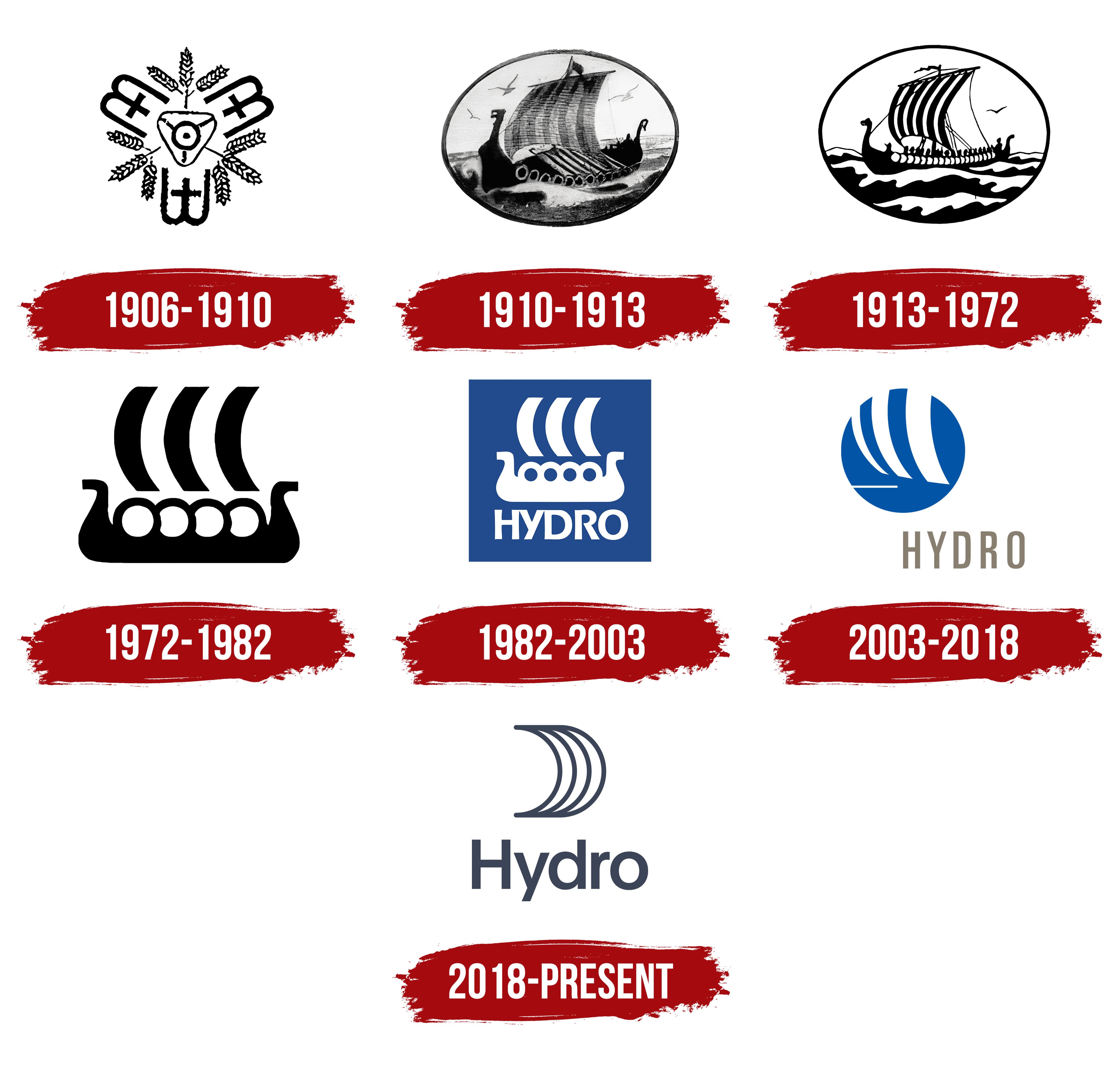
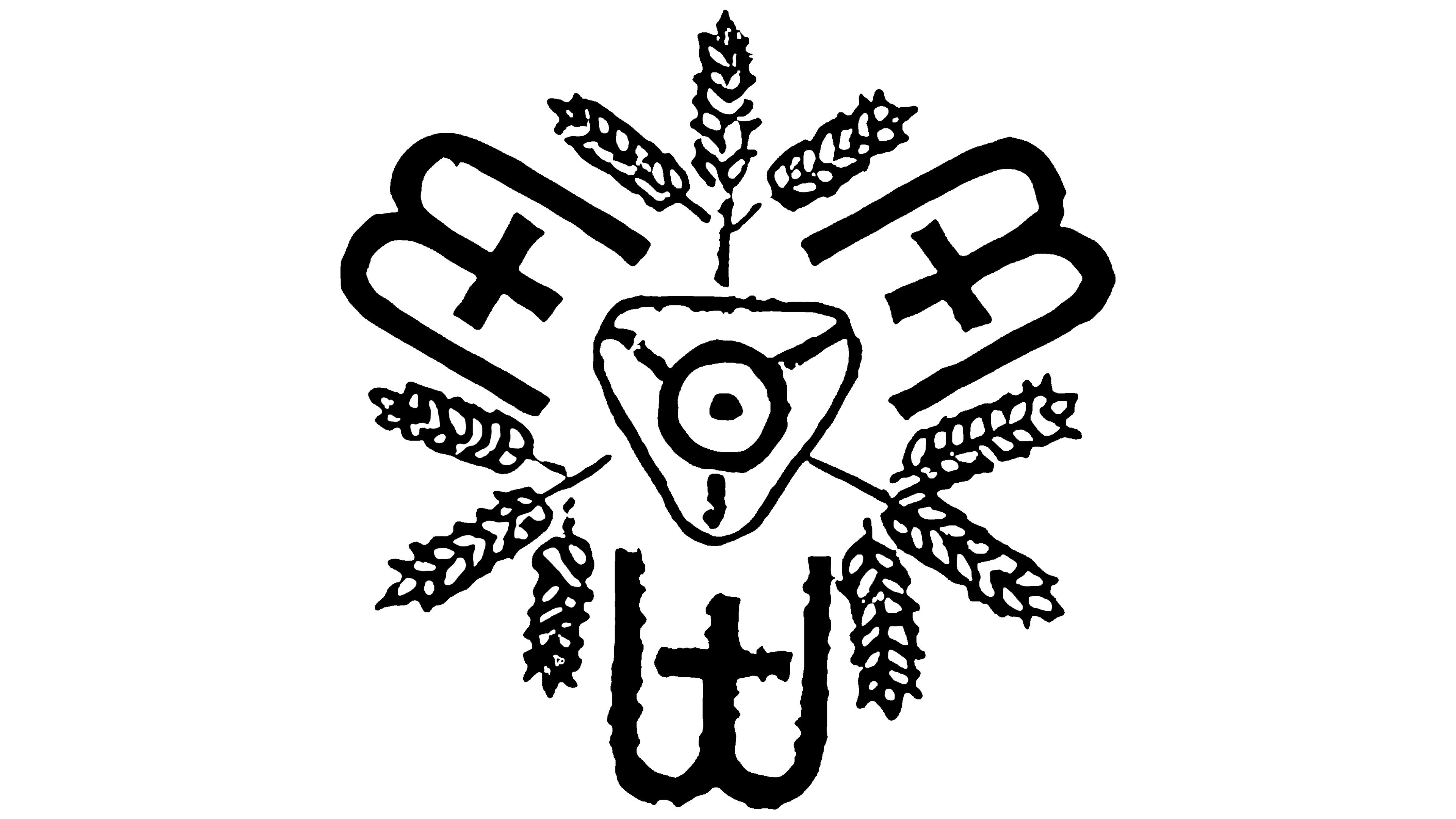
Rather than displaying the company’s full name, its first emblem illustrated the production technology and the purpose of its products. At the center of the black-and-white design was a schematic representation of an electric furnace. An equilateral triangle pointed downward, enclosing a circle with a black dot at its center. Lines connected the circle to the triangle’s three corners. The furnace represented the industrial production of nitrogen compounds.
Three monograms combining “B” and “E,” the initials of Birkeland and Eyde, surrounded the furnace. One appeared below it, while the other two sat on either side, tilted slightly outward. The interwoven letters formed three vertical lines joined by semicircular curves. A cross-shaped stroke appeared on the shorter middle line. Between the monograms were three groups of wheat heads, three in each group, for a total of nine. The stems and kernels angled in different directions. The repeated initials and wheat heads created an almost symmetrical ornament. The initials identified the technology’s inventors, while the wheat connected fertilizer to farming.
1910 – 1913
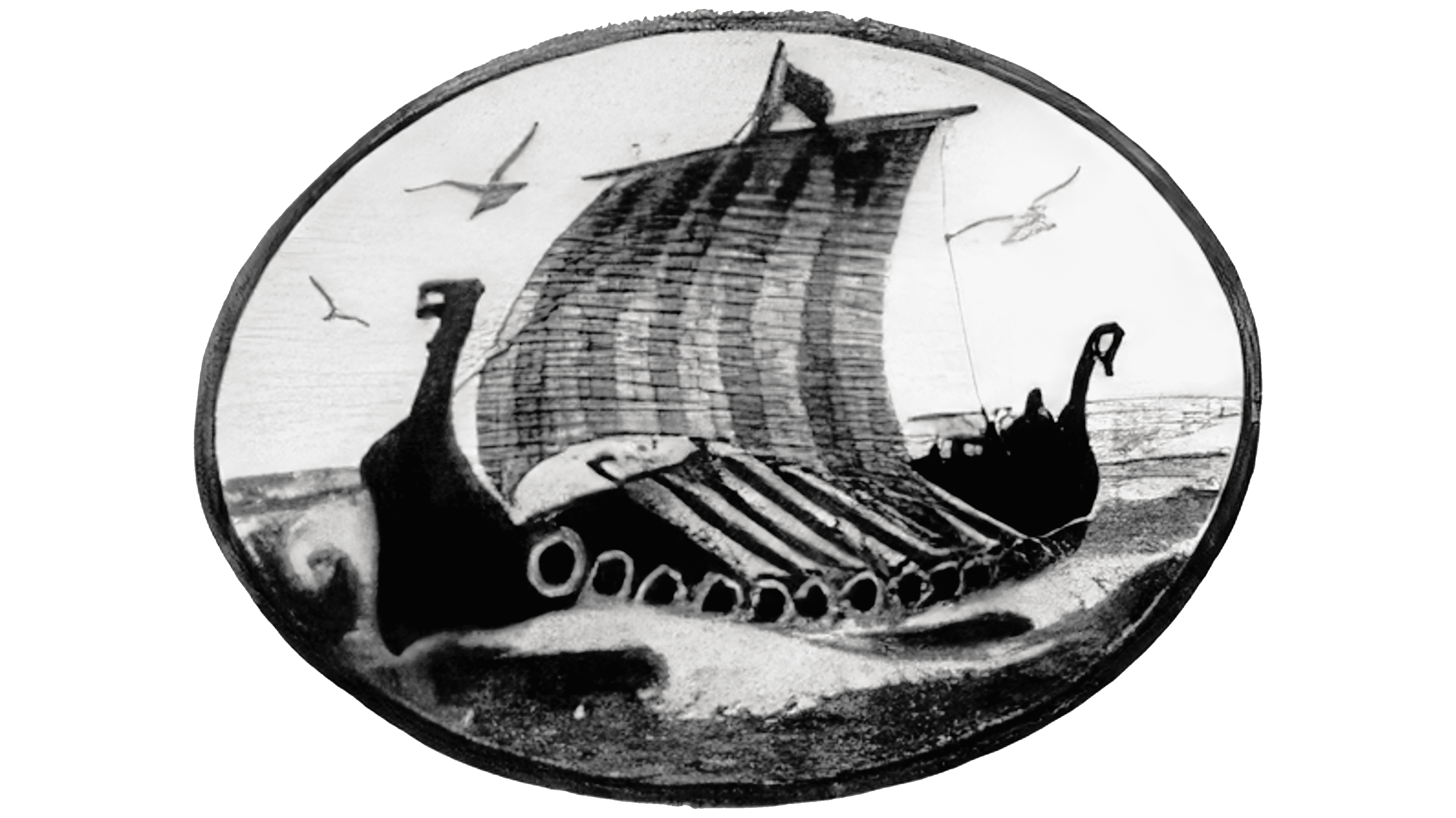
In 1910, Norsk Hydro replaced the electric furnace and wheat ornament with a Viking ship in its emblem. Norwegian artist Thorolf Holmboe created the maritime scene. Rendered in black and gray, the drawing sat inside an oval medallion. Detailed hatching on the sail, hull, and water made it look like an illustration from a book.
Holmboe depicted a Viking longship with a high bow and stern. Their curved ends took the form of dragon heads, and a heavy rim outlined the hull. Shields lined the side. A slender mast rose above the vessel, topped by a small flag pointing to the right. A large rectangular sail occupied the middle of the oval. Vertical bands of hatching conveyed the fabric’s texture, while light and dark areas defined its volume and folds. Rigging added detail to the ship. Beneath the sail, two rows of cylindrical containers stood on the deck as cargo.
Waves surrounded the hull, with spray and splashes in the foreground. Behind the ship, a flat shoreline marked the horizon, with birds soaring above it. The vessel, water, and distant shore all fit within the oval frame.
1913 – 1972
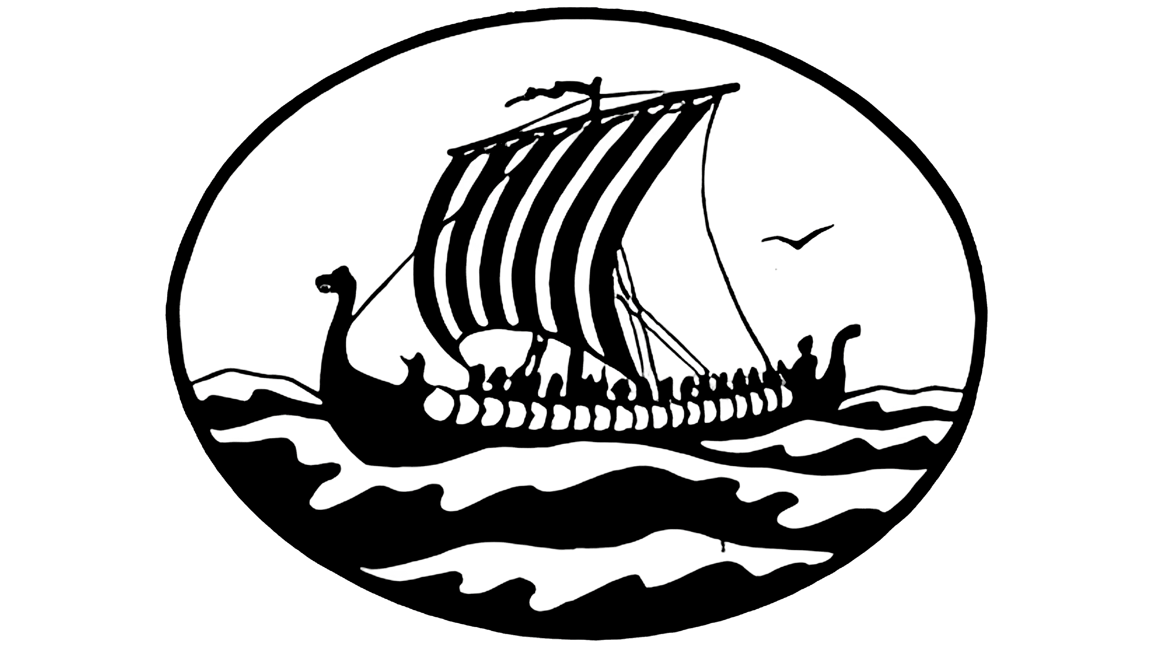
The coarse fabric of fertilizer bags prompted Norsk Hydro to redesign its ship emblem. Fine lines disappeared when the detailed image was printed on the bags, so the ship was simplified in 1913. Large black areas and white gaps replaced most of the delicate hatching. The maritime scene remained, but the sail and hull outlines became the image’s basis.
Inside the black oval frame, the longship retained its elongated hull, with a high bow and stern decorated with dragon heads. Rows of round shields with alternating outlines ran along its sides. Rowers sat in a line between the drawing’s black areas. Above them rose a mast with a large curved sail billowing in the wind. Vertical black-and-white stripes divided its surface, and rigging connected it to the hull. A flag at the top of the mast pointed to the left.
Alternating black-and-white wavy bands filled the lower oval. The upper portion remained lighter. A single stylized bird appeared above the horizon. The maritime details remained, but silhouettes largely replaced hatching.
Other businesses also used the ship. Hydro repeatedly defended the emblem in court and sent infringement notices. The drawing also varied within the company. A late-1950s review found 20 versions of the ship used in operations in different countries. Local adaptations had given the shared brand an inconsistent appearance.
1972 – 1982
Norsk Hydro’s ship emblem was redesigned in 1972. Leif Frimann Anisdahl replaced the maritime scene with a silhouette built from a few large shapes. The oval frame, waves, birds, people, and rigging were removed. Anisdahl worked at Anisdahl/Christensen, the design firm he had founded with Carl T. Christensen.
The longship’s hull became a solid shape with a raised bow and stern. Their short rectangular ends curved outward and finished in angled cuts. Four large round shields appeared at regular intervals along the side. In the black-and-white version, the shields’ white centers stood out against the dark hull.
Three elongated curved bands above the ship represented the sail. Identical in shape and size, they curved to the left, suggesting fabric filled by the wind. The bands were separated from one another and from the mast. The gaps between them followed the same curves. Even after the earlier details were removed, the hull, shields, and sail continued to evoke a Viking vessel.
The original version used green and black. In 1975, blue and white replaced those colors.
1982 – 2003
In 1982, the Hydro name became part of the ship logo, linking the emblem directly to the company’s name. A white longship occupied the upper half of a blue square, with “HYDRO” beneath it. The symbol and lettering now shared a single colored field.
The hull retained its elongated horizontal shape, raised bow and stern, and sharply outward-turned ends. Four round shields appeared at even intervals along the side. The color reversal changed their appearance. Where white openings had previously stood out within a black hull, blue circles now appeared within a white silhouette. Above the vessel, three identical, elongated sail bands curved left. Gaps separated them from the hull. The design was limited to the hull, shields, and sail.
“HYDRO” appeared in white, set in tightly spaced, bold, single-line sans-serif capitals. The lettering resembled Futura Bold or Gill Sans Heavy. The name occupied the lower part of the square, with open space between it and the ship.
2003 – 2018
The planned separation of its fertilizer business prompted Hydro to reconsider its identity. The company had acquired aluminum producer VAW and was preparing to operate Hydro Agri outside the group. The new identity was intended for the remaining oil and gas, energy, and aluminum businesses. Gene Grossman of the American agency Siegel & Gale designed the logo. The company unveiled it on December 11, 2003, at the annual Capital Markets Day in Oslo, and it became the company’s official emblem at the beginning of 2004.
Grossman kept the earlier ship-sail motif and enclosed it in a blue circle. The hull and shields were removed. Inside the circle, three white vertical shapes curved left, resembling wind-filled sails. Similar in outline and evenly spaced, they widened from left to right. A short horizontal white line beneath them suggested a simplified hull or the water’s surface. The circle represented Hydro’s international reach.
The name moved below the emblem, replacing the earlier arrangement of a white ship and lettering inside a blue square. “HYDRO” was set in narrow, elongated sans-serif capitals. A gray-beige color distinguished the lettering from the blue symbol, and the letter spacing was increased. The name ran horizontally, with upright letters resembling Univers or DIN.
The ship emblem remained associated with fertilizer production. In 2004, Hydro Agri was spun off as Yara International. The new company kept a reworked ship motif for its agricultural products and replaced Hydro with Yara. After the split, the companies used different logos, but sails remained a shared motif in Hydro’s and Yara’s identities.
2018 – today
Hydro’s 2017 acquisition of Sapa added new operations and more than 20,000 employees. The expanded group needed a shared identity to unite its international business. Architecture and design firm Snøhetta, with offices in Oslo and New York, was commissioned to lead the process. Development took about a year. More than 100 Hydro representatives, from executives to production specialists, participated in discussions in Oslo, Innsbruck, and New York. Of the 12 directions developed, “Unite” became the project’s basis. The identity was publicly unveiled in September 2018 and launched on October 2.
The ship’s sail remained, but its design changed. Instead of a solid blue field, the emblem used four parallel curved bands of equal thickness that bowed outward to the right. Horizontal lines connected their upper and lower ends. On the left, the outline curved inward to form an open bend, while the arcs on the right created a rounded outer edge. The ends of the bands and their junctions were smoothly rounded.
The circle became the foundation of the identity’s construction. Snøhetta connected the rounded forms to bringing people together and to cylindrical aluminum billets. Alloy production also connected to the idea of “Unite,” since aluminum is combined with other metals. The geometry of the inherited sail motif reflected the group’s industrial work.
“HYDRO” became “Hydro.” The initial “H” remained uppercase, followed by lowercase sans-serif letters. The lettering was wider than the previous narrow capitals. In the primary version, the sail sits above the name; in the horizontal version, the two appear side by side. Both symbol and text use the same dark blue.
The logo was provided in dark blue, aluminum, white, and black versions. In print, the aluminum version can use Pantone 877 metallic ink or matte silver foil. Within the company’s color system, gray referred to aluminum, red to bauxite, and shades of blue to water and hydropower.
A separate large-scale version, called “The Sail,” used different band weights suited to enlargement. Accompanied by the Hydro name, it appeared on printed materials and other branded surfaces. A separate vertical logo version included the tagline “Industries that matter.” It sat beneath the name in a fixed position relative to the lettering and sail.