 Ollie’s Bargain Outlet Logo PNG
Discount retail stores offer goods at reduced prices, combining household chemicals, tools, groceries, and books in a single space. Shopping here is about finding great deals and a constantly updated assortment. The Ollie’s Bargain Outlet logo is associated with a chain of stores offering great deals on everyday essentials.
Morton Bernstein and Mark Butler founded Ollie’s Bargain Outlet in Mechanicsburg, Pennsylvania, in 1982. The store offered products from manufacturers’ and retailers’ liquidation inventories at deep discounts. The assortment changed weekly, creating a treasure-hunt shopping experience.
In the 1980s and 1990s, the company gradually expanded across Pennsylvania and neighboring states. It remained a local family business. In 2003, the company was sold to investment funds Comvest Partners and Oliver Partners. After the deal, the network began expanding at scale. By 2004, the company opened dozens of new stores each year and strengthened its presence in small towns.
In 2012, Oak Hill Capital Partners acquired Ollie’s. The deal was valued at about $ 200 million. In July 2015, the company went public on NASDAQ under the ticker OLLI and raised $120 million at a valuation of about $900 million. By then, the chain had about 200 stores in 16 states and generated $ 750 million in revenue.
From 2016 to 2018, Ollie’s increased its store count to 300. The company purchased liquidated goods after major chains, including Toys R Us and Sports Authority, went bankrupt. In 2019, it opened new distribution centers in Pennsylvania and Georgia to support expansion.
In 2020, amid economic instability, the company recorded record sales growth. In 2021, it continued its expansion and began testing compact store formats. In 2022, it adapted to rising costs and inflation while maintaining its image as an affordable discount retailer.
In 2023, the chain surpassed 500 stores and reached 30 states. In 2024, the company invested in updating merchandising and loyalty programs.
Ollie’s Bargain Outlet is among the largest discount retail chains in the United States. The company operates hundreds of stores and continues to expand nationwide.
Meaning and History
What is Ollie’s Bargain Outlet?
A large-format discount store chain that operates on a quick-sale model, offering everyday goods including groceries, household chemicals, furniture, clothing, and electronics. Its business model is based on purchasing surplus, discounted lots, and warehouse inventory, allowing it to maintain low prices without promotions. Stores are designed simply, with no extra spending on décor or advertising, and the assortment is updated regularly to spark interest in new arrivals. The company focuses on family shoppers.
1982 – 2009
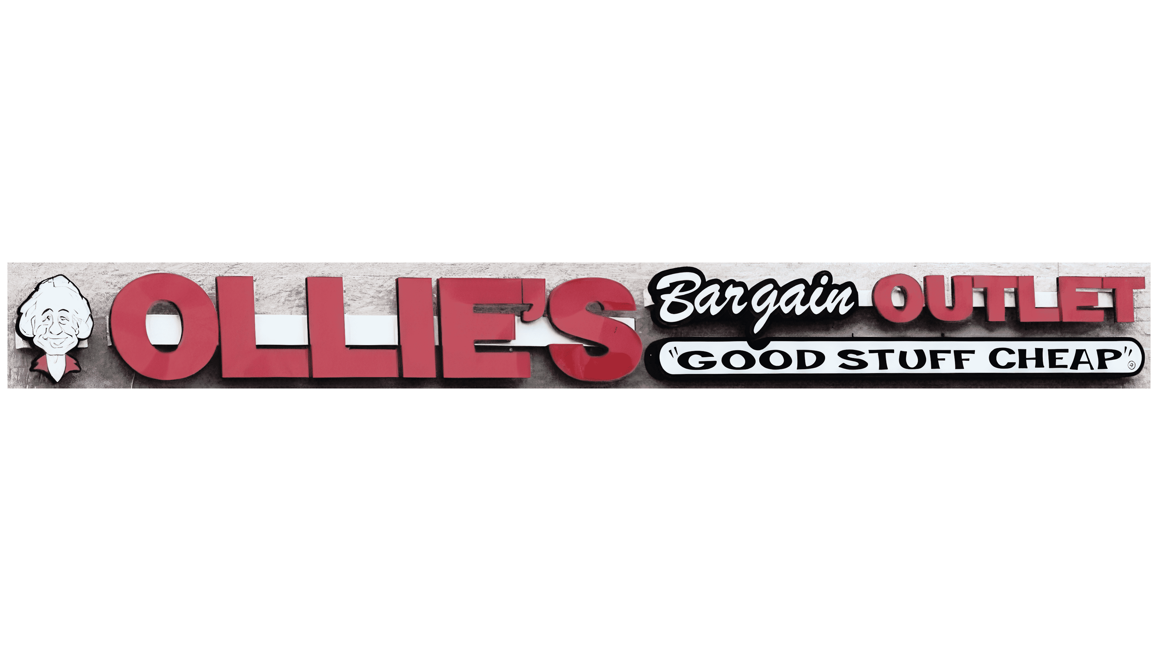
The smiling man on the early Ollie’s Bargain Outlet signs was based on a real person. Oliver “Ollie” Rosenberg, a cofounder of the chain, worked in real estate and helped finance the first store. The business took his name, and his portrait became the basis for its caricature. The artist depicted an older man with a high forehead, large ears, white hair, a mustache, and a broad smile. A red collar completed the image. His portrait appeared to the left of the lettering.
The first store opened in Mechanicsburg, Pennsylvania, in 1982. Rosenberg founded the business with Morton Bernstein, Mark Butler, and Harry Coverman. The American chain bought excess inventory, discontinued merchandise, and goods from business liquidations, then sold them at discounted prices. The words “Bargain Outlet” described its retail format. “Ollie’s” combined the nickname for Oliver with the possessive ending “‘s.” The name invited shoppers to Ollie’s store for bargains.
Bernstein adopted the business model from Building 19. Through an agreement with that chain, he began selling surplus merchandise in Pennsylvania and using its slogan, “Good Stuff Cheap.” The phrase told shoppers what the store offered and became part of the logo alongside the cofounder’s name.
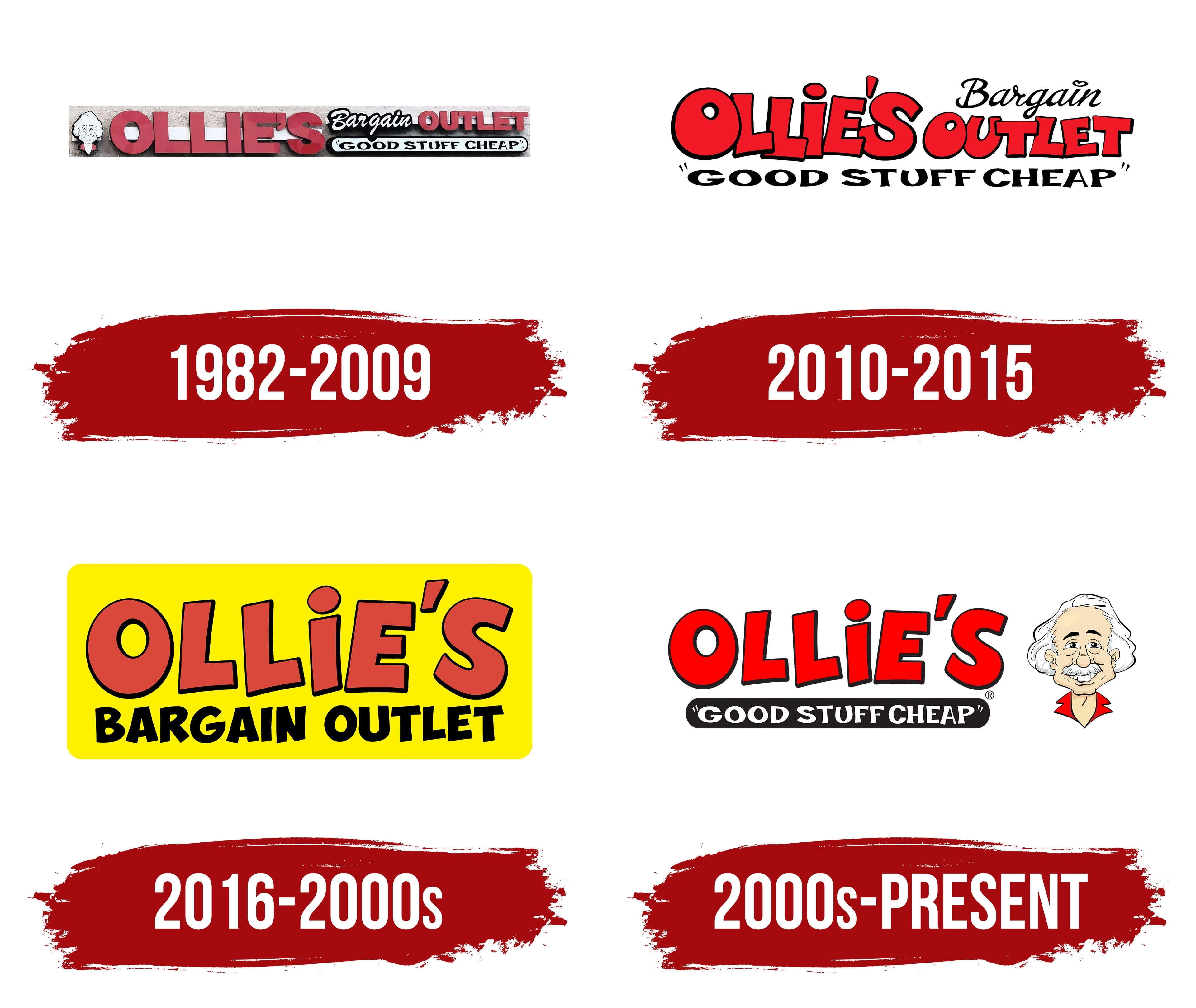
In the early design used from 1982 to 2009, OLLIE’S appeared in large red capital letters with blocky, rectangular shapes. The words “Bargain Outlet” followed, with OUTLET using the same lettering style as the main name, but smaller. The white word “Bargain,” outlined in black, resembled a handwritten signature. Its flowing italic strokes made it feel more informal and set it apart from the heavy lettering around it.
Beneath “Bargain Outlet” was a white capsule-shaped panel with a black outline. Inside, the slogan “GOOD STUFF CHEAP!” appeared in quotation marks, set in black serif capitals. The name, store description, and low-price promise used 3 different lettering styles. On storefront signs, the letters projected from the wall and cast shadows. The raised construction gave the lettering its depth.
2010 – 2015
Uneven letters gave the second Ollie’s Bargain Outlet logo a cartoon-like appearance. The version used from 2010 to 2015 continued the full-name design introduced in 2007. It combined red lettering outlined in black, a handwritten “Bargain,” and a separate slogan line below.
OLLIE’S dominated the logo. The large capital letters varied in height and width, tilted at different angles, and formed an uneven line. The slanted apostrophe resembled a drop. A black outline followed the exaggerated contours of the red letters. Their distorted proportions echoed decorative typefaces like Komika Axis and Yikes!
To the right, “Bargain Outlet” occupied 2 lines. OUTLET, on the lower line, repeated OLLIE’S style at a smaller size. Its closely spaced red letters had black outlines, varied in width, and sat at slightly different heights. Above them, “Bargain” appeared in thin black strokes. The mostly lowercase italic lettering resembled handwritten typefaces such as Brush Script and Freestyle Script. A small stylized heart replaced the dot over the “i.”
The phrase “GOOD STUFF CHEAP” appeared beneath the name in black capital letters enclosed in quotation marks. Giving the slogan its own line separated the store’s promise of a bargain from its name.
2016 – 2000s
The third logo placed the full Ollie’s Bargain Outlet name on a yellow sign. The lettering occupied 2 lines inside a rounded-corner rectangle, with yellow margins around the edges. Size and color distinguished OLLIE’S from BARGAIN OUTLET.
Large brick-red letters with thick black outlines filled the upper line. Their widths varied, their vertical strokes curved, and slight tilts gave the name a cartoon-like appearance. An elongated, drop-shaped apostrophe stood between the “E” and “S.” The heavy letters had exaggerated, caricature-like forms. Their dark outlines separated the red fill from the bright background.
On the lower line, BARGAIN OUTLET appeared in black sans-serif capitals. These letters were smaller and thinner than those above, retaining slight tilts and uneven shapes reminiscent of comic-book and circus lettering. The handwritten “Bargain” gave way to the same print lettering used for “Outlet.” The store description now formed a single line beneath Ollie’s.
2000s – today
Ollie’s caricature and the hand-drawn lettering give the Ollie’s Bargain Outlet logo a humorous tone. In the full version introduced in 2020, the smiling figure appears to the right of the name and slogan. His head spans nearly the entire height of the 2 lines of lettering. Black lines define his cream-colored face, broad forehead, large ears, prominent nose, and wrinkles. His mustache and full white hair recall caricatures of Albert Einstein. His bright red shirt collar matches the name’s color.
OLLIE’S appears in large red capital letters with thick black outlines. The decorative, hand-drawn lettering combines angular strokes, varying letter widths, and slight distortions. The letters sit at slightly different heights along the line, and a separate red apostrophe is tilted.
An elongated black bar with rounded ends runs beneath the name. Inside, “GOOD STUFF CHEAP” appears in white capital letters. The slogan, enclosed in quotation marks, replaced the words “Bargain Outlet.” The wording beside the name shifted from describing the retail format to promising good merchandise at low prices.
Red, yellow, and black dominate the design. The figure’s hair, the open spaces within the letters, and some lettering remain white. The main portrait versions are intended for white or yellow backgrounds.
An additional horizontal version appeared in 2021 and features a thin vertical divider. Red OLLIE’S lettering sits on the left, while the black slogan “Good Stuff Cheap” occupies several lines on the right. The divider separates the two sections.