 QBE Insurance Logo PNG
Business insurance covers losses resulting from accidents, supply chain disruptions, and operational risks. In such situations, it is crucial that the policy functions properly and that the contract terms are honored when an insured event occurs. The QBE Insurance logo is associated with a company that provides insurance services for the corporate sector, including asset protection and risk management.
QBE Insurance began in 1886 in Townsville. That year, James Burns and Robert Philp founded the North Queensland Insurance Company. The company was created to ensure the fleet of Burns Philp, their shipping firm. By 1890, the organization had more than thirty-five agencies in Australia, Asia, and London. In the early 20th century, the company began international expansion, opening offices in India, China, Malaysia, and the United States.
In 1921, James Burns founded the Bankers’ and Traders’ Insurance Company. Queensland Insurance became its main shareholder. In 1923, the company’s management passed to his son. He continued to expand operations in Asia, Europe, and North America.
The organization survived the Great Depression and World War II. In the 1950s and 1960s, a new growth phase began. In 1973, Queensland Insurance, Bankers’ and Traders’, and Equitable Probate and General Insurance were merged into QBE Insurance Group. The new holding began trading on the Australian Stock Exchange.
In the 1990s, QBE began acquiring companies internationally. The company bought Australian Eagle Insurance, Trade Indemnity Australia, and a stake in Mercantile Mutual. In the early 2000s, QBE acquired HIH assets and strengthened its position in aviation insurance.
In 2007, the company expanded its presence in Latin America and the United States. It acquired Seguros Cumbre and General Casualty Insurance. In 2008 and 2009, it completed deals with PMI Australia and Elders Insurance.
In 2011, the company acquired Balboa Insurance from Bank of America. In the same year, it completed the consolidation of a joint venture with ING. By the end of the decade, it had offices in 27 countries and more than 13,000 employees.
In 2023, net profit reached 1.355 billion U.S. dollars. In 2024, the figure rose to $ 1.779 billion. Gross written premiums totaled 22.395 billion dollars, and revenue reached 18.74 billion.
The company remains one of the largest international insurers and continues to operate in key global markets.
Meaning and History
What is QBE Insurance?
An international insurance group based in Australia operates in 27 countries. It provides solutions for individual and corporate clients across property, automobile, agricultural, marine, energy, aviation, health, and workers’ compensation insurance. Operations are divided into five regions: North America, Europe, Australia and New Zealand, emerging markets in Latin America and Asia, and the reinsurance center Equator Re in Bermuda.
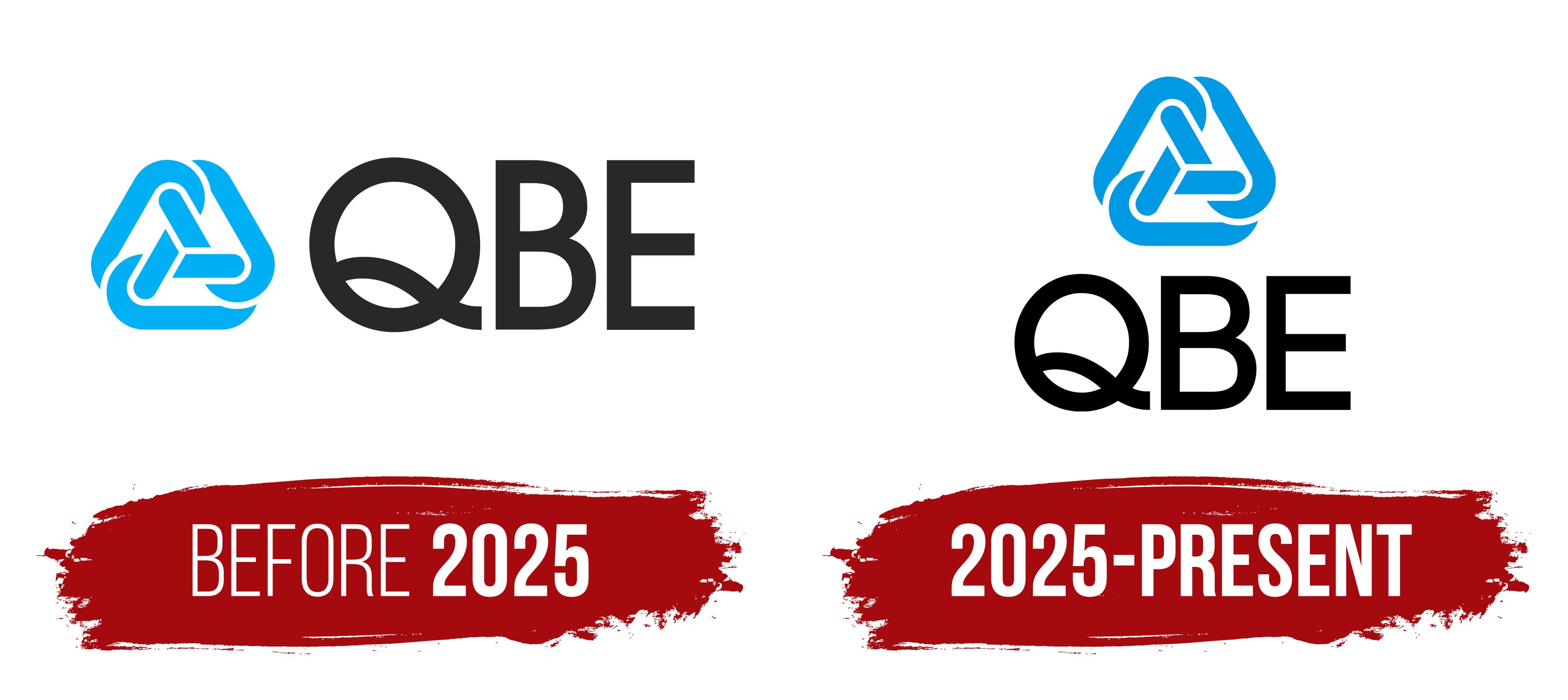
before 2025

Before 2025, QBE used a logo based on rigid geometry and a short abbreviation. The company began operations in Townsville in 1886 under the name The North Queensland Insurance Company Limited. The QBE name appeared in 1973 following the merger of Queensland Insurance and Bankers’ and Traders’ Insurance Company.
The abbreviation combines the names of three companies. The “Q” comes from Queensland Insurance, the “B” from Bankers’ and Traders’, and the “E” from The Equitable Probate and General Insurance Company. The brand was built around three letters tied to the history of the combined insurance business.
The left side of the logo contained an enclosed light blue figure resembling a triangle with rounded sides. Three connected lines ran through its interior. They followed the outer contour and formed a loop resembling a three-part Möbius strip.
The QBE wordmark appeared on the right. All letters were uppercase, black, and equal in height. The heavy typeface featured soft forms and resembled modified versions of Neo Sans or Gotham Rounded. The light blue emblem beside the black name gave the brand a formal appearance without excessive decoration.
2025 – today
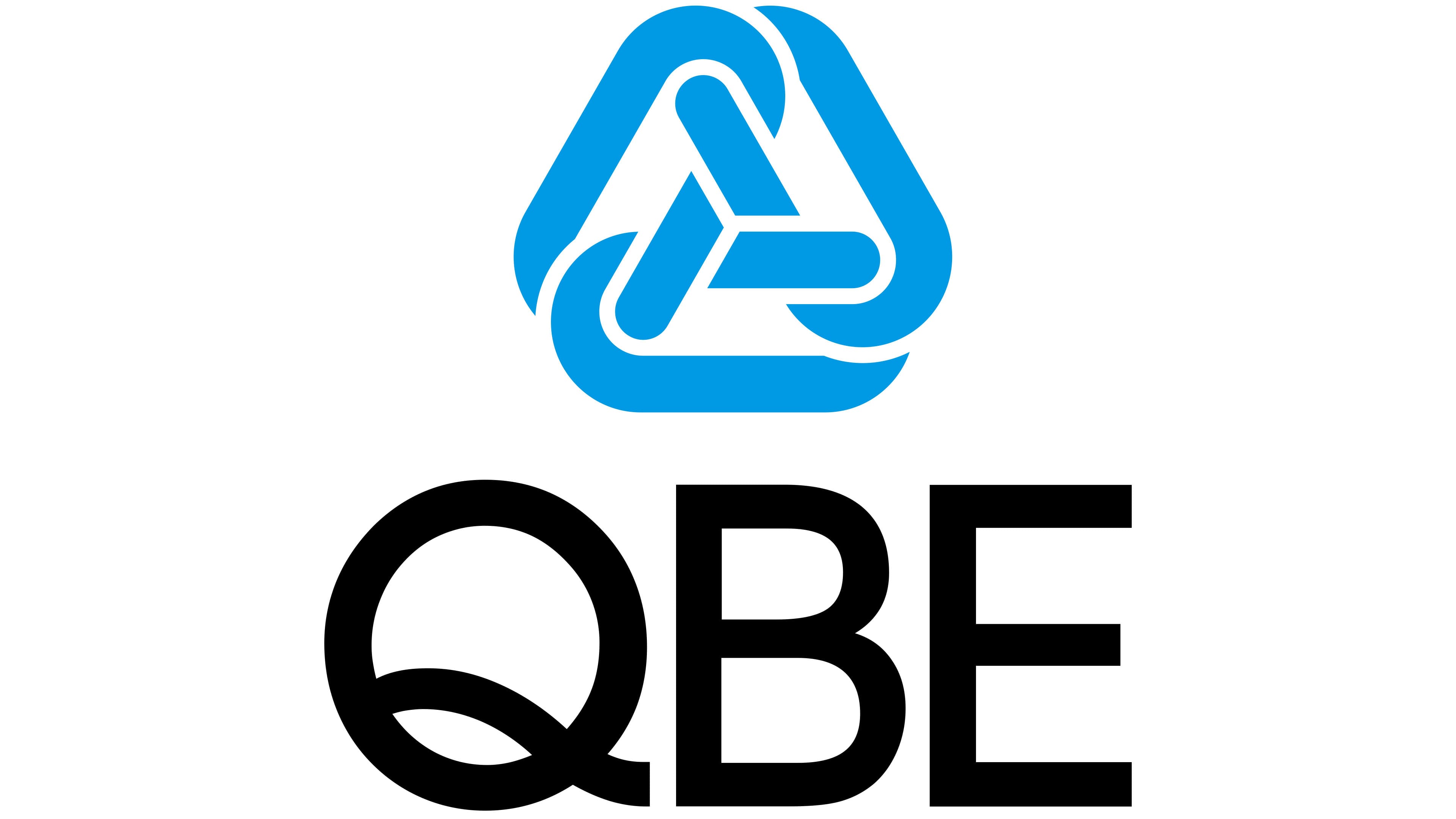
In the current version, QBE retained the foundation of its previous logo but changed the arrangement of its parts. The light blue symbol moved above the QBE wordmark. The vertical layout made the emblem more compact and easier to use as a unified block.
The symbol remained close to its previous color, although the blue shade became slightly darker. Its form remained nearly unchanged. The enclosed figure with soft corners and intersecting interior lines was preserved. Moving it above the wordmark changed the overall appearance without breaking its connection to the earlier version.
The QBE wordmark received a minor adjustment. The letters became slightly thinner, while the typeface still resembles Gotham Rounded. The new arrangement, denser blue shade, and lighter lettering gave the emblem a more formal and composed appearance.