 SQM Logo PNG
Mineral resource extraction includes the mining of lithium, potassium, and other elements used in the energy, agriculture, and chemical industries. These materials are processed and supplied to various industries, where the final product depends on their properties. The SQM logo is associated with a Chilean company that extracts and processes raw materials, including lithium for batteries and fertilizers for the agricultural sector.
The company SQM was founded in 1968 through a partnership between private investors and the Chilean government. The new enterprise gained control over nitrate deposits and focused on modernizing the declining industry. In 1971, SQM was nationalized. From 1983 to 1988, the company was privatized and placed under Julio Ponce Lerou’s management.
Since the early 1990s, SQM has expanded its operations. In 1993, the company acquired MINSAL’s assets. In 1995, it was listed on the New York Stock Exchange. During this period, it launched potassium chloride production and developed the lithium segment. In 1997, the company began producing lithium carbonate at the Salar del Carmen plant.
From 1994 to 2017, the company invested more than $1.8 billion in the Salar de Atacama deposit. The company strengthened its international presence and, in the 2000s, acquired enterprises in India, China, France, and Canada. In 2018, the Chinese company Tianqi Lithium acquired 23.77 percent of SQM’s shares from Nutrien Corporation for $ 4.07 billion.
In 2024, SQM and Codelco agreed to jointly manage lithium assets until 2060. In the same year, potassium sales reached 695 thousand tons. Revenue from the specialized plant nutrition segment amounted to $ 942 million.
SQM completed the construction of the Covalent plant in Australia. The Mount Holland project is designed to produce 50 thousand tons of lithium hydroxide per year. In the first half of 2025, the company’s revenue reached $ 2.08 billion. Net income amounted to 226 million. In the second quarter, lithium prices fell, and profit fell 58 percent to $88.4 million. The company continues to increase lithium production and adapt to changing market conditions.
Meaning and History
What is SQM?
SQM is a major Chilean producer of chemical and mineral resources headquartered in Santiago, and it ranks among the world’s top three lithium producers, along with Albemarle and Arcadium Lithium. It extracts lithium at the Salar de Atacama and processes it at the Salar del Carmen plant, which has a capacity of about 210,000 tons per year. The company controls about 24% of the global iodine market and remains the largest supplier of potassium nitrate. Tianqi Lithium owns about 23% of the company. Together with Wesfarmers, it is developing the Mount Holland lithium hydroxide project in Australia. Clients include Hyundai, Kia, Ford, and LG Energy.
1968 – 1997
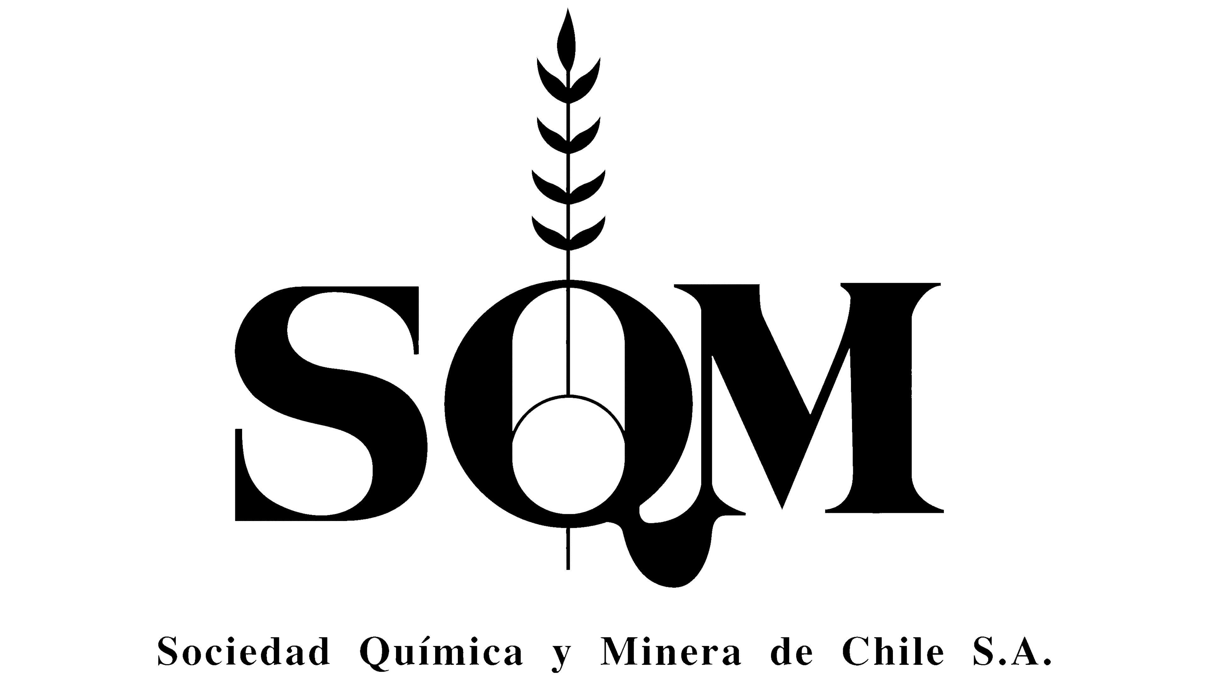
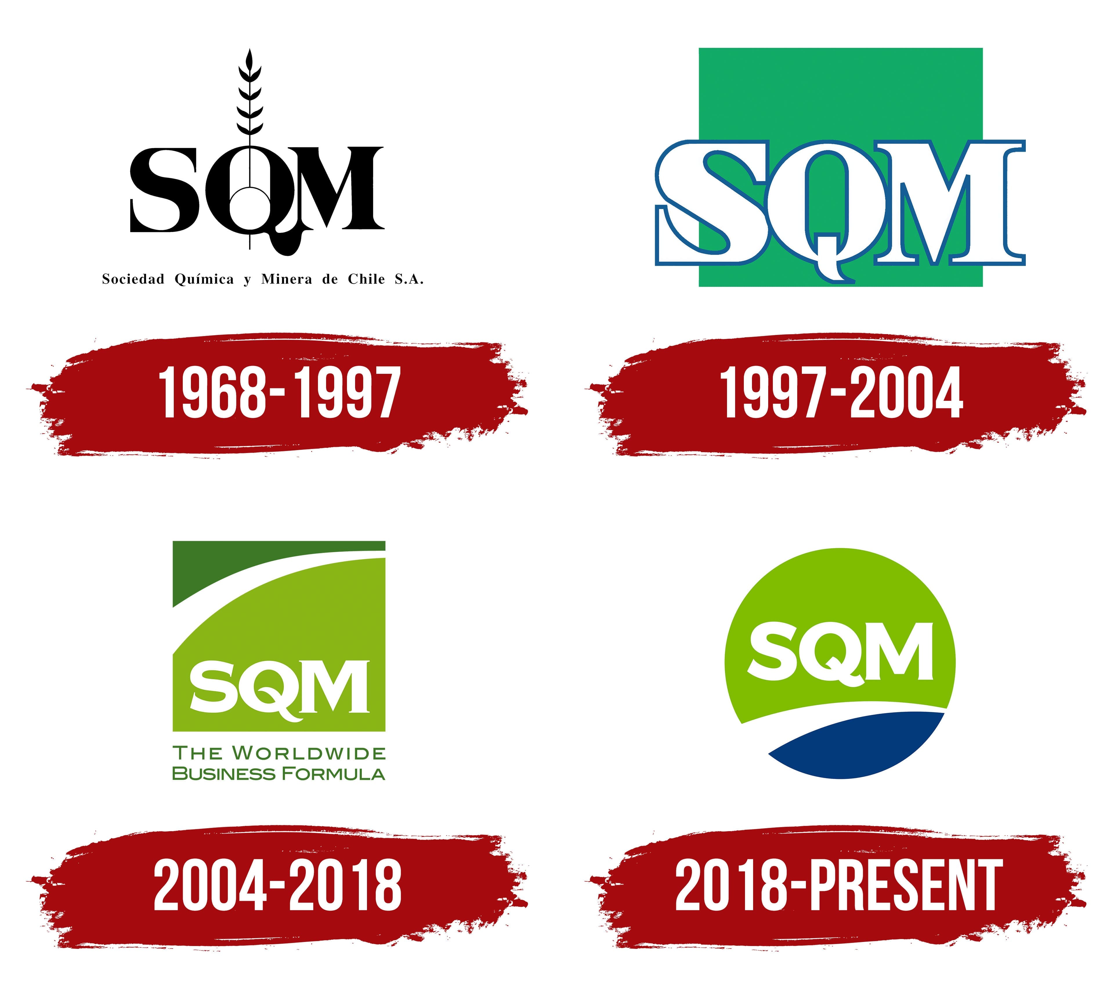
SQM’s early logo featured an ear of grain growing through the letter “Q.” Four pairs of narrow, pointed grains extended along its sides, with a projection at the top. A small circular detail sat on the vertical line inside the “Q.” The agricultural image connected the emblem to the use of nitrates in fertilizer production.
The company’s full name, Sociedad Química y Minera de Chile, translates as “Chemical and Mining Company of Chile.” The letters “S,” “Q,” and “M” come from Sociedad, Química, and Minera. Alongside the abbreviation, the name Soquimich became established, combining parts of the Spanish name. The company was formed in 1968 as a joint venture between Compañía Salitrera Anglo Lautaro and the state development corporation Corfo. The state took ownership in 1971, and privatized it from 1983 to 1988. From its origins in the nitrate industry, it developed into a producer of fertilizers, iodine, lithium, and industrial chemicals.
Large black SQM lettering occupied the upper portion of the logo. The serif capitals contrasted thin and thick strokes. The tail of the “Q” extended below the baseline and ended in a rounded thickening. Beneath the abbreviation, the full legal name, ending in S.A., appeared in small black serif lettering. The abbreviation dominated the design, while the lower line preserved the company’s official name.
1997 – 2004
SQM’s 2004 logo redesign accompanied an expanding product range and growing customer relationships across international markets. The abbreviation moved inside a green square near its lower edge. A white band crossed the upper portion, curving upward from left to right and narrowing near the right edge. Above the curve was a dark green section, with a light yellow-green field below. The company associated the rising line with growth and a shift from product focus to addressing customer needs.
The white SQM capitals became more compact. They retained their serifs, with lettering resembling Bookman and modified versions of Times. The “S” gained smoother terminals, while the “Q” retained an elongated, curved tail. Beneath the square, “The Worldwide Business Formula” appeared in two lines of green text. The slogan presented SQM as a supplier of products and services for international business. “Formula” linked the company’s chemical expertise to business success.
2004 – 2018

SQM’s 2004 logo redesign reflected a shift from a product focus to customer needs. The company expanded its product range and developed relationships with customers in different countries. The updated emblem’s rising arc symbolized growth and a shift in how it worked with customers.
A white band crossed the upper portion of the square diagonally, rising from left to right and narrowing at the right edge. A dark green section appeared above it, with a light yellow-green field below. The SQM abbreviation moved inside the square, near its base. The white capitals became more compact while retaining their serifs. Their forms resembled Bookman or a slightly modified Times. The “S” terminals were softened, while the “Q” retained its long, curved tail.
The green tagline, “The Worldwide Business Formula,” appeared beneath the square in two lines. It presented SQM’s products and services to international customers. “Formula” linked the company’s chemical expertise to business success.
2018 – today
SQM began work on its 50th-anniversary identity in 2017. The company intended to preserve its familiar name while using the logo to show how its production connected to healthcare, nutrition, and technology. The development and planning division, led by Pablo Altimiras, worked on the project with agency Blok. Employees from different business areas participated in the discussions, and the team gathered their views through surveys and focus groups.
In the 2018 logo, a circle replaced the square. A bright green field containing white SQM lettering occupied the upper portion, with a dark blue segment below. A curved white band separated the colored sections, continuing the motif from the previous version. The abbreviation used a bold sans-serif typeface. The rounded “Q” retained a short tail pointing downward to the right.
The colors and shape represented SQM’s business areas. Green represented agriculture, nutrition, and environmental commitments, while blue represented industry and technology. The circle stood for international operations, openness, and closeness to people. The update reflected the expanding uses of the company’s products beyond agriculture, including medicine, batteries, electronics, and solar energy.
The logo was accompanied by “Solutions for human progress,” with the Spanish version “Soluciones para el desarrollo humano.” The tagline showed how SQM’s products improve people’s lives, shifting the emphasis from international business relationships to everyday applications. Iodine connected the company to medicine, lithium to electronics and electric vehicles, fertilizers to food production, and nitrate salts to thermal energy storage at solar power plants.