 Koc Holding Logo PNG
This diversified holding company brings together enterprises across the energy, transportation, finance, and manufacturing sectors and manages assets across them. This structure enables coordinated company development and resource allocation across business lines. The Koç Holding logo represents a Turkish group that manages businesses across various industries and operates long-term in domestic and international markets.
Koç Holding began to take shape in 1917. Vehbi Koç then opened a small store in Ankara. The official founding date is May 31, 1926, when the company Koçzade Ahmet Vehbi was registered. As early as 1928, Vehbi Koç became a representative of Ford Motor Company and Standard Oil.
In 1938, the entrepreneur consolidated his enterprises into Koç Ticaret A.Ş. After World War II, he helped establish the first American-Turkish enterprise, General Electric T.A.Ş. This marked an important stage in Turkey’s industrialization.
In the 1950s, Arçelik and Otosan were founded and became key players in the country’s industrial development. In 1963, Vehbi Koç established Koç Holding A.Ş. and unified all assets under a single structure. Over the following decades, the holding expanded into the automotive, food, and energy sectors. During this period, the holding founded enterprises such as Tat Konserve and Ford Otosan.
In the 1980s, Rahmi Koç took over leadership. The holding strengthened its position and began collaborating with companies such as American Express and Mobil. In 1993, the Koç family founded a private university. In the early 2000s, the holding entered new markets and launched joint projects with Statoil and Opet.
In 2005, the group acquired Tüpraş and Yapı Kredi. This expanded its influence in the energy and financial sectors. In 2011, Arçelik purchased the South African company Defy Appliances. The companies Otokar and Ford Otosan opened new production lines.
Since the mid-2010s, Koç Holding has focused on digital transformation. To support this, Koç created a structure called KoçDigital. The Platform360 system was implemented in key group enterprises, including Ford Otosan and Arçelik.
The company operates in fourteen countries. It has implemented more than five hundred digital transformation projects. Consolidated revenue reached 29.6 billion dollars. The company employs about 130 thousand people. It is preparing to celebrate its centennial in 2026.
Meaning and History
What is Koc Holding?
The largest industrial and financial conglomerate in Turkey, owned by the Koç family, accounts for about 10% of the country’s industrial output and 9% of exports. The main business areas cover automotive manufacturing, energy, retail, home appliances, finance, construction, and IT. Its assets include joint ventures with Ford, Fiat, and Otokar; the appliance manufacturer Arçelik (Beko, Grundig); the energy companies Aygaz and Tüpraş; the retail chains Migros and Koçtaş; the bank Yapı ve Kredi; and the hotel chain Divan Group.
1984 – today
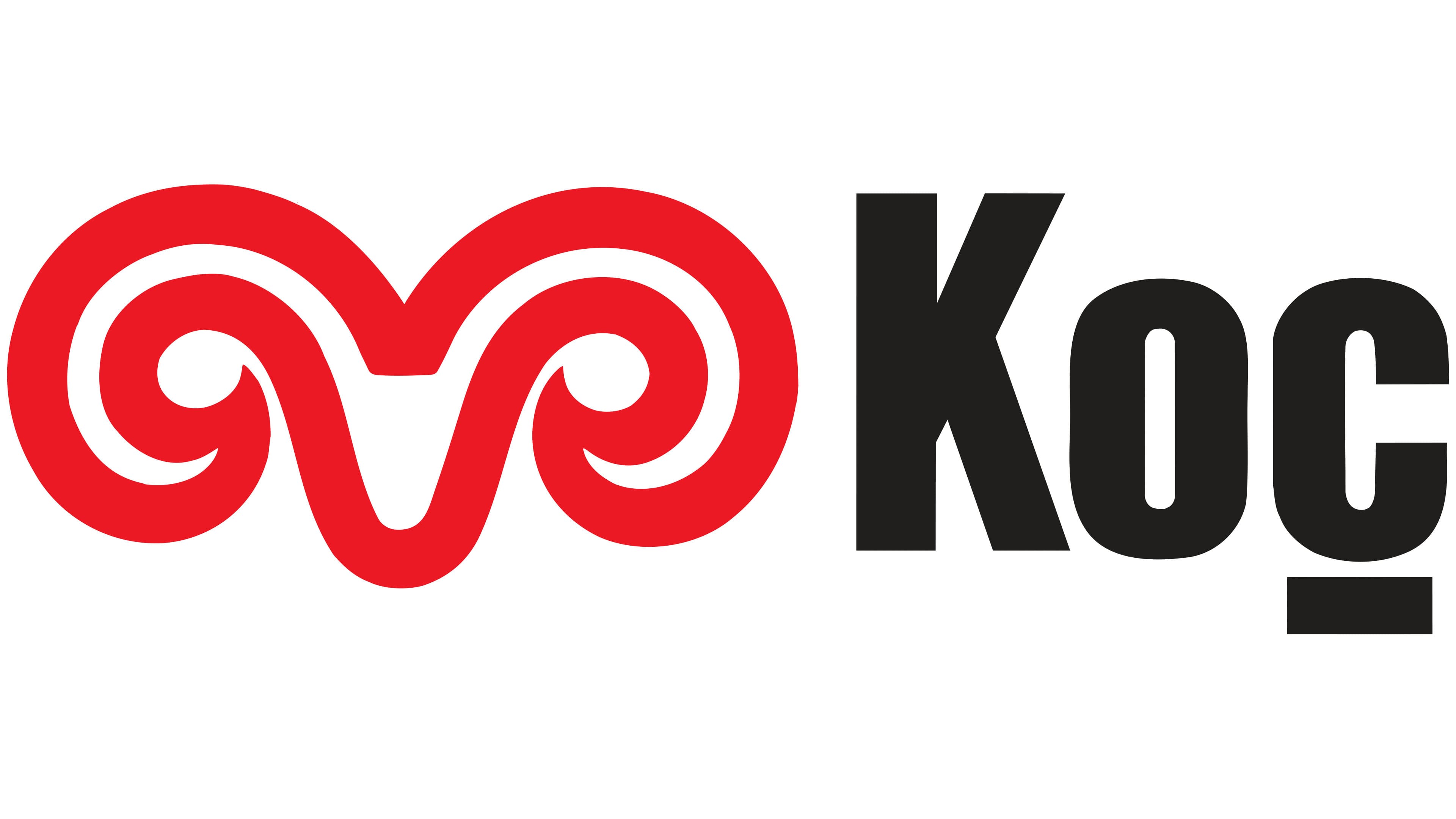
In 1984, Koç received a logo featuring red ram’s horns and the company name in black on the right. The image connects to the founder’s surname. The Turkish word koç means “ram,” so the emblem conveys the name’s meaning. The New York studio Chermayeff & Geismar, founded by Ivan Chermayeff and Tom Geismar, created the project. The firm was later renamed Chermayeff & Geismar & Haviv.
The holding company had previously used a large uppercase “K.” It represented the owners’ surname and served as a shared emblem for the group’s companies. By 1984, management considered the identity outdated. Koç Holding had grown into an international industrial group and entered the Fortune 500. Rahmi M. Koç met Chermayeff through a Mobil executive and asked him to update the logo. The designer recommended replacing the initial with the full name. The three-letter surname took up little space and let the full word represent the group.
The family business began in Ankara in 1917, when 16-year-old Vehbi Koç entered the trading business. On May 31, 1926, he registered Koçzade Ahmet Vehbi, a company named after his father. The registration date became the official starting point in the group’s history. After Ankara was declared Turkey’s capital, the city saw extensive construction, and the company began selling building materials and equipment. Vehbi later expanded into industrial manufacturing, international partnerships, and a network of companies. Koç Holding A.Ş., Turkey’s first holding company, was established in 1963 to manage the expanding business. In 1984, when the new logo appeared, leadership passed from Vehbi to his son Rahmi.
Chermayeff gave the horns a symmetrical form. Thick lines curl inward to create two spirals connected by a solid band. A depression remains between the curls, while the lower contour converges into an angular point. The overall silhouette resembles an animal’s head. Open spaces inside the horns follow the curves of the red lines. The compact figure with dense contours resembles a livestock brand in its construction.
The team developed custom letterforms for the Koç name. The bold sans-serif letters have heavy strokes, narrow interior spaces, and rounded curves that complement the horns’ shape. The uppercase “K” is followed by the lowercase letters “o” and “ç.” The cedilla beneath the “ç” is a short, thick horizontal bar with straight edges. It matches the wordmark’s proportions and preserves the surname’s Turkish spelling.
The shared brand helped identify dozens of businesses as part of one holding company. The red horns and the statement “A Koç Group Company” appeared alongside subsidiary names. The emblem also appeared in Yapı Kredi Bank’s identity. The black Koç name appeared with the logos of companies from different industries. Chermayeff and Geismar continued working with the group and created related emblems for its companies.
According to Rahmi Koç’s recollections, the relationship with Chermayeff included an unusual agreement. The designer agreed to create logos in Turkey exclusively for Koç and honored the arrangement by declining offers from other clients. The exhibition “50 Years of Graphic Design” at the Pera Museum in Istanbul included projects for the holding company and its businesses. The exhibition ran from January 24 through March 25, 2007. The studio’s Turkish work appeared alongside its international projects, and the exhibition included a 264-page catalog.
The 2025 edition of the corporate guidelines retains the 1984 logo’s structure. The emblem uses Koç Red, corresponding to Pantone Warm Red C. Its values are CMYK 0, 88, 80, 0, RGB 249, 66, 58, and HEX F9423A. On a light background, the red horns are accompanied by a black wordmark. On a dark background, the wordmark is white. The single-color logo appears entirely in black or white. Silver Pantone 877 and gold Pantone 871 are available for selected presentation materials. The secondary gray corresponds to Pantone Cool Gray 8.