


 Sterling Trucks Logo PNG
The Sterling Trucks logo stands out for its immense internal power and large dimensions, much like the vehicles the company offers. The stylish emblem demonstrates the strength and reliability of the trucks, adapted to meet specific industry needs. Although the company no longer exists, the unique symbol still serves as a reminder of the success of its machinery.
Sterling Motor Truck Company was founded in 1906 by William Sternberg in Milwaukee, Wisconsin. Its first era was defined by heavy-duty trucks for construction and logging, sectors that required durable machines for hard daily work. During World War I, the company shifted part of its production to military equipment.
In the 1920s and 1930s, Sterling expanded its range with trucks of different capacities and began testing diesel engines. World War II again redirected production toward military trucks and specialized vehicles for the U.S. Army. After the war, the company returned to civilian models, but stronger competition weakened its position. In 1953, White Motor Company acquired the business.
The second era began in 1997, when Daimler-Benz AG revived the Sterling name after Freightliner acquired Ford Motor Company’s heavy-truck division. The brand was positioned between regular heavy trucks and the higher-priced Western Star line. In 1998, Sterling introduced the L-Line for local and vocational work and the A-Line for long-haul transport, both based on updated heavy-truck engineering.
The Acterra medium-duty truck followed in 2000, and the Set-Back A-Line appeared in 2003 with changes tied to aerodynamic and emissions demands. In 2006, the Bullet introduced Sterling to lighter commercial vehicles, using the Ford F-650/F-750 platform, developed in partnership with Ford. Falling truck sales and the cost of new emissions technology led Daimler Trucks North America to end production in October 2008. The final Sterling truck left the line on March 3, 2009.
Meaning and History
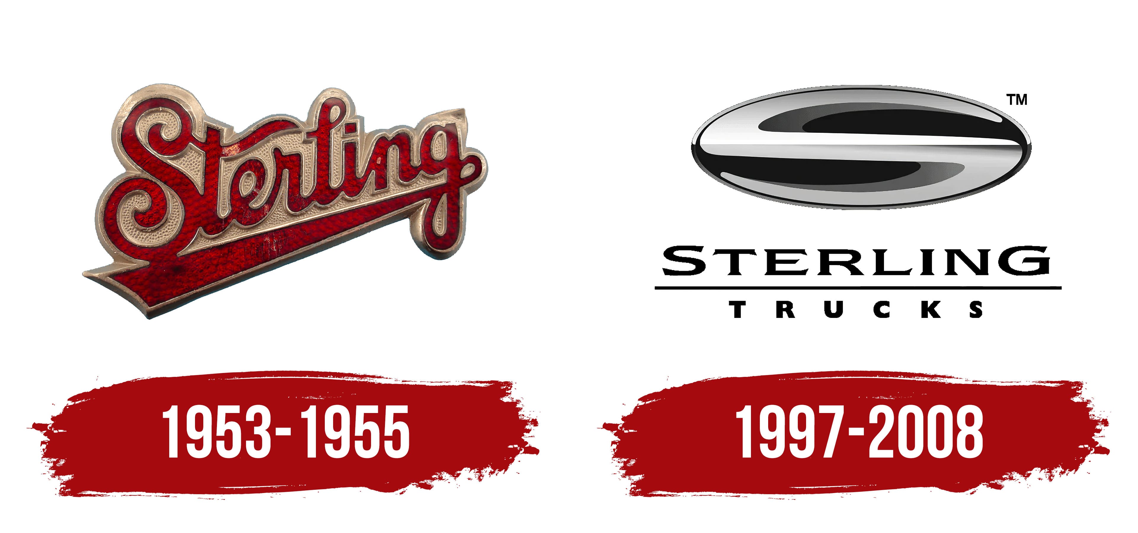
What is Sterling Trucks?
The American company, founded in 1946, manufactures heavy commercial vehicles. Freightliner, a subsidiary of Daimler AG, owned the brand and produced various vehicles from class 5 to class 8. In addition to highway trucks, the brand specializes in vocational vehicles used in construction, waste management, and other specialized industries. The company was known for offering custom-engineered solutions to meet specific customer requirements. The trucks were renowned for their reliability and efficiency in demanding work conditions.
1953 – 1955
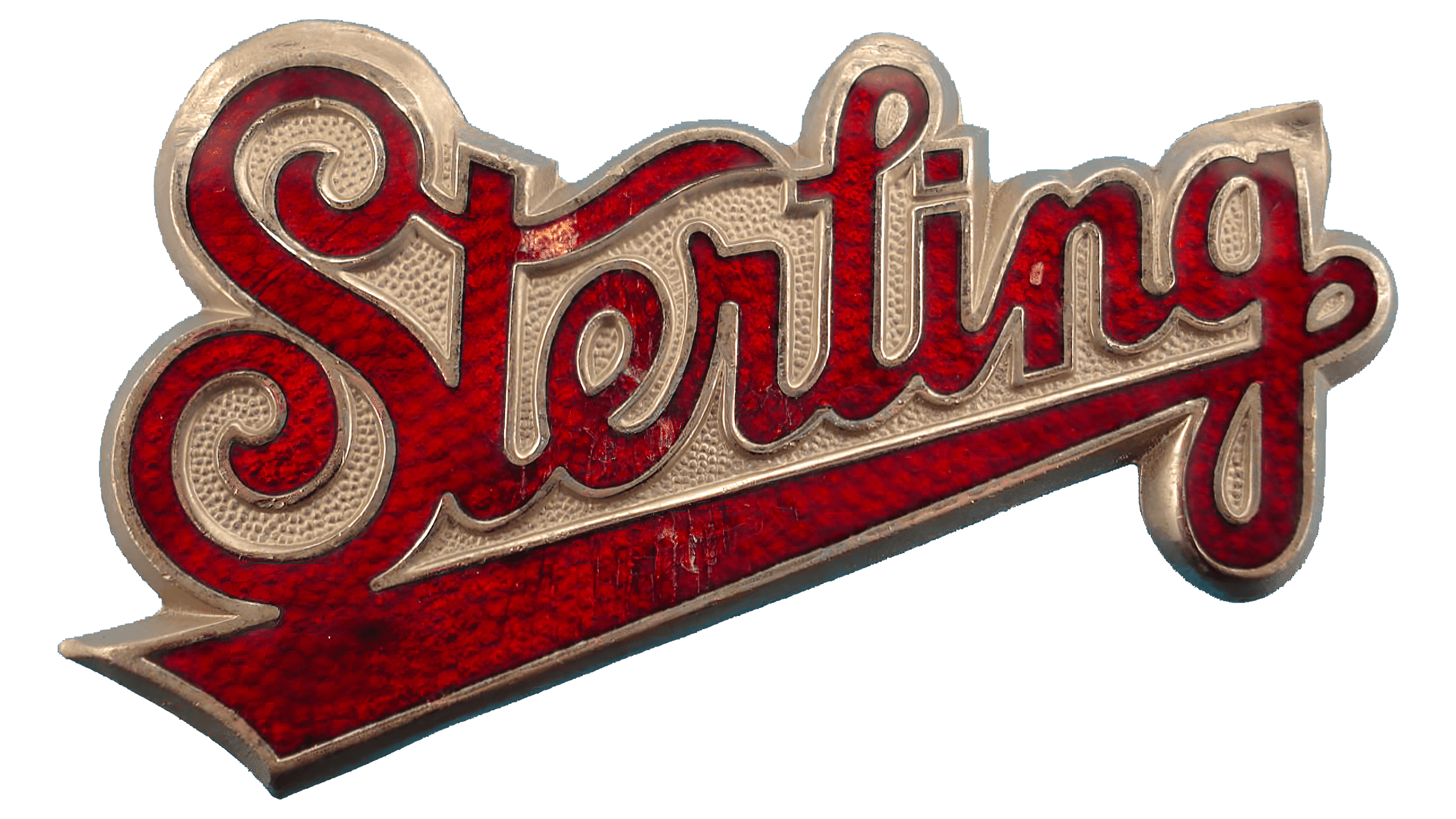
Even though the company specialized in manufacturing powerful, large-scale machines for specific tasks, it chose an incredibly delicate logo, soft, gentle, and even somewhat romantic. It consisted of a single inscription stylized as handwritten text with an elegant underline below.
The name was arranged horizontally, with a slight leftward tilt, giving the impression that the line was ascending. To achieve a perspective effect (near and far objects in space), the designers halved the size of the last letters and enlarged the front ones. This created the illusion that the inscription was shrinking and soaring far into the sky. This typographic technique added movement to the emblem, diversified it significantly, and brought the two-dimensional image to life. The emblem’s charm was enhanced by:
- An “S” with curls at the top and bottom resembling spirals;
- A “t” with a wave-like crossbar resembling a light ribbon;
- An “l” with a small, shortened loop that is graceful and coquettish;
- A “g” with an elongated tail extending under the entire inscription.
Additionally, the underline widened at the beginning of the word “Sterling,” forming a solid platform that embodies the brand’s stability and the reliability of its trucks. The soft, handwritten glyphs left a pleasant impression. The red-crimson letters looked striking against the golden background, as the combination of red and gold symbolizes leadership, energy, resilience, and strength.
1997 – 2008
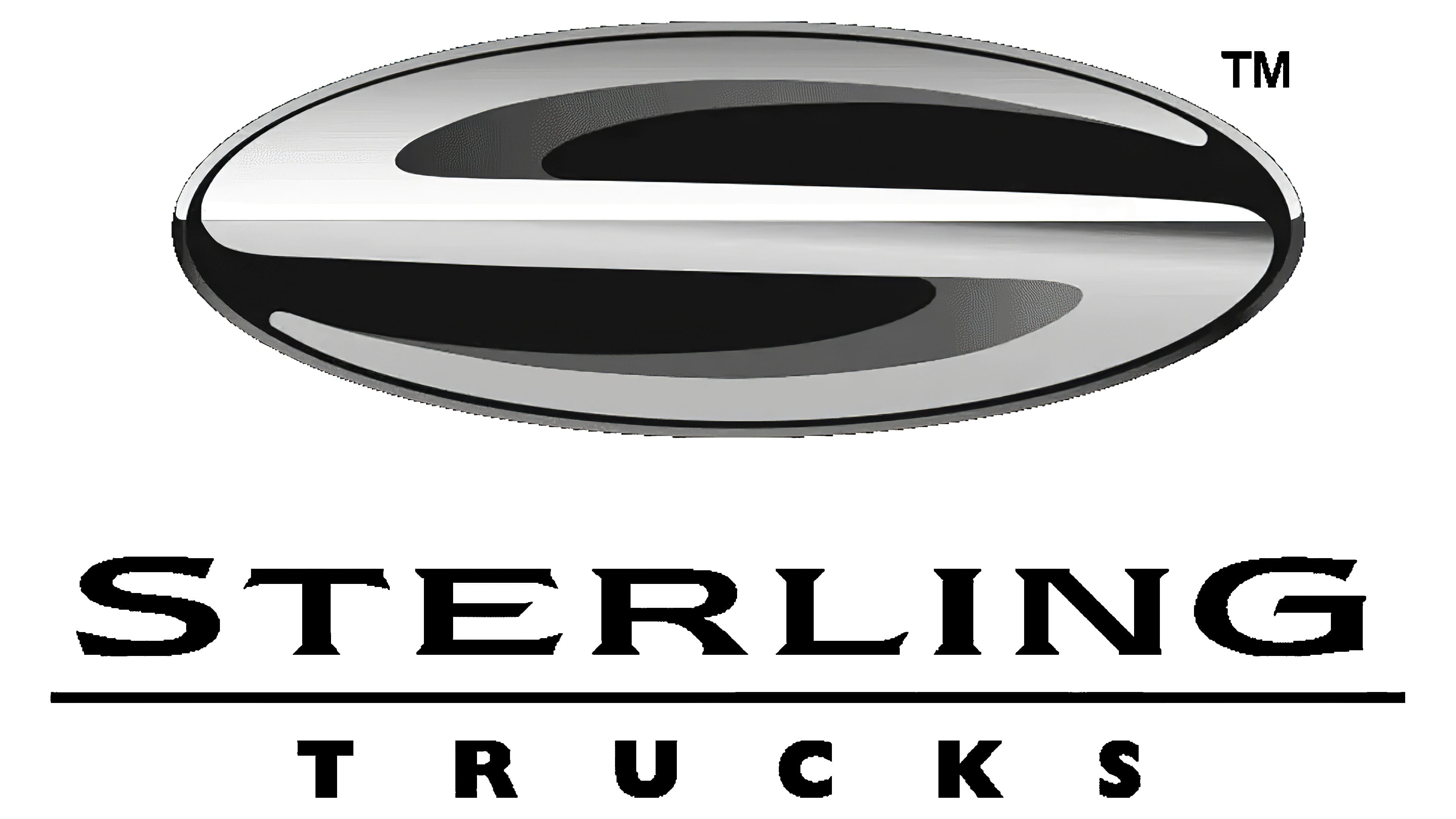
The Sterling Trucks logo became more thematic, featuring a metallic texture and a silvery appearance, as if covered with a special protective layer, shiny and sparkling. Additionally, the following elements changed:
- Shape (the emblem was redesigned into an oval);
- Color (the colorful palette was replaced by black and white monochrome);
- Inscription (it became two-level and printed).
The horizontal oval served as an excellent background for placing the company’s first letter. To fit harmoniously into the small space, designers compressed the “S” from the top and bottom, resulting in a wide glyph resembling a double-curved element. The shadow gave it a three-dimensional look, adding a touch of mystery to the emblem, as the elliptical dark background appeared like a black hole with the silvery-white silhouette of the letter “S” hovering within.
The text was centered below and spread across two lines. The top row contained the first word of the brand name. It was rendered in a very elegant and decorative font with sharp serifs. However, the serifs were not straight and needle-like but rather pointed like miniature thorns. This Gothic style did not entirely fit the automotive industry; it resembled the credits of some historical film.
The word “Trucks” was set in a modern, smooth, even, bold font. All the letters were uniform in width and height. The only distinctive feature of the lower line was the large spacing between the glyphs.