 Symrise Logo PNG
Fragrances and flavor components are created in laboratories, where teams develop formulas for food, cosmetics, and perfumes. These ingredients are added to finished products, shaping their sensory properties. The Symrise logo is associated with a company that develops fragrance compositions and flavor solutions for the food and cosmetics industries.
Symrise AG dates back to 1874. At the time, chemists Wilhelm Haarmann and Ferdinand Tiemann founded Haarmann & Reimer in Holzminden. They first synthesized vanillin from coniferin. This became an important achievement for the global perfume and food industries. In 1953, Bayer AG acquired the company while retaining its brand and business focus.
In 1973, Haarmann & Reimer began producing synthetic menthol on an industrial scale. It was the world’s first project of its kind. The product was used in toothpaste, chewing gum, and cosmetics. By the end of the 20th century, the company sold its products on all continents.
Separately, in 1919, the company Dragoco was founded in Holzminden. It specialized in developing perfume compositions and cosmetic fragrances. In 2003, Haarmann & Reimer and Dragoco merged. This merger created Symrise AG. The new organization immediately became one of the largest producers of flavor and fragrance ingredients.
In 2005 and 2006, the company acquired the British company “Flavours Direct” and the Hamburg-based Kaden Biochemicals. In December 2006, the organization carried out an initial public offering in Frankfurt. It became the largest German IPO of the year. Since 2007, Symrise shares have been included in the MDAX index.
In 2013 and 2014, the company strengthened its international position. It acquired the American company Belmay, the Swedish company Probi, and the French Diana Group for 1.3 billion euros. Later, it also purchased Rennesenz and Cobell. In 2020, the company acquired Sensient Technologies’ fragrance division.
In 2022, the organization entered the pet food market by acquiring the Chinese company Wing Pet Food. In the same year, Symrise strengthened its perfume business by purchasing the French Groupe Neroli.
Symrise ranks second worldwide in fragrance and ingredient sales. The company operates in 40 countries and supplies products to more than 140 countries. It remains a leading participant in the global market for aromatic solutions.
Meaning and History
What is Symrise?
A German company from Holzminden that ranks among the world’s largest producers of flavorings and fragrance compositions, with revenue exceeding € 3 billion. It was created by merging Haarmann & Reimer, which developed the first synthetic vanillin, and Dragoco, a manufacturer of perfumes and soap. The company expanded by acquiring Flavors Direct, Diana Group, Pribi, and Rennesenz. Partners include Amouage, Donna Karan, and Le Labo.
2003 – 2016
Symrise was formed in 2003 through the merger of 2 competitors from Holzminden, Haarmann & Reimer and Dragoco. Preparations for the merger began after EQT Northern Europe acquired the companies in 2002. The companies introduced the shared name in February 2003. Business World developed it and led the brand’s launch. Symrise CEO Horst-Otto Gerberding linked the name to the businesses’ symbiosis, renewal, and the start of their work together. It suited an international group and gave both companies equal standing under a shared brand.
Haarmann & Reimer’s history began with research into vanillin. In 1874, Wilhelm Haarmann and Ferdinand Tiemann first synthesized it from coniferin. Haarmann opened a production facility in Holzminden in 1875. After Karl Reimer joined in 1876, the business became Haarmann & Reimer. Carl-Wilhelm Gerberding and August Bellmer founded Dragoco in the same city in 1919. Initially, the company created fragrance blends for perfumes and soaps. Over time, both manufacturers became international suppliers of aroma chemicals, food flavorings, and cosmetic ingredients.
The German design firm Heine Lenz Zizka, later known as HLZ, was entrusted with Symrise’s identity. The project was intended to unite employees, divisions, and products while preserving connections to the predecessor companies. The designers used animals from the previous emblems. The dragon represented Dragoco. Its name came from the English “Dragon Company” and reflected Gerberding’s interest in East Asian culture. The hummingbird was inherited from Haarmann & Reimer.
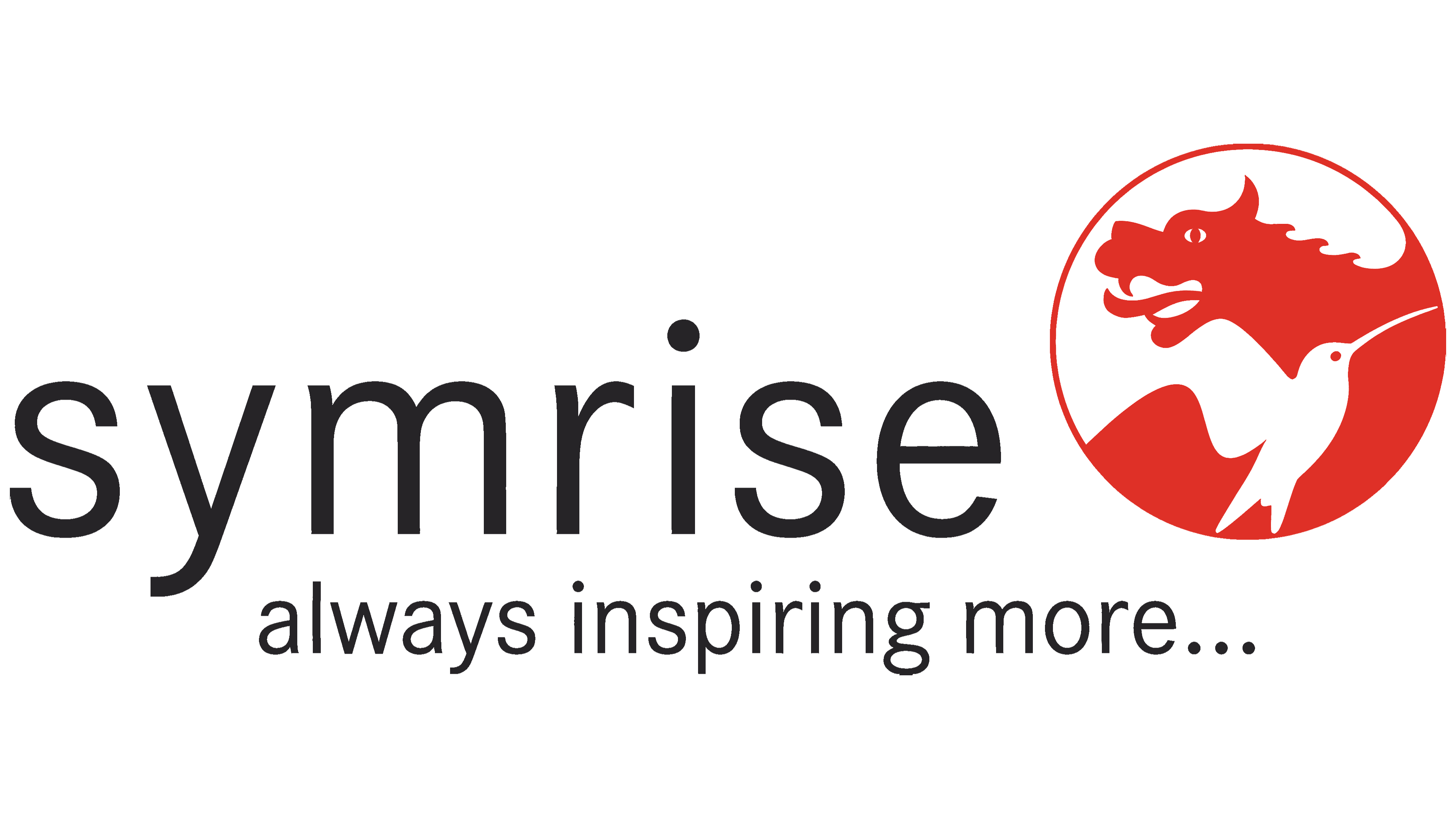
In the 2003 logo, the animals were combined inside a red circle. A dragon occupied the upper portion, its head facing left. Its profile included an open mouth, teeth, and a round eye. A white hummingbird crossed the lower portion diagonally, its long beak pointing right. The adjoining silhouettes divided the circle into 2 parts, recalling yin and yang. Their equal standing conveyed both companies’ participation in creating Symrise. Ray Hughes, president of the North American flavor division, described the emblem as a combination of experience and knowledge that supports customers’ brands.
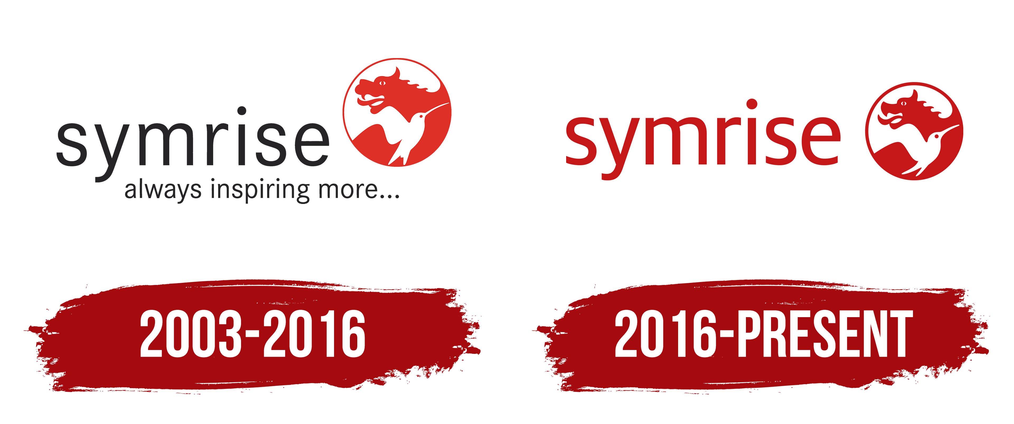
Black “symrise” lettering appeared to the left of the circle. The name was set in thin lowercase sans-serif letters with generous spacing. The round dot above the “i” complemented the letters’ rounded contours. The long wordmark and compact red-and-white emblem formed a horizontal logo. Space beneath the name was reserved for an additional, smaller line.
At launch, Symrise used the phrase “creating brands. supporting brands.” It described the company’s involvement in creating and developing its customers’ consumer brands. By 2007, the expression “Always inspiring more” had appeared. In 2008, it became the basis for an updated brand identity that brought together science, sensory perception, and products with added benefits. In early 2009, the phrase became the new tagline. In the extended logo, “always inspiring more…” appeared beneath the name. The lower line was set in thin black lowercase sans-serif letters and ended with an ellipsis.
2016 – today
By the mid-2010s, Symrise had expanded its range through acquisitions. New food, cosmetic, fragrance, and functional ingredients had entered its portfolio. Different divisions needed visual identities that reflected their specialties. Symrise AG commissioned Heine Warnecke Design GmbH of Hanover to develop a system for products, subsidiary brands, and corporate materials. The work took up to 12 months, and the launch took place in 2016.
The logo retained the lowercase “symrise” wordmark and the circular emblem on the right. The black name became red, the letter strokes were thickened, and the spacing was reduced. The lettering remained sans-serif. The circle was reduced relative to the name, making the horizontal logo more compact. A shared color united the 2 parts. The primary arrangement removed “Always inspiring more” and used it separately as a corporate motto.
The emblem retained Dragoco’s dragon and Haarmann & Reimer’s hummingbird. The pair recalled the companies that merged to create Symrise. The dragon represented Eastern traditions and sources of raw materials, while the hummingbird represented nature, fragrances, and taste sensations.
The dragon’s head faced left in the upper portion of the circle. The detailed version included an eye, an open mouth, and a crest. Below it, a white hummingbird silhouette crossed diagonally, its beak pointing right. Its contour divided the red field, while alternating colored and white areas formed the images of both animals.
Heine Warnecke prepared versions with different levels of detail for different sizes. The large version retained the full illustration, while the small version reduced the detail. The emblem versions and logo placement guidelines became part of a system of interconnected design modules. The project received a Berliner Type Award and a DDC Award in 2016, a Corporate Design Preis in 2017, and later an iF Design Award.