 VF Logo PNG
Managing clothing and footwear brands includes developing collections, overseeing production, and distributing products globally. Holding companies bring different brands together into a single portfolio. The VF logo represents a company that manages The North Face, Timberland, and Vans, coordinating their activities and development.
VF Corporation began operations in 1899 in Reading, Pennsylvania. The company, Reading Glove and Mitten Manufacturing Company, produced gloves and workwear. In 1919, it launched the women’s lingerie brand Vanity Fair. By the mid-20th century, the enterprise had become one of the United States’ largest textile manufacturers.
In 1969, the company acquired the jeans manufacturer Lee and adopted the new name VF Corporation. This reflected a transition to a diversified business model. In 1976, VF acquired Blue Bell, the owner of the Wrangler brand, and became the world’s largest jeans producer. In the 1980s, VF expanded internationally. The company opened manufacturing operations in Asia and Latin America.
In 2000, VF acquired The North Face for $ 25 million. In 2004, VF added the Vans brand to its portfolio for $396 million. In 2011, the company purchased Timberland for $ 2.3 billion, strengthening its position in the outdoor apparel segment. In 2017, the company acquired Dickies for $ 820 million. During the same period, it relocated its headquarters to Denver. The move was completed in 2019.
In 2019, VF spun off the Wrangler and Lee brands into a separate company called Kontoor Brands. The deal was valued at $ 2.8 billion. After that, the corporation focused on the lifestyle segment. In 2020, the company acquired Supreme for $2.1 billion. The integration was unsuccessful. In 2024, the brand was sold to EssilorLuxottica for $ 1.5 billion.
From 2021 to 2023, the company faced logistics disruptions and declining Vans sales. This led to restructuring and workforce reductions.
VF Corporation manages a portfolio of leading global brands. Its portfolio includes The North Face, Timberland, Vans, and Dickies. The company remains a major player in the streetwear market.
Meaning and History
What is VF?
It is an international holding company headquartered in Denver that produces clothing and footwear for sports, leisure, work, and urban environments. Its portfolio includes The North Face, Vans, Timberland, Dickies, Supreme, Kipling, Napapijri, JanSport, Wrangler, and Lee. The product range covers outerwear and workwear, shoes, bags, and accessories. The company’s operations are divided into Outdoor, Active, and Work segments, each focused on a specific style and customer needs. Sales are carried out through its own stores, online platforms, and partner networks.
1969 – 1998
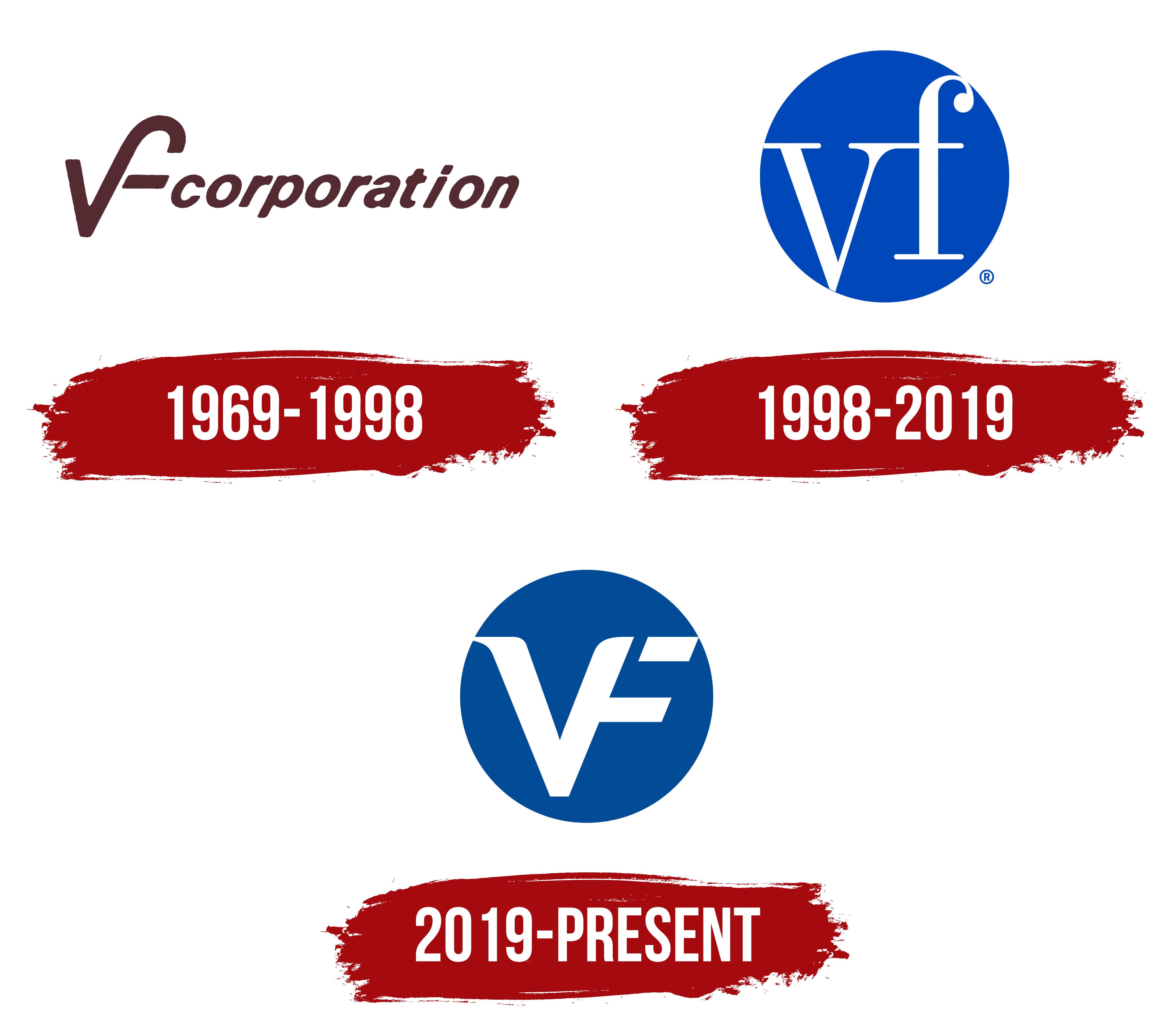
The VF monogram preserved the Vanity Fair name in the corporate logo even after the women’s underwear manufacturer became a group of apparel, footwear, and accessories businesses. Its brands included Vans, The North Face, and Timberland, among others. The former brand’s initials became the name VF Corporation. The lingerie business continued operating as Vanity Fair within the group until it was sold in 2007. After the sale, the historical abbreviation remained in the corporate name.
VF’s path began in 1899 in Reading, Pennsylvania. John Barbey and a group of investors established Reading Glove and Mitten Manufacturing Company to make gloves. The name identified the factory’s location and products. In 1913, a shift to silk products brought the name Schuylkill Silk Mills. The company began producing women’s underwear in 1914, and three years later, it held a naming competition for the new line. The person who submitted the winning name, Vanity Fair, received $25. In 1920, the factory became Vanity Fair Silk Mills. Silk supply restrictions during World War II led the company to switch to other materials. The company dropped “Silk” from its name, leaving Vanity Fair Mills.
In 1969, the company expanded by acquiring jeans manufacturer H.D. Lee and hosiery company Berkshire International. VF Corporation suited the new structure while preserving the group’s origins in the initials of Vanity Fair. The early logo linked the abbreviation to its corporate status by joining the monogram with the word “corporation.”
On the left, the “V” flowed into the second letter’s tall, curved stroke with a rounded top. A short, thick crossbar on the right helped identify the “F.” The monogram’s lines were heavier than the adjacent “corporation” lettering. The lowercase word used a bold, slanted sans-serif style resembling ITC Kabel or Futura Oblique, continuing the emblem’s stroke direction. Against a light background, the logo used a solid burgundy or dark brown fill without an outer frame.
1998 – 2019
In 1998, VF Corporation replaced its horizontal logo with a blue circle containing white lowercase “vf” lettering. The name was reduced to two letters that occupied almost the full height of the emblem. The circle brought them together while preserving their individual forms. This circular version remained in use until the 2019 update.
The lettering relied on strong contrasts between thick strokes and thin connections, resembling Bodoni or Didot. The “v” had thin upper serifs and a deep lower point extending below the base of the “f.” The second letter had a tall stem, a rounded upper curve, and a long lower serif. The light-colored letters against the solid blue field formed the entire logo, without additional wording.
2019 – today
VF Corporation introduced a new emblem at an investor meeting in Beaver Creek, Colorado, on September 25, 2019. The update coincided with the company’s 120th anniversary, its headquarters’ relocation to Denver, and the separation of its jeans business into Kontoor Brands. GIRVIN was tasked with bringing the divisions’ identities into a shared standard. Alongside the logo, the agency developed usage guidelines for the corporation, its divisions, and collaborative projects.
The blue circle and white VF letters remained, but the monogram changed. Broad lines replaced thin strokes. A straight “V” connects to a right-slanting “F” through a shared diagonal. A short horizontal terminal was added at the lower point of the “V.” The upper crossbar of the “F” is detached from the other strokes and resembles a small slanted quadrilateral. Smooth curves remain at the transitions between lines, and the letters reach the edge of the blue field.
GIRVIN assigned specific meanings to parts of the emblem. The shared line between the “V” and “F” represents unity and collaboration. At the same time, the rounded forms relate to care and empathy. The monogram’s contact with the circle expresses openness and people’s participation in collective work. The detached “F” crossbar represents growth. For VF CORPORATION, the agency created custom lettering with bold capitals and softened contours. The update was accompanied by “Purpose led. Performance driven.”, connecting the company’s purpose with its focus on results.