 AutoNation Logo PNG
Buying, trading in, and servicing a car require access to a range of vehicles and services within a single network. Car dealerships combine vehicle sales and maintenance, providing a full cycle of automotive services. The AutoNation logo is associated with a company that operates a network of car dealerships and service centers and sells new and used cars.
AutoNation was founded in 1991 as Republic Industries. It was a waste management company created by entrepreneur Wayne Huizenga, who had previously built Waste Management and Blockbuster Video. In the mid-1990s, Huizenga applied a consolidation strategy to auto retail. At the time, more than 20,000 independent car dealers operated in the United States.
In 1995, Republic Industries began acquiring dealerships in Florida and other states. In 1996, the company renamed its automotive division AutoNation USA. That same year, the company launched a network of megastores with fixed no-haggle pricing. In 1997, the company invested hundreds of millions of dollars in expansion. The format proved unprofitable. In 1999, the company closed all megastores, wrote off losses, and returned to the traditional franchise model.
In 1999, Republic Industries was split into three public companies. The waste management division became Republic Services. The rental business was spun off separately. The automotive division retained the name AutoNation and became a public company on the NYSE under the ticker AN. By the end of 1999, the corporation owned more than 300 dealerships.
In 2003, amid a recession, the company closed about forty underperforming locations. In 2006, Mike Jackson became CEO. He began restructuring and expanding the network in Texas, California, and Florida. In 2008 and 2009, the global crisis and the bankruptcies of GM and Chrysler sharply reduced sales. The company cut expenses and reduced inventory.
From 2010 to 2015, the market gradually recovered. AutoNation upgraded its dealerships, strengthened its service division, and launched an online sales platform in 2015. In 2018, AutoNation introduced the One AutoNation program, uniting all brands under a single name.
In 2019, the company expanded its used car business and began testing home delivery. In 2021, amid the chip shortage, AutoNation achieved record profitability. In 2022, leadership passed to Mike Manley, who had previously led Stellantis North America. In 2023, the company sold several dozen dealerships and focused on key regions. In 2024, it expanded online sales of certified pre-owned vehicles.
The company operates about 220 dealerships in seventeen states and remains the largest automotive retailer in the United States by revenue.
Meaning and History
What is AutoNation?
It is the largest automotive dealership network in the United States, headquartered in Florida, and manages hundreds of centers across multiple states. The company has built a system that combines new and used car sales under a single brand. Its operations are divided into three segments: domestic, import, and premium. Services include sales, maintenance, parts supply, and financial solutions. It grew through large-scale acquisitions of independent dealerships nationwide, creating the largest auto retail network.
1996 – 2000
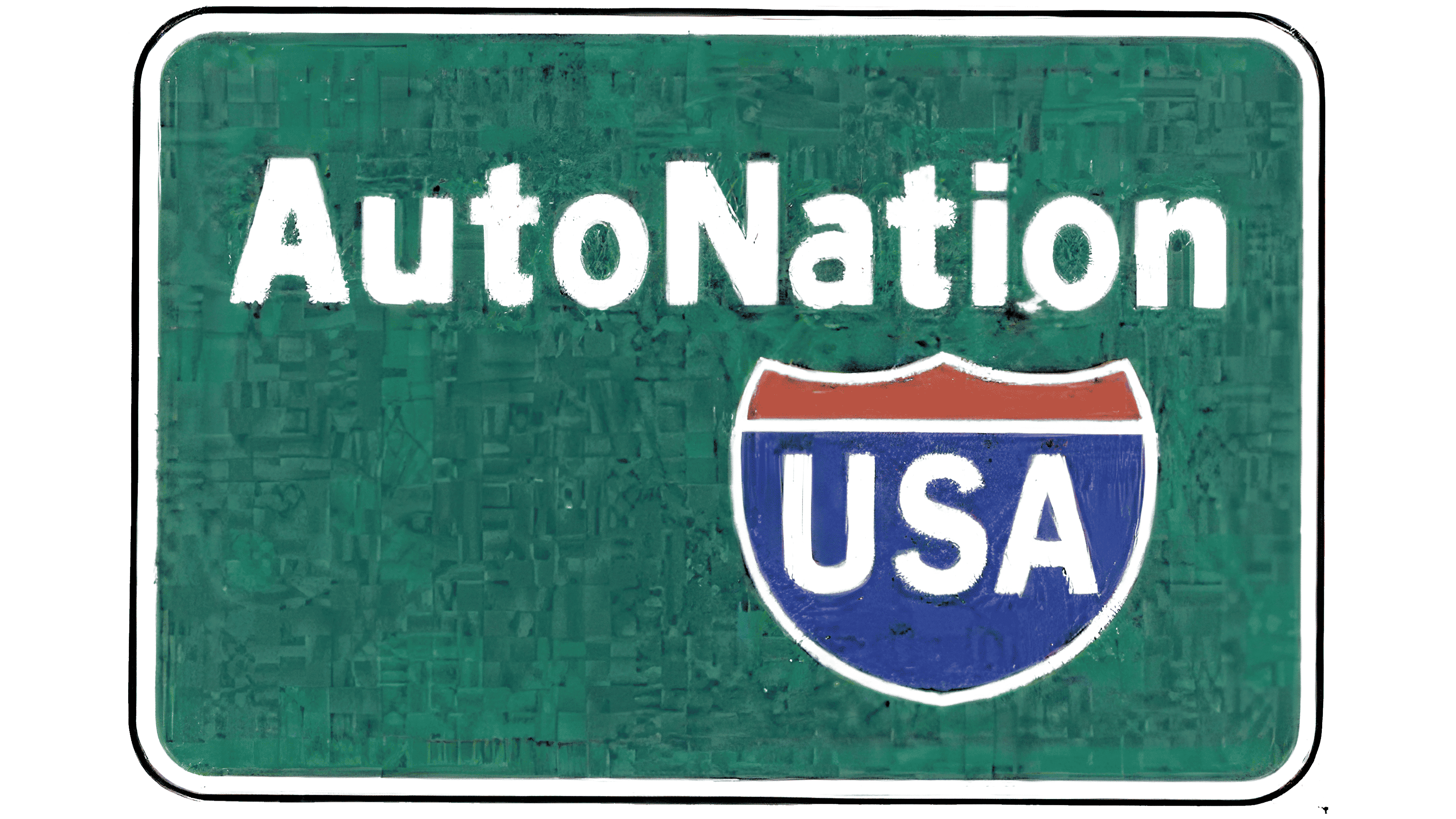
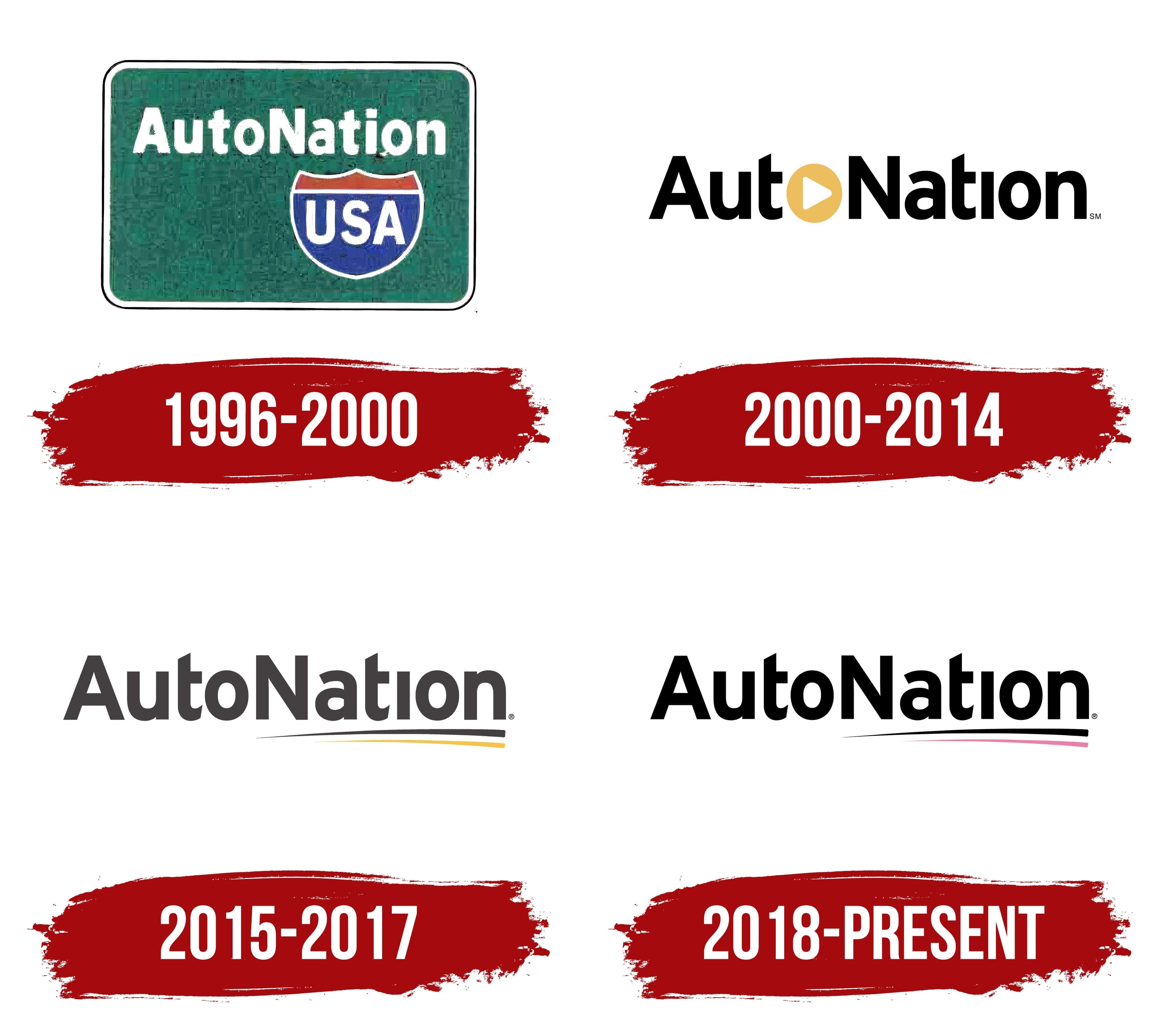
Before becoming the corporate name, AutoNation was used for AutoNation USA, a chain of large used-car stores. The brand entered the automotive retail market in 1996 with an emblem styled after an American highway sign. A green panel, white lettering, and a red-and-blue shield connected the chain with road travel and its plans for nationwide expansion.
The company’s corporate history dates to Republic Waste Industries, incorporated in Delaware in 1991. The business provided waste collection services. After Wayne Huizenga joined the company, the group expanded through acquisitions and entered new industries. In 1995 and 1996, Republic Industries moved into automotive retail, car rentals, and security services.
The automotive division grew through dealerships and AutoNation USA used-car megastores. Therefore, 1991 refers to the legal predecessor, while the AutoNation automotive brand began in 1996. Wayne Huizenga planned to build a major American retail chain with standardized sales and service practices.
The name AutoNation combined the words “auto” and “nation.” The first identified automobiles, while the second conveyed the chain’s nationwide scale. Adding “USA” connected the brand to the American market and the highway theme of its early logo. The shared name brought stores in different regions into a single system.
Republic Industries adopted the corporate name AutoNation, Inc. on April 6, 1999. The annual report explained the renaming as part of the company’s transition from a diversified organization to a business focused on automotive retail. Under the AutoNation brand, the company planned to develop a nationwide digital marketplace that would complement its regional dealership brands.
A green panel with rounded corners occupied the upper section of the emblem. A white border ran around its edge, surrounded by a thin black outline. Inside, the white AutoNation name sat in a bold sans-serif typeface. The combined spelling retained uppercase “A” and “N” letters to mark the boundaries between the 2 parts of the name. The remaining letters were lowercase.
Below the green panel was a shield shaped like an American interstate highway sign. Its upper edge was curved, while the bottom ended in a point. A white outline separated the shield from the background. A horizontal line divided the interior into a red upper field and a blue lower field. Large white sans-serif letters spelling USA appeared in the blue area.
Red, blue, and white matched the colors of American national symbols. The shield and USA lettering supported the national reference in the name. At the same time, the green panel resembled a highway direction sign. In late 1999, the company closed 23 unprofitable megastores, pushing the former large-scale used-car retail model into the background. The AutoNation USA highway emblem remained in use from 1996 to 2000, covering the period when AutoNation evolved from an automotive division into the name of the entire corporation.
2000 – 2014
In 2000, the AutoNation logo introduced a gold circle containing a white triangle. The circle replaced the first “o” and became part of the company name. The USA designation and highway shield gave way to the corporate name arranged on a single line.
AutoNation appeared as one word. An uppercase “A” began Auto, while an uppercase “N” marked the beginning of Nation. The remaining letters were lowercase. The mixed capitalization separated the 2 parts of the name within a single word.
The wordmark used a bold sans-serif typeface. The black letters were upright, compact, and aligned along a common baseline. The logo combined the name and circular insert into a compact typographic block.
An ocher-yellow disk with a gold tone replaced the first “o” in Auto. Inside was a white triangle pointing to the right. The circular shape resembled a play button used in digital interfaces. The contrast between the colored disk and black lettering made the insert stand out within the word.
In 2013, AutoNation began moving 210 mainstream dealerships across several states under one corporate name. The transition covered dozens of regional brands and made the 2000 logo the retail network’s primary identifier. The unified name allowed the company to maintain consistent communications and offer the same digital services across its dealerships.
The local brands replaced during the process included Maroone in Florida and Champion in Texas. Automakers approved the transition to the shared name. Their names continued to appear beside the network brand in combinations such as AutoNation Ford and AutoNation Toyota. The format identified the vehicle manufacturer and the dealership’s affiliation with the AutoNation group.
2015 – 2017
In the 2015 version, gold moved from the first “o” to a position beneath the AutoNation name. The circle with the white triangle was replaced by a standard letter, while the wordmark became the primary component. Two long lines appeared beneath the second half of the name and extended to the right beyond the text.
AutoNation retained its combined spelling. An uppercase “A” began Auto, while an uppercase “N” marked the beginning of Nation. The remaining letters stayed lowercase. The capitalization separated the 2 roots within the single corporate name.
The wordmark used a heavy sans-serif typeface with thick strokes. The upright letters had even edges and broad vertical lines. Black changed to dark gray with a graphite tone. The “o” received a conventional form, giving the name a more consistent construction.
Two elongated strokes with a slight upward curve ran beneath Nation. They began below the “N” and “a,” then followed the name’s lower edge. Their right ends extended beyond the final letter, continuing the typographic block.
The upper stroke used the same dark gray as the AutoNation wordmark. The lower line had the yellow-gold tone previously used for the circle. Both curves widened toward the right edge. The different colors separated the lines, while their matching curvature paired them beneath Nation.
2018 – today
Pink entered the AutoNation logo through the lower line beneath the name in 2018. The update affected the colors, while the placement, proportions, and lettering remained unchanged. The composition retained the structure introduced in 2015.
The dark gray corporate name became black. The upper line beneath it changed to the same color, visually extending the wordmark. The yellow-gold lower curve was replaced with pink close to Pantone 204 C.
The pink line stayed beneath the black upper curve. The color difference separated the 2 strokes without changing their form. The black wordmark and matching upper line formed the logo’s foundation, while the pink curve served as its color accent.
By 2018, AutoNation was already using pink in materials for its Drive Pink charitable program. The initiative received separate program status in 2015 and raised funds for cancer research and treatment. Drive Pink brought the color into the group’s communications several years before it appeared in the primary logo.